Color Fusers--October
/Hi friends!
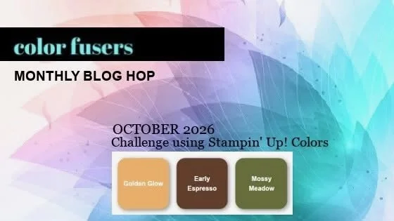
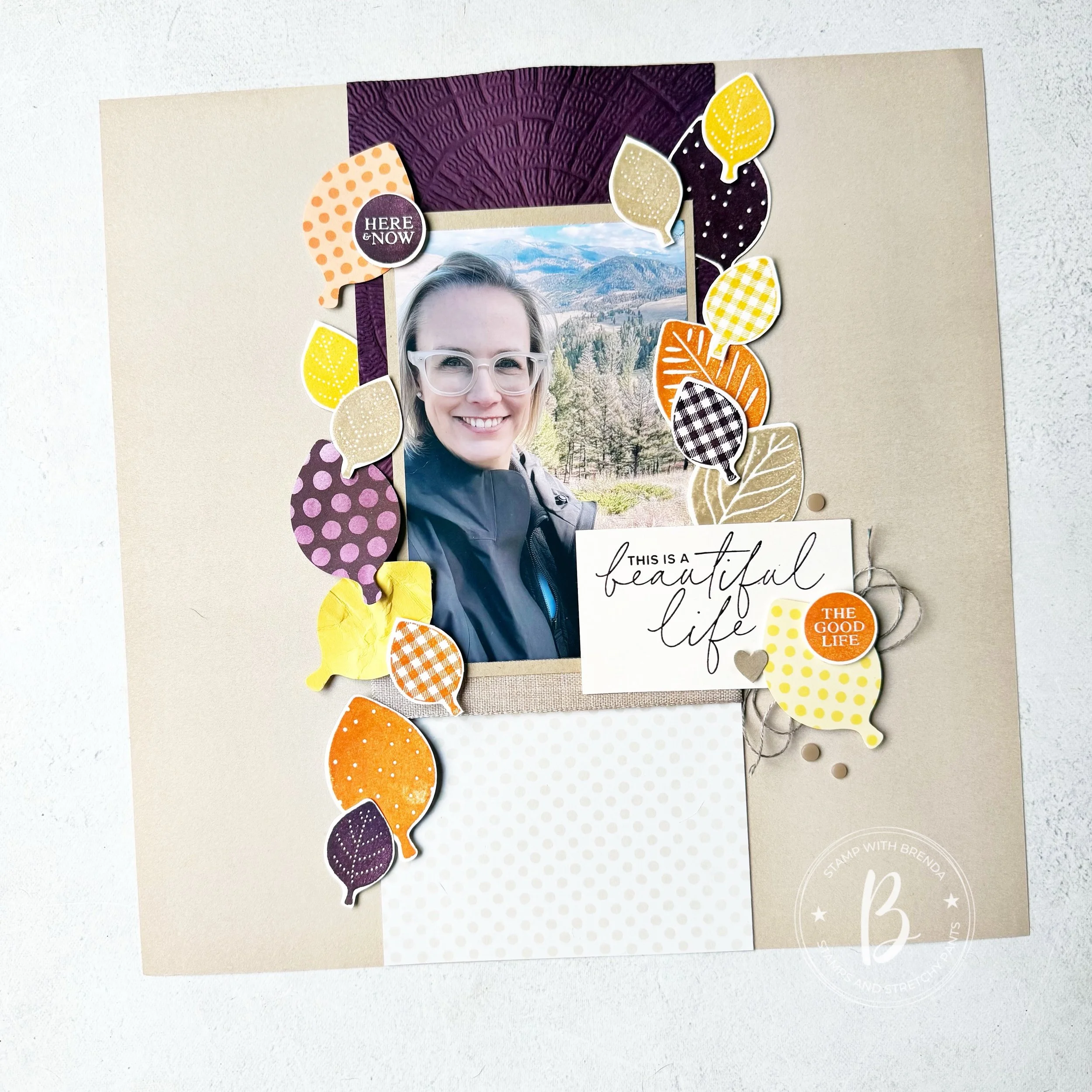
I am so happy you are here! I was really excited about this month’s Color Fusers color combo—Golden Glow, Early Espresso and Mossy Meadow are perfect for fall crafting and I had an immediate idea for a scrapbook page!
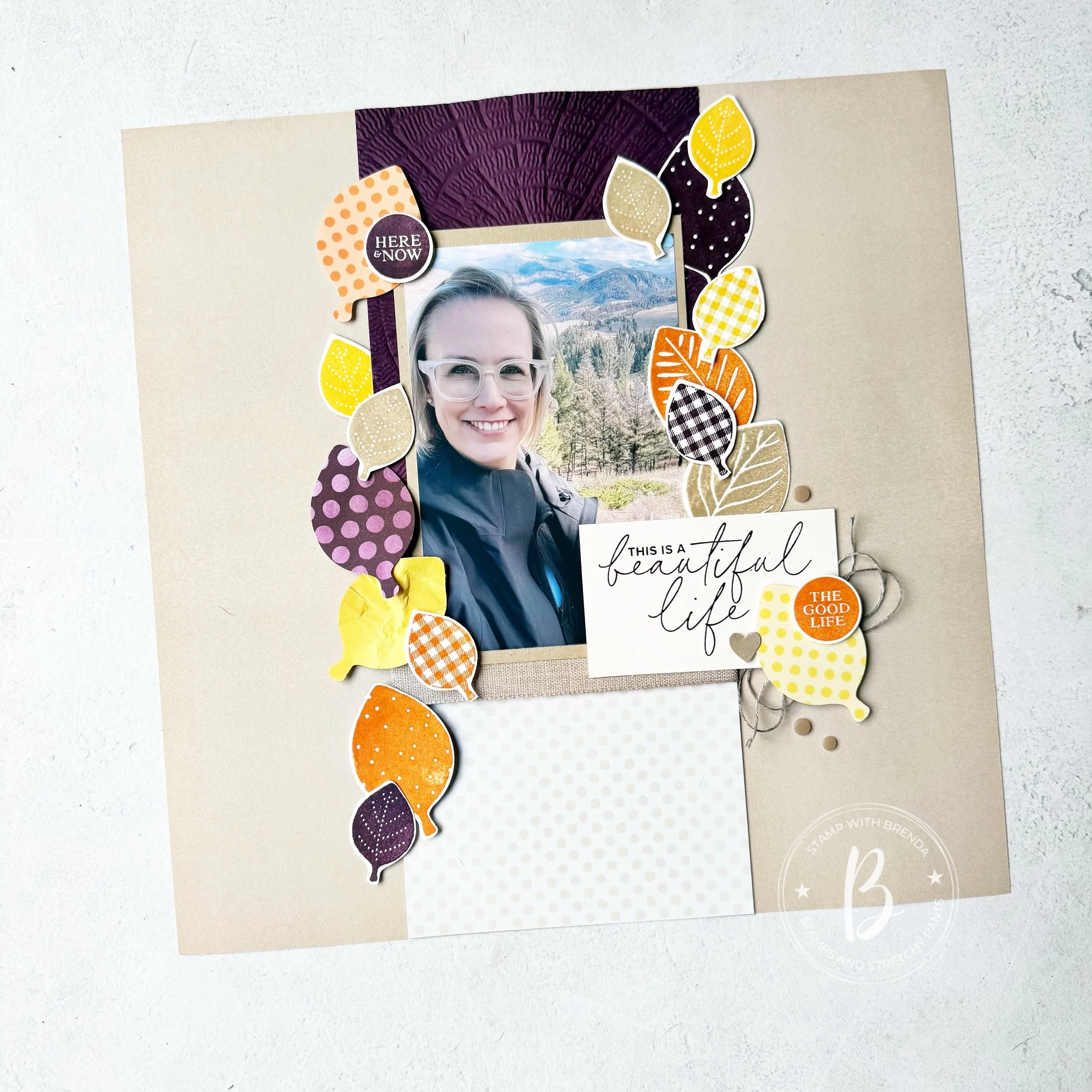
I love all of the options we have for fall crafting! My favorite Designer Series Paper paper right now is the Painted Patch collection—particularly the two awesome plaid patterns—one which has this awesome Golden Glow leaf design on the reverse sign. Sometimes it is so hard to choose which side to use! However, this leaf pattern was the beginning of my scrapbook page.
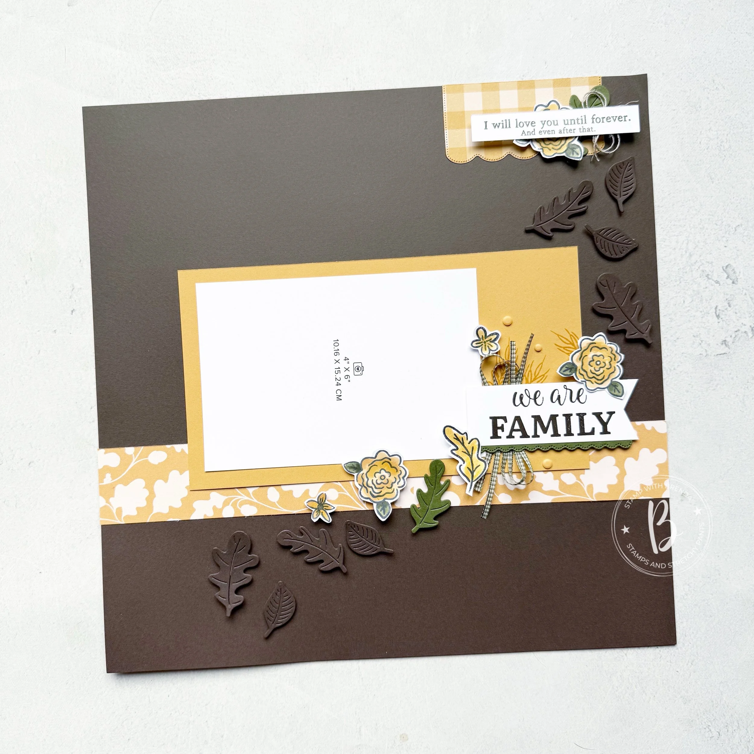
The base of the page is Early Espresso and to me the DSP strip influenced the rest of my design by focusing on the leaf pattern and bringing it to life with the dies from the Autumn Fields Bundle. Die cutting them and popping them up with dimensionals makes the background so interesting. It adds texture and interest keeping them tone on tone.
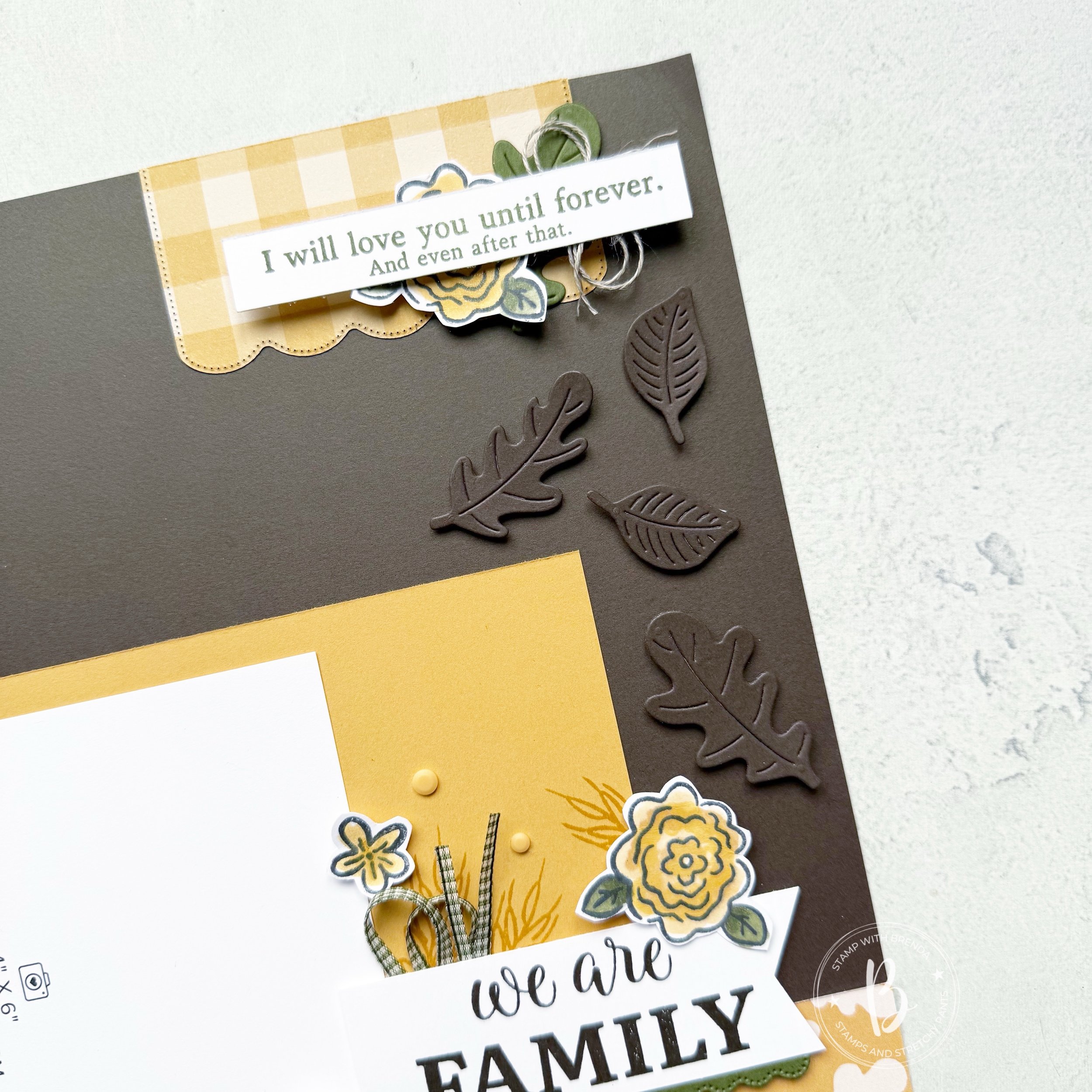
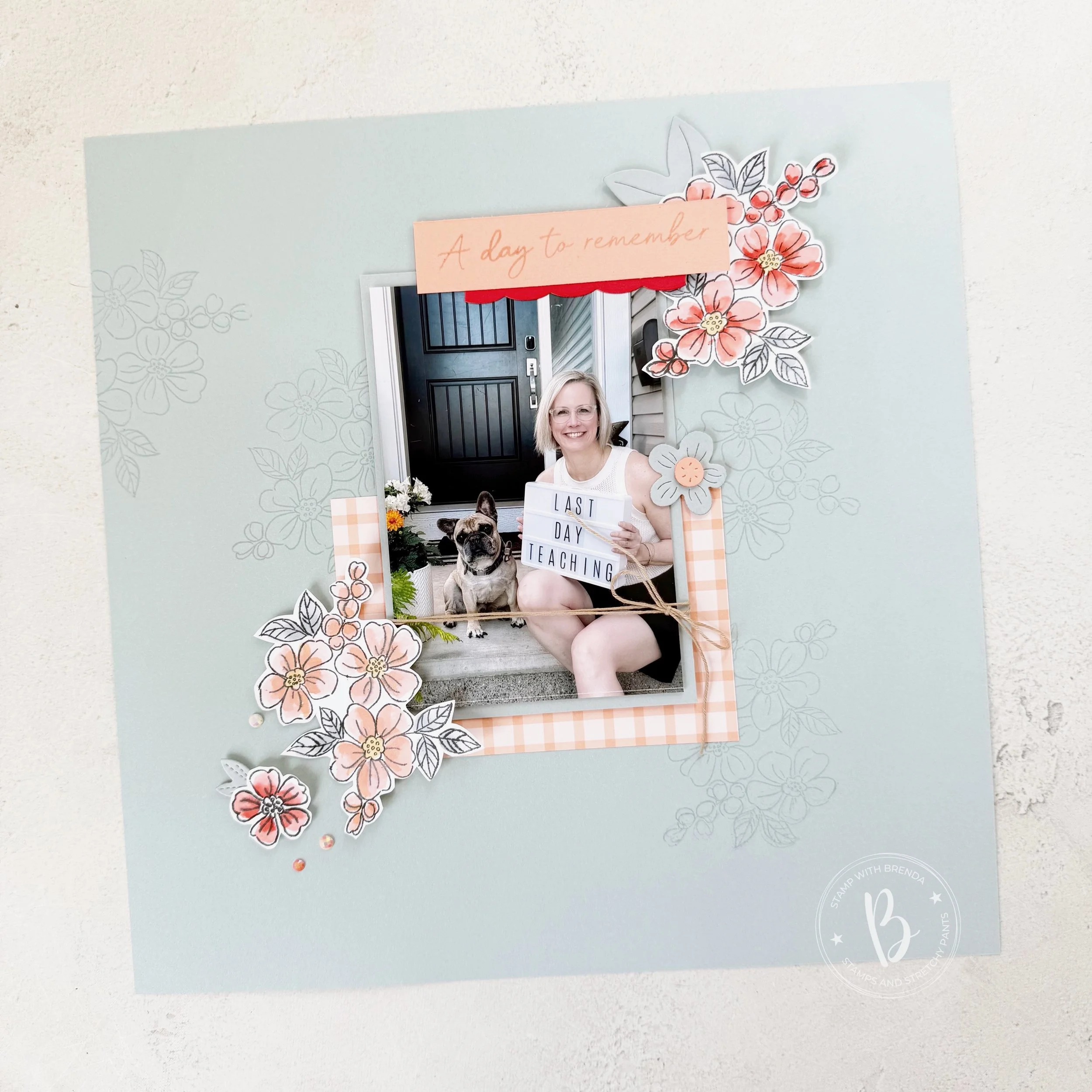
I also used the Gingham Gallery DSP in Golden Glow to die cut the scallop section at the top of the page. I trimmed off the top (which also a smaller scallop) to give this a straight edge to butt up along the top of my page.
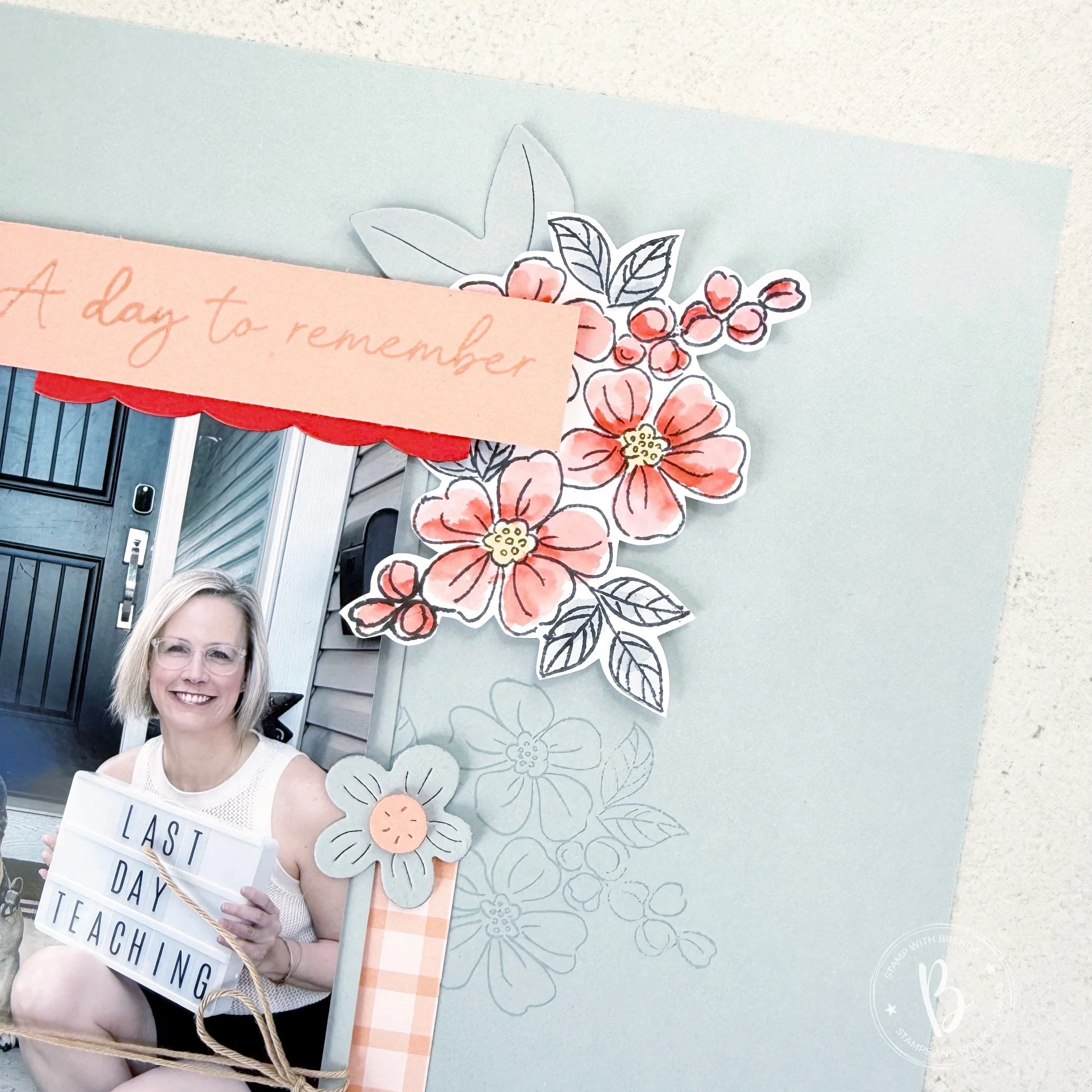
I thought this was a nice way to build another sentiment into the page. This sentiment is from the Winnie the Pooh Sweet Word & Labels set. I layered a flower and Mossy Meadow leaf behind with some Linen Thread. Adding a brush of the Golden Glow Shimmer Pen on the flowers gave them a really nice finish.
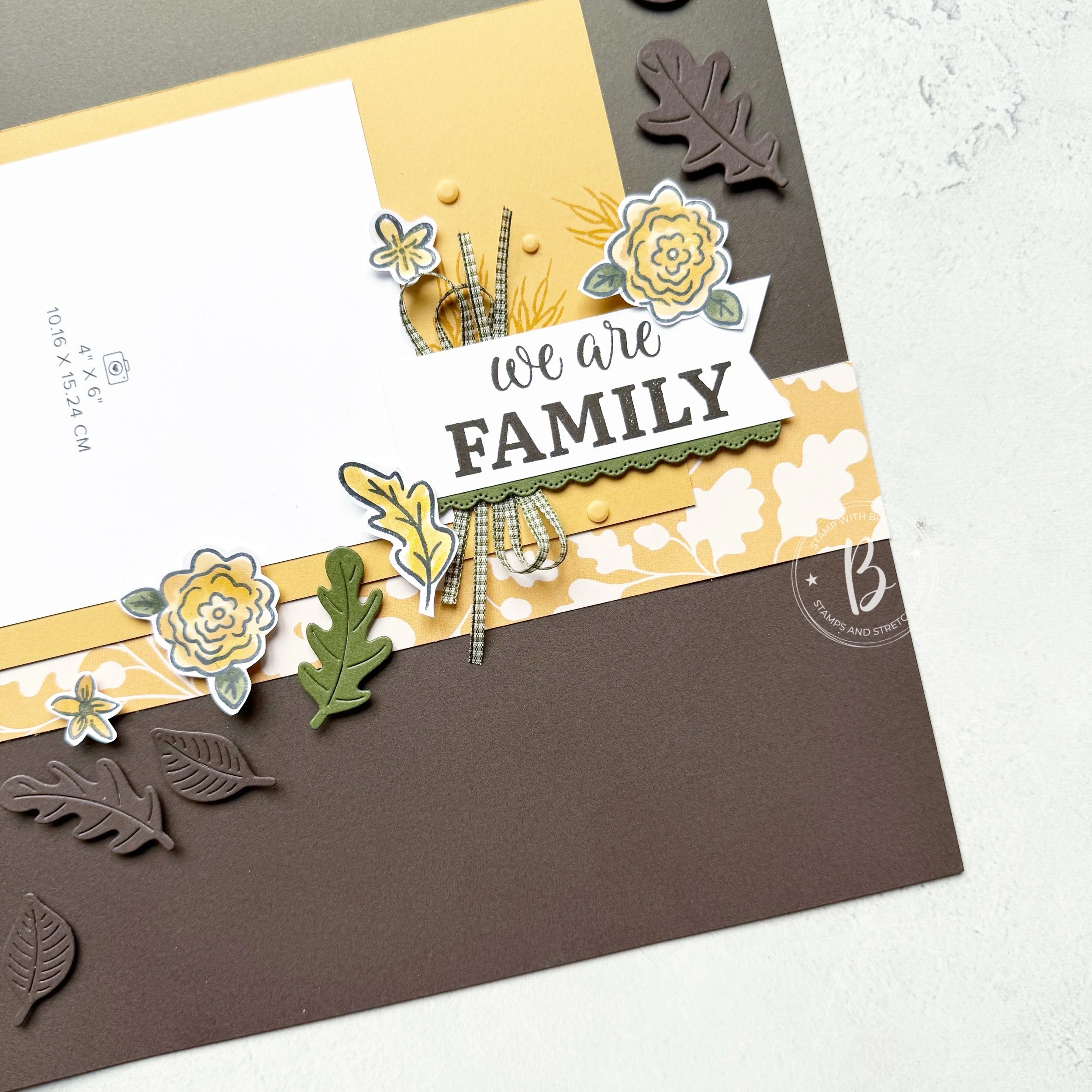
The same scallop die makes a smaller scallop option that I decided to use under the sentiment “We Are Family”. This sentiment is created by blending two stamps together. Another great aspect of the Autumn Fields stamp set.
I used the new Mossy Meadow Gingham ribbon (trimmed in half) to add some interest to the sentiment. Honestly, I rarely make a scrapbook page without ribbon or thread of some kind.
The stamp set also includes an image that looks like a sheaf of wheat. So I decided to add that on my oversized photo mat. This photo mat is designed to give you space to decorate. It is 8 1/2 by 4 3/4 and holds a 4x6 photo on the left. Adding some of the Golden Glow dots from the Painted Patch Adhesive Backed Dots was the perfect finishing touch.
I really love the combination of stamped and coloured flowers and leaves (using Golden Glow Blends, Shimmer Pen and Mossy Meadows Blends) and die cut leaves.
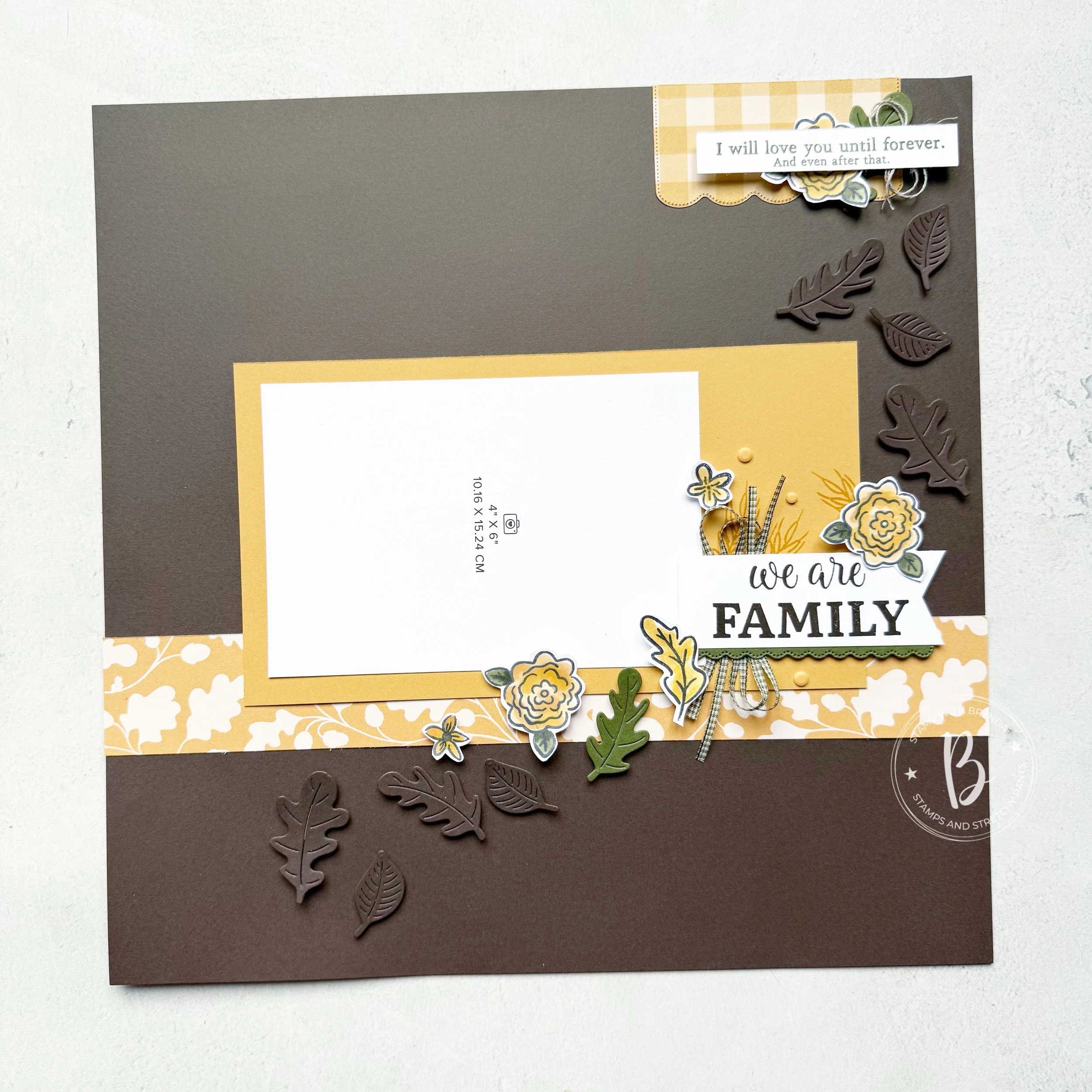
I really hope this page inspires you to create your own fall scrapbook page. Mine is waiting for the perfect memory—it’s a good way to motivate me to be outside!
Next up on the swap is Heather from the Songbird Stamper. You can see what she has designed by copying this link into your browser:

Or go in reverse and see what Melissa created first!

If you have enjoyed my project, please consider following me on Instagram as I shared a lot more over on that platform. I have also been sharing my 50 Things to Do When I am 50 List on the Lifestyle portion of my blog—feel free to check out what I have been up to. And if you are in Canada and need any crafting supplies, consider shopping with me so I can keep doing what I love!
Shop My Online Store
Product List![Autumn Fields Bundle (English) [ 168329 ]](https://assets1.tamsnetwork.com/images/EC042017NF/168329s.jpg "Autumn Fields Bundle (English) [ 168329 ]")
![Early Espresso 12" X 12" (30.5 X 30.5 Cm) Two Tone Cardstock [ 166668 ]](https://assets1.tamsnetwork.com/images/EC042017NF/166668s.jpg "Early Espresso 12\" X 12\" (30.5 X 30.5 Cm) Two Tone Cardstock [ 166668 ]")
![2026–2028 In Color™ Gingham Gallery 12" X 12" (30.5 X 30.5 Cm) Designer Series Paper [ 168218 ]](https://assets1.tamsnetwork.com/images/EC042017NF/168218s.jpg "2026–2028 In Color™ Gingham Gallery 12\" X 12\" (30.5 X 30.5 Cm) Designer Series Paper [ 168218 ]")
![Painted Patch 12" X 12" (30.5 X 30.5 Cm) Designer Series Paper [ 168430 ]](https://assets1.tamsnetwork.com/images/EC042017NF/168430s.jpg "Painted Patch 12\" X 12\" (30.5 X 30.5 Cm) Designer Series Paper [ 168430 ]")
![Golden Glow 8 1/2" X 11" Cardstock [ 167685 ]](https://assets1.tamsnetwork.com/images/EC042017NF/167685s.jpg "Golden Glow 8 1/2\" X 11\" Cardstock [ 167685 ]")
![Mossy Meadow 8-1/2" X 11" Cardstock [ 133676 ]](https://assets1.tamsnetwork.com/images/EC042017NF/133676s.jpg "Mossy Meadow 8-1/2\" X 11\" Cardstock [ 133676 ]")
![Basic White 8 1/2" X 11" Cardstock [ 166780 ]](https://assets1.tamsnetwork.com/images/EC042017NF/166780s.jpg "Basic White 8 1/2\" X 11\" Cardstock [ 166780 ]")
![Mossy Meadow & Very Vanilla 1/4" (6.4 Mm) Gingham Ribbon [ 168364 ]](https://assets1.tamsnetwork.com/images/EC042017NF/168364s.jpg "Mossy Meadow & Very Vanilla 1/4\" (6.4 Mm) Gingham Ribbon [ 168364 ]")
![Linen Thread [ 104199 ]](https://assets1.tamsnetwork.com/images/EC042017NF/104199s.jpg "Linen Thread [ 104199 ]")
![Painted Patch Adhesive Backed Dots [ 168443 ]](https://assets1.tamsnetwork.com/images/EC042017NF/168443s.jpg "Painted Patch Adhesive Backed Dots [ 168443 ]")
![Mossy Meadow Stampin' Blends Combo Pack [ 154890 ]](https://assets1.tamsnetwork.com/images/EC042017NF/154890s.jpg "Mossy Meadow Stampin' Blends Combo Pack [ 154890 ]")
![Golden Glow Stampin’ Blends Combo Pack [ 167682 ]](https://assets1.tamsnetwork.com/images/EC042017NF/167682s.jpg "Golden Glow Stampin’ Blends Combo Pack [ 167682 ]")
![Golden Glow Shimmer Brush [ 167662 ]](https://assets1.tamsnetwork.com/images/EC042017NF/167662s.jpg "Golden Glow Shimmer Brush [ 167662 ]")


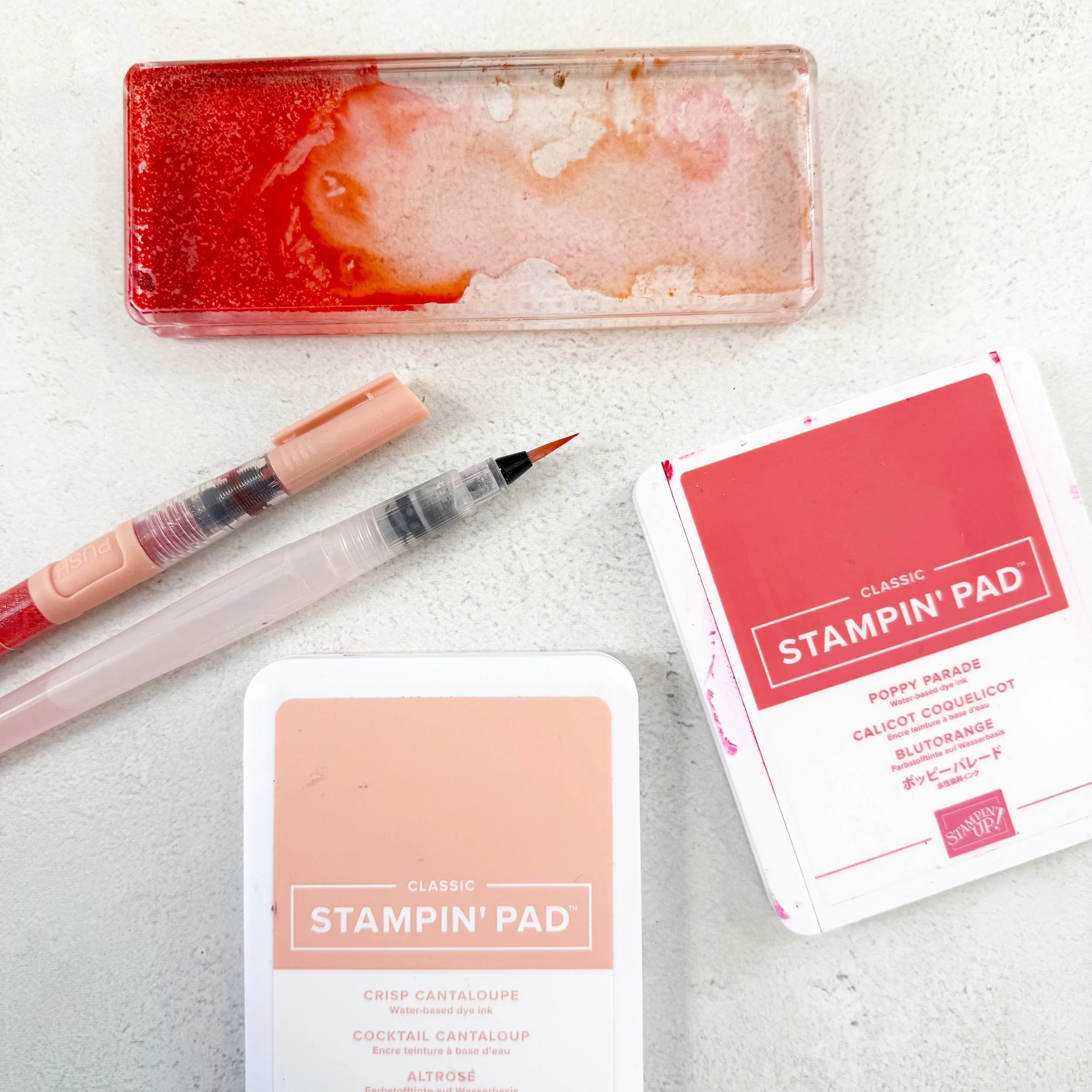
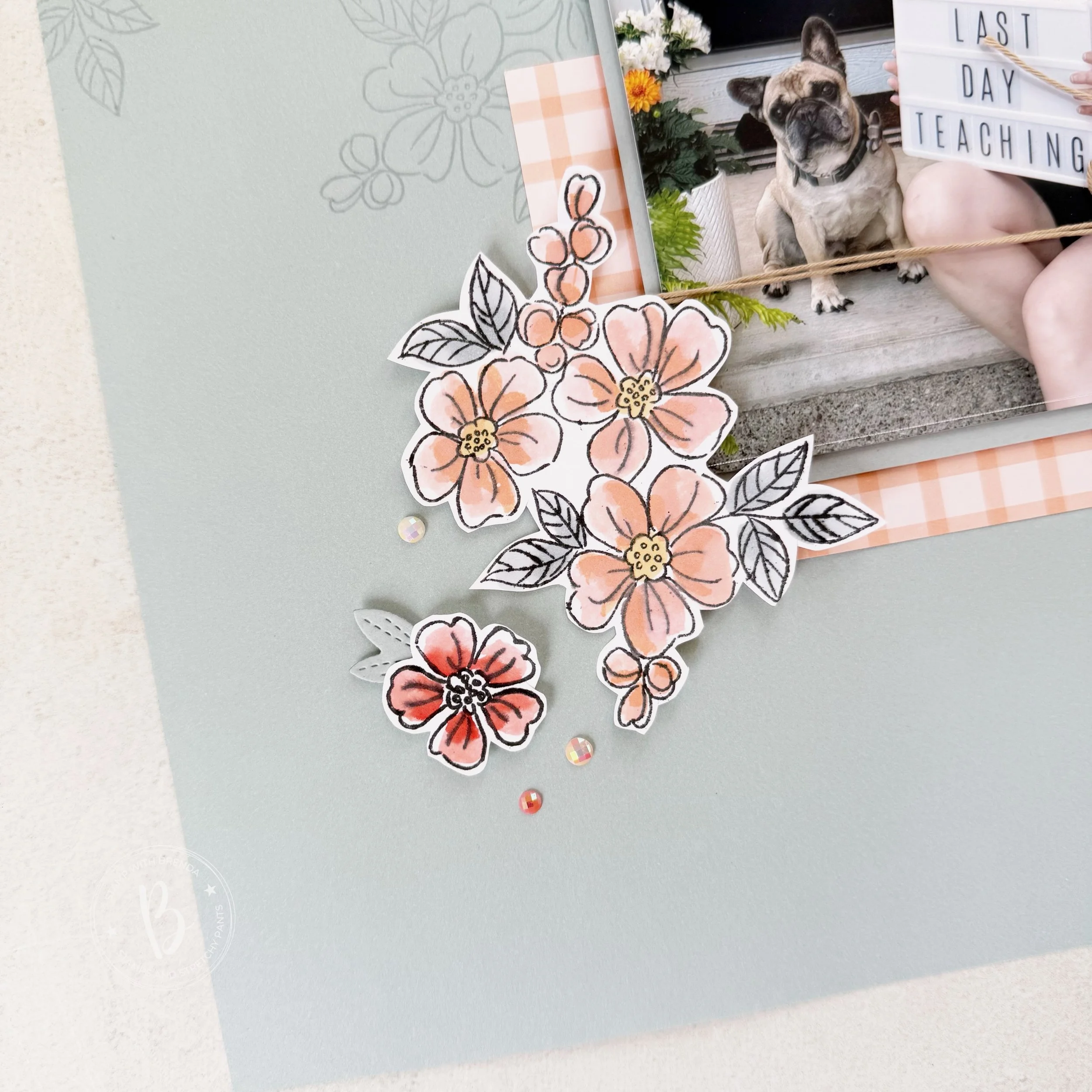
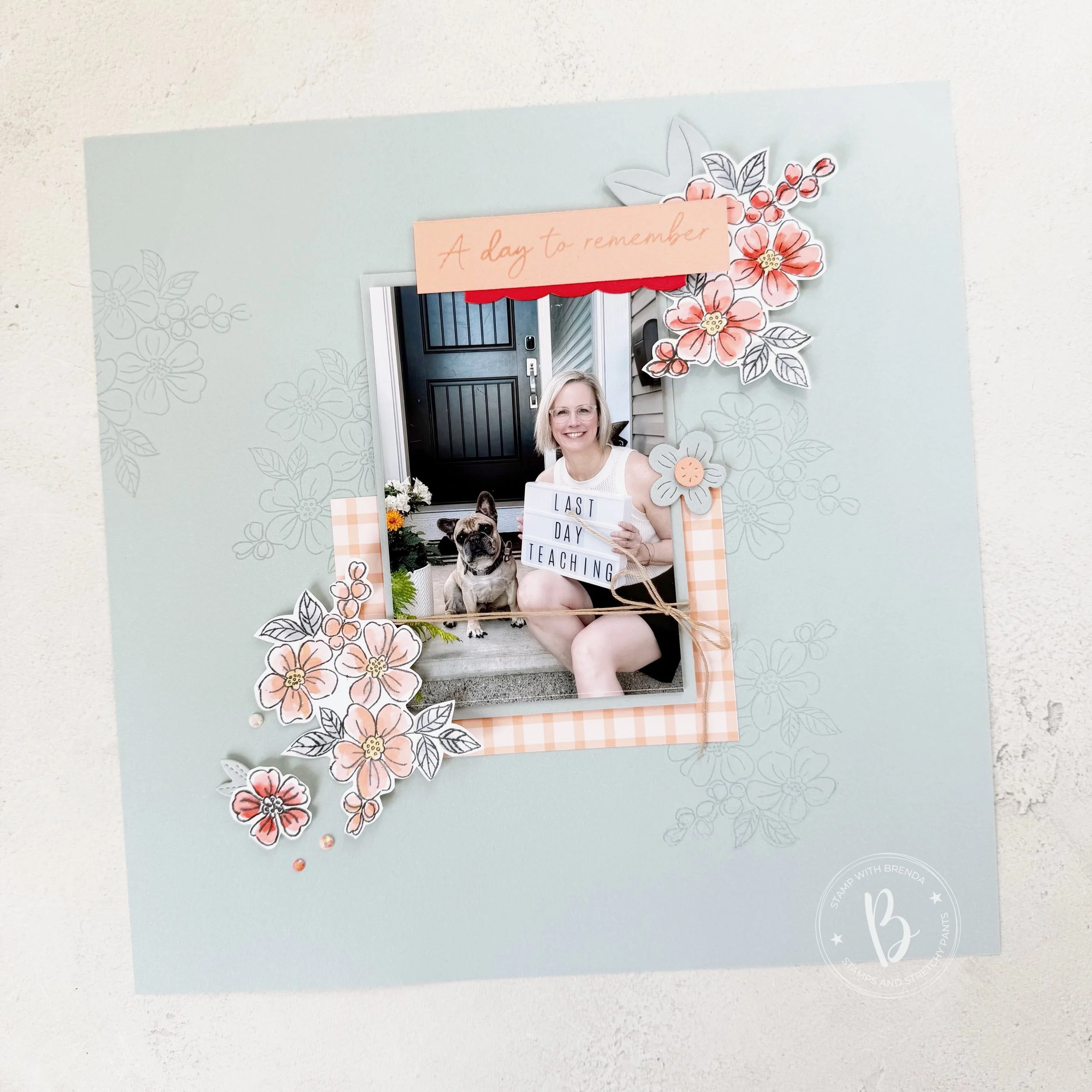


![Fragrant Layers Photopolymer Stamp Set (English) [ 167150 ]](https://assets1.tamsnetwork.com/images/EC042017NF/167150s.jpg "Fragrant Layers Photopolymer Stamp Set (English) [ 167150 ]")
![Heirloom Boutique Dies [ 167730 ]](https://assets1.tamsnetwork.com/images/EC042017NF/167730s.jpg "Heirloom Boutique Dies [ 167730 ]")
![Extraordinary Life Dies [ 167718 ]](https://assets1.tamsnetwork.com/images/EC042017NF/167718s.jpg "Extraordinary Life Dies [ 167718 ]")
![Cloud Cover 12" X 12" (30.5 X 30.5 Cm) Two Tone Cardstock [ 166708 ]](https://assets1.tamsnetwork.com/images/EC042017NF/166708s.jpg "Cloud Cover 12\" X 12\" (30.5 X 30.5 Cm) Two Tone Cardstock [ 166708 ]")
![Cloud Cover 8 1/2" X 11" Cardstock [ 165621 ]](https://assets1.tamsnetwork.com/images/EC042017NF/165621s.jpg "Cloud Cover 8 1/2\" X 11\" Cardstock [ 165621 ]")
![Crisp Cantaloupe Shimmer Brush [ 167661 ]](https://assets1.tamsnetwork.com/images/EC042017NF/167661s.jpg "Crisp Cantaloupe Shimmer Brush [ 167661 ]")
![Baker's Twine Essentials Pack [ 155475 ]](https://assets1.tamsnetwork.com/images/EC042017NF/155475s.jpg "Baker's Twine Essentials Pack [ 155475 ]")
![Pearlized Faceted Circles [ 166978 ]](https://assets1.tamsnetwork.com/images/EC042017NF/166978s.jpg "Pearlized Faceted Circles [ 166978 ]")
![Water Painters [ 168253 ]](https://assets1.tamsnetwork.com/images/EC042017NF/168253s.jpg "Water Painters [ 168253 ]")
![Poppy Parade Classic Stampin' Pad [ 147050 ]](https://assets1.tamsnetwork.com/images/EC042017NF/147050s.jpg "Poppy Parade Classic Stampin' Pad [ 147050 ]")
![Crisp Cantaloupe Classic Stampin Pad [ 167680 ]](https://assets1.tamsnetwork.com/images/EC042017NF/167680s.jpg "Crisp Cantaloupe Classic Stampin Pad [ 167680 ]")
![Cloud Cover Stampin’ Blends Combo Pack [ 165287 ]](https://assets1.tamsnetwork.com/images/EC042017NF/165287s.jpg "Cloud Cover Stampin’ Blends Combo Pack [ 165287 ]")
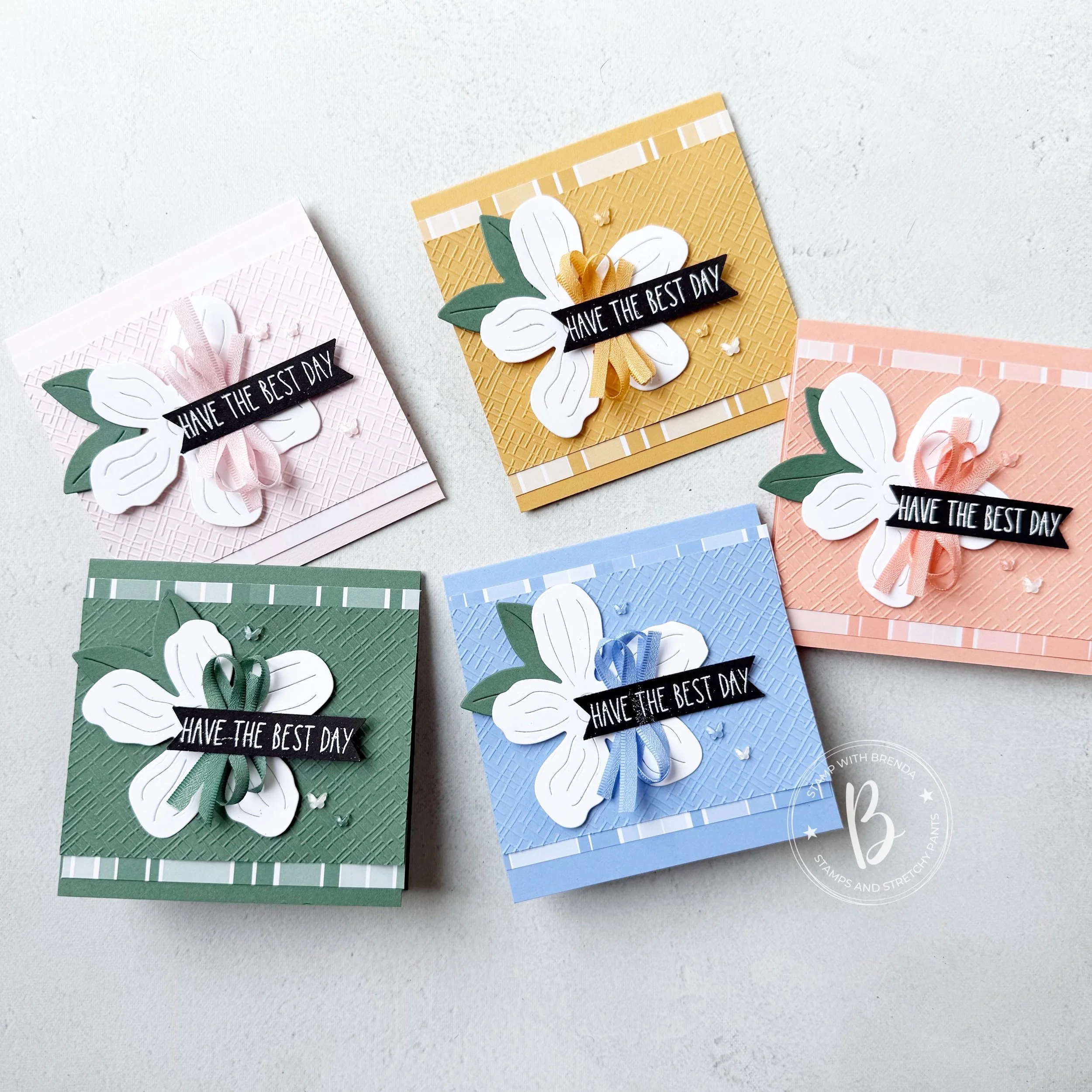
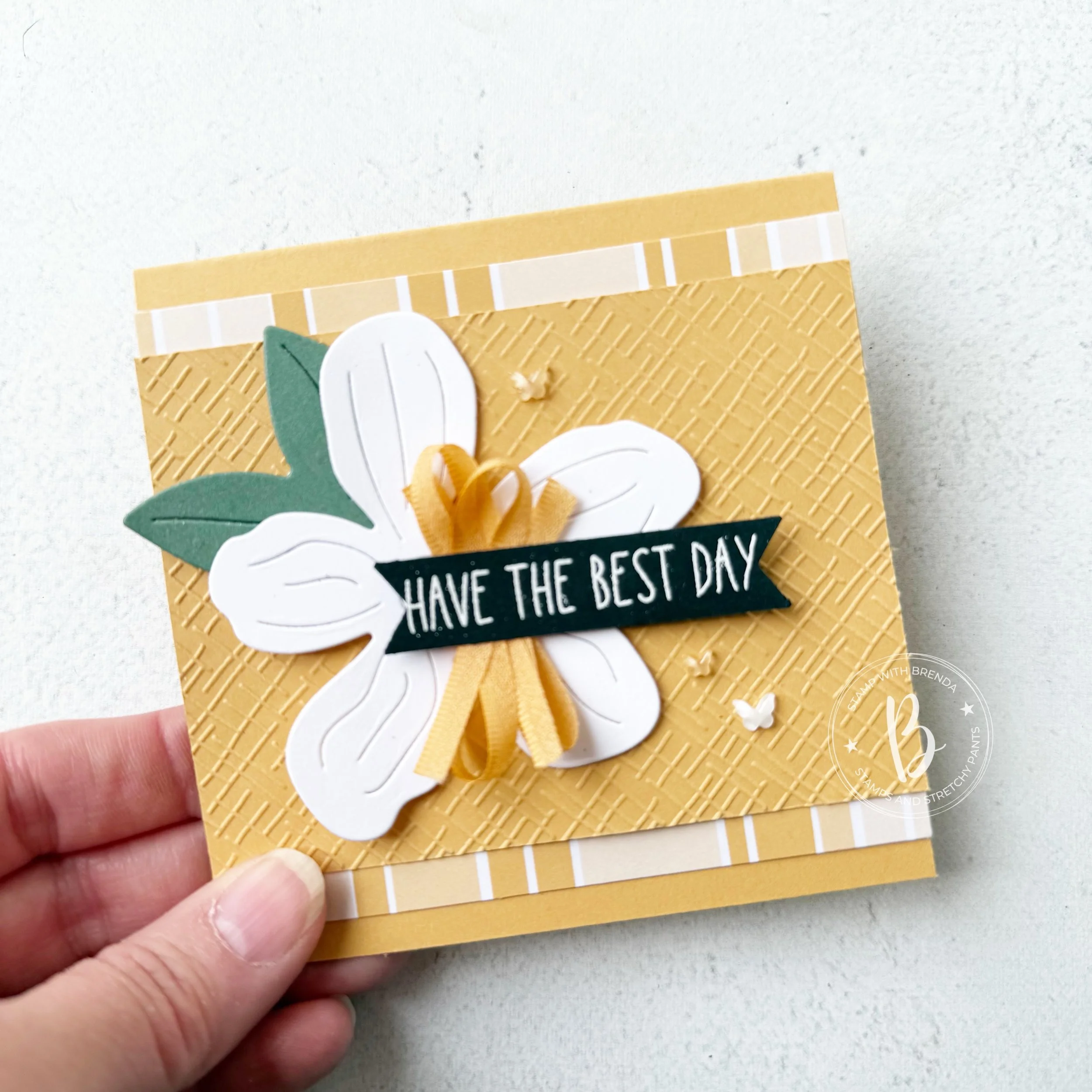
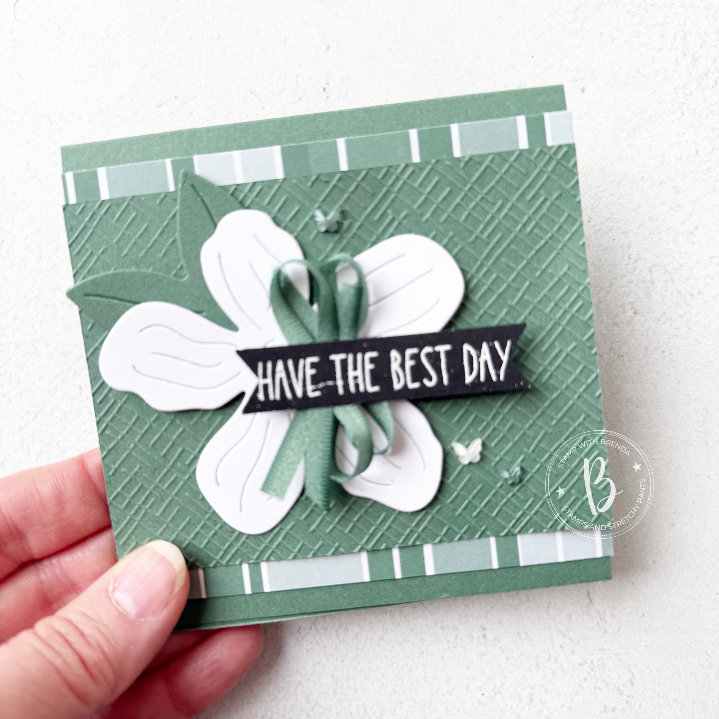
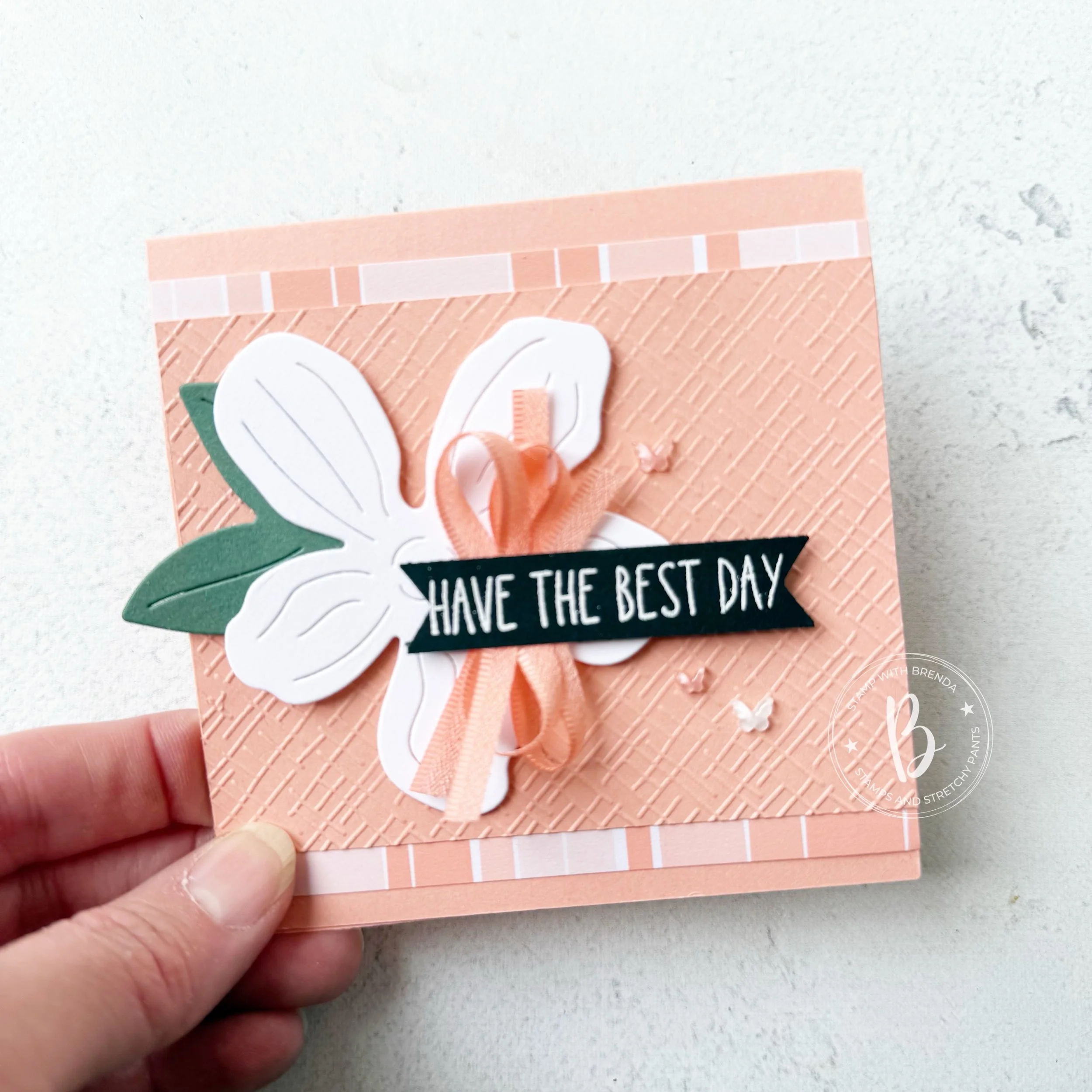



![Cutest Crew Photopolymer Stamp Set (English) [ 167146 ]](https://assets1.tamsnetwork.com/images/EC042017NF/167146s.jpg "Cutest Crew Photopolymer Stamp Set (English) [ 167146 ]")
![2026–2028 In Color™ Painted Patterns 12" X 12" (30.5 X 30.5 Cm) Designer Series Paper [ 167755 ]](https://assets1.tamsnetwork.com/images/EC042017NF/167755s.jpg "2026–2028 In Color™ Painted Patterns 12\" X 12\" (30.5 X 30.5 Cm) Designer Series Paper [ 167755 ]")
![Hydrangea Hue 8 1/2" X 11" Cardstock [ 167687 ]](https://assets1.tamsnetwork.com/images/EC042017NF/167687s.jpg "Hydrangea Hue 8 1/2\" X 11\" Cardstock [ 167687 ]")
![Peaceful Pine 8 1/2" X 11" Cardstock [ 167691 ]](https://assets1.tamsnetwork.com/images/EC042017NF/167691s.jpg "Peaceful Pine 8 1/2\" X 11\" Cardstock [ 167691 ]")
![Barely Blush 8 1/2" X 11" Cardstock [ 167689 ]](https://assets1.tamsnetwork.com/images/EC042017NF/167689s.jpg "Barely Blush 8 1/2\" X 11\" Cardstock [ 167689 ]")
![Crisp Cantaloupe 8 1/2" X 11" Cardstock [ 167693 ]](https://assets1.tamsnetwork.com/images/EC042017NF/167693s.jpg "Crisp Cantaloupe 8 1/2\" X 11\" Cardstock [ 167693 ]")
![White Stampin' Emboss Powder [ 109132 ]](https://assets1.tamsnetwork.com/images/EC042017NF/109132s.jpg "White Stampin' Emboss Powder [ 109132 ]")
![Three Banner Punch [ 167050 ]](https://assets1.tamsnetwork.com/images/EC042017NF/167050s.jpg "Three Banner Punch [ 167050 ]")
![Barely Blush 3/8" (1 Cm) Bordered Ribbon [ 167550 ]](https://assets1.tamsnetwork.com/images/EC042017NF/167550s.jpg "Barely Blush 3/8\" (1 Cm) Bordered Ribbon [ 167550 ]")
![Crisp Cantaloupe 3/8" (1 Cm) Bordered Ribbon [ 167552 ]](https://assets1.tamsnetwork.com/images/EC042017NF/167552s.jpg "Crisp Cantaloupe 3/8\" (1 Cm) Bordered Ribbon [ 167552 ]")
![Peaceful Pine 3/8" (1 Cm) Bordered Ribbon [ 167551 ]](https://assets1.tamsnetwork.com/images/EC042017NF/167551s.jpg "Peaceful Pine 3/8\" (1 Cm) Bordered Ribbon [ 167551 ]")
![Hydrangea Hue 3/8" (1 Cm) Bordered Ribbon [ 167549 ]](https://assets1.tamsnetwork.com/images/EC042017NF/167549s.jpg "Hydrangea Hue 3/8\" (1 Cm) Bordered Ribbon [ 167549 ]")
![Golden Glow 3/8" (1 Cm) Bordered Ribbon [ 167548 ]](https://assets1.tamsnetwork.com/images/EC042017NF/167548s.jpg "Golden Glow 3/8\" (1 Cm) Bordered Ribbon [ 167548 ]")
![2026–2028 In Color™ Butterflies [ 167656 ]](https://assets1.tamsnetwork.com/images/EC042017NF/167656s.jpg "2026–2028 In Color™ Butterflies [ 167656 ]")