12 Days of Christmas with Brenda & Melanie
/Hi friends welcome back to our annual 12 Days of Christmas Blog Hop! This year Mel and I are going to feature a variety of projects using the Homemade Treats and the Gingerbread Man bundles! Today we will each share a project and then we will alternate days and on the 12 day each share a project! So over the course of the next 12 days you will get piles of inspiration using these bundles!

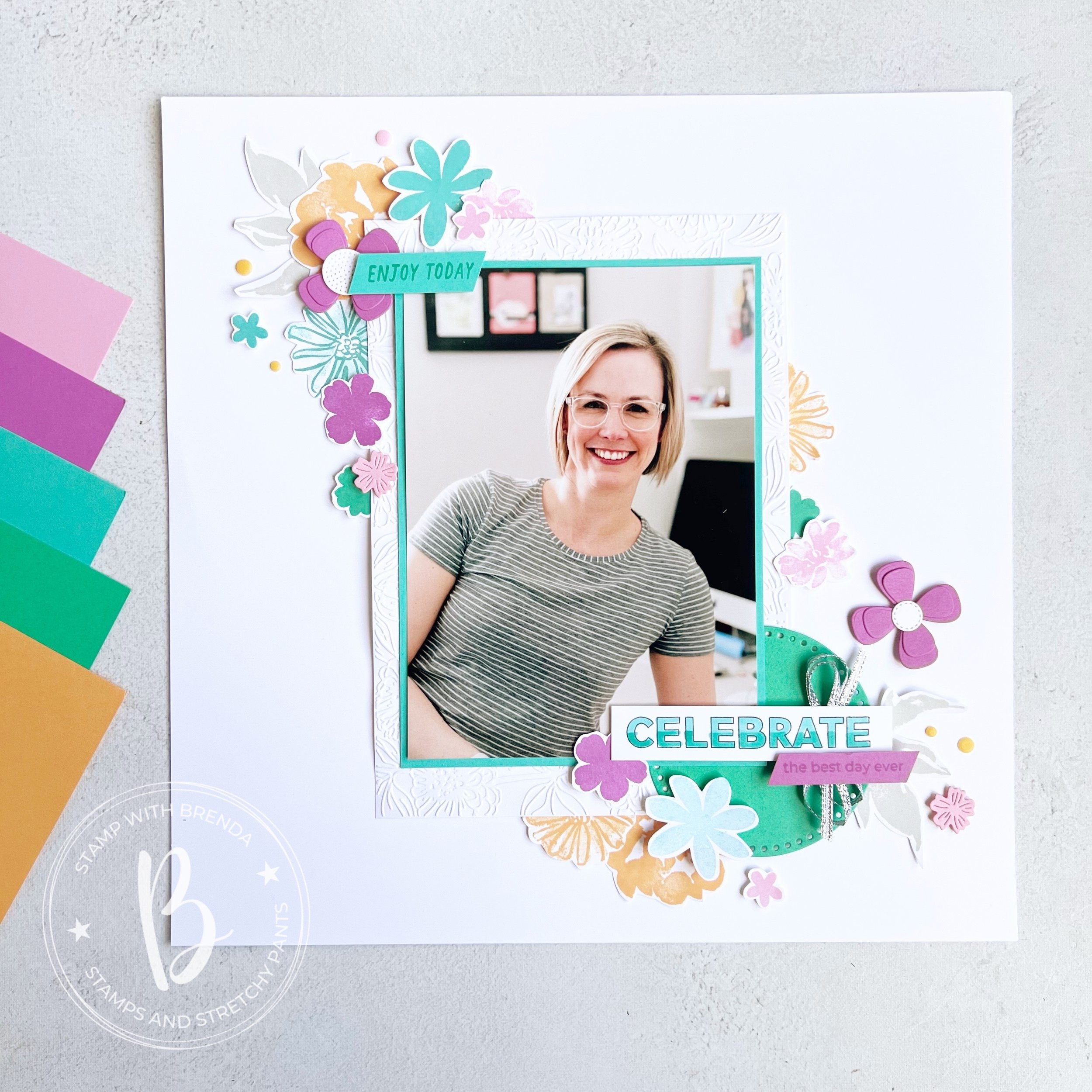
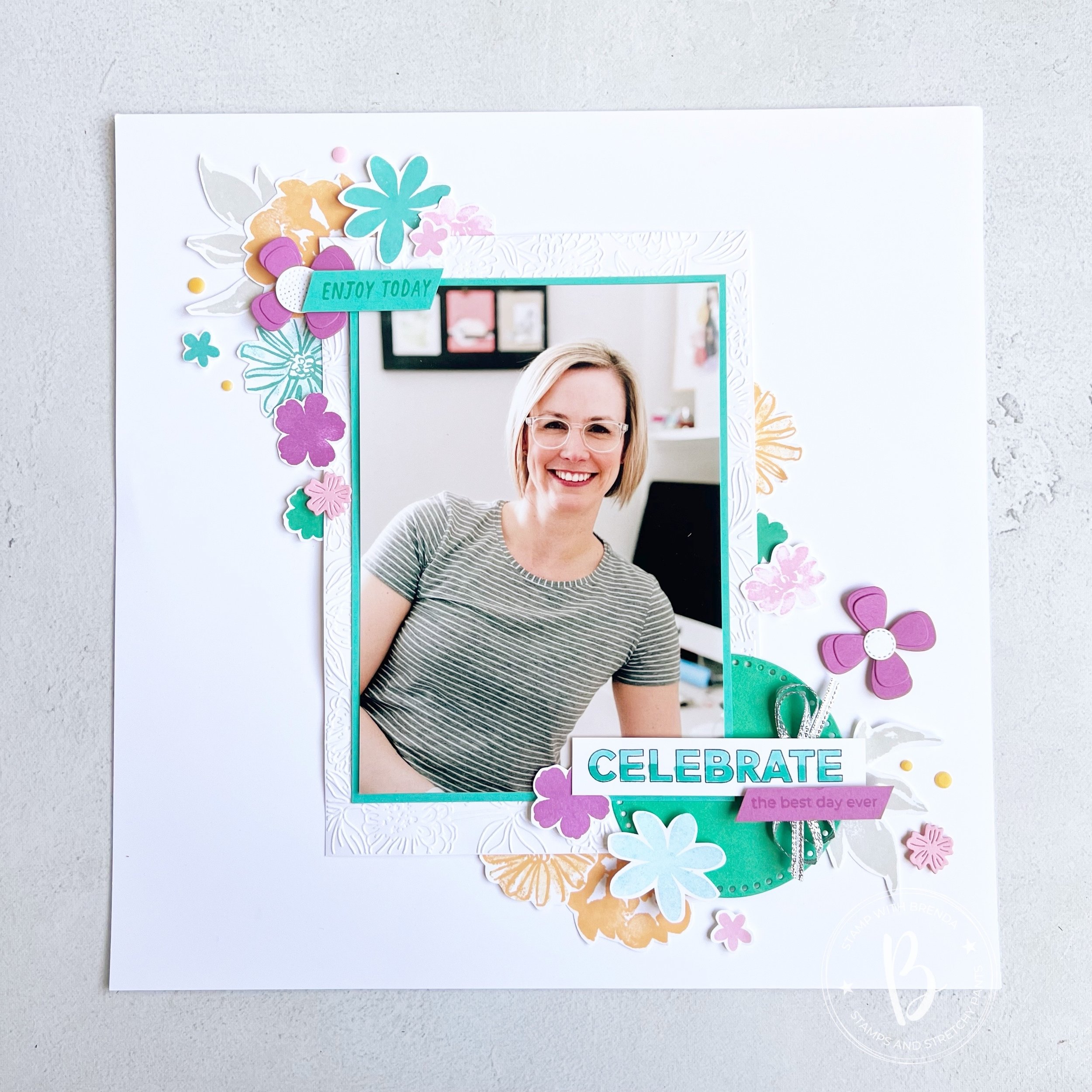
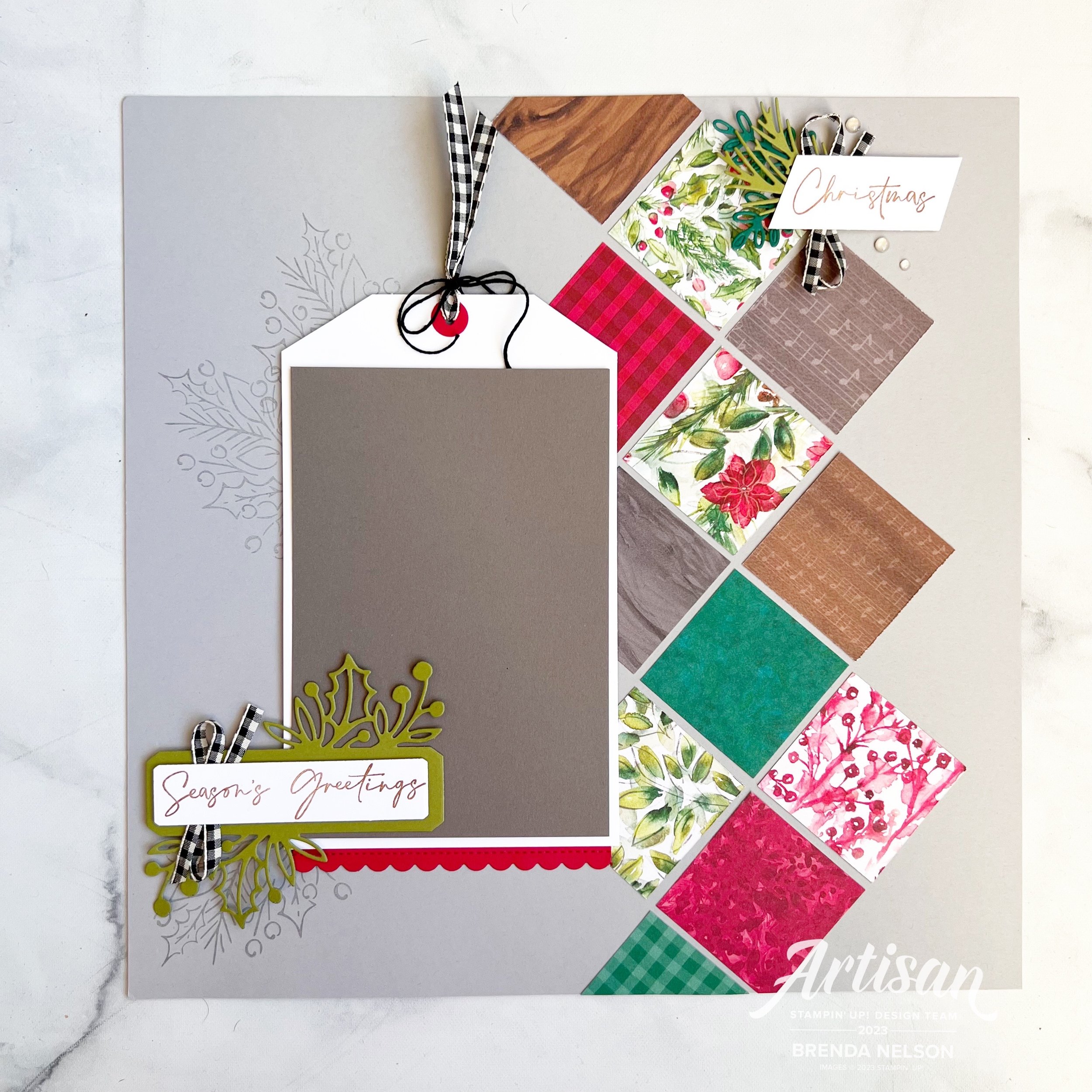
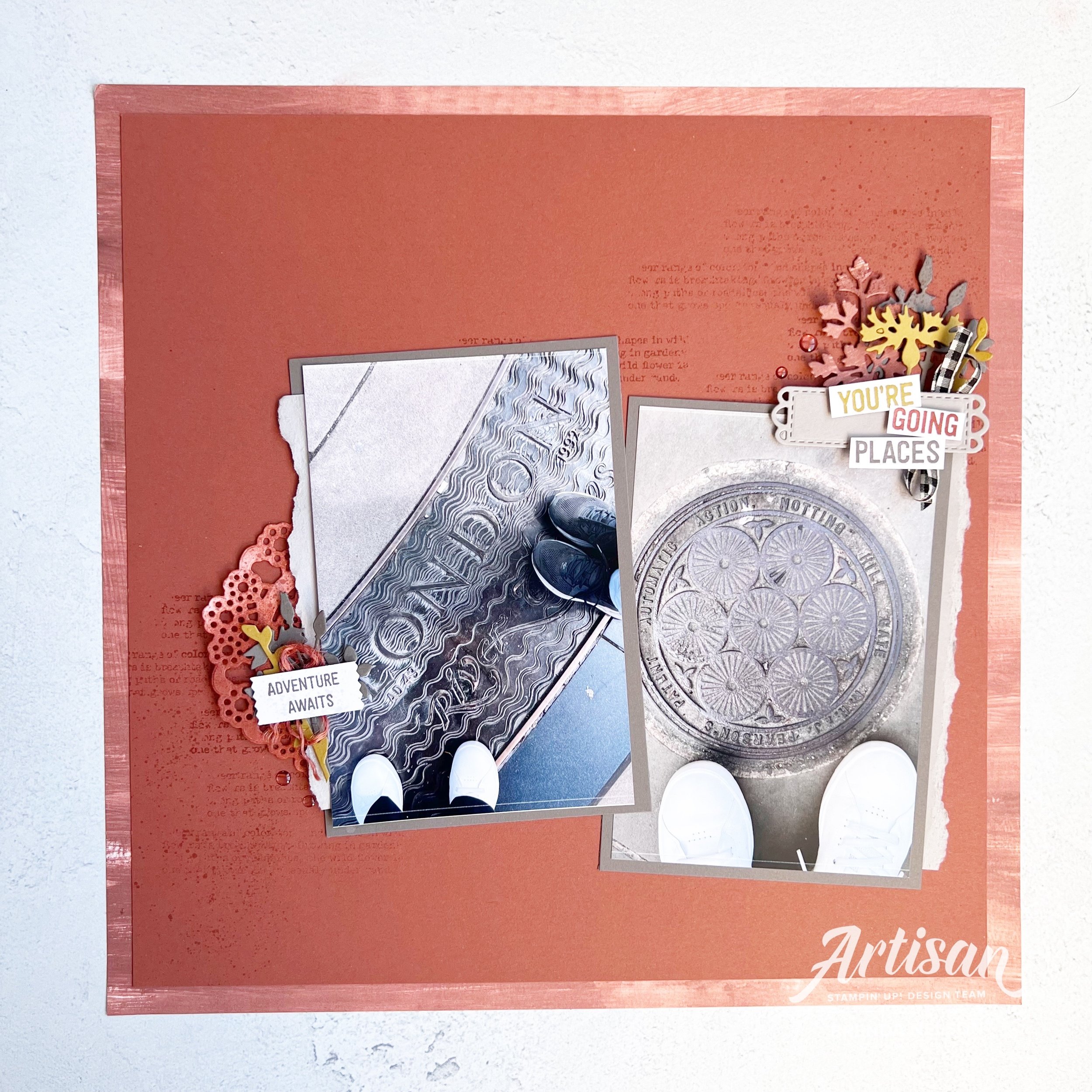
For my first project I wanted to share a scrapbook page as I love scrapbooking and I wanted to share a fun idea with how you can use this fun bundle to create a scrapbook page.

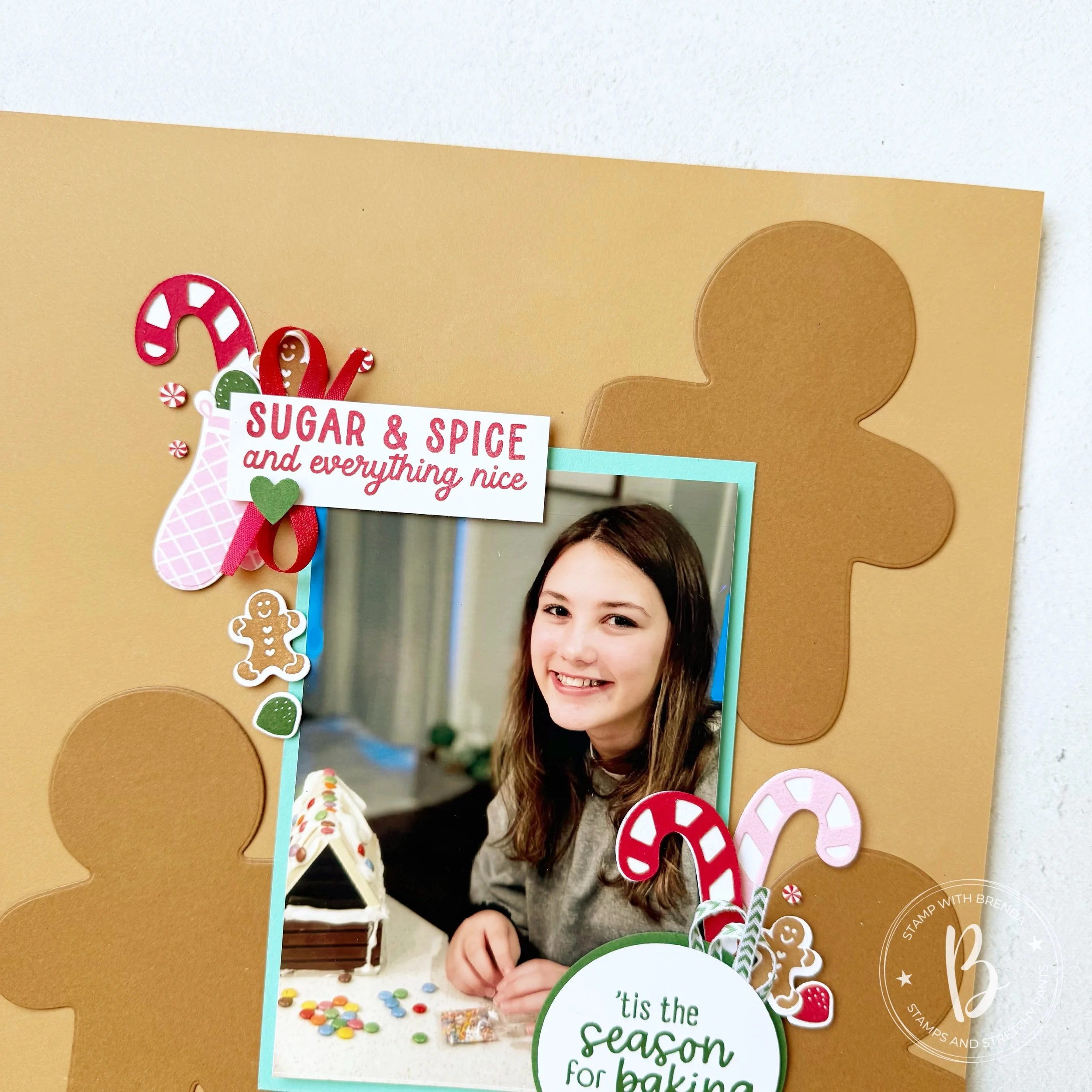
I started with a base of Pecan Pie Two Tone card stock and used the light side. The reason for this was so that when I die cut the gingerbread men out of the card stock you would see a contrast in the shapes. I love how it turned out!
I dug out an older picture of Summer where she is putting together a Gingerbread House as its a fun memory I want to keep. This is a reminder that we are never caught up in our memory keeping—its not a linear hobby!
The photo mat is Coastal Cabana and this color lends itself so well to this general color combination of Real Red, Garden Green and Pretty in Pink.
As mentioned Melanie and I are going to be using both the Homemade Treats and Gingerbread Man bundles over our 12 Days of Christmas Shares so I wanted to design this page to showcase how to use both on this project.
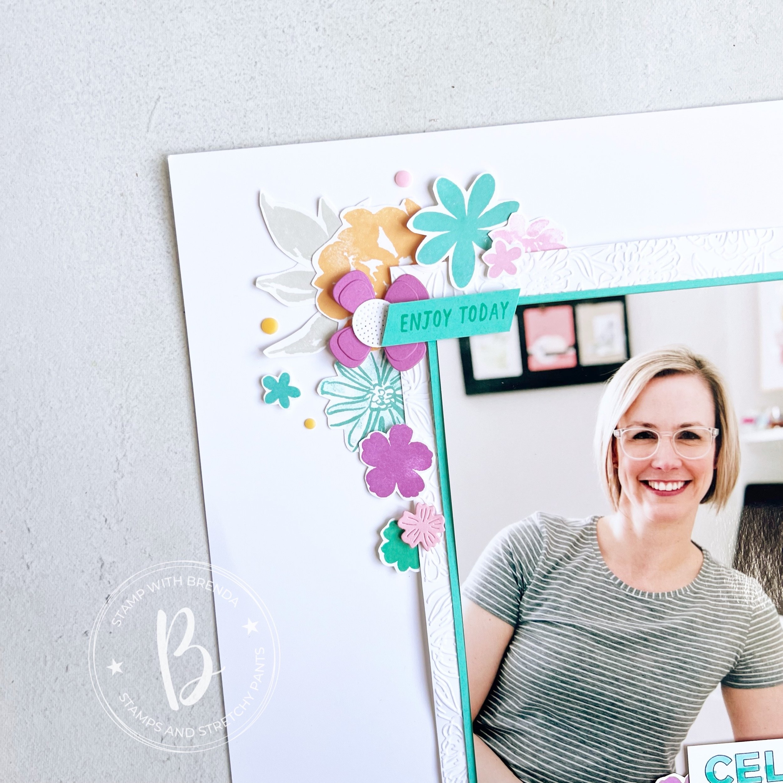
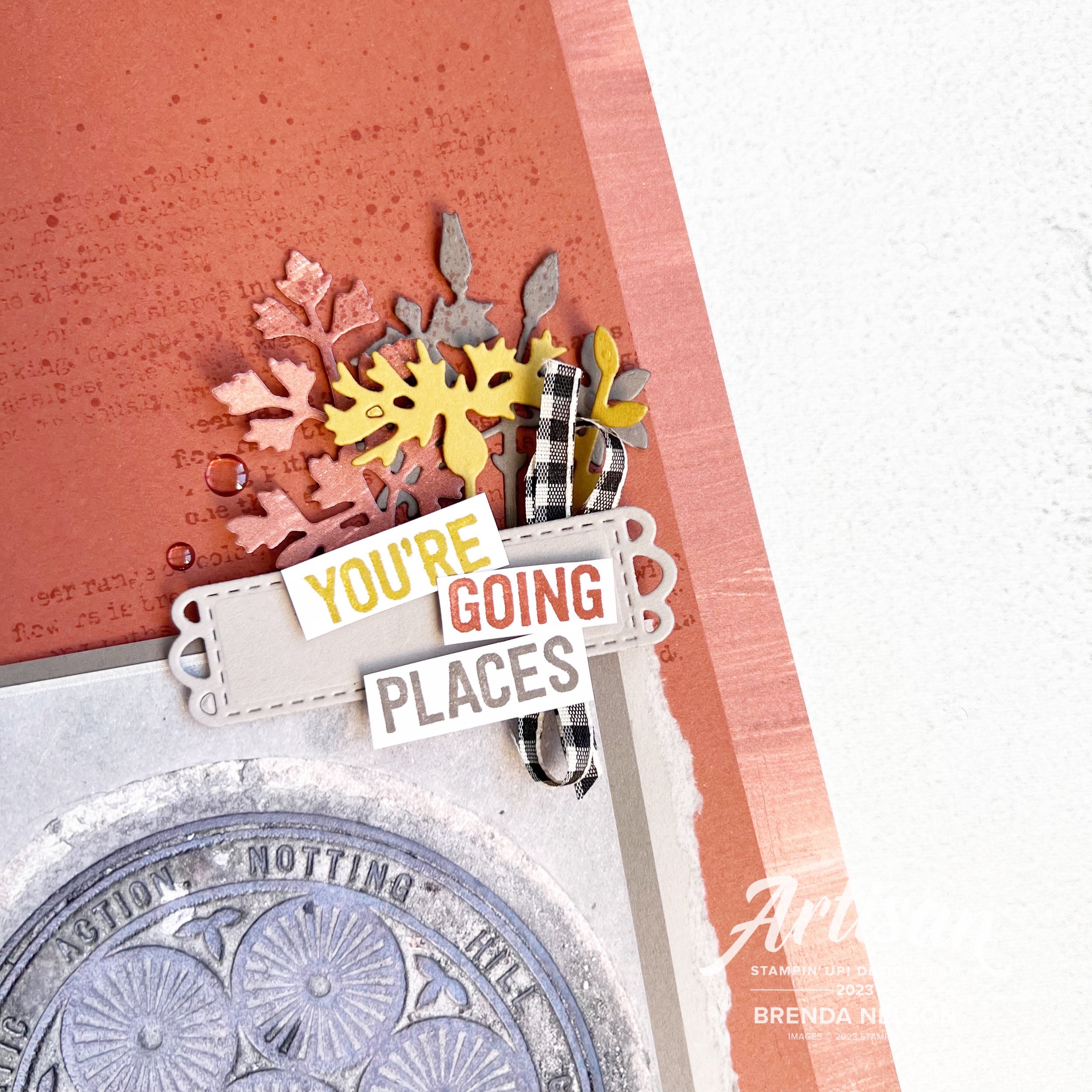
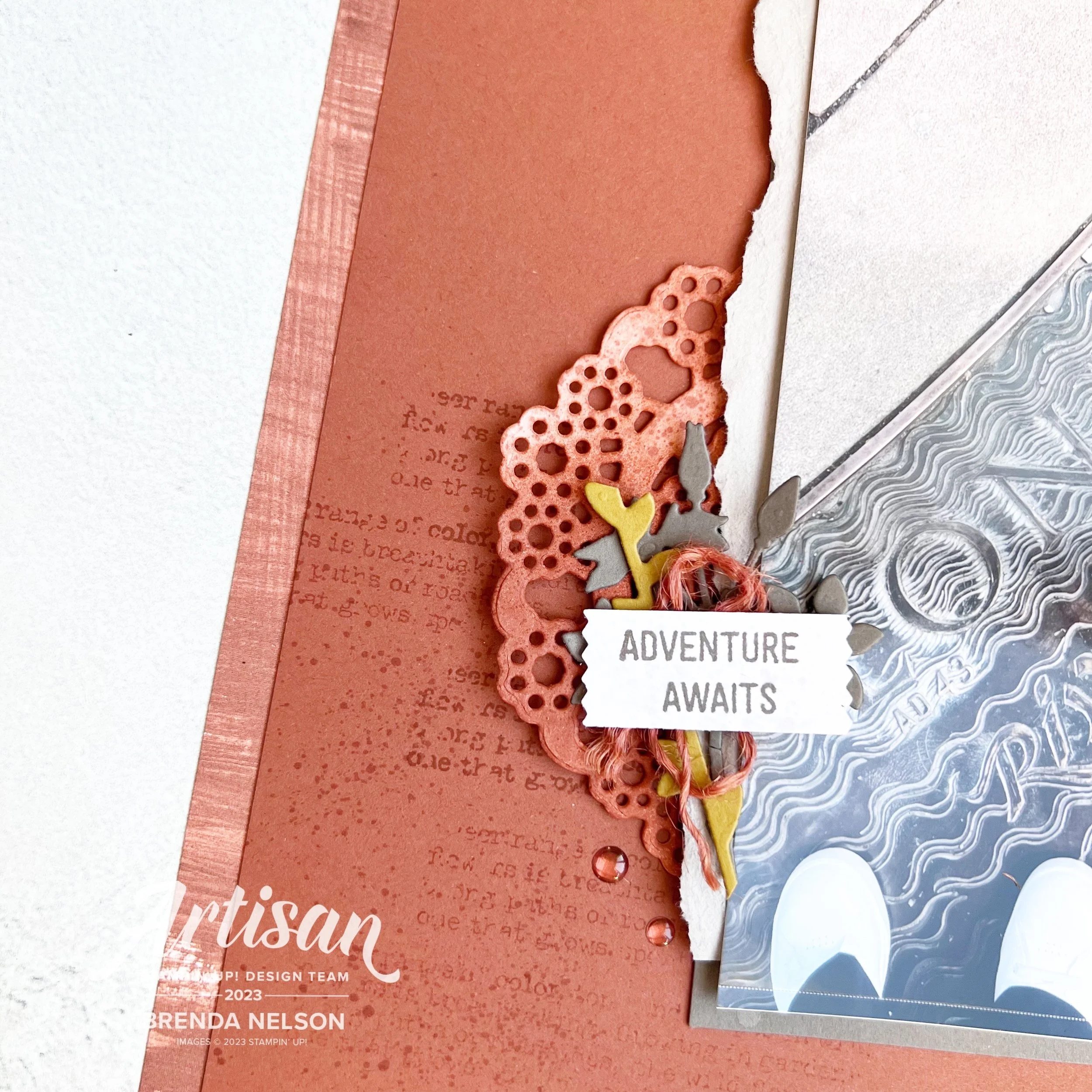
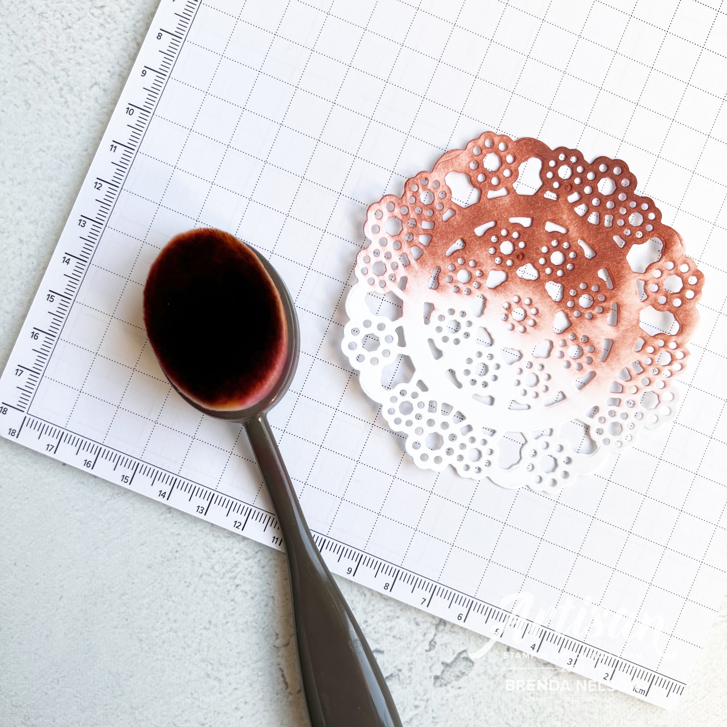
I absolutely. LOVE the dies from the Gingerbread Man Bundle —especially the candy cane. I cut it out to have both a red and white candy cane and a Pretty in Pink candy cane.
TOP TIP: This is easy to do with the dies as you just flip the paper over to the backside to have the candy canes going in opposite directions.
The sentiment Sugar & Spice is from the Gingerbread Man stamp set and the ‘tis the Season for Baking’ can be found in the Homemade Treats stamp set.
I had fun adding in the little gingerbread man and gumdrops to act like embellishments on this page.

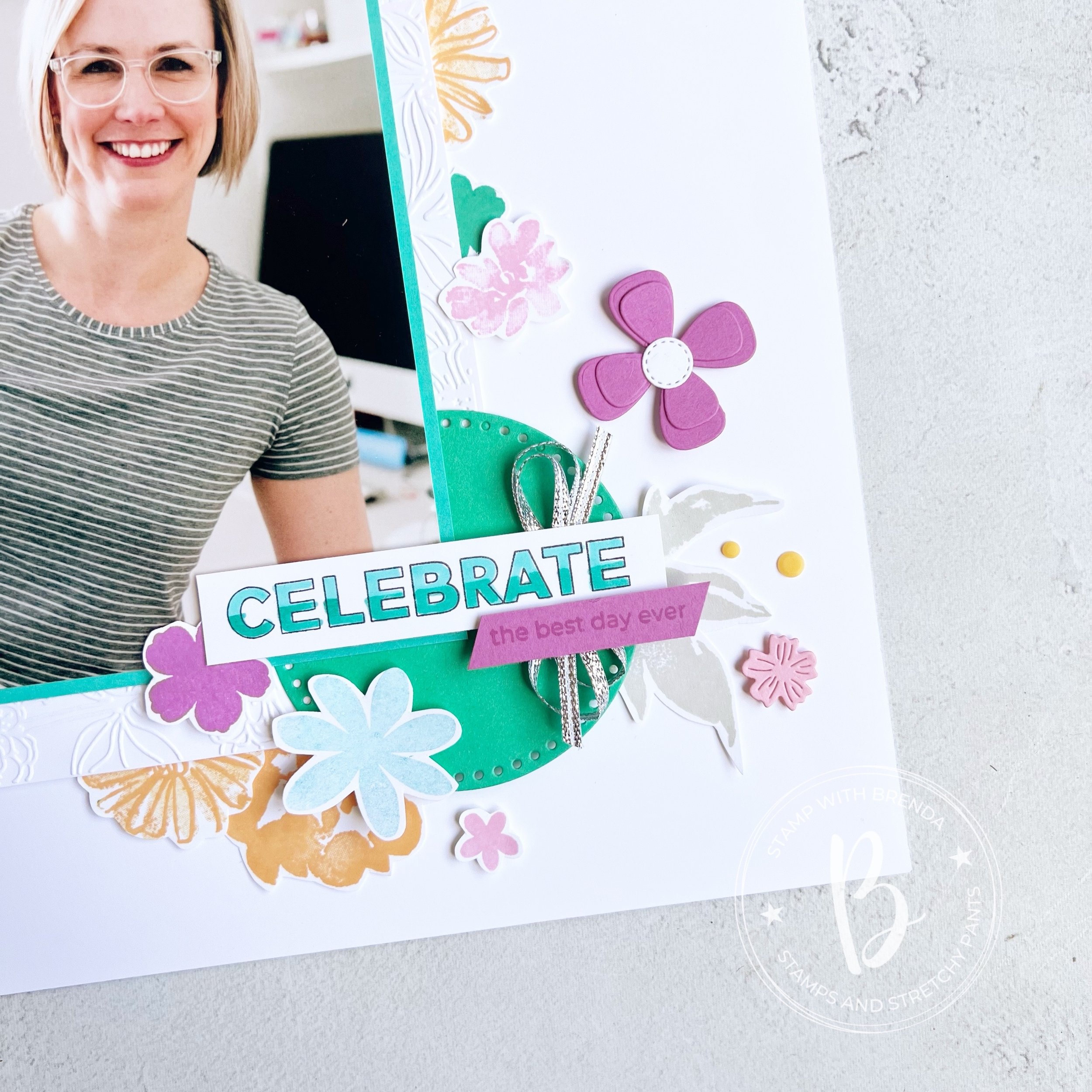
I wanted the oven mitt to act like a stocking in a sense with things popping out of the top of it and falling down the side of the photo.
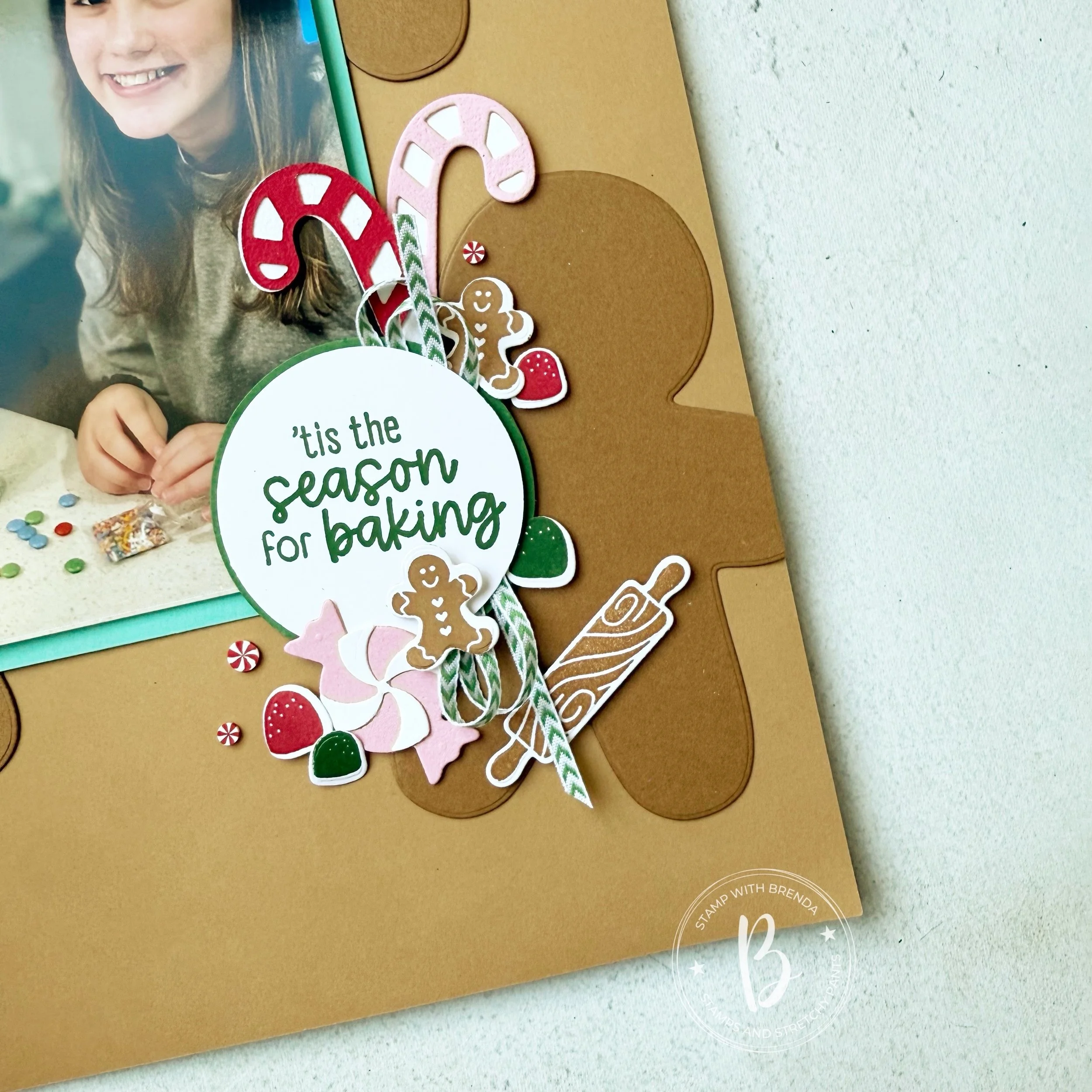
Adding the wrapped candy, rolling pin and the Peppermint Embellishments made this little section so fun. The Garden Green and White Chevron ribbon is a sneak peek of a new ribbon coming out this month with our newest Online Exclusive release. It’s a perfect ribbon to add to this page along with the Real Red Shiny Ribbon at the top.

I hope this page inspires you to use these bundles together as they really are perfect partners! You can now head on over to Melanie’s blog—Mels Inky Fingers to see what she is sharing today. Click on the image below to go straight to her blog.
Then check back with her tomorrow as she is going to share on even days and I will share again on the odd days (so Nov 3rd) and we will each share on day 12!

If you are inspired and live in Canada, please consider shopping with me so I can continue to love what I do!
Scrapbook Page Supply List
Product List![Gingerbread Man Bundle (English) [ 165785 ]](https://assets1.tamsnetwork.com/images/EC042017NF/165785s.jpg "Gingerbread Man Bundle (English) [ 165785 ]")
![Homemade Treats Bundle (English) [ 166017 ]](https://assets1.tamsnetwork.com/images/EC042017NF/166017s.jpg "Homemade Treats Bundle (English) [ 166017 ]")
![2 1/4" (5.7 Cm) Circle Punch [ 143720 ]](https://assets1.tamsnetwork.com/images/EC042017NF/143720s.jpg "2 1/4\" (5.7 Cm) Circle Punch [ 143720 ]")
![2 3/8" (6 Cm) Circle Punch [ 161354 ]](https://assets1.tamsnetwork.com/images/EC042017NF/161354s.jpg "2 3/8\" (6 Cm) Circle Punch [ 161354 ]")
![Pecan Pie 12" X 12" (30.5 X 30.5 Cm) Two Tone Cardstock [ 166688 ]](https://assets1.tamsnetwork.com/images/EC042017NF/166688s.jpg "Pecan Pie 12\" X 12\" (30.5 X 30.5 Cm) Two Tone Cardstock [ 166688 ]")
![Pecan Pie 8 1/2" X 11" Cardstock [ 161717 ]](https://assets1.tamsnetwork.com/images/EC042017NF/161717s.jpg "Pecan Pie 8 1/2\" X 11\" Cardstock [ 161717 ]")
![Coastal Cabana 8-1/2" X 11" Cardstock [ 131297 ]](https://assets1.tamsnetwork.com/images/EC042017NF/131297s.jpg "Coastal Cabana 8-1/2\" X 11\" Cardstock [ 131297 ]")
![Basic White 8 1/2" X 11" Cardstock [ 166780 ]](https://assets1.tamsnetwork.com/images/EC042017NF/166780s.jpg "Basic White 8 1/2\" X 11\" Cardstock [ 166780 ]")
![Garden Green 8-1/2" X 11" Cardstock [ 102584 ]](https://assets1.tamsnetwork.com/images/EC042017NF/102584s.jpg "Garden Green 8-1/2\" X 11\" Cardstock [ 102584 ]")
![Real Red 1/2" (1.3 Cm) Shiny Ribbon [ 165876 ]](https://assets1.tamsnetwork.com/images/EC042017NF/165876s.jpg "Real Red 1/2\" (1.3 Cm) Shiny Ribbon [ 165876 ]")
![Real Red & White Adhesive Backed Peppermints [ 164050 ]](https://assets1.tamsnetwork.com/images/EC042017NF/164050s.jpg "Real Red & White Adhesive Backed Peppermints [ 164050 ]")
![Pretty In Pink Classic Stampin Pad [ 163807 ]](https://assets1.tamsnetwork.com/images/EC042017NF/163807s.jpg "Pretty In Pink Classic Stampin Pad [ 163807 ]")
![Real Red Classic Stampin' Pad [ 147084 ]](https://assets1.tamsnetwork.com/images/EC042017NF/147084s.jpg "Real Red Classic Stampin' Pad [ 147084 ]")
![Garden Green Classic Stampin' Pad [ 147089 ]](https://assets1.tamsnetwork.com/images/EC042017NF/147089s.jpg "Garden Green Classic Stampin' Pad [ 147089 ]")
![Pecan Pie Classic Stampin' Pad [ 161665 ]](https://assets1.tamsnetwork.com/images/EC042017NF/161665s.jpg "Pecan Pie Classic Stampin' Pad [ 161665 ]")
And if you didn’t hear the fun news we are hosting a crafting cruise in 2026 and would love you to join us! Our blog hop will give you an idea of our crafting styles plus you can check out our social channels as well! If you would like to join our Craftin’ Fun in the Sun Facebook group, please let me know or search it to join!
You can follow me on Instagram @stampwithbrenda


")
")


 Cardstock")


 Trim Combo Pack")


")
")
 Designer Series Paper")
 Cardstock")


 Large Check Ribbon")


")

 Cardstock")
 Designer Series Paper")


