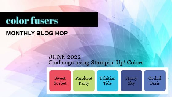
Color Fusers--June--New In Colors!
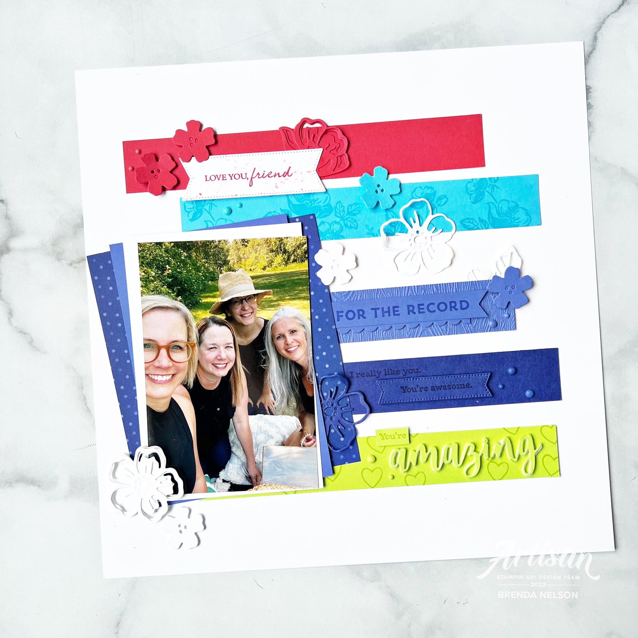
Hi friends! I am so excited to be sharing a project, a scrapbook page, with the new 2024-2026 In Colors! I am absolutely in love with this new collection—I dare say, its my favorite yet! Definitely in the last decad!

I new I had to make a scrapbook page with these colors and they literally pop off the page when added to a Basic White base. Do you have a favorite of the 5? Mine seems to switch with each new project I create, however, the fact that all of these colors work so well as a family, makes me so happy!

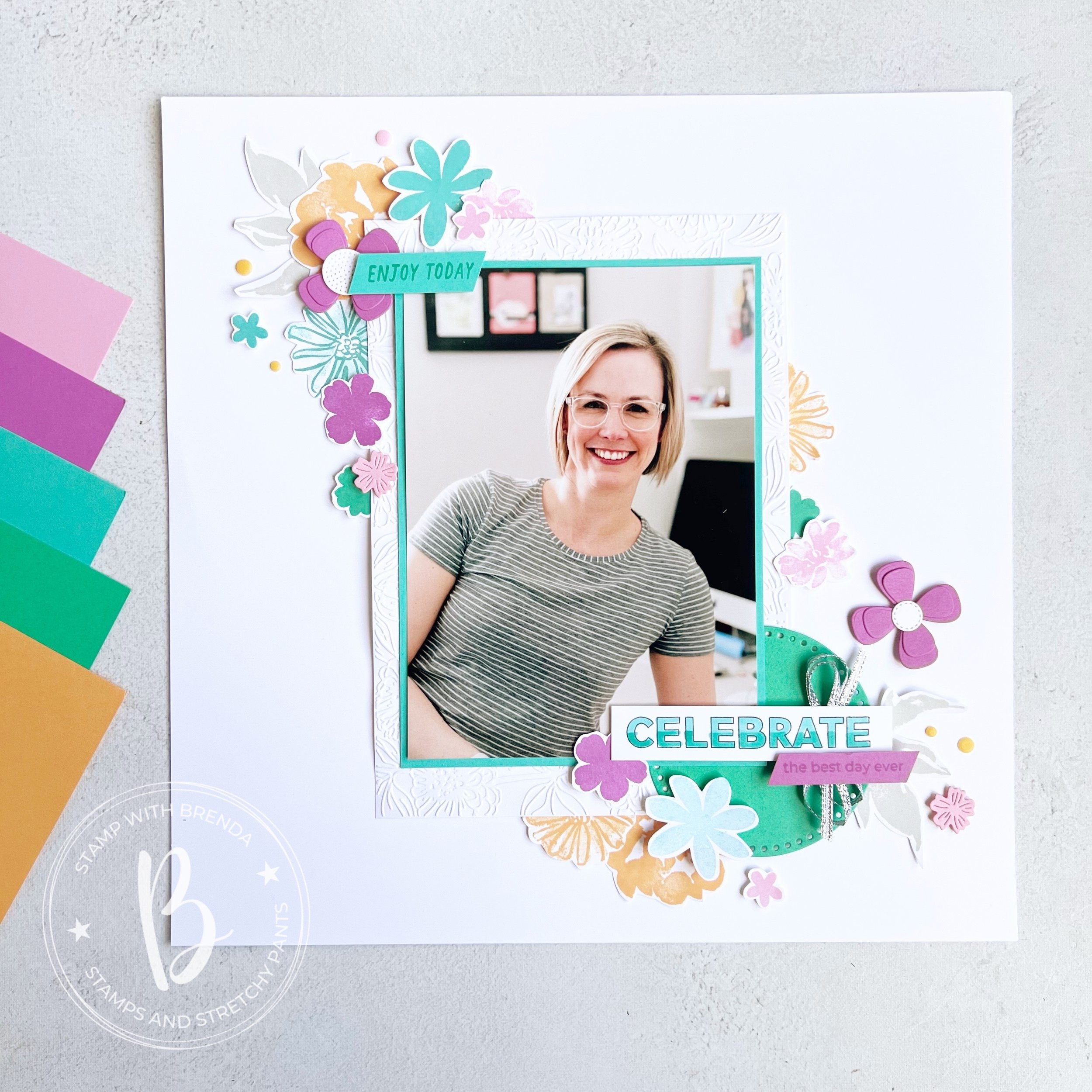
I decided to scrapbook myself, because really—who else is going to do it? I started with a 5x 7 picture that I matted with Summer Sky and then on a larger piece of Basic White that I ran through the Zinnia folder for some texture.

This page is a mashup of some of my favorite stamp sets, past and present! Because I was making this page for myself, to hang in my craft room, I didn’t work about things all being ‘current’. My very first Artisan Assignment in 2021 featured the In Bloom Bundle. It is still one of my favorites! I also used Color & Contour which is retired and the Paper Florist Dies (I was so so sad when they retired them, I will not quit using them!).

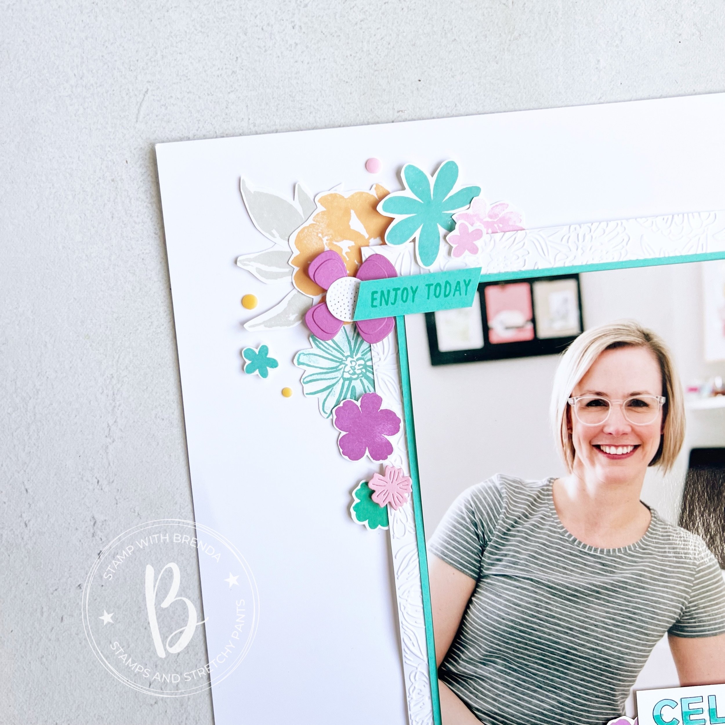
I love mixing and matching stamp set and dies and I used all five of the new colors on this layout—either in stamped or die cut form!

Many of these stamps actually have dies, but sometimes I like to just sit in one spot and be creative so I actually don’t use the Stamp Cut & Emboss Machine—gasp!

I like to layer images on top of each other and have things tucked in and behind and right on top of my photo too.

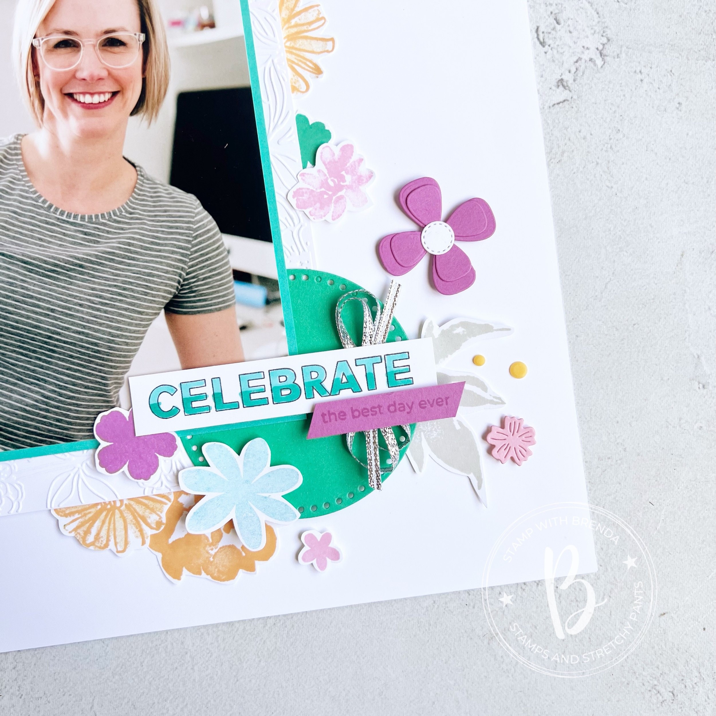
I created a really easy ombre effect on ‘Celebrate’ with my Stampin’ Blends markers which I think makes things a little more interesting. I also used the Everyday Details behind the ‘Celebrate’ to help it pop.

I didn’t want to favor a specific color so I used some of the silver ribbon from the Gold & Silver Trim Combo Pack.

I also stamped a few neutral leaves in Grey Granite so that they almost blend into the background.

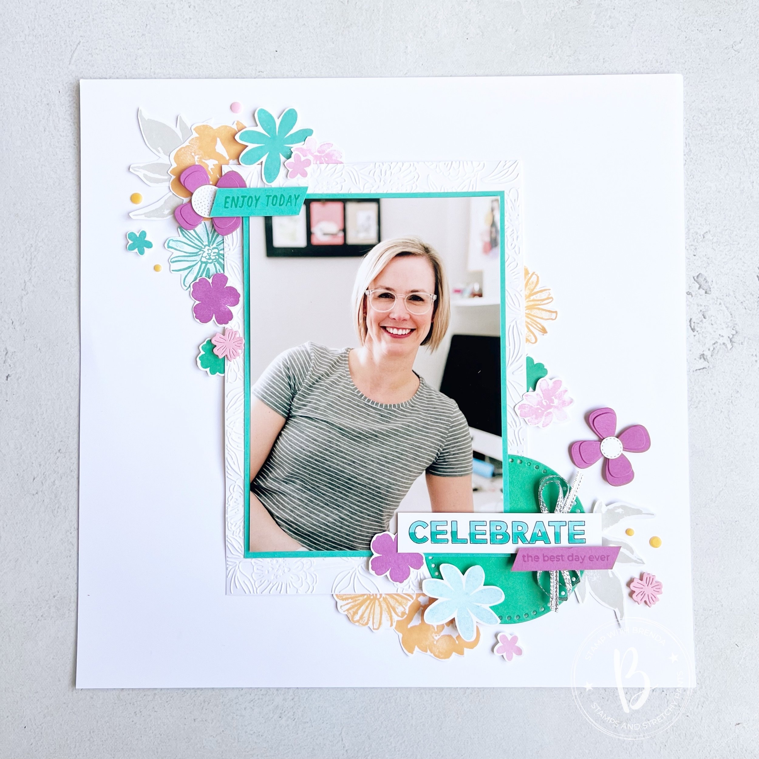
I think this layout is one that you can also recreate by mixing up colors, stamp sets and die cuts. I love how the flowers frame my photo making it the feature of my page. I never think your picture should compete with the elements on your scrapbook layout.

I can’t wait to see if the rest of the Color Fusers team focused on a specific color or created a project that combined all of the colors like mine. I am so happy with how it turned out and I am excited to have it up in my craft room.

Up next on the Hop is Janneke, a former Artisan teammate! I know you will love what she has created.

If the hop links get broken or you want to go backwards, you will be visiting another former Artisan teammate, Tami’s blog! I love everything she makes so I know you will be inspired too!

If you are inspired by my design and need a few things, please hit #addtocart by shopping my online store! I would love to keep doing what I love!

Be Inspired May--Monochromatic!

Hi friends! Welcome to another Be Inspired Blog Hop! This month our theme is ‘monochromatic’ which I have decided to use the 5 NEW In Colors to create 5 monochromatic cards with! This is something that I do every new year when we get our new color options!

I just love when we have new colors to play with, which is why I could not wait to make a batch of cards using our 5 new colors:

—Peach Pie

—Shy Shamrock

—Summer Splash

—Petunia Pop

—Pretty in Pink (if you have been stamping a while you might have thought this color name sounded familiar and you would be right—it was a core color many years ago!)

This is my take on monochromatic! I created one card featuring each of our new colors—repeating the same design and only using Basic White as my neutral element.

I wanted these card to have a bit of a ‘technique’ to them so I used the ink pad swiping technique. You simply drag your ink pad from the top to the bottom of your card stock. Each attempt with look a bit unique as well as you can see in my 5 cards. Don’t apply too much pressure when you are dragging, you want it to look like a swipe! That is part of the charm!

Each ‘monochromatic’ card has the same base elements—card base matches the color of choice, a die cut from the Spotlight on Nature Dies, which are a definite #addtocart item!

A die cut using the new Flowers of Beauty Dies, a sentiment and stamped flowers from the Labeled with Love stamp set, white Bakers Twine and a little bit of the In Color Glimmer Paper and In Color Shimmer Gems!

Once you have your initial design done, its so easy to create a batch of these fun monochromatic cards!

I added a bit of background stamping on top of the ink pad swiping as well as you get that tone on tone look which is really fun.

If you look close at the die cut image you can see that each is cut from the new 6x6 In Color DSP stack—this year they also changed up the patterns on the paper as well. So each card has a bit of different look to the die cut depending on the pattern that was used.

I really enjoyed putting these 5 cards together—I think the little strip of Glimmer Paper underneath the sentiment helps it shine a bit too! And everything is better with glitter—right?

I can’t wait to see what the rest of the design team created and their unique interpretations of ‘monochromatic’! I can’t even pick a favorite version of the cards above because each of our new 5 In Colors are so amazing. They look fabulous together and work so well with our existing color line up!

You can click on the ‘NEXT’ button to see what the amazing Artisan Design Team member, Maheswari, has designed this month!

And if you are inspired, please consider shopping my online store so I can continue to LOVE WHAT I DO :)

Color Fusers--May 2023!

Hello and welcome back friends! You know what this means…our new catalogue has officially launched along with Core Colors and our brand new In Color Collection—which is what the Color Fusers Team is creating with this month! I always look forward to our In Color Collections and this next bunch is really unique and fantastic. Stampin’ Up! knocked it out of the park with these!

Let me introduce you to Copper Clay, Wild Wheat, Boho Blue, Moody Mauve, and Pebbled Path.!


2023/2025 NEW IN COLORS

〰️

2023/2025 NEW IN COLORS 〰️

Who doesn’t love new COLORS? I know I do and all of the new color potential they unlock. I love how this collection has a neutral earthy vibe. Definitely different than others we have seen before.

Each year when we have this release of new colors, I also try and create at least one or two projects that feature all five of the colors working together to make with my card making groups. This is a great way for them to get a sample or little taste of the five colors.

I started with a base of Basic White so that they new colors would have a nice crisp platform. My first layer has a die cut banner cut out featuring a new set of dies called the Nested Essentials Dies. I have been using them so much, they are definitely a craft room MUST HAVE. Make sure to put them at the top of your wish list!

Behind the die cut banner I added strips of the 5 colors in this order:

  1. Boho Blue

  2. Wild Wheat

  3. Misty Mauve (which in Canada rhymes with stove)

  4. Copper Clay

  5. Pebbled Path

For my design element I used the stamp set Sending Smiles and some of the new In Color Dots as an embellishment.

I stamped out “Sending” in Boho Blue and used the coordinating Sending Dies to cut it out. I layered that on some vellum that I hand cut around just for some added dimension. This is then popped up with Mini Dimensionals and centered through the die cut banner.

“A Card to Say Hello” is stamped in Moody Mauve and added slightly offset below. What I love about this bundle is the mix of sentiments and the flowers and greenery you can use to embellish your project.


I stamped out the flowers in a mix of the colors with the exception of Pebbled Path. Instead to bring life to that color I added two of the coordinating In Color Dots to that strip of card stock.

I love how this card turned out and I think these five colors look absolutely fantastic together. I can’t even pick a favorite at the moment! You can also head to my Instagram @stampwithbrenda to see another card that I created with these colors. However, I know you will be inspired by what the rest of the Color Fusers Design Team has created this month. Make sure to hop all the way through and if I have inspired you in a anyway, please consider shopping with me so I can continue to love what I do!

Next up on the Hop is Bonnie O’Neill from the US…go give her all the love!

If you want to shake it up and go in reverse (or if the Hop is ever broken) you can go Previous to see what my friend Melanie Hockin (also from the US) has designed. And in case you didn’t know, I am sharing from Edmonton, Alberta Canada (GO OILERS)!

These supplies are current at the time the Hop goes live…the new Annual Catalogue and all new In Color items I showcased will be available a day or two later!

Click any image to shop what is current at original time of posting< Product List

/p>

Seven Days of Scrapbooking--Day 7!!

Hey I did it! I shared 7 scrapbook pages in a row! YAY! I hope you have enjoyed following along and seeing what everyone has created using the #sevendaysofscrapbooking!

My last page features two of my kids (my younger two who are 19 months apart) back in the good ole days I like to say. When they were besties! Now they are at the age of constant disagreeing and competition with each other (which is great when it comes to besting each other with their school marks).

I created this page to celebrate that moment in time when they truly were besties. I really hope it comes back around again—someone reassure me this tween thing is a stage!

The base of this page is my current fav In Color—Starry Sky! I used the stamp set Framed Occasions and Butterfly Kisses to bring this page to life. I used 3 of the fun patterns from the DSP and used the color palette to dictate the colors in my sentiments and the flowers. And my Paper Snips definitely got a workout this month!


I stamped some of the dotted circles on the left side of the page for a little texture that is tone on tone.

And I brought in the Beautiful Shapes Dies as this stamp set was designed to coordinate with these dies. I love when SU gives us another reason to use something!

I also used the Fun Flower Resin Shapes as an accent to this page as they work with my hand cut flowers as well. And really, they are just super cute!

I love everything about this page and how easy it was to create with this stamp set! I hope you don’t over look it in the Annual Catalogue!
Make sure to check my Instagram Stories to see the last set of pages being shared using the tag #sevendaysofscrapbooking

And if I can help you in any way, getting started on scrapbooking or ordering any products, please shop my store with the biggest appreciation!

Color Fusers June 2022--Day 6 of Seven Days!

Today is really a double whammy! The Color Fusers Team is creating with the NEW In Colors and some of my Artisan Alumni friends are spending a week sharing scrapbooking projects so of course I combined these two concepts into ONE project!

Each month this awesome design team created projects featuring a color scheme, of course this month we are featuring our 5 new In Colors—Parakeet Party, Sweet Sorbet, Orchid Oasis, Starry Sky and Tahitian Tide!

My current favorite new In Color is Starry Sky? What is yours?

This is my project featuring all 5 of the new In Colors—I love how it turned out! Each year I do try and create a scrapbook page that incorporates all the new colors together. Sometimes its a challenge and sometimes its easy and in this case, its easy as these 5 new colors look absolutely spectacular together! What do you think?

I started with a base of Basic White and used Basic white elements along with the new colors. I feel like they really pop on this crisp base. Last summer a couple of my long time bestie’s and I got together for a girls weekend and besties photo shoot. Our awesome photographer is also a friend so of course I had to snap my own girlfriends selfie and I thought it was a fun picture to add to this page. I layered our picture on Basic White, Orchid Oasis and a piece of the Starry Sky DSP from the In Color 6x6 stack.

I have known these amazing gals for over 20 years. It is a blessing to have such fantastic lifelong friends!

I mashed up a whole bunch of products on this page! That is my favorite thing to do! I used the For the Record stamp set, Summer Shadows Dies, Shaded Summer stamp set, Stylish Shapes Dies and the Amazing Thanks Dies. I even ran the Orchid Oasis card stock through the TImber 3D folder.

Each row of color has a stamped and die cut element to bring it to life along with some of the Matte In Color dots. And each row of color is working to build the story of this page, starting with the sentiment ‘Love You, Friend’.

and ending with “For the Record, I really like you, You’re Awesome and You’re Amazing”. I love taking a bunch of individual sentiments and building them into a broader more encompassing phrase.

I can’t wait to see what every one else on the Color Fusers team has created this month using one or all of the new In Colors—and if you are following along with #sevendaysofscrapbooking then you know you are going to see some amazing projects shared today! Make sure to check things out in my Instagram Stories.

The keep going with our Blog Hop you can go NEXT to see what my awesome former Artisan Design Teammate (#artisanalumni) Janneke has created. And if you want to go in reverse you can see what my current Artisan teammate, Tami, has designed. Make sure to hop all the way around and see what everyone has designed using our amazing new In Colors!

Thanks so much for following along on this Blog Hop and make sure you scroll back through my blog for some scrapbooking and card inspiration!