Color Fusers--May 2023!

Hello and welcome back friends! You know what this means…our new catalogue has officially launched along with Core Colors and our brand new In Color Collection—which is what the Color Fusers Team is creating with this month! I always look forward to our In Color Collections and this next bunch is really unique and fantastic. Stampin’ Up! knocked it out of the park with these!

Let me introduce you to Copper Clay, Wild Wheat, Boho Blue, Moody Mauve, and Pebbled Path.!


2023/2025 NEW IN COLORS

〰️

2023/2025 NEW IN COLORS 〰️

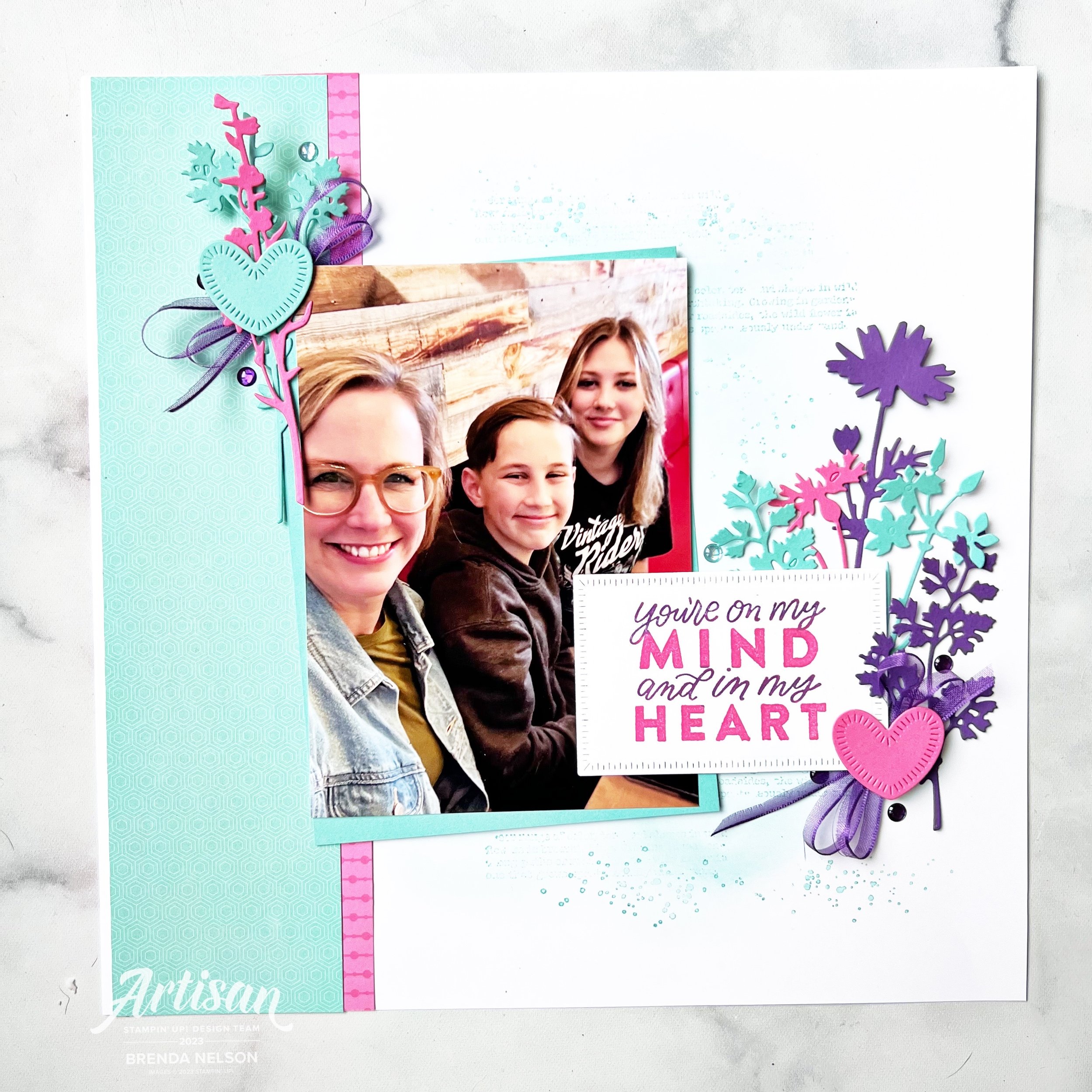
Who doesn’t love new COLORS? I know I do and all of the new color potential they unlock. I love how this collection has a neutral earthy vibe. Definitely different than others we have seen before.

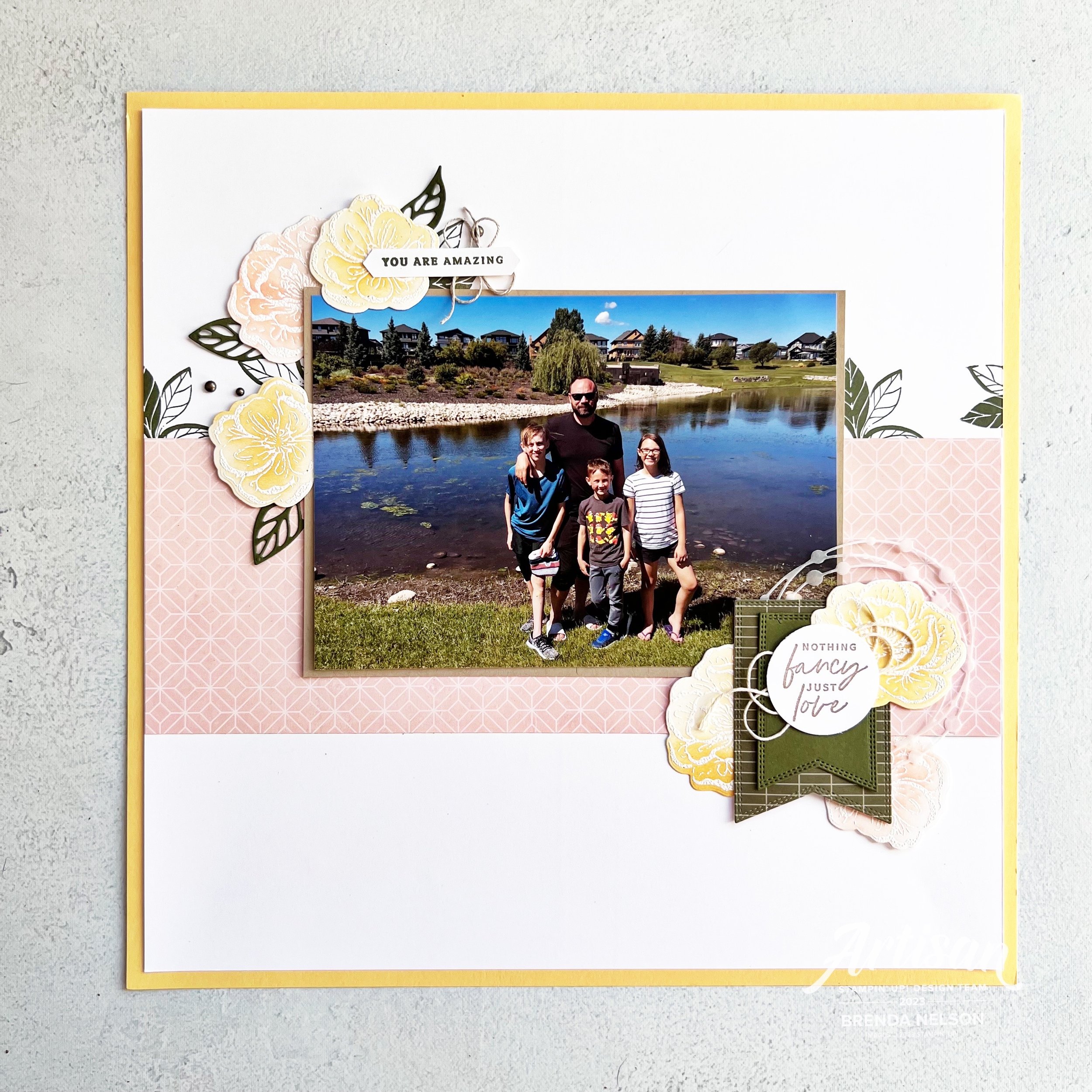
Each year when we have this release of new colors, I also try and create at least one or two projects that feature all five of the colors working together to make with my card making groups. This is a great way for them to get a sample or little taste of the five colors.

I started with a base of Basic White so that they new colors would have a nice crisp platform. My first layer has a die cut banner cut out featuring a new set of dies called the Nested Essentials Dies. I have been using them so much, they are definitely a craft room MUST HAVE. Make sure to put them at the top of your wish list!

Behind the die cut banner I added strips of the 5 colors in this order:

  1. Boho Blue

  2. Wild Wheat

  3. Misty Mauve (which in Canada rhymes with stove)

  4. Copper Clay

  5. Pebbled Path

For my design element I used the stamp set Sending Smiles and some of the new In Color Dots as an embellishment.

I stamped out “Sending” in Boho Blue and used the coordinating Sending Dies to cut it out. I layered that on some vellum that I hand cut around just for some added dimension. This is then popped up with Mini Dimensionals and centered through the die cut banner.

“A Card to Say Hello” is stamped in Moody Mauve and added slightly offset below. What I love about this bundle is the mix of sentiments and the flowers and greenery you can use to embellish your project.


I stamped out the flowers in a mix of the colors with the exception of Pebbled Path. Instead to bring life to that color I added two of the coordinating In Color Dots to that strip of card stock.

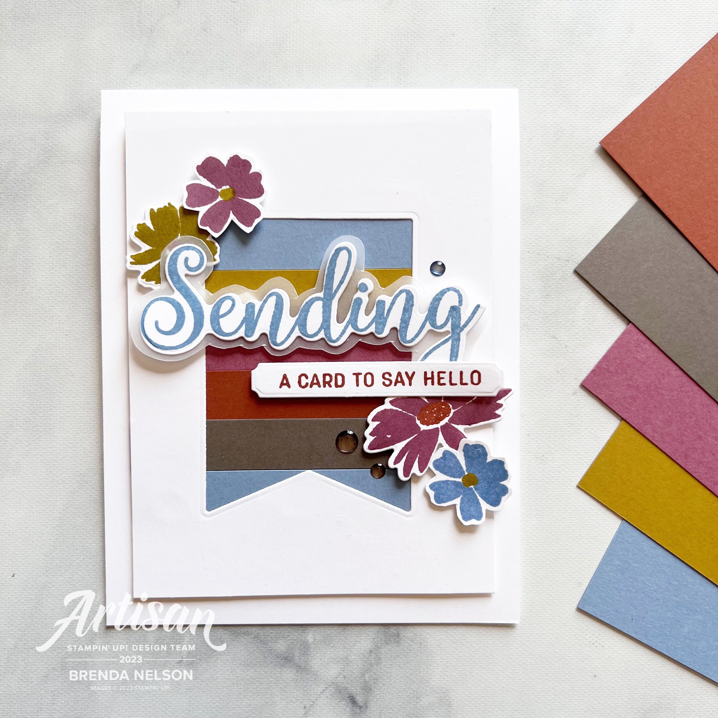
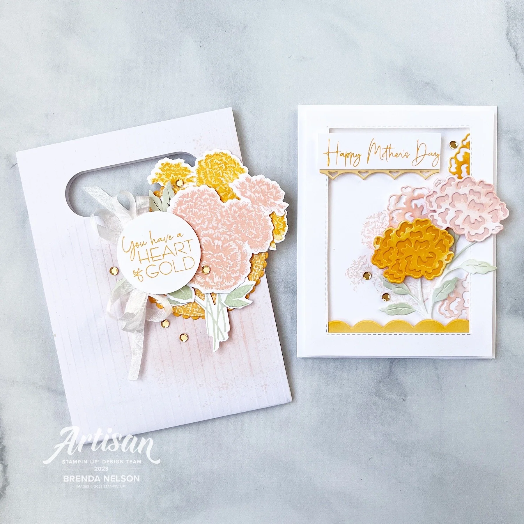
I love how this card turned out and I think these five colors look absolutely fantastic together. I can’t even pick a favorite at the moment! You can also head to my Instagram @stampwithbrenda to see another card that I created with these colors. However, I know you will be inspired by what the rest of the Color Fusers Design Team has created this month. Make sure to hop all the way through and if I have inspired you in a anyway, please consider shopping with me so I can continue to love what I do!

Next up on the Hop is Bonnie O’Neill from the US…go give her all the love!

If you want to shake it up and go in reverse (or if the Hop is ever broken) you can go Previous to see what my friend Melanie Hockin (also from the US) has designed. And in case you didn’t know, I am sharing from Edmonton, Alberta Canada (GO OILERS)!

These supplies are current at the time the Hop goes live…the new Annual Catalogue and all new In Color items I showcased will be available a day or two later!

Click any image to shop what is current at original time of posting< Product List

/p>

Artisan Design Team Project--Marigold Moments Bundle

Hello friends! This month my Artisan Group consisting of Tammy Wilson, Heather Thomas, Sandra Herzog, Karine Lison and myself where given the Marigold Moments bundle to design with. I actually quite enjoyed this bundle as it has some really amazing elements!

I am really going to miss these embossed treat bags! they were so easy to create with!

I decided to make a card and coordinating treat bag for my projects this month. You can give these together or individually! Let’s start with the Embossed Treat Bag—I used my Blending Brush in Blushing Bride to give a bit of color to the right side of the bag and then I flicked my Stampin’ Write marker over top as I do love the splatter look.

I cut a large scallop circle from the Layering Circle Dies and then a circle of DSP from the Regency Park DSP to go on top. The marigold cluster was stamped in Blushing Bride and Mango Melody ink and die cut. All of the greenery is either stamped or die cut from Soft Seafoam ink.

I actually LOVED this color combination and am sad to see both Blushing Bride and Mango Melody retire. I had alot of fun creating with them over the years.

The sentiment “You have a Heart of Gold” is absolutely AWESOME and one that I don’t recall ever seeing in any other stamp sets before. I added a double bow behind it in the Crinkled Seam Binding Ribbon, another LOVE that is retiring. And lastly to play off of the sentiment I added some gold sequins from the Adhesive Backed Pastel Sequins.

To all of the moms out there…you are killin’ it. have an awesome mother’s day!

This card is quite fun as its a shakerless shaker card, hahaha! I cut a window out of my first layer of Basic White card stock using the Stitched Rectangle Dies and after I stamped the cluster of marigold flowers on the card base in Blushing Bride, I added this window layer with the Adhesive Strips.

TOP TIP: Use Adhesive Strips instead of Dimensionals to get a little more lift. They are thicker and so easy to run around the edges of your shape as you can cut them to any length you like!

The Marigold Moments Dies have a really awesome border die that cuts out the scallop that I tucked along the inside bottom of the card and the reverse image underneath the sentiment. I love that this stamp set includes a Happy Mother’s Day stamp,

There are two dies used to create one of these marigold flowers and one for the stem. For the base of the flowers I die cut the solid back in Mango Melody and Blushing Bride. The top die cut layer and the stamps are cut out of Basic White and then I used my Blending Brushes to add some color. I love this look because it adds so much texture and depth. The idea is NOT to make the Basic White base look like card stock but to allow for color variation. I added a few extra flowers tucked in and behind my main blooms to help give the illusion of a bouquet.

And of course I had to add some gold sequins. Every project needs a little bling right?

I hope these projects inspire you and please make sure to check out what the rest of my group has created on either the Stampin’ Up! Official Instagram page or their individual pages:

Tammy @stampspaperscissors

Sandra @herzerlskreativecke

Heather @thesongbirdstamper

Karine @karinelison73choupinette

Thanks friends and see you again soon!

Here is a supply list of what was used to create these projects. If they have inspired you, please consider shopping with me so I can continue to do what I love!

Be Inspired Blog Hop--Let's Get Crafty with the Subtles Family!

Welcome back friends for another edition of the Be Inspired Blog Hop! We are so happy you are here and would love all of your comments on our projects, or to share our hop with a friend or two. If you like my stamping style you can also follow me on Instagram @stampwithbrenda!

This month we are designing with the Subtles family—now I didn’t see a rule about it being NEW colors to the Subtle family so I decided to go that route!

I created a card, yes a CARD, not a scrapbook page this month, although I think my card will be inspiring a future scrapbook layout. My card features the new Lemon Lolly and Bubble Bath Core Colors and the returning color Lost Lagoon.

I started with a base and first layer of Lemon Lolly. I ran my layer partially through the new Twisted Rope 3D folder and a added a fun strip of stripped DSP from the Delightfully Eclectic 12x12 DSP in Bubble Bath and Basic White. I love a good stripe pattern no matter the color scheme!


The stamping on my card features the new Cheerful Daisies Bundle which I am really enjoying creating with.

I like that you can design with 2 Step Stamping or single images that you can stamp and cut out, like I did with larger daisy behind the sentiment or stamp the line image and color in. This set has a lot of creative possibilities!

Isn’t this new lemon lolly color lucious? it reminds me of lemonade!

The ribbon behind the sentiment is Bubble Bath and its one of three colors in the 3/8 Sheer Ribbon Combo pack that is coming out in the new Annual catalogue in May 2023. I love the silver edge on the ribbon.

The daisies are all stamped in Lemon Lolly with the center on the front flower being stamped in Pecan Pie. I did stamp it off on my scratch paper so it was a little lighter. The leaves are stamped in Lost Lagoon which I felt worked because it become more ‘green’ on this project.

And of course I had to add some embellishments in Lemon Lolly. I really love tone on tone embellishments and the variety in our new catalogue is AWESOME! These are from the new Adhesive Backed Solid Gems.

I know you are going to be so excited to start stamping with all of the new Core Colors, especially when you see the members of the updated Subtles family. I hope this color combo of Lemon Lolly, Bubble Bath and Lost Lagoon inspires you to create you own fun project in the future. Happy Stamping!

Up next on the Be Inspired Blog Hop is a former Artisan Design Teammate of mine, Janneke! I love her stamping style and can’t wait to see what she creates! Click on the image below to head to blog.

Thank you for visiting this month! We can’t wait to see you back in May!

Around the World on Wednesday--April Showers Bring May Flowers!

Hello and welcome friends! April is the 4 year anniversary of the Around the World on Wednesday Blog Hop! This was one of the first Blog Hops I ever joined and it was created by the amazing Angie Mackenzie. While as of late I haven’t been contributing each month (there are girls in the Hop that have NEVER missed a month which is amazing) I had to participate this month to celebrate!

Our theme is for this month is anything that makes us think of SPRING—so I created a soft and subtle scrapbook page with a picture of my family from a few years back!

My scrapbook page contains a little bit of everything—current, retired, retiring and Online Exclusive products!

I started with a base of So Saffron which is a soon to be retiring color, I am actually quite sad about this because our new yellow, is NOT the same, so I will miss having a pastel yellow to create with. I added a second layer of Basic White and then a nice big 4 x 12 strip of DSP from the Sale a bration paper Favored Flowers.

I added some stamping straight to the Basic White with the Irresistible Blooms (an Online Exclusive stamp set) in Mossy Meadow. The photo mat is Crumb Cake and adds a neutral anchor to my page.

I used the emboss resist technique on all of the flowers—White Craft ink embossed with White Embossing powder and then using the Blending Brushes add Petal Pink and So Saffron Ink. You can buff the stamped image with a tissue afterwards to brighten up the embossing. The Irresistible Blooms dies were used to cut out all of the flowers and the leaf dies that are added as accents.

The sentiment “You are Amazing” is from the Sentimental Park stamp set and punched with an ancient punch that I believe was called Word Window. I will NEVER part with it!

I added a few Rusted Metallic Adhesive Dots as accents along with some Linen Thread.

What is completely NEW on this page are the Nested Essentials Dies—there are 3 shapes with 4 of each size in this new die set and they have a double stitched detail which is beautiful. I die cut the largest shape with DSP from the SAB Favored Flowers and then added a solid Mossy Meadow die cut.

The sentiment “Nothing Fancy Just Love” is from the Something Fancy stamp set. This set is carrying over which is awesome! Behind the sentiment I added some vanilla Bakers Twine.

One of my favorite things is to cut using Vellum the circle die accent piece from the Irresistible Blooms dies and layer it behind flowers and tags as a subtle accent. It is a different way to think about using this die.

I love how this page came together, it feels nice and soft which is how I think of spring. I am looking forward to seeing some green and flowers over the next few weeks as the snow melts and the new growth emerges.

Make sure you visit everyone on the hop and please feel free to comment! I would LOVE to hear from you! You can also check out my Scrapbook Gallery if you are looking for more inspiration and follow me on Instagram @stampwithbrenda if you are not already!

Up next on the hop is….Tricia Butts from the United States! Click on NEXT BLOG to see what she has created!


If I have inspired you in any way, please help me continue to do what I love by shopping my online store! You can click any image below or the SHOP WITH ME button!

Color Fusers--April 2023

Hello April…I am so happy you are here as it is finally beginning to feel like spring! Our Color Fusers Hop this month is featuring one retiring color, Polished Pink, and two continuing colors—Coastal Cabana and Gorgeous Grape. Now I won’t lie…Gorgeous Grape is a fun color but not one that I reach for alot, so it was fun to incorporate it into my design!

I decided to use a bundle and a single stamp set that are being carried forward into our new Annual Catalogue that is officially live in May. I chose the Quiet Meadow Bundle and the Good Feelings Stamp set. I feel that using the Quiet Meadow Bundle with this bright color combo has breathed some new life into it. And I forgot how amazing these dies are, I am so glad I dusted them off!

I started with a 12x12 base of Basic White to help settle these bright colors down a bit. I added a 3x12 strip of Coastal Cabana DSP to the left edge and I found it in the recent Sale a bration paper stack Dandy Designs. I then used a smaller 1 inch strip of Polished Pink DSP from the In Color 6x6 stack and hid the seam of the two pieces behind my photo mat.

I blended a large area on my page base with my Blending Brush and Coastal Cabana ink pad and added some stamping from the Quiet Meadow stamp set. The set includes some distressed words and spots so I added them on top of my blending.

TOP TIP: Make sure to stamp images off on your Stampin’ placemat to get lighter and different tones

You can see how easy it is to create a custom background for your scrapbook page by layering ink and stamps!

I cut a variety of the wildflowers from the Meadow Dies in the three focus colors and layered them behind the sentiment “You’re on my Mind and in my Heart”. What I love about the Good Feelings stamp set is how big the sentiments are. Perfect for memory keeping!

And if you don’t recognize the die the sentiment is on, it can be found in the Online Exclusive section of the Stampin’ Up! website or my store. The Polished Pink and Coastal Cabana heart are also from this same die set—Radiating Stitches. I also had some Glossy Dots in my stash and they were perfect for this page along with some retired Gorgeous Grape ribbon. #useyourstash

I decided to carry some of the ribbon, wildflowers and the heart over to the top left of my page as well so that the opposing corners of my layout felt connected.

Honestly, this page came together pretty fast and it will definitely brighten up my craft room! I can’t wait to see what the rest of the Color Fusers Blog Hop has created this month!

You can check out what the awesome Bonnie O’Neill has created and make sure you visit everyone to get some inspiration on how you can use up your Polished Pink supplies!

If you would rather go backwards you can do that as well by hitting the Previous tab as it will take you to my fabulous friend Melanie Hockin!

Thank you so much for coming by and checking out all of our projects. It has been a while since I have shared a card as you know I love to scrapbook so I appreciate you letting me showcase my passion, even if you are more of a card lover! Luckily the other members of the hop typically make cards so you will always have inspiration!