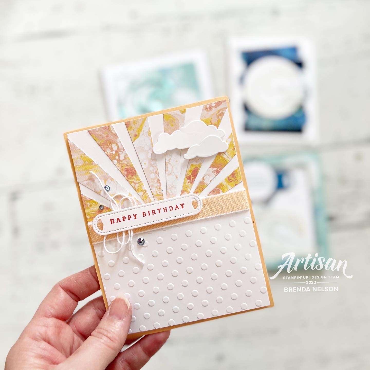
A Card a Day in May--Day 4!
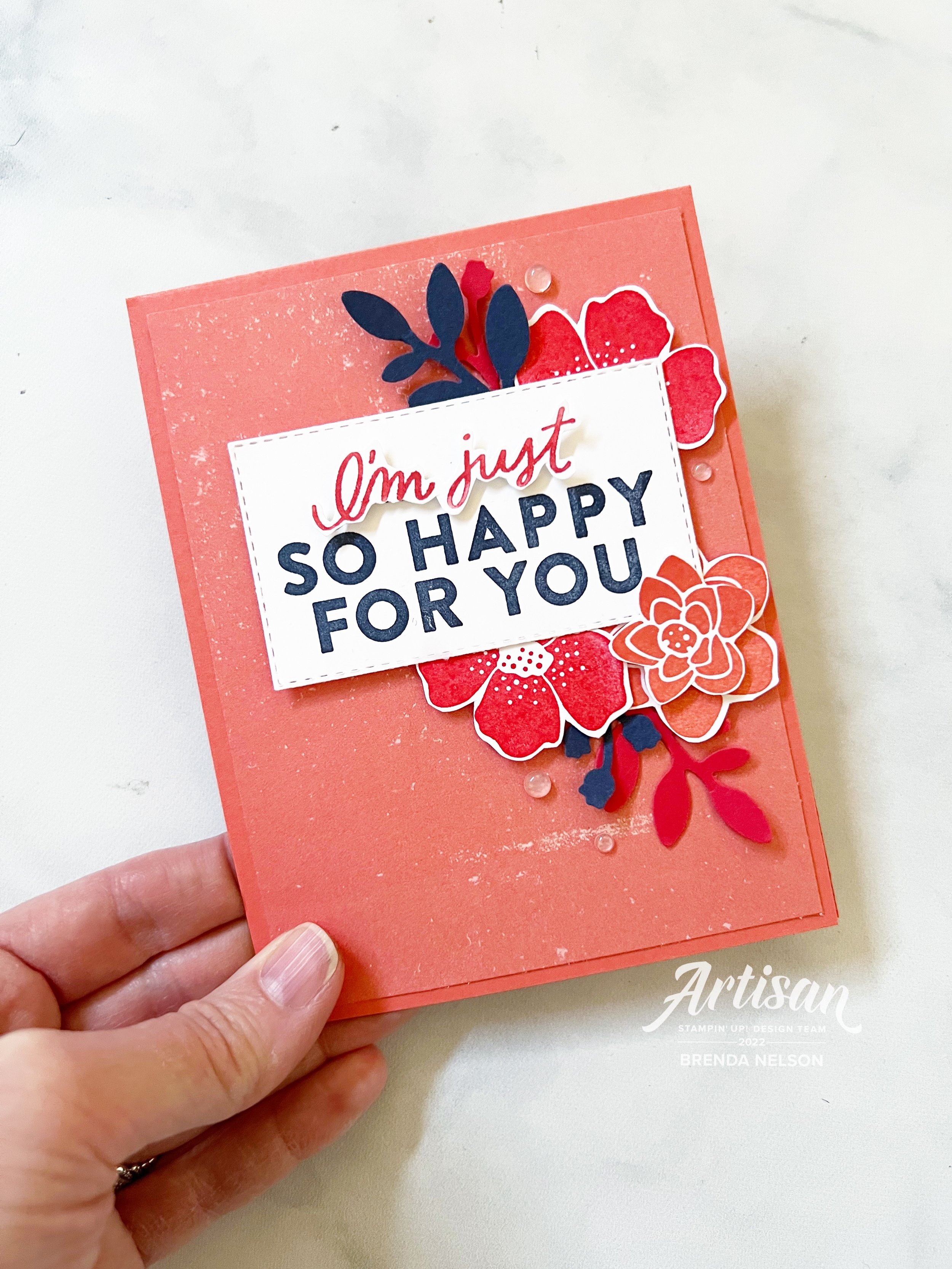
Hello friends! Were you excited to see doilies back in the January/June Catty? I know I was happy to see them as a product offering with the Heart & Home suite! And I know with the launch of the new catalogue it is easy to forget that we have this ‘other’ catalogue. Hopefully my Card a Day in May share for today will remind you there are awesome products in there too!

The base of my card is Smoky Slate and the first layer of this card is a fabulous piece of Designer Series Paper from the Heart & Home collection. I then added a Basic Grey Doily and imagery from the Boughs & Blossoms Bundle in the JJ Catty. I really loved this bundle and am actually sad to not see it in the Annual Catalogue.

The flowers are stamped in Fresh Freesia, Calypso Coral and So Saffron with the greenery in Old Olive.

The sentiment is not the same orientation as what is shared in the stamp set and I altered it using a Fresh Freesia Stampin’ Write Marker so that I could punch the sentiment in a circle.

I added some twine (no surprise) and a few rhinestones to complete my card!

Thanks for coming by today and I hope you leave inspired to go create something!

A Card a Day in May--Day 3!!

Hello my friends! Instead of seeing a card project first you are going to have to look at my happy face as its NEW CATALOGUE DAY! I hope by the time you get to this post you have placed your first of many orders from this fabulous new Annual Catalogue!

I was telling my coworkers its like Christmas, its exciting and fun, and when my box arrives its literally THE BEST DAY EVER!! I am so lucky to love what I do and have so much doing it! This is also a great time to join the SU family and community of crafters. Its been 16 years for me and I still going strong!

My card share for today features some brand new products, which is so fun! And I have to say the Hues of Happiness is probably my favorite new suite in the catalogue. The color palette of the Designer Series Paper is my jam, like literally my personality in a paper. If that could be a thing!

This card is actually a part of my May Class to Go Kit which means if you love it and live in Canada, you can purchase my Class to Go Kit until May 15th! I will have all the details ready to share under my Class to Go Tab underneath the Stamp with Brenda tab. And if you are wondering what is under my Lifestyle tab it has fun stuff like recipes!

I love how crisp and light this card feels, don’t you? The base is Basic White with a nice layer of Night of Navy and another layer of Basic White that I ran through the Timber 3D Embossing Folder. I added a small strip of the Hues of Happiness DSP and a underneath that I tucked a piece of Basic White that I ran through one of the amazing die strips in the Blossoming Happiness Dies.

The sentiment is stamped and die cut with the Stylish Shapes Dies accentuated with a bit of the Starry Sky Bakers Twine.


The flowers from the Happiness Abounds stamp set are stamped in Momento Ink and then colored with a technique that I like to call ‘Lazy Watercoloring’.

I use my Water Painter with the ink colors in Parakeet Party, Fresh Freesia, Blushing Bride and Pool Party to color the flowers and leaves. Its fast and furious and just how I like to make cards! hahaha

Add a few of the Glossy Dots Assortment and In Color Opal Rounds and this card is perfect!

I hope this card inspires you to take a peek in the new catalogue and start your wish list! If you are inspired or would like to purchase my May Class to Go Kit please send me a message or click on Shop Now to be directed to my online store!

A Card a Day in May--Day 2!

Hello friends! Thank you for coming back to another A Card a Day in May project share! Today I wanted to share a card that I made for a recent Waves of the Ocean class as my favorite thing about it is actually the starburst technique!

This card was created featuring the Waves of the Ocean DSP which I don’t believe is available any longer however you can easily recreate this card using any DSP that catches your eye!

This project features the Waves of Inspiration bundle which was an early release bundle and I was lucky enough to receive it as a member of the Artisan Design Team so I had a lot of fun creating with it. Not only did I used it to create some Design Team projects but I also used this bundle for an online class.

However I wanted to share it with you because this card just feel so relaxing and serene to me and I love how fun and easy it is to create a starburst pattern or detail.

I also like how adding the embossed panel at the bottom and hiding the seam with ribbon can disguise the weird center that develops from laying down the strips to make the starbust. I just randomly angle but strips of DSP (great way too use up those scraps) and lay the skinny point along a center point. I do not get technical and measure, I honestly just eyeball it. You will have paper hanging off of the base so simply snip that away!

Add a few clouds to the starburst section using the dies, a sentiment, twine and some rhinestones and voila!

Color Fusers May 2022

Hello friends! My oh my, its been a hot minute since I posted on my blog. Seriously I do not know where a whole month can go in a blink of an eye and I really do admire the diligence of people who update their blogs regularly! If you do like my creative style, please go follow me on Instagram @stampwithbrenda as you will find alot more content over there! And while you are at it, make sure to go follow the new Stampin’ Up! Instagram @stampinupofficial as they were recently hacked! The nerve! Why target crafty people? We are the nicest people ever!

Ok enough with that, you are here to see a fun project featuring our monthly color challenge! This month we are creating with Pacific Point, Crumb Cake and Balmy Blue. Colors that make me think of my boys so I decided to scrapbook an older picture of husband and kits from a Father’s Day a few years back. Looking at their cute little faces just kills me. They are teens now. I say no more.

This page is clean and simple which makes putting it together a snap!

I started with a 12x12 base of Pacific Point and I added a base layer of Basic White 12x12 that I trimmed half an inch off 2 sides. This would be similar to what you would do with a making a card. I will say it again, a scrapbook page is just a larger card canvas with a picture!

I also new that I wanted to use the Your Biggest Fan bundle to make this page. I love love love this bundle and am a little crushed it won’t be in the new Annual Catalogue. Its a keeper for me and will have some extra shelf life in my Home Studio!

I created this cute little area on the top left of my photo using the bundle and the new upcoming Stylish Shapes Dies (you will love them!).

An easy way to add texture to your scrapbook page is to use die cut shapes in the same color as your main background. Here I used one of the ticket dies to highlight the sentiment area. The large ticket in the die set was cut in half and I stamped in Balmy Blue ink “You’re Amazing” and added a little Classic Matte Dot beside it.


The sentiment “Most Valuable Dad” is stamped on Crumb Cake cardstock with the same ink. I also matted my 5x7 photo on this color. I added some of the blue twine from the Fan Bakers Twine behind and popped it up on the pennant shape.

I stamped the outline in Pacific Point ink on the same color cardstock and then used the dies to cut it out. The pennant die has little add ons such as the tassels which I added with a Mini Dimensional to make this more 3 dimensional.

I added a few of the blue Resin Stars as well to finish off this little area,

I wish I could go back in time and snuggle my kids a little longer. I miss this cute little faces! The teen expressions I see a lot are not nearly as enjoyable. If you know, you know.

My next little area of interest is on the bottom right. Our eye naturally travels this way so from a design point of view it makes sense to have something visual to look at here. I started by stamping the sentiment “You’re Amazing” again in Balmy Blue ink and then flicked my Balmy Blue Dark Stampin’ Blend maker over the area.

Once again I added a couple of tag dies in Basic White to add some texture.

I used the “Happy Father’s Day” sentiment as well in Crumb Cake ink and paper to mimic the “Most Valuable Dad” sentiment. I also added the #1 die cut in Pacific Point and layered on Balmy Blue card stock.

A few more Resin Stars and Classic Dots and this page was complete!

If you live in the Edmonton region and are interested in learning how to scrapbook, I offer several groups and classes per month! More than card classes to be truthful!

It did not take me long to put this page together, when you have the right elements I find things come together quite quickly! Scrapbooking doesn’t have to feel overwhelming or intense and I think this page reflects that style of clean and simple!

I can’t wait to see what the rest of the Color Fusers Team has designed this month to share with this color scheme! Please make sure to hop all the way around and comments are always appreciated!

You can shop all of these products by clicking on any of the project images to go directly to my store as well! Thank you for helping me keep loving what I do!

Let see what the amazing Melanie Hockin has created for us! You can click on the link to visit her next!

You can always chose to go backwards (really though…does anyone? Lol. It seems weird to me but at least if the link chain get broken you have this option!

A Card a Day in May!

A few years back I started this card mailing challenge called “A Card a Day in May” as a way to challenge myself and others to send or hand deliver a card each day for the entire month. This truly is a challenge as each day we need to take a selfie of ourselves mailing and delivering each card.

I set up a private Facebook group where we can share our daily photos! It is a fun way to connect with my team and customers and to mail out and bright the day of 30 different people. I truly look forward to doing it and try my best to not just do a mailbox dump, but to actually send a card each day.

It is a challenge because it takes time, commitment and planning to hit up your mailbox each day! And it doesn’t always happen because of you know LIFE. But I make my best effort and its fun.

Fun Fact: I like a challenge which is why I am personally challenging myself to post a Card a Day in May on my blog as I have sort of been neglecting my blog. Which is silly because A) I PAY FOR IT B) YOU are here reading this right now C)This is a great memory keeping tool for me and a way to curate a collection of things I love.

Making the cards is not my issue so I am going to share a Card Picture a Day in May. I am not going to hold myself to any standards (why add stress) so I am going to share cards that maybe I already have on my Instagram account or are sitting on my cameral roll!

Here is my first card for May 1st! I LOVE IT. I actually made this card for a Color Challenge I have each month with my team. It uses Calypso Coral, Poppy Parade, and Night of Navy. Colors that were chosen at random that I probably would never put together on my own, but actually really love!

So Dear Reader (Yes, I am currently reading the Bridgerton books and watching the show) I encourage you to attempt to send a Card a Day in May. At the very least, follow me along here for some inspiration!

Please feel free to shop by shop by clicking on the image links. This allows me to keep loving what I do.