Creative Convention--Day 3!

Hi friends! Welcome back to Day 3 of my Creative Convention—a fun little blog sharing, creative inspiration, sneek peek week that I decided to create and put together while I am away at Backstage in Las Vegas!

Today the project I want to share with you is one I decided for a recent swap I participated in with some of my demonstrator friends. The Pick of the Patch stamp set was one of the first sets on my list when we were able to put in our pre-order. I love pumpkins and Halloween and I LOVE the whimsical fun feel of the pumpkins and gourds in this stamp set. There is also a coordinating pumpkin punch too! SO much to love!

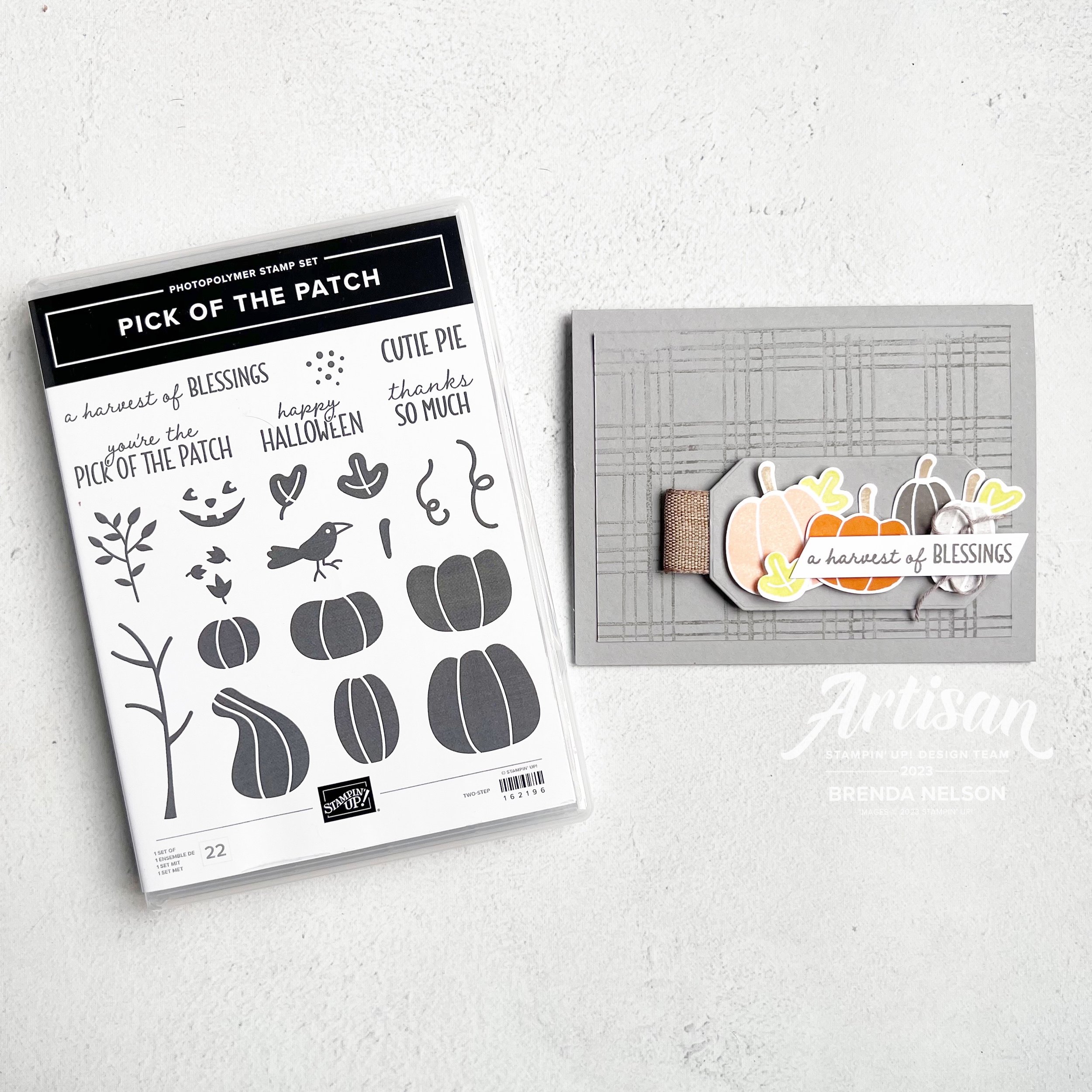
I decided to tie in the Pick of the Patch stamp set with some items that I love from our annual catalogue—so I reached for the Sketched Plaid stamp set and the Country Corners Dies. I have been using these dies ALOT—they are definitely a #craftroommusthave

If you haven’t already I would definitely #addtocart and you can do so by clicking on this link if you are interested!

Shop with me

I started with Smoky Slate as my base and stamped the Sketched Plaid onto my first layer using Pebbled Path ink—however, to soften it, I took my Blending Brush over top of the stamp to actually REMOVE some of the ink. I really like the finished look! And am glad I took this extra step!

I stamped the pumpkins ini Petal Pink, Pumpkin Pie and Pebbled Path ink that was stamped off. The leaves are in Lemon Lime Twist—so I used the Brights, Subtles In Colors and Neutral color families to make this awesome swap!

Now I had to make 24 of these cards…how do you prep for swaps?

I pulled out my little muffin tin to use for storing the different images I was stamping and cutting out! It makes keeping things sorted and easy for the assembly stage. Especially if I plan on working on the swaps over a course of a few days.

I added my little pumpkin patch to one of the Country Corner die cuts and some of the new Natural Ribbon to act like a little tab and popped this layer up with Dimensionals.

I am so happy to share this card as inspiration for you this week and I really hope everyone is excited to get my swap card in the mail!

Make sure to check back tomorrow to see my 4th project share!

Creative Convention--Day 2!

Hi friends! Welcome back for another fun inspiration project as I host my own little ‘Creative Convention’ this week! I thought it would be a fun way to celebrate with you as I am off in Vegas at Backstage!

I absolutely love fall—sweater weather, pumpkin spice lattes, fall crafting, the colors and smell of fall! So fun!

My project today is a fall inspired card featuring the Autumn Leaves Bundle and All About Autumn 6x6 Specialty Paper. I really love how this paper is foiled on one side and photography prints on the other. It is really unique paper! And the designers at SU added Moody Mauve into this fall mix and I really really love that!

My card features 3 shades of brown—Copper Clay as the base, Crumb Cake as the first layer and Pecan Pie as the base of the leaf! I love how awesome these 3 tones of brown all look together! And adding in some Moody Mauve is like a chef’s kiss!

I stamped the large maple leaf image on the bottom area of the card in Crumb Cake, did a little blending with my brush and ink, and then finally flicked my Crumb Cake Stampin’ Blend marker over top!

I cut a 1 1/4 x 5 1/4 inch strip of DSP from the All About Autumn DSP and added it to the front with just a teeny tiny sliver of Moody Mauve card stock tucked in behind. It was a subtle way to introduce this color into the palette.

I love when we have leaf dies. I love all the different cool grungy techniques that you can do to create leaves!

Option 1: CRUMPLE—thats right, crumple up that die cut and then slightly flatten it like I did here with Moody Mauve leaf

Option 2: TEXTURE—give your leaf texture by running it through one of our many Embossing Folders—in this case I used the new Distressed Tile 3D folder which is a part of this suite

Option 3: COLOR—add some color to the tips of your leaves with a Blending Brush, Dauber, sponge—you name it! It gives your die cut depth

Let’s talk about the large maple leaf die and the cool veining die you can cut to add on top. I die cut this leaf in Pecan Pie (swoon!) and ran it through the embossing folder, then added the veining over top. I cut this out using our Adhesive Sheets so that I didn’t have to worry about glue creeping out the sides. No sticky fingers for me!

If you are looking for the sentiment “thanks so much” you will find it in the adorable Pick of the Patch stamp set. It is stamped with Moody Mauve ink, with a little ribbon and a layered circle from the All About Autumn DSP. The two shiny gold pearls are from the Blooming Pearls embellishment.

I hope you are intrigued by todays project and will come on back tomorrow to see what else I am sharing!

Color Fusers--July--Hello Summer!

Hello friends! It is OFFICIALLY SUMMER—Whoo Hoo! I love summer time, I love to water my flowers and I see it as a personal challenge to keep them alive ALL season long, which is a challenge as I do not have a green thumb. Our Color Fusers Blog Hop this month is featuring these 3 colors:

And because I have flowers on the brain, I knew that I had to incorporate the new Paper Florist Dies into my design. I also knew that I wanted to create a scrapbook page with one of my favorite pictures taken on the Norway trip. So here you go!

This awesome picture was taken in Stavanger, Norway

I decided to use Azure Afternoon as my base. Now if you have been following me on Instagram I have made a couple of comments about how this is currently my new favorite blue! I think it looks great paired with two classics—Daffodil Delight and Pumpkin Pie. All three of these colors are also in the Brights Family as well.

The main sentiment on this page is from the Good Feelings stamp set and I felt it was appropriate because none of us live in the same area in the world. Kylie and Bruno on the right, live in Australia and Alanna and her family, while fellow Canadians, live a couple provinces away from me. So it is true, I do send sunshine and good feelings to all of my friends no matter where they are :)

I used Designer Series Paper from the Bright & Beautiful and the Brights 6x6 stack to add interest to my page along with a square ran through the new Exposed Brick 3D folder and a square stamped with hearts from the Little Monkey Stamp set.

The flowers are all from the amazing Paper Florist Dies which you need to serious #addtocart if you have not already!


I found a bunch of single words to add to my page such as ‘Love’ which is from the Seasonal Branches stamp set. A few Tinsel Gems and some Bakers Twine finished off this little vignette.

The cute tag and fringe are from the Beautiful Balloons dies. I love this die set and I thought they made the perfect addition to this layout. I added some of the new white Herringbone Ribbon through the tag and you can find ‘Hello, friend’ in the Inked & Tiled stamp set. The white sequins are from the Adhesive-Backed Sequins Trio and just added a little something to this area.

This page is really quite eclectic, which is what I love about Stampin’ Up! I really disagree with those who say you cannot scrapbook with our products. YES YOU CAN!

May is die cut using the Alphabet A la Mode dies and added using the Foam Adhesive Sheets. Look how awesome the Exposed Brick folder looks beside it! This new folder is definitely a must have.

I can’t wait to see what the rest of the team has designed with these three amazing colors—Azure Afternoon, Daffodil Delight and Pumpkin Pie. I know you will be inspired and if you haven’t purchased Azure Afternoon yet, then I encourage you to give it a go. It is a really lovely blue.

My amazing friend and fellow Artisan teammate Tami Hewlett is up next on our blog hop—you can visit her by clicking the image below.

If you want to go in reverse or a link gets broken, you can visit the uber talented Stacey Marsh by clicking the Previous image.

Please feel free to comment, it makes me happy to hear that you have enjoyed stopping by my blog. If you do not have a Canadian Demonstrator, I would love to get crafty with you! You can reach out to me or shop with me by clicking any link in my supplies section or by using the monthly host code. Thank you in advance!

Color Fusers--May 2023!

Hello and welcome back friends! You know what this means…our new catalogue has officially launched along with Core Colors and our brand new In Color Collection—which is what the Color Fusers Team is creating with this month! I always look forward to our In Color Collections and this next bunch is really unique and fantastic. Stampin’ Up! knocked it out of the park with these!

Let me introduce you to Copper Clay, Wild Wheat, Boho Blue, Moody Mauve, and Pebbled Path.!


2023/2025 NEW IN COLORS

〰️

2023/2025 NEW IN COLORS 〰️

Who doesn’t love new COLORS? I know I do and all of the new color potential they unlock. I love how this collection has a neutral earthy vibe. Definitely different than others we have seen before.

Each year when we have this release of new colors, I also try and create at least one or two projects that feature all five of the colors working together to make with my card making groups. This is a great way for them to get a sample or little taste of the five colors.

I started with a base of Basic White so that they new colors would have a nice crisp platform. My first layer has a die cut banner cut out featuring a new set of dies called the Nested Essentials Dies. I have been using them so much, they are definitely a craft room MUST HAVE. Make sure to put them at the top of your wish list!

Behind the die cut banner I added strips of the 5 colors in this order:

  1. Boho Blue

  2. Wild Wheat

  3. Misty Mauve (which in Canada rhymes with stove)

  4. Copper Clay

  5. Pebbled Path

For my design element I used the stamp set Sending Smiles and some of the new In Color Dots as an embellishment.

I stamped out “Sending” in Boho Blue and used the coordinating Sending Dies to cut it out. I layered that on some vellum that I hand cut around just for some added dimension. This is then popped up with Mini Dimensionals and centered through the die cut banner.

“A Card to Say Hello” is stamped in Moody Mauve and added slightly offset below. What I love about this bundle is the mix of sentiments and the flowers and greenery you can use to embellish your project.


I stamped out the flowers in a mix of the colors with the exception of Pebbled Path. Instead to bring life to that color I added two of the coordinating In Color Dots to that strip of card stock.

I love how this card turned out and I think these five colors look absolutely fantastic together. I can’t even pick a favorite at the moment! You can also head to my Instagram @stampwithbrenda to see another card that I created with these colors. However, I know you will be inspired by what the rest of the Color Fusers Design Team has created this month. Make sure to hop all the way through and if I have inspired you in a anyway, please consider shopping with me so I can continue to love what I do!

Next up on the Hop is Bonnie O’Neill from the US…go give her all the love!

If you want to shake it up and go in reverse (or if the Hop is ever broken) you can go Previous to see what my friend Melanie Hockin (also from the US) has designed. And in case you didn’t know, I am sharing from Edmonton, Alberta Canada (GO OILERS)!

These supplies are current at the time the Hop goes live…the new Annual Catalogue and all new In Color items I showcased will be available a day or two later!

Click any image to shop what is current at original time of posting< Product List

/p>

Artisan Design Team Project--Marigold Moments Bundle

Hello friends! This month my Artisan Group consisting of Tammy Wilson, Heather Thomas, Sandra Herzog, Karine Lison and myself where given the Marigold Moments bundle to design with. I actually quite enjoyed this bundle as it has some really amazing elements!

I am really going to miss these embossed treat bags! they were so easy to create with!

I decided to make a card and coordinating treat bag for my projects this month. You can give these together or individually! Let’s start with the Embossed Treat Bag—I used my Blending Brush in Blushing Bride to give a bit of color to the right side of the bag and then I flicked my Stampin’ Write marker over top as I do love the splatter look.

I cut a large scallop circle from the Layering Circle Dies and then a circle of DSP from the Regency Park DSP to go on top. The marigold cluster was stamped in Blushing Bride and Mango Melody ink and die cut. All of the greenery is either stamped or die cut from Soft Seafoam ink.

I actually LOVED this color combination and am sad to see both Blushing Bride and Mango Melody retire. I had alot of fun creating with them over the years.

The sentiment “You have a Heart of Gold” is absolutely AWESOME and one that I don’t recall ever seeing in any other stamp sets before. I added a double bow behind it in the Crinkled Seam Binding Ribbon, another LOVE that is retiring. And lastly to play off of the sentiment I added some gold sequins from the Adhesive Backed Pastel Sequins.

To all of the moms out there…you are killin’ it. have an awesome mother’s day!

This card is quite fun as its a shakerless shaker card, hahaha! I cut a window out of my first layer of Basic White card stock using the Stitched Rectangle Dies and after I stamped the cluster of marigold flowers on the card base in Blushing Bride, I added this window layer with the Adhesive Strips.

TOP TIP: Use Adhesive Strips instead of Dimensionals to get a little more lift. They are thicker and so easy to run around the edges of your shape as you can cut them to any length you like!

The Marigold Moments Dies have a really awesome border die that cuts out the scallop that I tucked along the inside bottom of the card and the reverse image underneath the sentiment. I love that this stamp set includes a Happy Mother’s Day stamp,

There are two dies used to create one of these marigold flowers and one for the stem. For the base of the flowers I die cut the solid back in Mango Melody and Blushing Bride. The top die cut layer and the stamps are cut out of Basic White and then I used my Blending Brushes to add some color. I love this look because it adds so much texture and depth. The idea is NOT to make the Basic White base look like card stock but to allow for color variation. I added a few extra flowers tucked in and behind my main blooms to help give the illusion of a bouquet.

And of course I had to add some gold sequins. Every project needs a little bling right?

I hope these projects inspire you and please make sure to check out what the rest of my group has created on either the Stampin’ Up! Official Instagram page or their individual pages:

Tammy @stampspaperscissors

Sandra @herzerlskreativecke

Heather @thesongbirdstamper

Karine @karinelison73choupinette

Thanks friends and see you again soon!

Here is a supply list of what was used to create these projects. If they have inspired you, please consider shopping with me so I can continue to do what I love!