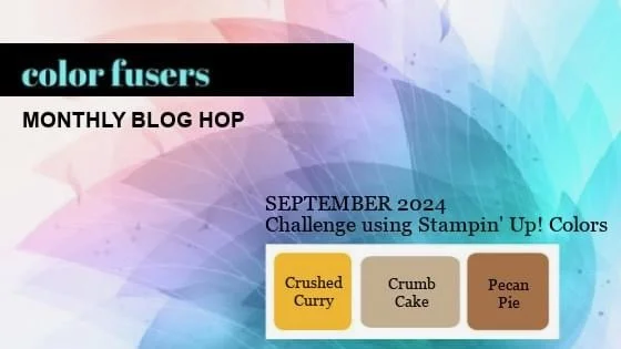
Color Fusers--September is Neutral!

Hi friends—can you believe it is officially the start of ‘Sweater Weather’? I actually love this time of year, I can’t help but appreciate a good cardigan! And I love crafting with fall colors, especially the one we are featuring this month—Crushed Curry, Crumb Cake and Pecan Pie.

I am really excited to see what everyone designs this month and I actually decided to create a CARD versus a scrapbook page! Although I love this card so much that I will probably use it as inspiration for a future page.

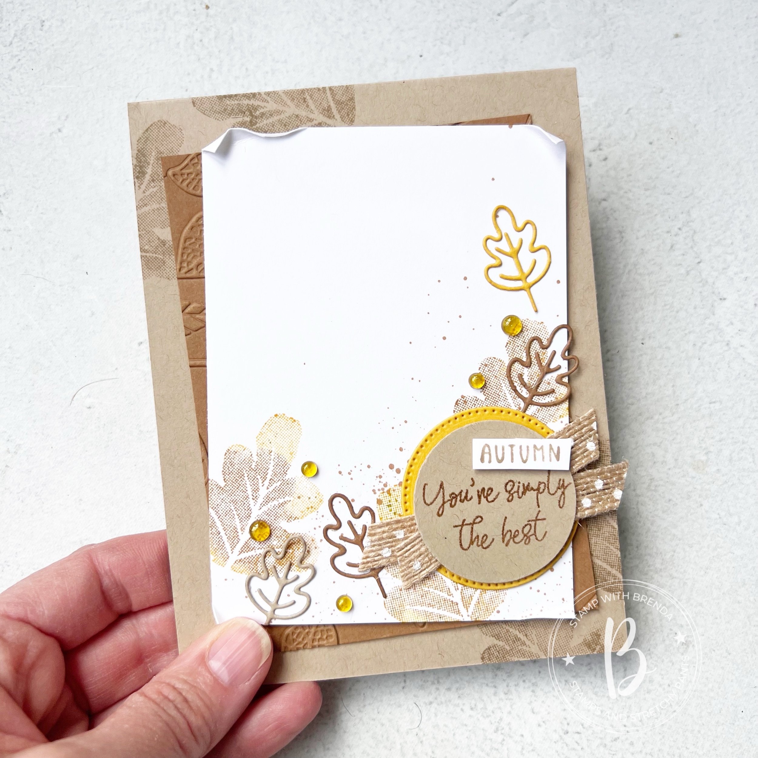
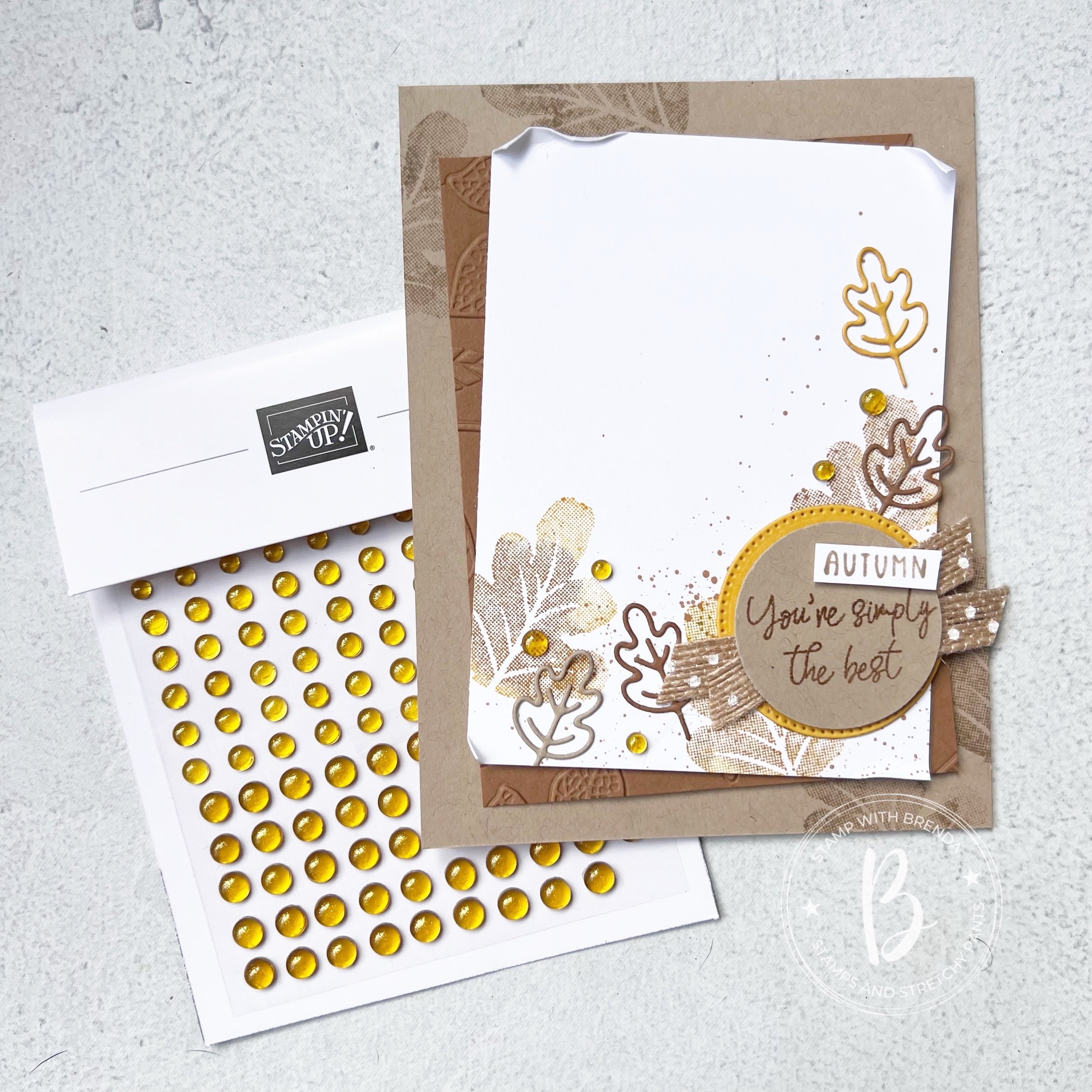
I started with a base of Crumb Cake card stock and stamped some leaves from the Caring Leaves stamp set in the opposing corners in the same ink. Caring Leaves is a well priced autumn stamp set that is a great addition to some of the other fall products.

My second layer is Pecan Pie that I ran through the Changing Leaves Hybrid Embossing Folder. I love how you see just a few leaves poking through on the sides for some added texture.

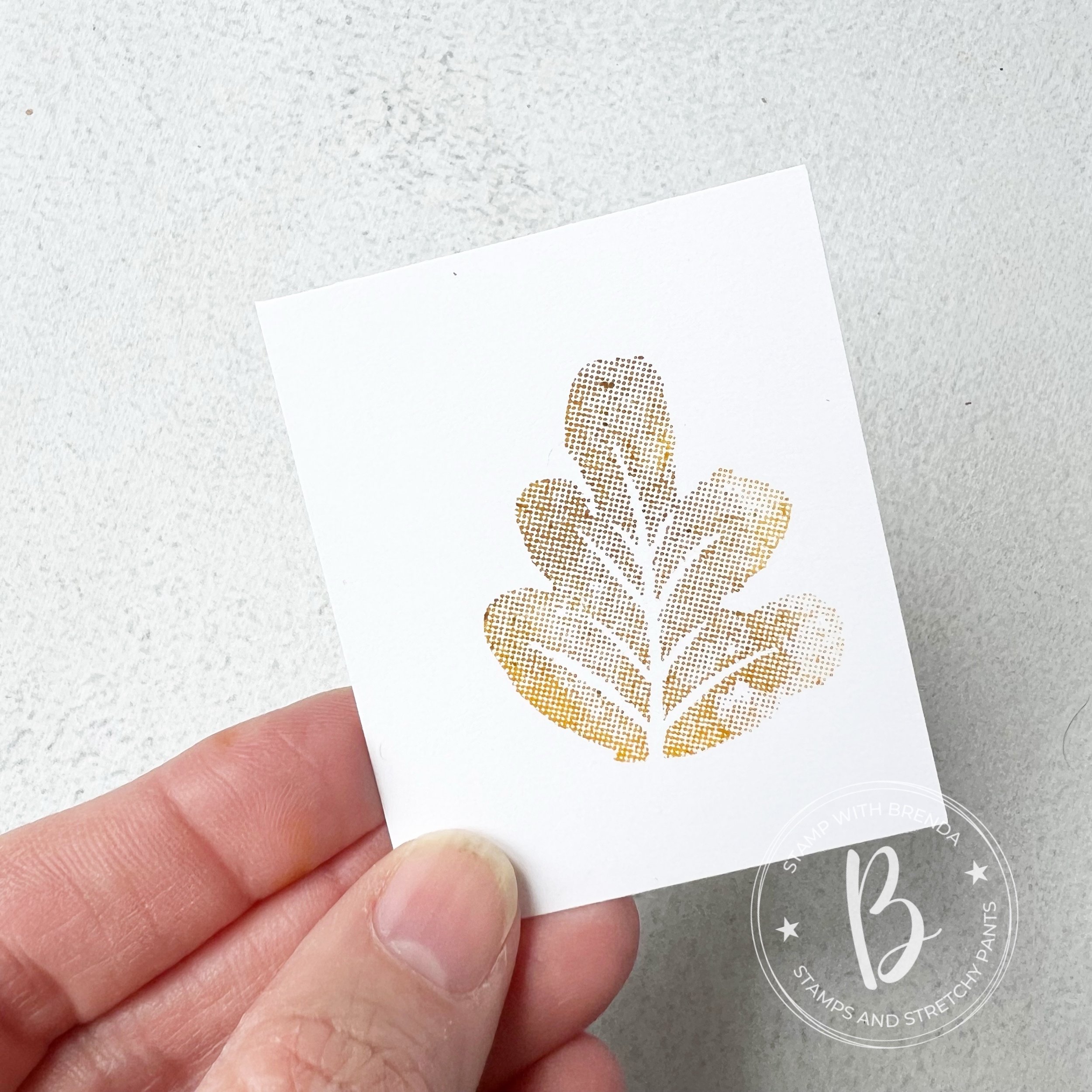
I used an easy technique to stamp the leaves on the Basic White layer. I inked up my stamp in Crushed Curry and then used a Dauber in Pecan Pie to to add a bit of color variation in the leaf.

You can use two colors or more to create a fun unique leaf design for your projects.

I really love how fun and simple this technique is and how can it make your projects feel unique as each time you stamp it will be different.

I stamped the leaf 3 times on the Basic White layer of my project and added a little spray of Pecan Pie ink over top.


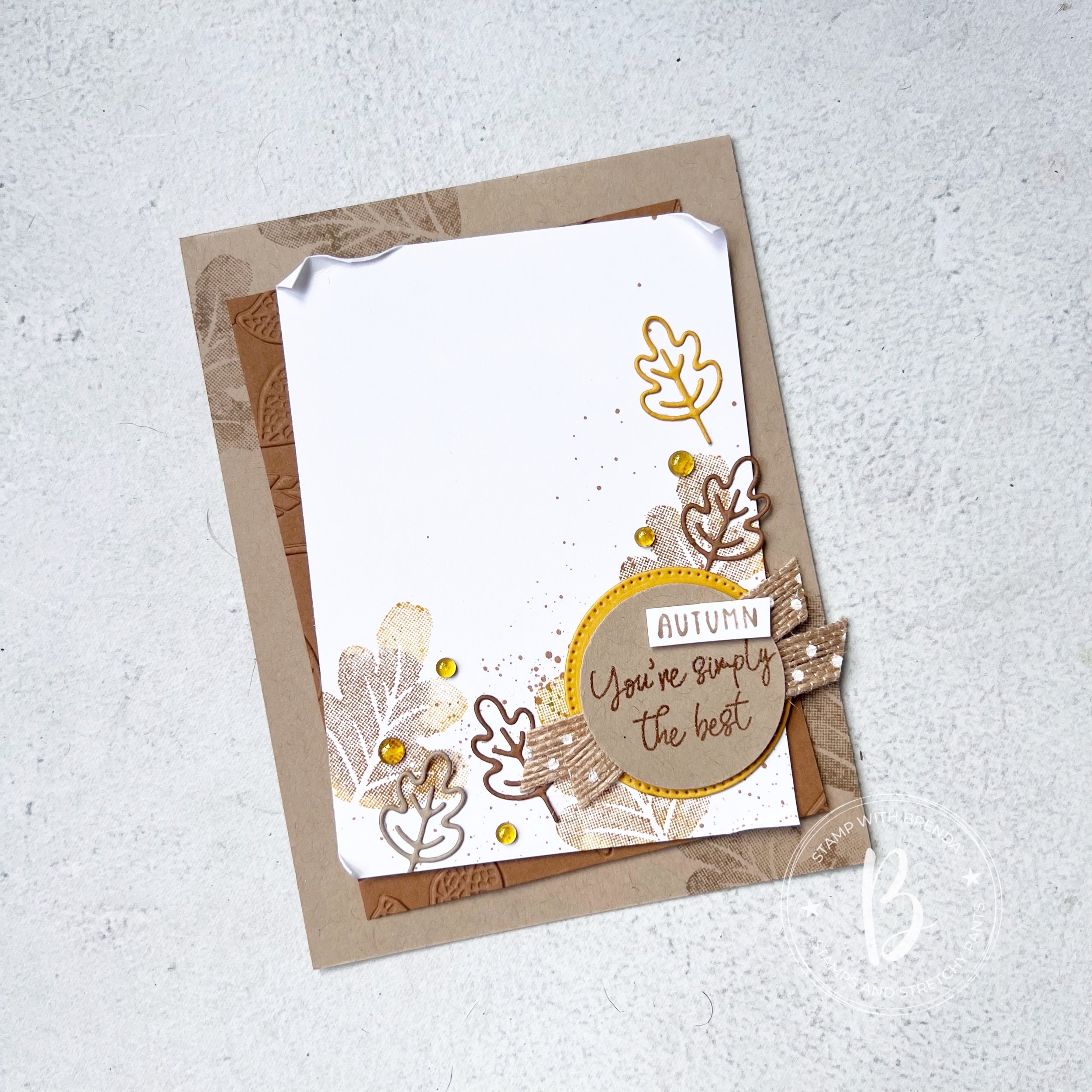
I die cut a stitched circle in Crushed Curry to layer behind my sentiment. ‘You’re Simply the Best’ is from the Caring Leaves stamp set—I used Pecan Pie ink with Clear Embossing Powder to make it pop a bit on the Crumb Cake. I used one of my favorite ribbons behind, the Natural Polka Dot ribbon. I snipped the word ‘Autumn’ from the Choose Happy stamp set.

The adorable die cut leaves are from the More than Autumn Dies and are cut in the 3 colors we are featuring this month. A few of our new Gold Textured Adhesive Backed Dots. I think they will become a staple in my holiday crafting!

I can’t wait to see what the rest of the team designs this month! I am always inspired by what they make so please make sure to ‘hop’ all along so you don’t miss anything. Next up we have Melissa Kerman!

You can always go in reverse to Bonnie O’Neill as well. Either way will bring you around to our Design Team.

Here are the supplies that I used to make this card that are current as of this post. The Caring Leaves stamp set, More Than Autumn Dies and Gold Textured Dots will all be available to order once our Holiday Catalogue goes live!

Father's Day Projects!

Hi friends! I wanted to share a really adorable Father’s Day project that I designed for a recent kids class! We had so much fun putting everything together and I know the lucky dad’s will be truly touched by this gift!

Of course you need to make things a ‘gift set’ right? We have our fun project, a coordinating card and tag for our gift bag! I do love matchy matchy stuff and its always so easy with Stampin’ Up!


I started with an inexpensive canvas that I got at our local ‘dollar’ store.

I did a bit of ink blending with Boho Blue and a Blending Brush on the canvas around the top left and bottom right of where my photo was going to be placed.

I used a cute 4x6 picture of my youngest son and his dad on a Night of Navy base. I love the combination of Boho Blue, Misty Moonlight, Night of Navy and Pebbled Path! It worked so well on this project!

I added a little strip of Misty Moonlight DSP along the left side of the picture and used a Pebbled Path piece to create the rosette. I am loving the Round We Go bundle! The rosettes are pretty easy to assemble and make this project come to life!

The sentiment ‘So Glad You are My Dad’ is from the Gone Fishing stamp set and ‘You’re Awesome’ is from the retired Circle Saying Stamp set. I also used the Encircled in Nature Dies as well to layer ‘So Glad’ in Boho Blue.

I think this project turned out so adorable and you could modify it for any occasion like a birthday or celebration (think Grad or even a wedding shower!).

And of course we have a coordinating card and I used our new Brayer for the first time on the bottom section! I inked it up in Night of Navy and brushed it over Basic White card stock, leaving a section at the top to run through an embossing folder. I used a strip of Night of Navy card stock to hide where it was uneven and to create separation between the two section.

I used our Water Painter to flick water over the inked section so the water droplets would ‘remove’ some of the ink. It basically happens on contact and is pretty cool technique.

The Trusty Tools stamp set was perfect for the front and inside of the card. ‘Dad’ is stamped in Pebbled Path ink on another shape from the Encircled in Nature Dies and ‘Happy Father’s Day’ is on Boho Blue in Night of Navy ink.


I decorated the inside of the card as well with a little strip of DSP and ‘You’re the most Awesome’ from Trusty Tools. The frame around the sentiment is from the Labeled with Love Bundle.

I think this is such a fun gift to give Dad and I loved how all the kids had their own creative spin on how to assemble the project! As you can see from the smiles below I think they really did enjoy putting things together!

Please feel free to shop my store or DM to place an order if you are inspired by this project! All of your support allows me to continue to ‘love what I do’!

Be Inspired May--Monochromatic!

Hi friends! Welcome to another Be Inspired Blog Hop! This month our theme is ‘monochromatic’ which I have decided to use the 5 NEW In Colors to create 5 monochromatic cards with! This is something that I do every new year when we get our new color options!

I just love when we have new colors to play with, which is why I could not wait to make a batch of cards using our 5 new colors:

—Peach Pie

—Shy Shamrock

—Summer Splash

—Petunia Pop

—Pretty in Pink (if you have been stamping a while you might have thought this color name sounded familiar and you would be right—it was a core color many years ago!)

This is my take on monochromatic! I created one card featuring each of our new colors—repeating the same design and only using Basic White as my neutral element.

I wanted these card to have a bit of a ‘technique’ to them so I used the ink pad swiping technique. You simply drag your ink pad from the top to the bottom of your card stock. Each attempt with look a bit unique as well as you can see in my 5 cards. Don’t apply too much pressure when you are dragging, you want it to look like a swipe! That is part of the charm!

Each ‘monochromatic’ card has the same base elements—card base matches the color of choice, a die cut from the Spotlight on Nature Dies, which are a definite #addtocart item!

A die cut using the new Flowers of Beauty Dies, a sentiment and stamped flowers from the Labeled with Love stamp set, white Bakers Twine and a little bit of the In Color Glimmer Paper and In Color Shimmer Gems!

Once you have your initial design done, its so easy to create a batch of these fun monochromatic cards!

I added a bit of background stamping on top of the ink pad swiping as well as you get that tone on tone look which is really fun.

If you look close at the die cut image you can see that each is cut from the new 6x6 In Color DSP stack—this year they also changed up the patterns on the paper as well. So each card has a bit of different look to the die cut depending on the pattern that was used.

I really enjoyed putting these 5 cards together—I think the little strip of Glimmer Paper underneath the sentiment helps it shine a bit too! And everything is better with glitter—right?

I can’t wait to see what the rest of the design team created and their unique interpretations of ‘monochromatic’! I can’t even pick a favorite version of the cards above because each of our new 5 In Colors are so amazing. They look fabulous together and work so well with our existing color line up!

You can click on the ‘NEXT’ button to see what the amazing Artisan Design Team member, Maheswari, has designed this month!

And if you are inspired, please consider shopping my online store so I can continue to LOVE WHAT I DO :)

Be Inspired Blog Hop-Retiring In Colors!

Hi friends! Welcome to our fun monthly blog hop—I am proud to be on a team with so many amazing crafters and I know you will ‘Be Inspired’ by the terrific projects we have to showcase featuring the Retiring In Colors.

The 2022-24 collection is retiring and showcased Sweet Sorbet, Starry Sky, Orchid Oasis, Tahitian Tide and Parakeet Party.

I was able to add 4 of the 5 retiring colors to this project. I just couldn’t make the Parakeet Party work!

The base is Tahitian Tide which is a really lovely punching blue and I paired it up with a strip of Starry Sky with the Orchid Oasis twine wrapped around and a fun flower in Sweet Sorbet.

This card has a little bit of everything from retired DSP in the Tahitian Tide, to a NEW upcoming embossing folder called the Eyelet 3D Embossing folder, to products from the Annual Catalogue (card stock, twine and the Ombre Matte Decorative Dots) to Online Exclusive products like the Zinnia Dies AND the Beach Day stamp set from the Occasions Catty! Haha! Its quite the accomplishment to add literally a bit of everything to one project!

Thank you to whoever created this graphic! I appreciate you!

It is always sad to say goodbye to a color collection and I think I will miss Sweet Sorbet the most, if I had to pick.

I did however decide to go with the bright and fun Tahitian Tide as the base for my card. I like how the retired stripped DSP and the new Eyelet embossing folder work together as they are contrasting patterns.

The two patterns are separated by a 1/2 inch strip of Starry Sky with some Orchid Oasis Bakers Twine wrapped around, I love the new Zinnia Dies in the Online Exclusives Store so I knew I wanted to have a play with them. I cut two of each size to create this full feeling flower and added it with a Dimensional beside the twine.

The sentiment is really fun and I felt it was fitting for this relatively bright card. It is from the Beach Day stamp set, which I am happy to say the bundle will be carrying over. I stamped it in Starry Sky and then once again in the Sweet Sorbet to trim out the word ‘sunshine’. I added it on top of the original sentiment with a Mini Dimensional.

The leaves can be found in the Enduring Beauty Dies as they are a little more substantial than the delicate ones in the Zinnia dies. A few of the ombre dots and I thought this card was complete. I think it is a great card design that you can replicate with our huge selection of flower dies, folders and DSP!

I can’t wait to see what the rest of the team has created this month featuring the Retiring In Colors! Make sure to go all around the hop and please leave a comment!

If I have inspired you, please consider shopping my online store so I can keep loving what I do!

Next up on the hop is the AMAZING Maheswari who an amazing designer and member of the 2024 Artisan Design Team. I know you will love what she has created!

Color Fusers--March

Hi friends! How is everyone doing? Are you excited for March, Spring Break and Easter? I know I am! It means we are inching closer and closer to spring and summer! Yay!

This month the Color Fusers design team is creating projects with Sweet Sorbet, Pool Party and Lost Lagoon! I am really excited for this color combination and I am gearing myself up to say good bye to Sweet Sorbet as it is one of the In Color’s that will be retiring at the end of April.

For my card I was inspired to create a peek a boo window using the heart from the Hooray for Surprises Dies and some scraps of Pool Party and Lost Lagoon that I had laying around. The Lost Lagoon pieces were actually already embossed too so I thought they made a fun addition to the card.


I added my strips to a piece of Basic White that I covered with an Adhesive Sheet. I was feeling lazy and the Adhesive Sheets just make it so EASY! and then I just snipped off the excess. Easy Peasy!

This piece was then added flat the the card base with the top layer added with Dimensionals.

I stamped some of the mini hearts from the Hooray for Surprises stamp set in Sweet Sorbet from the top right corner down to the bottom left corner

I thought it a fun opportunity to add some of the In Color Twine in Sweet Sorbet was to tie it around the right side of die cut section.

I mixed and matched 3 of the sentiments from the stamp set on the outside. Stamping them in the colors of the month and hand trimming them out to make a custom phrase “Hooray you are simply the BEST”. I love to add sentiments together to make a whole new saying.

Lastly I added some white embellishments to help make the background pop with the contrast against the Sweet Sorbet.

Now to the inside! Because I had die cut a heart to create a peek a boo panel, I needed to use it!

So I used the polka dot heart die from the Hooray for Surprises set and added it over top of the original heart for this really fun look. I stamped some more hearts similar to the design on the front but this time going left to right.

I decided to keep the sentiments going by adding ‘Sending you lots of love’ in Lost Lagoon with an extra ‘Love’ stamped in Sweet Sorbet.

It is a really nice surprise to have the inside of your card decorated along with the outside, don’t you think?

I hope you are inspired to use this fun and bright color combo in some of your own projects. However, you will have lots more to see by following along our blog hop! Next up on the hop is Melissa! I can’t wait to see what she has designed for us to see!

You can also go backwards and see what my fellow Canadian friend Kim has designed. Either direction you choose, make sure you go all the way around to see the team’s amazing creations!

Thank you so much for stopping by today!