Artisan Design Team Project--Marigold Moments Bundle

Hello friends! This month my Artisan Group consisting of Tammy Wilson, Heather Thomas, Sandra Herzog, Karine Lison and myself where given the Marigold Moments bundle to design with. I actually quite enjoyed this bundle as it has some really amazing elements!

I am really going to miss these embossed treat bags! they were so easy to create with!

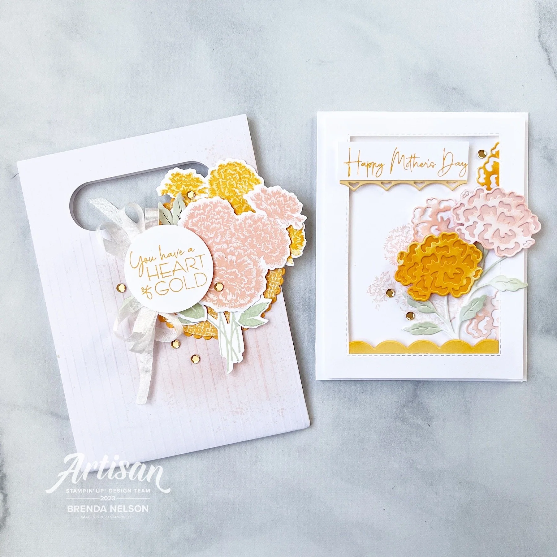
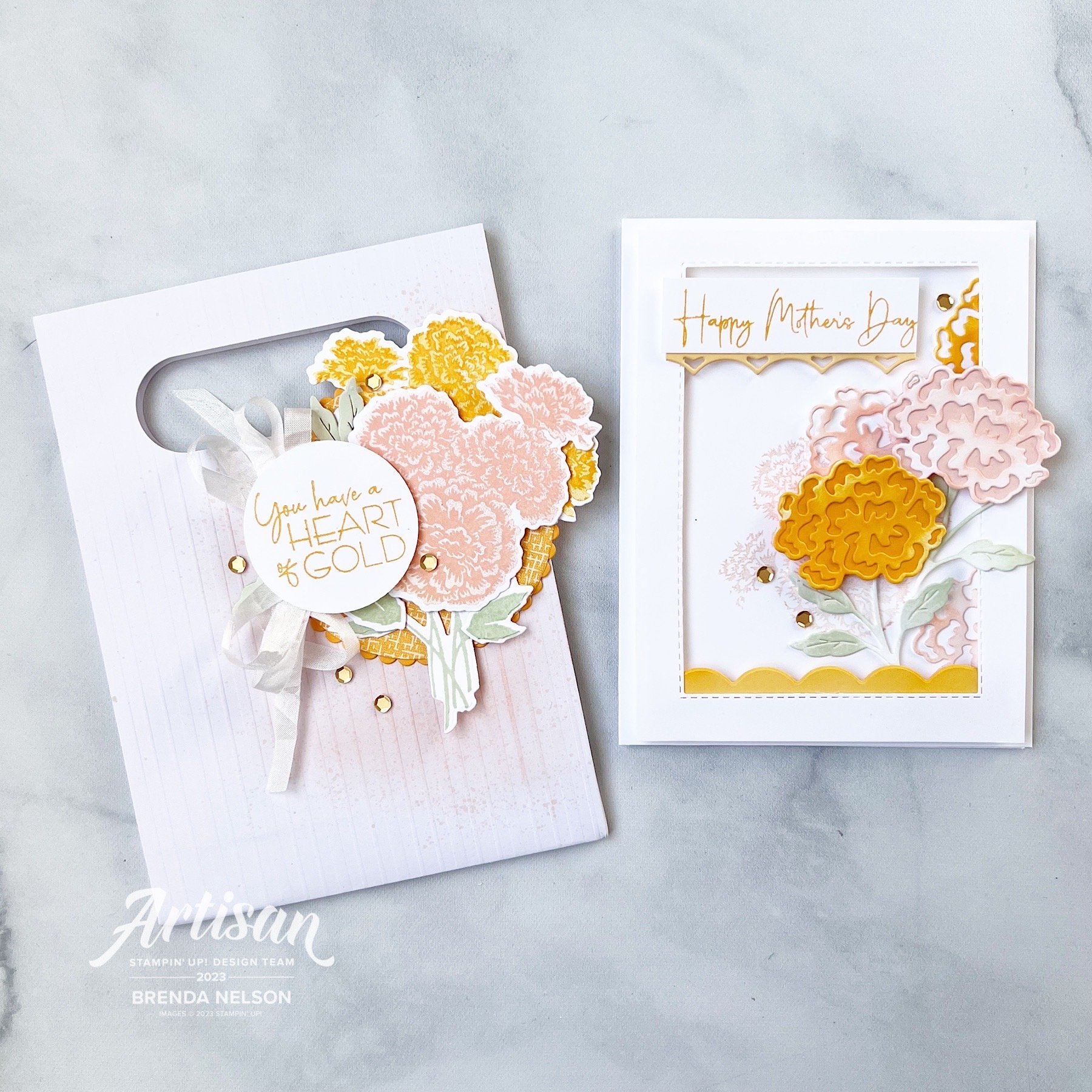
I decided to make a card and coordinating treat bag for my projects this month. You can give these together or individually! Let’s start with the Embossed Treat Bag—I used my Blending Brush in Blushing Bride to give a bit of color to the right side of the bag and then I flicked my Stampin’ Write marker over top as I do love the splatter look.

I cut a large scallop circle from the Layering Circle Dies and then a circle of DSP from the Regency Park DSP to go on top. The marigold cluster was stamped in Blushing Bride and Mango Melody ink and die cut. All of the greenery is either stamped or die cut from Soft Seafoam ink.

I actually LOVED this color combination and am sad to see both Blushing Bride and Mango Melody retire. I had alot of fun creating with them over the years.

The sentiment “You have a Heart of Gold” is absolutely AWESOME and one that I don’t recall ever seeing in any other stamp sets before. I added a double bow behind it in the Crinkled Seam Binding Ribbon, another LOVE that is retiring. And lastly to play off of the sentiment I added some gold sequins from the Adhesive Backed Pastel Sequins.

To all of the moms out there…you are killin’ it. have an awesome mother’s day!

This card is quite fun as its a shakerless shaker card, hahaha! I cut a window out of my first layer of Basic White card stock using the Stitched Rectangle Dies and after I stamped the cluster of marigold flowers on the card base in Blushing Bride, I added this window layer with the Adhesive Strips.

TOP TIP: Use Adhesive Strips instead of Dimensionals to get a little more lift. They are thicker and so easy to run around the edges of your shape as you can cut them to any length you like!

The Marigold Moments Dies have a really awesome border die that cuts out the scallop that I tucked along the inside bottom of the card and the reverse image underneath the sentiment. I love that this stamp set includes a Happy Mother’s Day stamp,

There are two dies used to create one of these marigold flowers and one for the stem. For the base of the flowers I die cut the solid back in Mango Melody and Blushing Bride. The top die cut layer and the stamps are cut out of Basic White and then I used my Blending Brushes to add some color. I love this look because it adds so much texture and depth. The idea is NOT to make the Basic White base look like card stock but to allow for color variation. I added a few extra flowers tucked in and behind my main blooms to help give the illusion of a bouquet.

And of course I had to add some gold sequins. Every project needs a little bling right?

I hope these projects inspire you and please make sure to check out what the rest of my group has created on either the Stampin’ Up! Official Instagram page or their individual pages:

Tammy @stampspaperscissors

Sandra @herzerlskreativecke

Heather @thesongbirdstamper

Karine @karinelison73choupinette

Thanks friends and see you again soon!

Here is a supply list of what was used to create these projects. If they have inspired you, please consider shopping with me so I can continue to do what I love!

Be Inspired Blog Hop--Let's Get Crafty with the Subtles Family!

Welcome back friends for another edition of the Be Inspired Blog Hop! We are so happy you are here and would love all of your comments on our projects, or to share our hop with a friend or two. If you like my stamping style you can also follow me on Instagram @stampwithbrenda!

This month we are designing with the Subtles family—now I didn’t see a rule about it being NEW colors to the Subtle family so I decided to go that route!

I created a card, yes a CARD, not a scrapbook page this month, although I think my card will be inspiring a future scrapbook layout. My card features the new Lemon Lolly and Bubble Bath Core Colors and the returning color Lost Lagoon.

I started with a base and first layer of Lemon Lolly. I ran my layer partially through the new Twisted Rope 3D folder and a added a fun strip of stripped DSP from the Delightfully Eclectic 12x12 DSP in Bubble Bath and Basic White. I love a good stripe pattern no matter the color scheme!


The stamping on my card features the new Cheerful Daisies Bundle which I am really enjoying creating with.

I like that you can design with 2 Step Stamping or single images that you can stamp and cut out, like I did with larger daisy behind the sentiment or stamp the line image and color in. This set has a lot of creative possibilities!

Isn’t this new lemon lolly color lucious? it reminds me of lemonade!

The ribbon behind the sentiment is Bubble Bath and its one of three colors in the 3/8 Sheer Ribbon Combo pack that is coming out in the new Annual catalogue in May 2023. I love the silver edge on the ribbon.

The daisies are all stamped in Lemon Lolly with the center on the front flower being stamped in Pecan Pie. I did stamp it off on my scratch paper so it was a little lighter. The leaves are stamped in Lost Lagoon which I felt worked because it become more ‘green’ on this project.

And of course I had to add some embellishments in Lemon Lolly. I really love tone on tone embellishments and the variety in our new catalogue is AWESOME! These are from the new Adhesive Backed Solid Gems.

I know you are going to be so excited to start stamping with all of the new Core Colors, especially when you see the members of the updated Subtles family. I hope this color combo of Lemon Lolly, Bubble Bath and Lost Lagoon inspires you to create you own fun project in the future. Happy Stamping!

Up next on the Be Inspired Blog Hop is a former Artisan Design Teammate of mine, Janneke! I love her stamping style and can’t wait to see what she creates! Click on the image below to head to blog.

Thank you for visiting this month! We can’t wait to see you back in May!

Artisan Design Team Project featuring Delicate Desert

Hello friends! I could not be more excited to share my projects for March that I created for the Artisan Design Team. I absolutely loved designing with the Delicate Desert Suite especially because I used one of my all time favorite pictures of my youngest son, Shepard.

I recently updated my Scrapbook Gallery on my blog as well—so if you are looking for more scrapbook page inspiration, please check there!

Shep really was the happiest baby and such an easy toddler—I simply cannot believe at the time of writing this he is 12. I wish i had a time machine to go back and cuddle this little guy again.

I decided to make a scrapbook page AND a card for my Team projects this month. I really love the color palette of this suite—Petal Pink, Calypso Coral, Cajun Craze, Pale Papaya, Soft Succulent and Gray Granite look so AWESOME together!

For my scrapbook page, I started with a sheet of the Delicate Desert 12x12 DSP as the base and then I added a layer of Basic White over top that is cut to 11x11. This lets you see a little bit of the pattern behind. I used another piece of the DSP for the photo mat as well and cut out the leaf like shape out of the DSP and the Dry Brushed Metallic 12x12 paper. If you haven’t ordered the Dry Brushed paper yet, you should really take a chance on it. It is really cool and has alot of fabulous texture w the hints of gold layered through.

Seriously, look at Sheppie’s cute face. I can’t even.

Because the Dry Brushed Metallic paper has gold in the design I decided to stamp one of the larger flowers in Versamark and use Gold Embossing Powder. I then used my Blending Brush with Pale Papaya ink to a bit of emboss resist. It is such a classic technique, and I find everyone is impressed with embossing! I also die cut some of the triangular shapes (they remind me of a pattern on a western blanket) to add it to represent foliage. I think it worked really well!

The sentiment could not be more perfect for this scrapbook page! However, the Desert Details Dies do not have a label shape, so I borrowed this one from the He’s the Man Dies. The suite also includes the Pale Papaya Faux Velvet Trim which I cut in half to add underneath the sentiment.

My favorite part of this scrapbook page is actually the base where I used both of the large panels to create interest and texture by die cutting them in Basic White. They are added flat to the page with all of the other elements on top. I also used the Gold Faceted Adhesive Backed Sequins to add interest to the scrapbook page.

The stamp set also includes two longer border type stamps which I used along the right side of the photo. I thought it was an interesting way to bring in those design elements.


The sentiment in the top left, “Your Smile is Pure Magic” was also a fantastic addition to this page. I stamped it in Pale Papaya first and then used my Calyspso Coral marker over the ‘magic’ to make it pop. I added some of the Pale Papaya Ribbon and a die cut element.

TOP TIP: I cut the element horizontally into two pieces so I could spread it out and give the illusion of it being larger than it really is

For my card design, I started with a base of Grey Granite, and then I used a piece of the DSP as a base, with another DSP design die cut with the larger decorative panel. I then cut the smaller decorative panel in Basic White. I love the edge detailing on both of these dies and how they nestle together.

The Basic White panel has a touch of color added by using a Blending Brush and Pale Papaya ink. I also flicked my Pale Papaya Stampin’ Blend over top.

The flower is also stamped in Versamark, then I added ink in Pale Papaya and Calypso Coral with a Blending Brush and finished it off with Clear Embossing Powder. This gives the flower a glossy feel. I used both the Delicate Desert and the Dry Brushed Metallic paper with the foliage die to layer behind the sentiment.

The border die included in the set was used as an accent underneath my sentiment as well. And of course, who can resist bling? So I added some of the Gold Faceted Adhesive Backed Sequins to this project as well.

I hope you enjoyed these projects and all of the other amazing things created by the Artisan Design Team! For more inspo with the Delicate Desert Suite check out on Instagram and Facebook the Stampin’ Up! Official account as well as Heather Thomas @thesongbirdstamper , Karine Lison @karinelison73choupinette, Sandra Herzog @herzerlskreativecke and Tammy Wilson @stamppaperscissors

Please feel free to shop my online store by clicking this button or any supply images! If I have inspired you, I appreciate your support so I can keep loving what I do :)

Shop with me

Color Fusers--February 2023

Hello friends! Welcome to the February Color Fusers BLOG HOP! I love to hop with this creative crew and I look forward to crafting with our color challenges each month!

This month we have a really unique color combination for you—Calypso Coral, Balmy Blue and Pale Papaya!

I love that our color challenge this month is NOT what you would expect for Valentines projects but I decided to make one with this combination anyway!

The reason I liked this color combination for a valentine’s card is because it doesn’t have to be a holiday about your spouse or significant other. It can also be a holiday about those who you LOVE so I designed a card that you could give to your mom, or a friend, or someone in your life who means something special to you.

I decided to make the base of my card Pale Papaya and I am officially going on record to say how much I will miss this fun color. It is a tone that seems to works so well with so many of our core colors!

I also had not used my Dots & Spots die in a while so I pulled it out to created an interesting first layer on my card. And because its Sale a Bration I had to use some of the DSP from the Favoured Flowers collection to anchor the bottom half of the card and create a base for the design. I also love how it has a more geometrical design that works well with the polkadot first layer.

One of the things I was most excited about in the new Occasions catalogue was the Love for You bundle. I think it is fantastic for card making AND an amazing set for scrapbooking (my first love).

I stamped out the sentiment ‘So Much Love’ in Balmy Blue. Now I think Balmy Blue is having a moment. If you flip through the Occasions Catalogue you might notice that it is showing up in a lot of the new DSP designs!


The flowers from Love For You are stamped in both Calypso Coral and Balmy Blue. I stamped the solid layer of the flower off on my grid paper and then the detail part of the stamp full strength over top. You can also add a little center if you desire as well. Seriously! The designers at Stampin’ Up! think of every possibility!

The centers and the cute little hearts are stamped in Pale Papaya.

I added Happy Valentine’s Day onto the design but you could easily omit it. But I love that you can send this card to someone who isn’t your sweetheart. And I couldn’t resist a bit of Linen Thread underneath the sentiment.

A few Pastel Adhesive Backed Sequins in blue completed this unique card! I really hope you like the twist on this Valentine’s Day project!

Next on the hop is the amazing Bonnie O’Neill so click on the image to head directly to her blog. If you want to go backwards you can click on PREVIOUS to see what Sue Vine has designed this month.

Make sure to check out everyone on the Hop and please leave a comment if you enjoy my project this month. I would love to hear from you!

Artisan Design Team--Recency Park Suite Project

Hello friends! I cannot express how excited and happy I am to be on the Artisan Design Team again for 2023. This really is a dream opportunity and I love the creative challenges each month.


The Artisan Team is split up into 4 groups and we are each given different assignments to create some truly awesome projects with to share with the Stampin’ community throughout each month.

My group is myself, Heather Thomas, Karine Lison, Sandra Herzog and Tammy Wilson!

Our assignment this month was to create with the Regency Park Suite and I could not love it more if I tried! The Petal Park punch bundle and the Sentimental Park die bundle are so fantastic and compliment each other so well. And all the add ons like the Textured Shimmer Paper and Recency Park 6x6 Paper are top notch!

I knew that I wanted to create a scrapbook page featuring my sons grade 12 grad because our family pictures were the perfect color palette for this suite. It honestly came together so easily using Night of Nave 12x12 for the background and then layering on some DSP and a big awesome photo mat of the Textured Shimmer Paper.

I used a 6x12 piece of Basic White card stock to tone down the blue a bit and to help all of the amazing flowers and the sentiment pop. I kept to the color palette of the DSP—Balmy Blue, Mango Melody, Petal Pink and Shaded Spruce. I did lots of stamping off so that the filler portion of the flowers was always a shade lighter.

This picture really shows off the Textured Shimmer paper and some of the gorgeous little flower dies from the Sentimental Park Dies. You can also see that I added some of the Adhesive-Backed Milky Dots as well to my project.


One of the best tips I learned from Tammy Wilson when we were on the team together is 2021 was to cut your ribbon in half (creates a thinner ribbon and releases some frays for that chabbier look) and how to tie a #tammybow

Tammy really is the queen of bows as you can see from her stunning projects.

I added one here underneath my sentiment which was created by combining 2 of the stamps from the Recency Park stamp set.

Along with my scrapbook page I also created some 3x3 cards and I forget how much fun they are!


I have also forgotten how much fun Mango Melody is—I think this color is having a moment along with Balmy Blue!

I used the new Cane Weave embossing folder on the base of my 3x3 card along with some coordinating DSP from the Regency Park 6x6 stack—and made a cute matching envelope!

The images on this card are from the Sentimental Park bundle! It is amazing!

This little mini card is made with a Balmy Blue base and I added a little strip of the Textured Shimmer Paper behind the first layer. The tag on the front is from the Sentimental Park dies and I just trimmed it down to fit this little card. I also hand cut out the words ‘YOU’ instead of just stamping it to the tag, just to add some interest and height. The Milky Dots are a great embellishment add on along with flowers from Petal Park.


I think of the 3 mini cards this one is my favorite. But I am partial to Petal Pink. It looks so good with the Night of Navy Bordered Ribbon (this ribbon is top notch).

I used another one of the labels from Sentimental Park and dressed it up with some images from both stamp sets and the DSP—you can see a Mango Melody flower at the bottom—I trimmed it right from the Recency Park paper. And I based everything on a panel of Petal Pink ran through the Cane Weave folder.

I love this whole suite! So much so that I am featuring it at my Spring Stamp Camp with my border buddy Hattie Nelson from Honeybee Stampers!

Our event is virtual on zoom—saturday, feb 25th. It includes a full package of the regency park dsp, 1/2 pkg of the textured 12x12 shimmer paper, milky dots and the full roll of ribbon—plus projects and demonstrations!

Hattie and I would love to have you at our event! I can ship kits anywhere in Canada! The event registration is $75 (plus extra if you need your kit shipped) and all the fun is shared in a private Facebook group! Try clicking this form to register! (I say try because this is something new!)

or you can touch base with me at stampsandstretchypants@gmail.com

Thank you so much!

I hope you enjoyed all of the projects shared by the team this first month of January! The Artisan Design Team is so excited to share in creativity with you all throughout 2023! Please come back every month to my blog and check Instagram to see all of the awesome projects we are sharing!