Around the World on Wednesday--something old & something new!

Hello friends! I was really excited about our theme this month and its really open to interpretation so I can’t wait to see what the team designs! Make sure can go “Around the World” with us and check out everyone’s crafty creations! And thank you for being a part of our journey this past year and a special round of applause for Angie @naturesINKspirations for being our fearless leader!

Our theme is Something Old and Something New so I decided to NOT making a Christmas card, gasp I know! But I just got some new stuff and I needed to play!

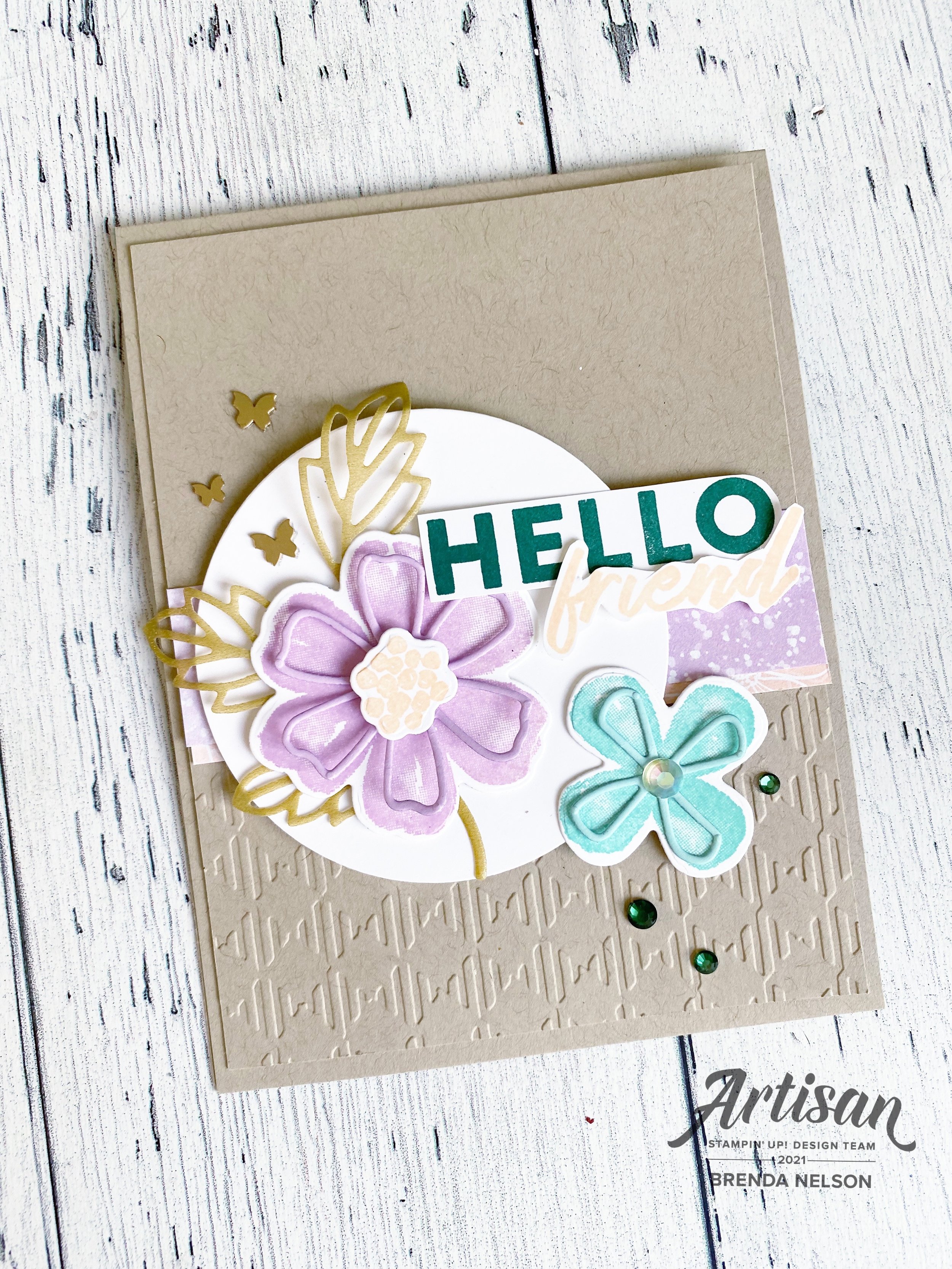
What you are seeing here is a sneak peek of a new Saleabration stamp set and Saleabration DSP paired with one of my favorite bundles from 2021! I absolutely LOVED the Pretty Perennials Bundle so I was really excited to have a chance to dust it off!

The color palette of my card is straight from the new Friendly Hello DSP! I love these soft pastel tones paired with the deepness of Shaded Spruce! The sentiment is from the SAB stamp set Friendly Hello (this is a level 2 bundle). This set has some great floral images and some awesome sentiments such as this one.

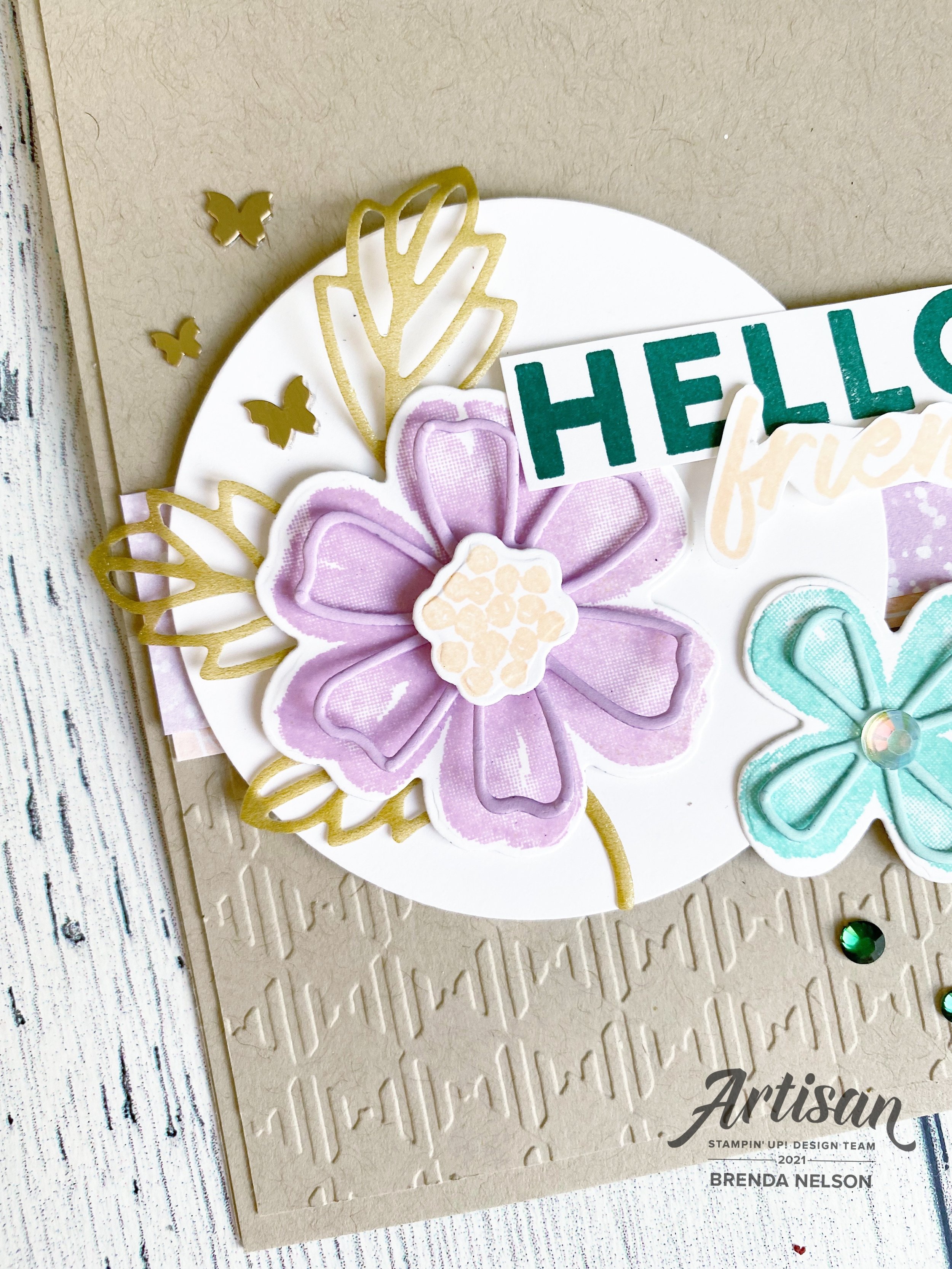
The base of my card is Crumb Cake (a classic don’t you think?) and I ran the top layer through a new gingham embossing folder that you will be seeing in the upcoming January to June catalogue. See those adorable brass butterflies? Also new and oh so fun!!!

I cut out the sprig from the Perennials Dies with the Gold Shimmer Vellum which was a Holiday Catalogue favorite of mine. I even added in some Holiday Rhinestones!

I am really happy with how this project turned out and I know I can recreate the design with ALL NEW stuff once the new year begins! I can’t wait to see what everyone else has made. You can go see what Tricia Butts has created this month! You are heading from Canada to the Unitied States!


Color Fusers December 2021

How can it be? How can it really be December 2021? One thing that does remain constant is the passing of time…and my love of stamping! I am really excited about the color combo our team has this month!

Isn’t this a unique color combo? I love pairing two dark deep colors with such a light soft pink! And because Petal Pink is one of my favorite pinks I decided to make it the base of my project and use the other two as accent colors!

I absolutely love this card and am excited to share it here and have some friends come over to make it too!

The base and first layer of my card are Petal Pink. I distressed the edges with my fingers and stamped a couple snowflakes from the Merry Snowflakes stamp set in the same color of ink on the background. I used the dies to cut out a snowflake in the same color. I love the stitched detailing on these snowflakes!

The sentiment is from the stamp set Encircled in Warmth and is stamped in Cherry Cobbler ink and die cut with the Layering Circles Dies. I brought attention to the sentiment by swiping my Blending Brush over “Christmas” with some Petal Pink ink to give it a little pop. It is probably my favorite aspect of this card!

The trio of trees is from the Cloche Dies and are now my favorite new thing! I can’t wait to incorporate them onto another project! They are die cut from Evening Evergreen card stock. I added this color in again behind the sentiment with the Evening Evergreen Chevron Weave Ribbon and some silver metallic cord from the Simply Elegant trim. A few little In Color Jewels and this fun whimsy Christmas card is complete!

Now aren’t you LOVING this color combo? I can’t wait too see how the rest of the gang incorporates these colors into their designs! You can go back to see what Melissa has designed and forward (next) to see what my friend Melanie has created! They are both so talented! Make sure to leave us some comments!

If anything catches your eye on my project and becomes a must have, please consider shopping my online store if you have not already! Thank you in advance! I love to do what I love!

Thank you for joining in and following along with our hop during 2021~ looking forward to sharing with you in the new year. Blessings to you and your family,

B.

Holly Jolly Santa

I was recently asked to be a guest designer for a super exciting Instagram account that I follow and many of you know and love! This is actually my OUTTAKE project as when they approached me and gave me a list of stamp sets to chose from, I choose this set—or so I thought! haha! Turns out I had my stamp sets mixed up! So this project is now going to be inspiration for you!

The best part is I spent quite a bit of time thinking about this card and the design, so I cannot let it go to waste! This was actually the first time I broke the seal on the Picture This Dies even though I have had them since June! Does that ever happen to you? You buy something and then get distracted from using it?

Well I do LOVE how this project came out in the end. I tried to create 3 little panels that felt unique. The base of the card is my favorite color Coastal Cabana. The first layer is black and then a layer of Basic White was added in after another layer of Coastal Cabana was die cut with the Picture This Die.

In the first panel I stamped the little star from the Be Jolly stamp set on the Basic White layer using Smoky Slate ink. My first Santa is stamped with Momento Ink and colored with the Stampin’ Blends markers in Real Red, Ivory, Basic Black and Petal Pink. I use the Petal Pink chubby tip to add a dot too each of Santa’s cheeks for a hit of rosy. I also use the light Smoky Slate Stampin’ Blend to add detail to his beard and hat pom pom.

I love how the Picture This Dies leave a stitched detail behind. And do throw away all the little bits that get cut out, those can definitely be used on a new project!

I like to add details to my sentiments so for this project I added a little bitty scalloped detail underneath the “A Merry Hello” by using a die from the Stitched So Sweetly Dies and a bit of white twine from the Bakers Twine Essentials Pack!

You can see just a hint of the bottom panel—I ran it though the Star-Crossed Embossing Folder, focusing just on the star half of the folder. I added a ton of Coastal Cabana Playing with Patterns Resin Dots to my card to play up the fun and whimsy feel! This Santa is colored with the same Stampin’ Blends and both are hand trimmed with paper snips to tuck into the little panels.

So even though this card is my OUTTAKE I think its pretty damn cute! And I am wondering why the heck it took me so long to use the Picture This Die set! You will definitely be seeing it in the future! I hope everyone has a merry day and if you are inspired to create your own project, please consider shopping my store if you live in Canada!


Comments are always welcome and appreciated!

Happy 50th Anniversary!

Did you know that can make Custom Cards? It is a service that I offer if you do need an extra special project! I have experience designing custom wedding invites, baby shower invites and even anniversary cards like this extra special one I made for my friends parents!

The only request my friend had was that I used some gold on this special card for her parents. I incorporated it on the 50 using Gold Foil paper and on the inside layer with the Shimmery Gold Vellum. Because the rest was left to me I decided to use brand new upcoming products with a bunch of favorites and retired products.

The star of this card though is the flower from the Blessings of Home stamp set. This set will be released in the upcoming January-June catalogue and I know you will love it as much as I have already! I colored this in using ink pads and a Water Painter and my lazy watercoloring technique. The stamp was stamped using Basic Grey ink in place of traditional black to give it a bit of a softer touch.

The sentiment is from a favorite retired stamp set of mine, Many Mates and is punched using the Label Me Fancy punch. I added a little bit of gold thread behind the sentiment. The card is a “fun fold” and is elegantly tied together with some of the White Crinkled Seam Binding Ribbon.

I added an extra panel of Basic White card stock to the front panel of the card. The fun flap is in Soft Seafoam card stock and the flap part was run through the Timeworn Type 3D Embossing folder to a add a subtle bit of textrure.

When you open the card you see a gorgeous panel of Shimmery Gold Vellum which I just love. You can see a tiny bit of a scalloped edge along the fun fold panel. I cut this with a die from the Peony Dies.

I stamped another floral image from the Blessings of Home stamp set and colored it with the same technique as the front. “Congratulations” is from the stamp set Inspired Thoughts in the Annual Catalogue. I added a few retired little pearls from the Share What You Love collection to complete this project.

I was told my friends parents absolutely loved their card and I was so happy to create it for them!

If you are ever in need of something extra special, please reach out to me, I would love to design and create something for you too!

Around the World on Wednesday--My Favorite Month!

I am really excited about the theme for this month’s Around the World on Wednesday Blog Hop! Our theme is our FAVORITE month…and it was a tricky one for me as my birthday is in January so obviously I LOVE BIRTHDAY MONTH but its also cold AF so my love of summer wins out!

July is my FAVORITE month because it is the month that we spend a week at the lake with the entire Nelson family. 19 grandkids and cousins! Isn’t that spectacular?

Deciding on the month of July as my favorite month also coincided perfectly with a new bundle of products that I was recently able to order. This bundle was a perk for Demonstrators attending On Stage this month and it will be available in the upcoming January-July Occasions Catalogue. You will LOVE this catalogue, hands down this publication is in my Top Ten favorites of all time. All I will say is Rainbows, Cactuses and Pineapples oh my!

This is our annual family picture that we take at Greenwater Lake each year. We have been visiting this lake since my oldest son was an infant—17 summers!

I knew I wanted to use this family picture and I wanted to make sure to honor the tones of the water and the trees in my design. I used a base piece of paper from the Hand-Penned Designer Series collection that was Garden Green with a white floral print.

I layered a piece of Basic White 12x12 that I trimmed down to 11 1/2 x 11 1/2 inches. As the main photo mat I used a piece of DSP from the new Heart & Home Designer Series Paper collection. One side of all of the papers is this amazing wood panel design in Basic Grey. There are several patterns of a wood look so I chose the one that looked like a tree to continue with the nature element.

I also added a striped piece of DSP in Mint Macaron from the Hand-Penned Designer Series collection. I made sure the stripes were going horizontal in nature to help elongate the page.


I love to create focal points or vignettes (areas of interest) on my scrapbook page that help tell the story. Sentiments are very important to me and they are honestly the criteria by how I pick most stamp sets. I absolutely love the sentiment “What a Beautiful Day for Love”. Obviously you can use this for a wedding or a baby’s arrival, but should it not be how we approach all of our days? Every day is a beautiful day for love and I never leave those words unsaid to my kids. I tell them all the time and it fills my heart when my teenage son will repeat them back to me on the phone or with his friends!

I stamped this gorgeous floral image, one of two in the stamp set Blessings of Home, in Momento Ink. I then colored it in with a term I have coined “Lazy Watercoloring”. I simply add ink to one of our clear blocks and use my Water Painter (the fine tip) to the ink with a very small amount of water. I then colored in the flowers with Bumblebee, Blushing Bride, Coastal Cabana and Garden Green ink. It barely took me any time at all which is why I love it!

I die cut the shape with the new Flowers of Home Dies and added it to a So Saffron die cut. I cut this using the Seasonal Labels Dies and ran it through the Timber 3D folder. I love how this page is a mix of so many different products from 3 different publications!

Stamping softly in the background added such a beautiful element to this page. I used the smaller floral image in Smoky Slate ink.

The sentiment is stamped in Bumblebee Ink and is also cut with the Seasonal Labels Dies! I added some white twine from the Bakers Twine Essentials Package and some of the Blushing Bride Frayed Grosgrain Ribbon behind my sentiment.

A few sprigs cut in Garden Green cardstock from the new Flowers of Home dies and this little area was complete—-or was it? No it wasn’t, it also need to add an embellishment so I chose some from the Classic Matte Dots (another upcoming new product). You will love these as you get 2 sizes and 4 colors—-white, vanilla/pearl, grey and black.

I created another focal point on the top right of my page. I stamped the smaller flower in Momento ink and colored it with Blushing Bride, Bumblebee and Garden Green ink. What I really love about this area is there is not a stamp in the set that actually says “Perfect Day”. I used my Stampin’ Write Basic Grey marker to combine two individual sentiments into one that better suited my page. I love how we can customize so many of our Stampin’ Up! products!

I added the same twine, ribbon and Matte Dots to this area plus a few sequins from the Subtle Shimmer Sequins. I love these sequins so much and hope they are available after the Holiday Catalogue period ends.

I am so in love with this page and creating it right now was perfect therapy for me. The days are shorter now and the weather has changed but making this page took me right back to the lazy days of summer.

I can’t wait to see what the rest of the Hop creates this month! There are some seriously talented people on this hop and the inspiration is unbelievable!

I am one of your Canadian ‘stop’s on this hop and next up you are going to the United States to see what Tricia Butts has designed for this challenge!