Be Inspired Blog Hop--Friends & Family!

Hello friends! I am so happy to be back after taking a little creative break last month! I could not resist this awesome theme of Friends & Family!

Do you ever find that you are using a color or color palette on repeat? For me the past few weeks its been Fresh Freesia—I mean, seriously, the color goes with EVERYTHING! I even found myself buying some Fresh Freesia inspired running shoes!

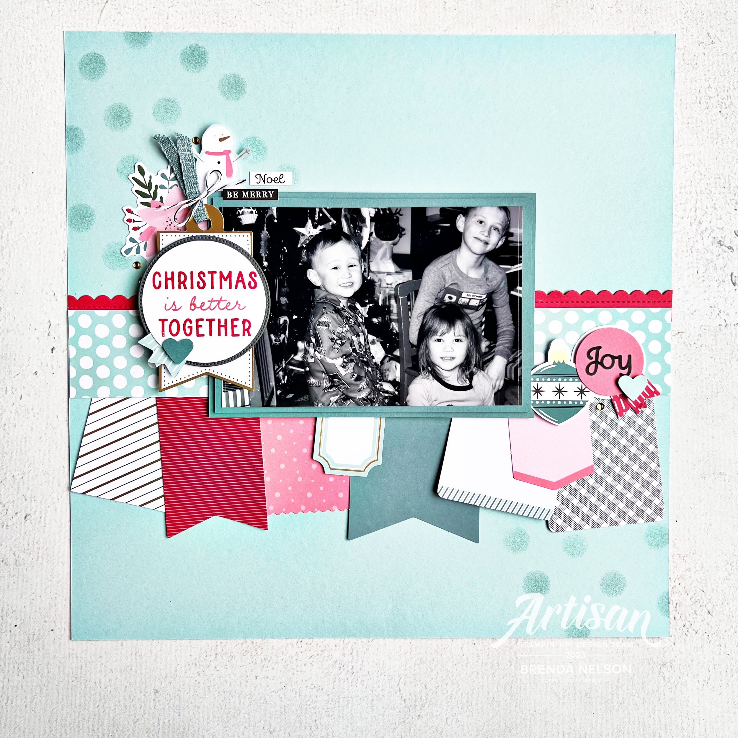
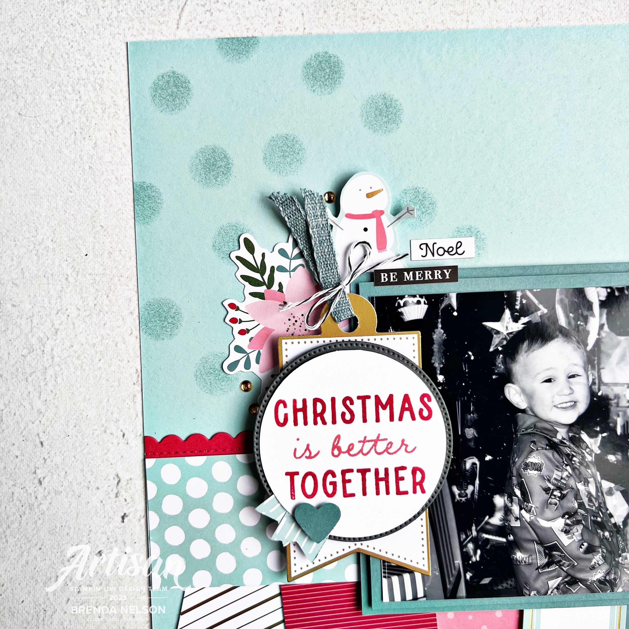
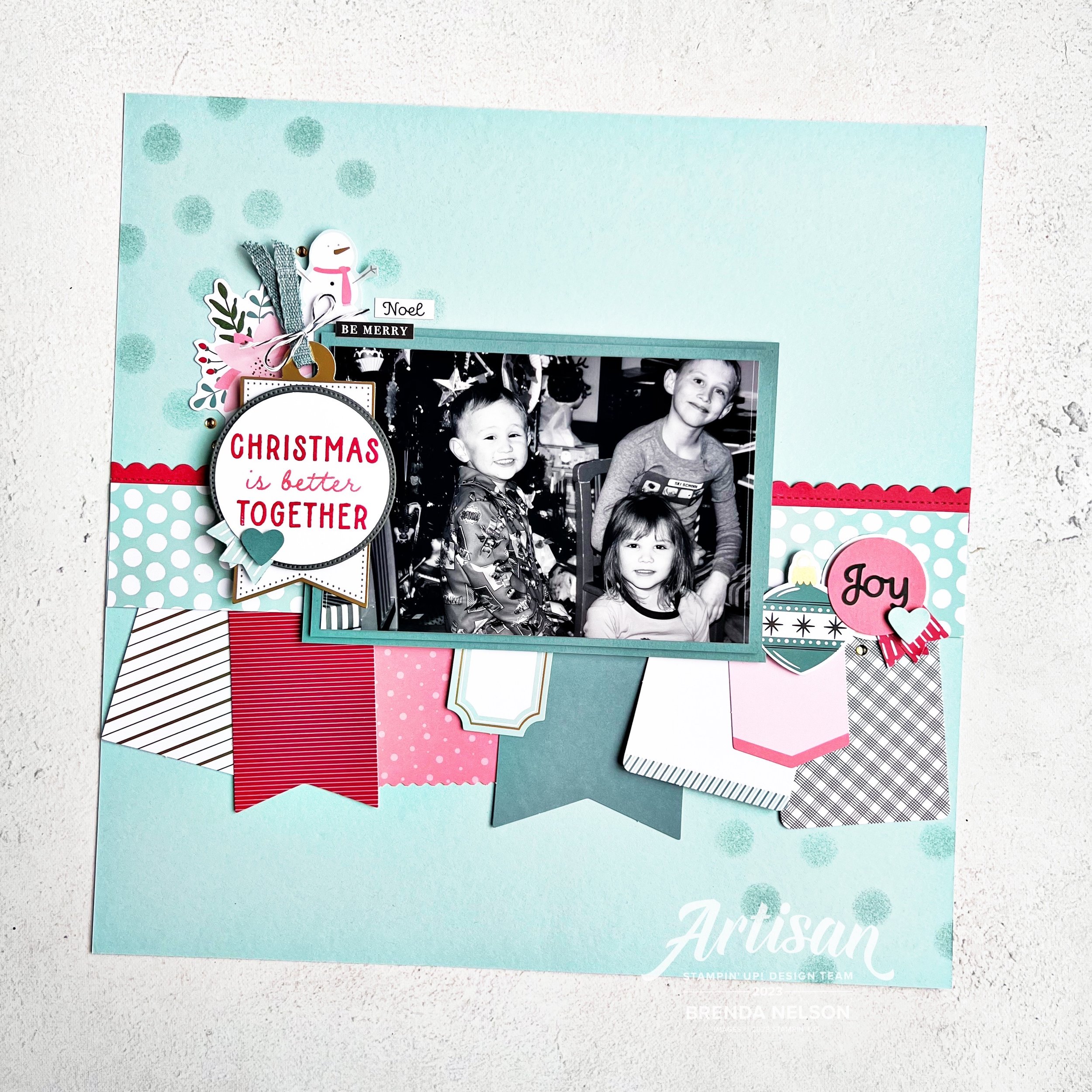
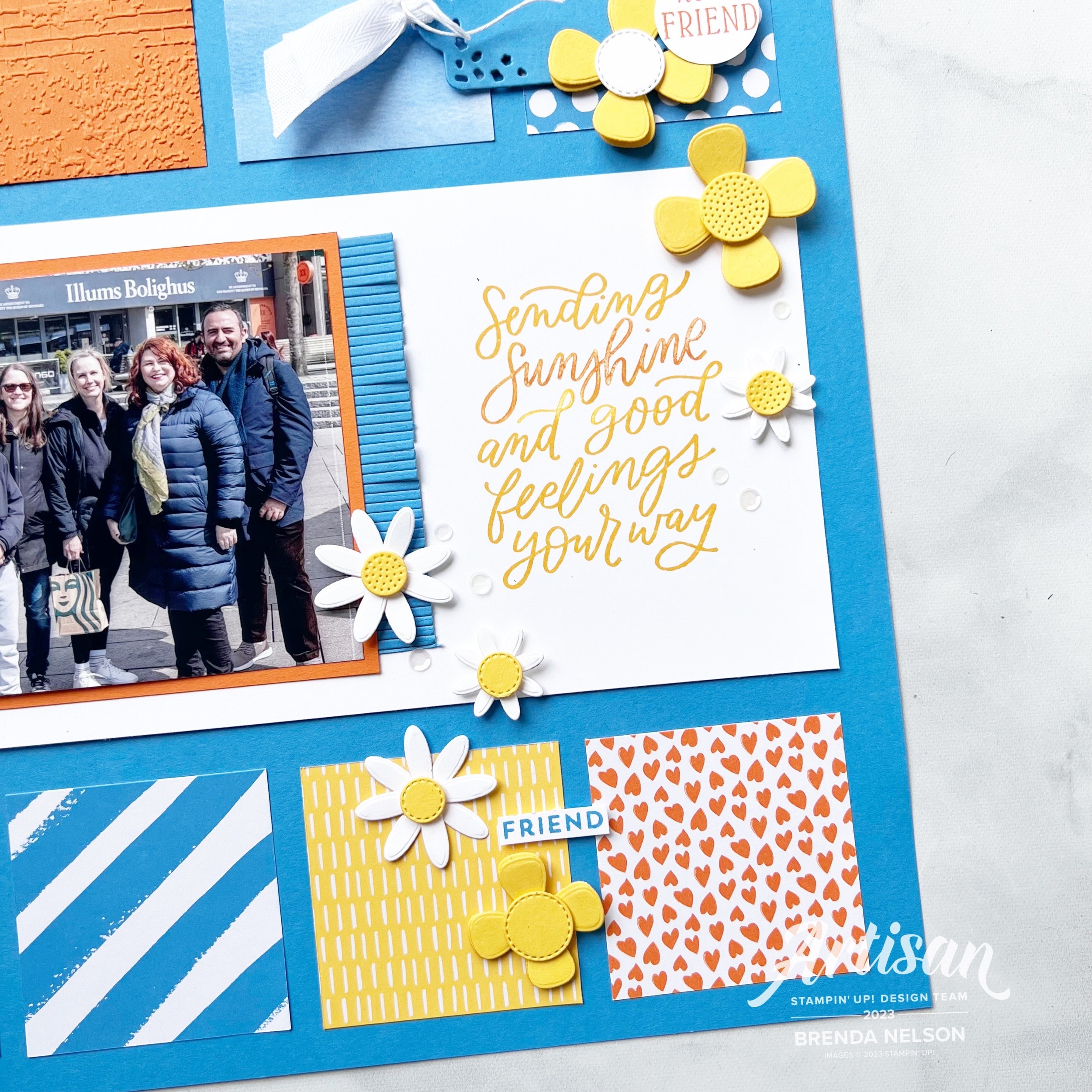
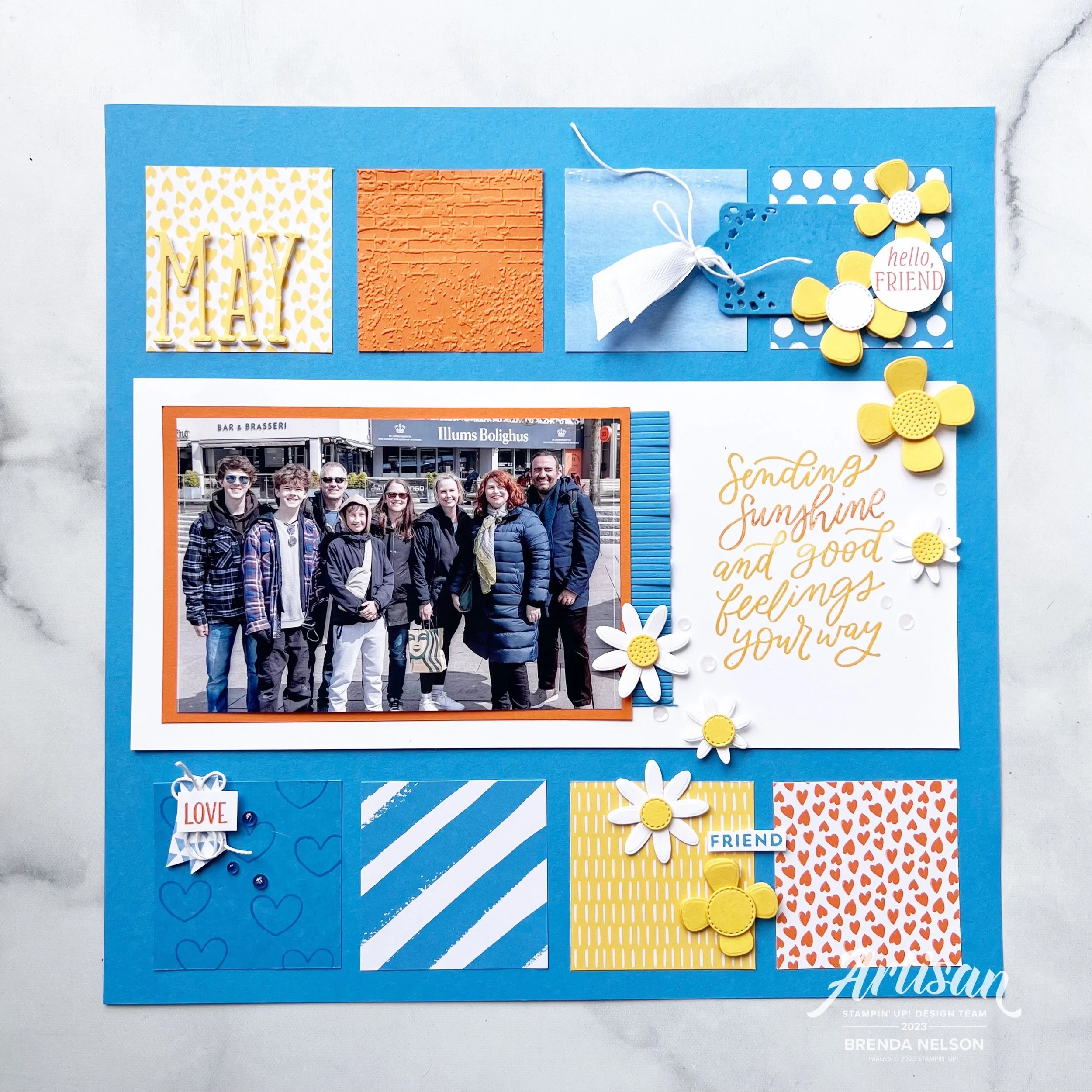
I decided to make a scrapbook page that features a picture of one of my fav friends who was up in Canada for a visit this past summer. The last time I saw her was when I went to visit right before Covid! I flew home to Canada on a Monday and on Wednesday they made the announcement that if you arrived back that day you would have to quarantine for 2 weeks. Doesn’t this all seem like a million years ago? So its been a LONG TIME coming for a visit and I am happy we got to have one this summer! So of course I had to make a scrapbook page for our Friends & Family themed blog hop this month!

This is my and my buddy Brett enjoying a coffee together and a canadian coffee house!

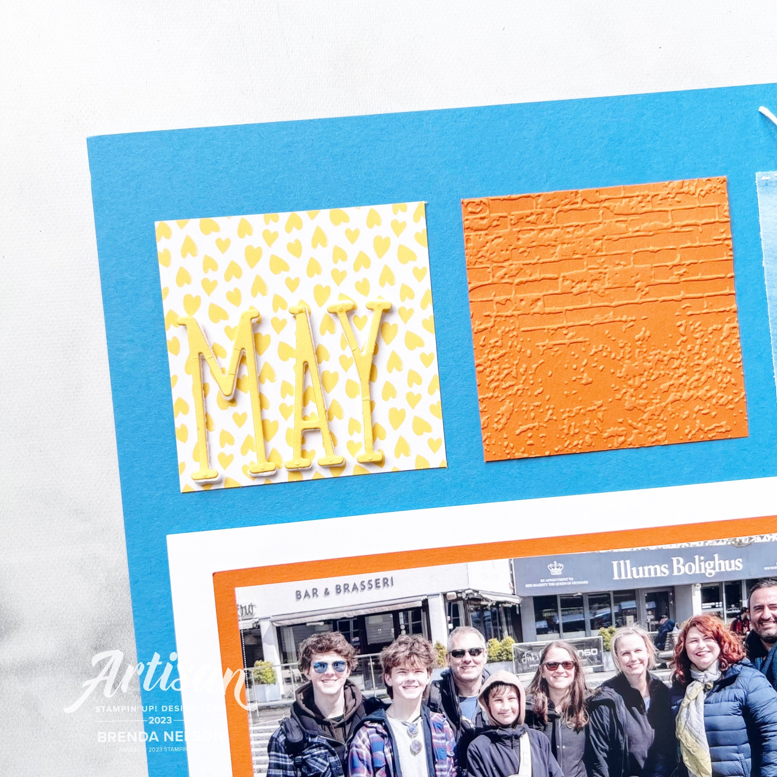
Was I the only one who stockpiled the Dandy Designs 12x12 paper? I absolutely LOVED the color palette of that paper collection and its perfect for scrapbooking!

I started with a Fresh Freesia pattern and then added a layer of Fresh Freesia card stock over top that is trimmed to 11 1/2 x 11 1/2. I had recently made a different card project with some triangles and that inspired me to cut our 6x6 DSP (here I used 4 colors from the Subtles Family—Highland Heather, Fresh Freesia, Petal Pink and Bubble Bath) into a triangle. Its such a cool way to layer DSP on a page and to think about using this paper size in your scrapbook designs!

I love the flowers in the Darling Details stamp set. I stamped them here with Pebbled Path ink (a nice alternative to Momento) and colored them with coordinating Stampin’ Blend colors. I used the Darling Details dies to cut out some floral images from the set with the Vellum Basics. I love to use vellum on scrapbooking projects. I decided to use Highland Heather as my photo mat as its the color furthest away from where I was placing my photo and it helps to tie in the DSP and the photo mat by anchoring them on each side of the layout.

You can find the sentiment “Fabulous Friend” in the Bold Bouquet stamp set. I trimmed it down from its original format and added a bit of Linen Thread behind. I added a few retired gems as well, because, Why Not? Why am I hoarding things…

One of my favorite dies is the heart from the Radiating Stitches Dies—these are an Online Exclusive. You definitely need #addtocart if you do not have these dies! The little tiny ‘love’ is from the Best Family Ever stamp set. It has such a great collection of descriptive words, it is really a set worth having in your long term collection.

‘Oh, Happy Day!’ can be found in the Kindest Expressions stamp set. This is a fabulous set for memory keeping because the sentiments are oversized which I love. I cut it out with the Stylish Shapes Dies—another craft room must have!

I hope this page encourages you to pull out some of your 6x6 paper in your favorite color combination or give this one a try:

Highland Heather, Fresh Freesia, Petal Pink and Bubble Bath!

I would love to see what you can come up with and I am excited to see what the rest of the team created with our them of Family & Friends. Make sure to ‘hop’ all the way around and please leave me a comment! I really look forward to them. And if I have inspired you to order anything, please consider using this button to shop with me!

Up next on the Hop we have my amazing former Artisan teammate Janneke! I know you will love what they have created!

I hope you visit everyone on our blog hop and please feel free to leave us some encouraging comments! I love to know what you think of my projects! And if you are not following me on Instagram, please do @stampwithbrenda

Creative Convention--Day 7!

Yay! A whole week of fun and inspiration! I have had an amazing time at Backstage being inspired myself so I wanted to inspire you as well! I hope you have enjoyed all of my posts so far and I have gotten you excited for the upcoming Holiday catalogue!

My last project had to be a scrapbook page, there was no way I could not share one as that is actually my passion. While I do enjoy making cards, I really LOVE making scrapbook pages!

I really wanted to use the new Festive Tags —kits are on sale this month, and I love how SU released a new kit and put it on sale for us! Isn’t that amazing? I always love our tag kits as I find them to be extremely valuable in content and a total time saver when the holidays get busy!

I thought these tags would look awesome as a banner on a scrapbook page and I was right! I was so easily able to bring my vision to life with this tag kit. I love the color palette of the kit—Lost Lagoon, Pool Party, Sweet Sorbet, Flirty Flamingo with gold accents!

I also printed my christmas picture in black & white—the reason is that I find holiday photos almost overwhelming with all the color and it sometimes competes with the colors in your scrapbook page, so this is an easy solve—print in black & white so it is a neutral canvas!

There is only one things stamped on this page because I could not resist this sentiment. I was absolutely perfect for this page! You can find ‘Christmas is better Together’ in the Beary Cute stamp set. I love it so much!

I also decided that my Pool Party background needed a little something and since I had already added polka dot Pool Party DSP (from the 6x6 Subtles paper collection) to my page I decided to continue that theme. The easiest way to add polka dots is with a finger dauber! It is the ideal size as the scale works perfectly on scrapbook pages and cards.

Not only does this kit have adorable tags but it also has cut things like snowmen, trees, ornaments and a whole bunch of holiday words that are STICKERS! Yes, this actually a stamp free kit!

I miss these little kids—this was christmas eve 2012! They say the days are long but the years are fast and it is so true!

I really hope this scrapbook page encourages you to look at our Kits as a whole in a new way. I often find I can use the elements to create completely different projects than intended!

Thank you so much for being a part of my “Creative Convention”—please feel free to shop with me if you do not have a demonstrator. I love what I do and your support allows me to keep doing it!

And if you missed yesterday’s post, please go back and take a look and consider joining me and Tricia for the Joy of Christmas Stamp Camp on October 21st on Zoom! We would love to spend the day stamping with you!

Creative Convention--Day 6!

Welcome back friends! I hope you are enjoying everything I am sharing so far! I have had some much fun preparing all of these “Creative Convention” project ideas for you in anticipation of the new upcoming Holiday Catalogue! We are getting so close to the happiest time of year (which is my world is Sept-Dec!)

My project for today is a card with a fun fold that I make EVERY SINGLE YEAR! Its just one of my go to favorites as its a great way to give a gift card inside or hide some money or even a flat little chocolate.

This project is a combo one that uses both of the stamp sets from the Joy of Christmas Suite collection!

I love how these bundles work together so that you can build off of each one of them and I do appreciate the traditional aspect of this suite. I knew I wanted to add the Shaded Spruce gingham pattern from the Joy of Christmas 12x12 paper so I decided to make the card base the same color.

This is a standard card that is scored at 4 1/4, and then you score one side at 1 1/4 to make the flap that folds down creating the ‘pocket’. I also rounded the pocket on the flap and base for a little extra touch.

I added a 2 1/4 x 5 1/4 layer of Shaded Spruce that I ran through the Exposed Brick 3D folder in the annual catalogue—if you do not have this folder you need #addtocart now as its awesome and works with SO MANY things!

Both the Joy of Noel and the Christmas Classics stamp sets are a part of a bundle and the Christmas Classics dies have all the labels and some greenery, while the Joy of Noel dies of the word ‘Noel’ and some larger greenery. I am going to say that you will just need them both, hahaha!

The fun part of this card for me is the greenery that you see emerging from the top and bottom of this fold. I die cut this shape, which is really designed to be a label with the greenery and I cut it in half!


I then tucked this greenery under the DSP on the right and under the flap more in the middle leftish.

I sealed the card with 2 staples that you don’t see, to make the pocket. The I sealed the flap down with some Dimensionls.

Sometimes to keep the card closed I will use twine or ribbon. However, this time I wanted the Pecan Pie ribbon to be more of an accent in between the layers of my sentiment.

The sentiment is stamped in Cherry Cobbler and then I used one of the large images from the Joy of Noel set to stamp some imagery behind the sentiment. I used Crumb Cake ink that I stamped off on my scratch paper (or grid paper) so that it would be faint. I added the sentiment onto of a 2 1/4 inch circle of DSP to bring in a few color just peeking from the outside ring.

Lastly I added some embellishments, Adhesive-Backed Star Trinkets, from the O Holy Night suite. I thought they were a more unique touch to this project than just a gold sequin or such.

I am really really pleased with how this card turned out and I will no doubt be sharing it at my upcoming ‘Joy of Christmas’ Virtual Stamp Camp/Retreat.

Joy of Christmas Stamp Camp —co hosted with Tricia Schaelow from @stampint—if you are not following her, please do!

When: Saturday, Oct 21 at 10:30 am on Zoom (which is awesome as anyone from Canada can join in the fun with us)

Fun Stuff: The stamp camp is $75 and includes everything you see below —Joy of Noel stamp set, full roll of Black & Very Vanilla ribbon, and half a pkg of the Joy of Christmas 12x12 paper PLUS a special guest demonstration from my friend Julie @thepaperhaven and 6-8 make’n takes! These won’t be your ordinary make’n takes either—they will be a mix of 3D, holiday decor and cards!

Registration closes on Sept 30th for this event and your kit can be shipped anywhere in Canada at your expense! Please reach out if you are interested in registering (one of these days I will figure out how to take payment through Squarespace!)

I have one more project to share with you tomorrow as a part of my ‘Creative Convention’ weeklong extravaganza! I hope you will come back and please feel free to leave any comments!

Color Fusers--July--Hello Summer!

Hello friends! It is OFFICIALLY SUMMER—Whoo Hoo! I love summer time, I love to water my flowers and I see it as a personal challenge to keep them alive ALL season long, which is a challenge as I do not have a green thumb. Our Color Fusers Blog Hop this month is featuring these 3 colors:

And because I have flowers on the brain, I knew that I had to incorporate the new Paper Florist Dies into my design. I also knew that I wanted to create a scrapbook page with one of my favorite pictures taken on the Norway trip. So here you go!

This awesome picture was taken in Stavanger, Norway

I decided to use Azure Afternoon as my base. Now if you have been following me on Instagram I have made a couple of comments about how this is currently my new favorite blue! I think it looks great paired with two classics—Daffodil Delight and Pumpkin Pie. All three of these colors are also in the Brights Family as well.

The main sentiment on this page is from the Good Feelings stamp set and I felt it was appropriate because none of us live in the same area in the world. Kylie and Bruno on the right, live in Australia and Alanna and her family, while fellow Canadians, live a couple provinces away from me. So it is true, I do send sunshine and good feelings to all of my friends no matter where they are :)

I used Designer Series Paper from the Bright & Beautiful and the Brights 6x6 stack to add interest to my page along with a square ran through the new Exposed Brick 3D folder and a square stamped with hearts from the Little Monkey Stamp set.

The flowers are all from the amazing Paper Florist Dies which you need to serious #addtocart if you have not already!


I found a bunch of single words to add to my page such as ‘Love’ which is from the Seasonal Branches stamp set. A few Tinsel Gems and some Bakers Twine finished off this little vignette.

The cute tag and fringe are from the Beautiful Balloons dies. I love this die set and I thought they made the perfect addition to this layout. I added some of the new white Herringbone Ribbon through the tag and you can find ‘Hello, friend’ in the Inked & Tiled stamp set. The white sequins are from the Adhesive-Backed Sequins Trio and just added a little something to this area.

This page is really quite eclectic, which is what I love about Stampin’ Up! I really disagree with those who say you cannot scrapbook with our products. YES YOU CAN!

May is die cut using the Alphabet A la Mode dies and added using the Foam Adhesive Sheets. Look how awesome the Exposed Brick folder looks beside it! This new folder is definitely a must have.

I can’t wait to see what the rest of the team has designed with these three amazing colors—Azure Afternoon, Daffodil Delight and Pumpkin Pie. I know you will be inspired and if you haven’t purchased Azure Afternoon yet, then I encourage you to give it a go. It is a really lovely blue.

My amazing friend and fellow Artisan teammate Tami Hewlett is up next on our blog hop—you can visit her by clicking the image below.

If you want to go in reverse or a link gets broken, you can visit the uber talented Stacey Marsh by clicking the Previous image.

Please feel free to comment, it makes me happy to hear that you have enjoyed stopping by my blog. If you do not have a Canadian Demonstrator, I would love to get crafty with you! You can reach out to me or shop with me by clicking any link in my supplies section or by using the monthly host code. Thank you in advance!

Around the World on Wednesday--April Showers Bring May Flowers!

Hello and welcome friends! April is the 4 year anniversary of the Around the World on Wednesday Blog Hop! This was one of the first Blog Hops I ever joined and it was created by the amazing Angie Mackenzie. While as of late I haven’t been contributing each month (there are girls in the Hop that have NEVER missed a month which is amazing) I had to participate this month to celebrate!

Our theme is for this month is anything that makes us think of SPRING—so I created a soft and subtle scrapbook page with a picture of my family from a few years back!

My scrapbook page contains a little bit of everything—current, retired, retiring and Online Exclusive products!

I started with a base of So Saffron which is a soon to be retiring color, I am actually quite sad about this because our new yellow, is NOT the same, so I will miss having a pastel yellow to create with. I added a second layer of Basic White and then a nice big 4 x 12 strip of DSP from the Sale a bration paper Favored Flowers.

I added some stamping straight to the Basic White with the Irresistible Blooms (an Online Exclusive stamp set) in Mossy Meadow. The photo mat is Crumb Cake and adds a neutral anchor to my page.

I used the emboss resist technique on all of the flowers—White Craft ink embossed with White Embossing powder and then using the Blending Brushes add Petal Pink and So Saffron Ink. You can buff the stamped image with a tissue afterwards to brighten up the embossing. The Irresistible Blooms dies were used to cut out all of the flowers and the leaf dies that are added as accents.

The sentiment “You are Amazing” is from the Sentimental Park stamp set and punched with an ancient punch that I believe was called Word Window. I will NEVER part with it!

I added a few Rusted Metallic Adhesive Dots as accents along with some Linen Thread.

What is completely NEW on this page are the Nested Essentials Dies—there are 3 shapes with 4 of each size in this new die set and they have a double stitched detail which is beautiful. I die cut the largest shape with DSP from the SAB Favored Flowers and then added a solid Mossy Meadow die cut.

The sentiment “Nothing Fancy Just Love” is from the Something Fancy stamp set. This set is carrying over which is awesome! Behind the sentiment I added some vanilla Bakers Twine.

One of my favorite things is to cut using Vellum the circle die accent piece from the Irresistible Blooms dies and layer it behind flowers and tags as a subtle accent. It is a different way to think about using this die.

I love how this page came together, it feels nice and soft which is how I think of spring. I am looking forward to seeing some green and flowers over the next few weeks as the snow melts and the new growth emerges.

Make sure you visit everyone on the hop and please feel free to comment! I would LOVE to hear from you! You can also check out my Scrapbook Gallery if you are looking for more inspiration and follow me on Instagram @stampwithbrenda if you are not already!

Up next on the hop is….Tricia Butts from the United States! Click on NEXT BLOG to see what she has created!


If I have inspired you in any way, please help me continue to do what I love by shopping my online store! You can click any image below or the SHOP WITH ME button!