Yellow Balloon Project

My last card in my “A Card a Day in May” challenge is dedicated to my friend Michelle who lost her battle with cancer earlier this month. We met while working at lululemon and her impact on me as in individual will last the rest of my days. I had never met anyone like Michelle before. She did not let her illness define her in any way. She lived a big full life and was so positive and resolute in her efforts to stay alive. She loved her dogs and her husband Aaron was the center of her universe. They were the ultimate team. When a health challenge came her way she would say ‘Aaron and I will discuss a plan’. She always believed there was something she could be doing or trying to keep her cancer at bay. Michelle was generous, and kind, funny and a believer. The legacy Michelle leaves behind is how blessed we all are for knowing her. She made my life better and brought such a wonderful light to this world.

One of her wishes was to have yellow balloons released on her birthday which was shortly after she passed away. So we did that, all across Canada, friends and family of Michelle’s got together and released balloons in the spirit of connection to Michelle and tagged it #yellowballoonproject.

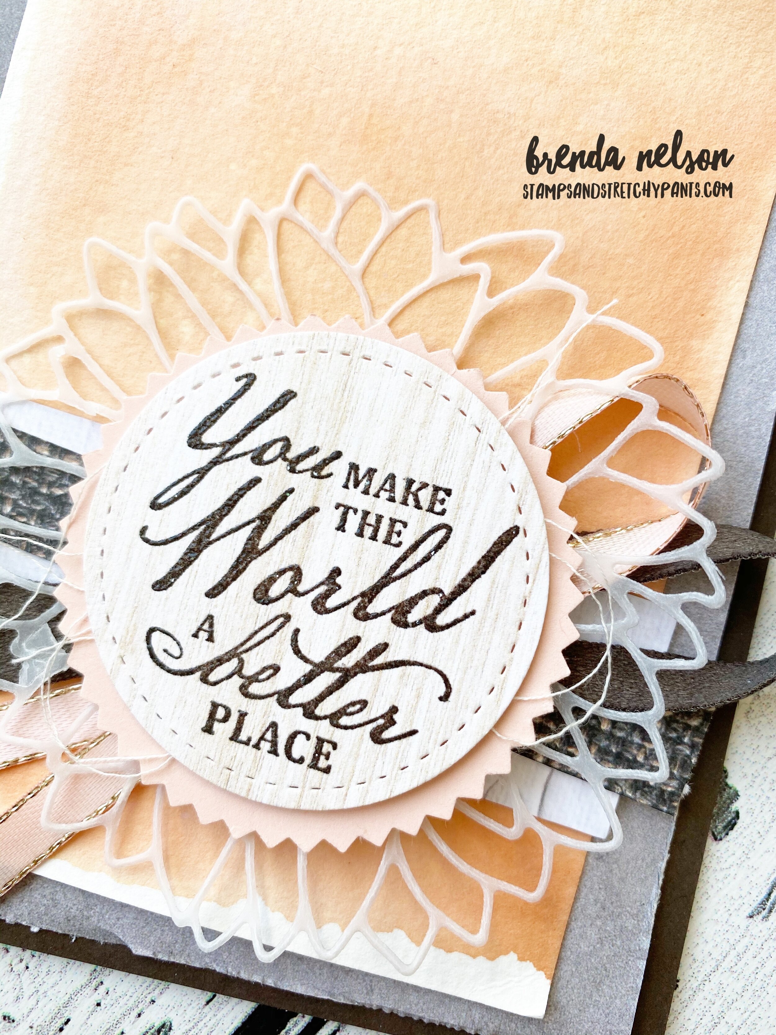
One way I felt I could stay connected to Michelle was to send her cards so that is why I am sharing this #yellowballonproject inspired card with you today. This stamp set is called Above the Clouds and that is where you are Michelle. I know you will continue to shine your light and your love down on us. Thank you for being you.

final.jpg
I will be your friend forever Michelle, I will continue to think of you and strive to approach my challenges in the same way as you, with light and grace. Until we meet again. XOXO

I will be your friend forever Michelle, I will continue to think of you and strive to approach my challenges in the same way as you, with light and grace. Until we meet again. XOXO

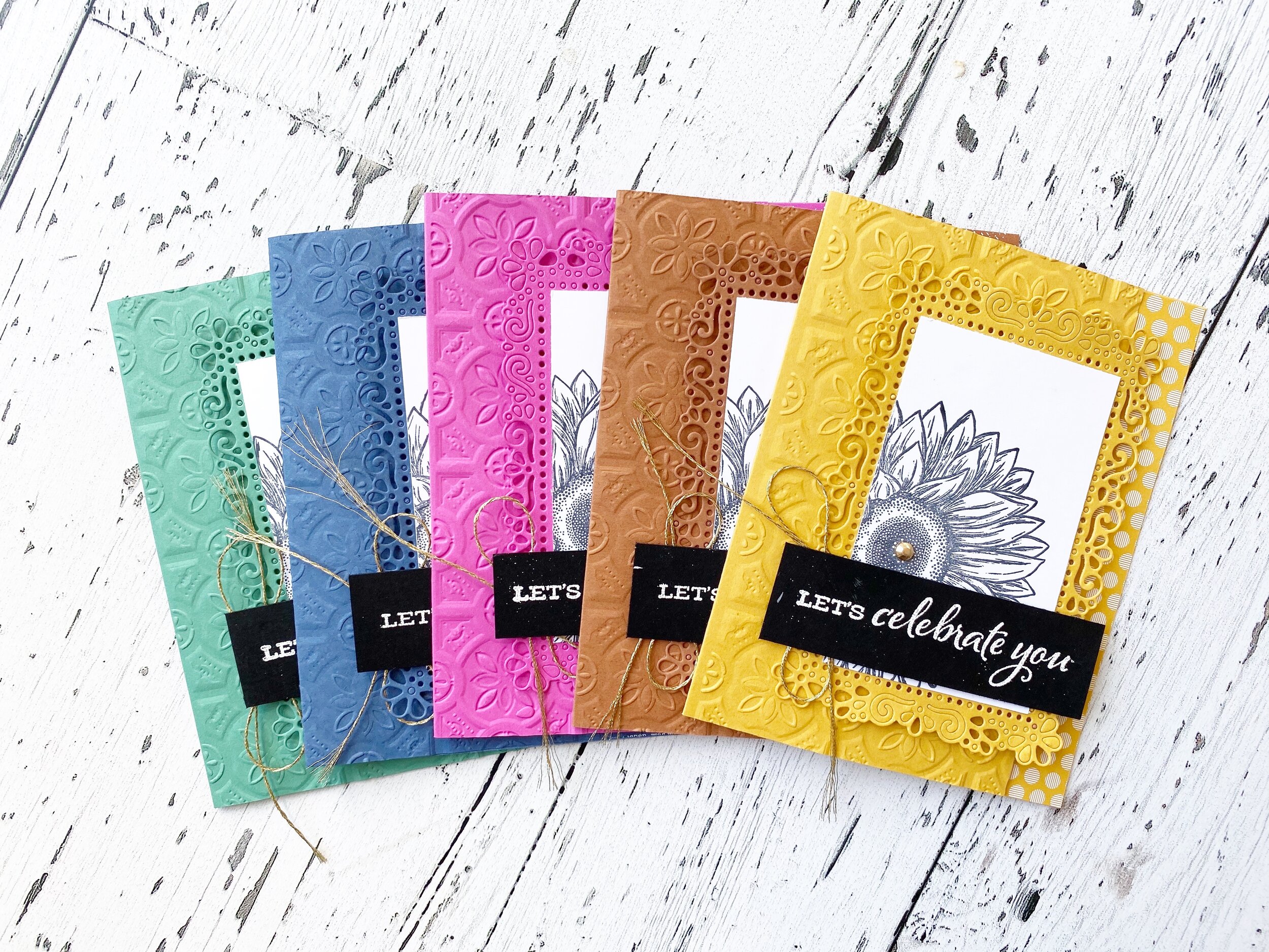
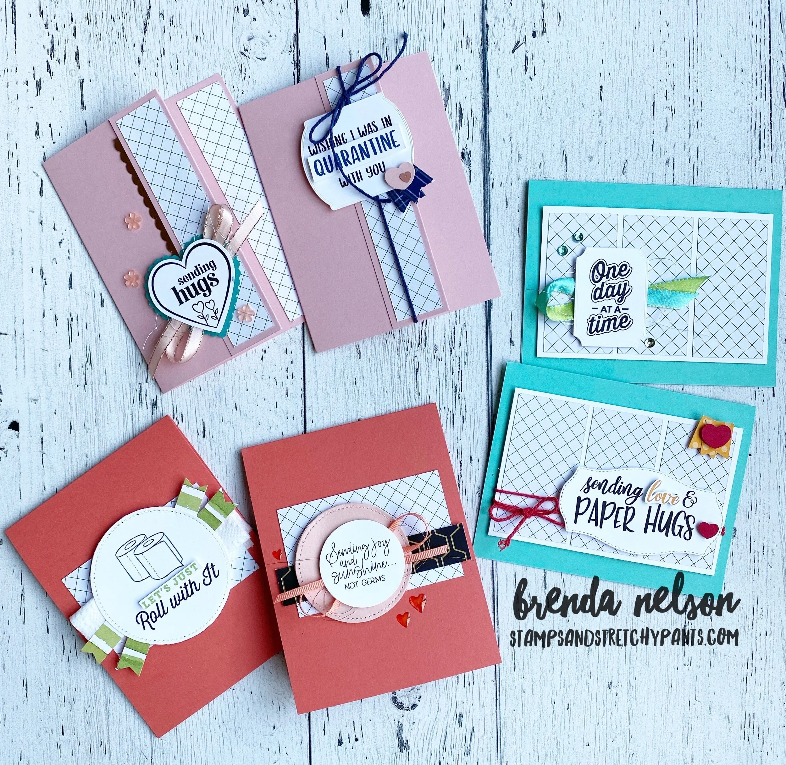
In case you missed any of the projects I shared this month I have collaged them all here! Take a look back through my blog to get more up close photos and the crafty details! It was a challenge for me to create a new card every day and to stretch my design muscles. Looking back I am really proud of all of my stampin’ in May. I am looking forward to a new month with a new catalogue!

E2777CCF-7F88-4104-A249-BCD18FBE35CA.jpg
299A3A6A-A6D8-4FB3-B8D9-A2B9B080F03D.jpg
80B22593-0C5E-450B-AAF4-78FEBDB5A888.jpg
A1E5B265-1C19-4971-93F9-7A88CD5F316B.jpg

Create with Connie and Mary--Favorite NEW product!

This week we are sharing our favourite new PRODUCT from the demonstrator pre-order. I have to say that it is hands down the In Good Taste Designer Series Paper. This paper is unique as its photographic paper, meaning the 12 x 12 pages are actual photographs of different woods, tiles, textiles and fabrics that have such a real deep feel to them. I have been wanting 12x12 wood grain paper for YEARS! I had to resist making a scrapbook page for the hop as I am committed to making 31 different cards this month for my person “A Card a Day in May” challenge. This is my 30th card of the MONTH!

The sentiment is from the Beautiful World stamp set that will be available on June 3rd

The sentiment is from the Beautiful World stamp set that will be available on June 3rd

Image 2020-04-27 at 6.31 PM (1).jpg

The card base is Early Espresso and then I chose a piece of DSP from the collection that looked like concrete to add in a grey tone. I knew I wanted to share an easy water color background technique and a couple more strips of the DSP to show you how easy it is to mix and match these great patterns. The sentiment is stamped on one of the light tone wood grain options in Early Espresso and then I added clear embossing powder on top so it would have a bit of shine. The new Faux Suede Trim is also at the top of my favourites list (I actually have a list on my blog, Brenda’s Top 10 that you can see all the things I am loving in this new catalogue). Follow the link here to see my list:

Brenda's Top 10

And of course I think its obvious from some of my other posts this month that I love the Sunflowers Dies so I found a way to add that onto this card too by pairing it with some vellum.

Here is a really easy way to color your water color paper. Cut a piece of watercolor (or shimmery white) paper to fit your card. Choose an acrylic block that is slightly bigger in size. I used Block E. You will need an ink pad and a water spritzer. Spritz the water color paper. Press the ink pad onto the block to ink it up. Lightly sprite the block and press it onto the watercolor paper. The trick is to let it SIT and absorb the ink. I usually let it sit there for a couple of minutes. When you remove it you get an awesome easy water color background!

Look how great this light pink watercolor background looks!

Look how great this light pink watercolor background looks!

I can’t wait to see what the other girls are loving this week! Hop back to see Melissa’s favourite new product and forward to see Connie’s!

Let's Celebrate YOU

I decided to create not one but FIVE cards that highlight our new In Color collection. I have given little sneak peeks of the colors and now I present to you a fun way to create a card collection. It is also nice to have these on display or to share at your in person classes so that people can see first hand how rich and delightful these colors are.

Once again I used the new catalogue for design inspiration and created these cards. It has been a challenge because we don’t have the new ink pads to work with, so using black and white as the work arounds has been a great option.

The card bases feature the Tin Tile 3D embossing folder. The card is cut to your standards size 5 1/2 x 4 1/4 however I trimmed 1 inch off of the front panel to have a peekaboo strip of DSP show through along the side. This was a great way to add in the coordinating DSP and showcase the new designs in the 6x6 stack. I used the Ornate Layers Dies in the same card stock color as the front panel and cut a layer of Whisper White for the top. I stamped the large sunflower with Staz On from the Celebrate Sunflowers stamp set. It was important to have a large image that could pop in just black ink on this piece. The sentiment is from the same stamp set stamped and embossed with white on Basic Black card stock. I added a little oversized bow behind the sentiments with the gold metallic trim from the Forever Greenery Trim Combo Pack.

 
fullsizeoutput_11d30.jpeg
I added a gilded gem to the center of each sunflower too for a little something extra!

I added a gilded gem to the center of each sunflower too for a little something extra!

Each different card showcases a little strip of the new 6x6 DSP stack, it is a great way to showcase these new patterns.

Each different card showcases a little strip of the new 6x6 DSP stack, it is a great way to showcase these new patterns.

Notice that all of the little bits are not out of the Ornate Layers Dies? Sometimes I embrace that, after all these cards were made by hand not on a machine!

Notice that all of the little bits are not out of the Ornate Layers Dies? Sometimes I embrace that, after all these cards were made by hand not on a machine!

I think the woodgrain pattern in the new 6x6 collections is my favourite!

I think the woodgrain pattern in the new 6x6 collections is my favourite!

final.jpg
 

Color POP!

I just love how BRIGHT and fun this card is! It is an awesome card to share with your team and customers to give them a sampling of our five incredible new In Colors! This is my 28th card for my “A Card a Day in May” challenge!

The colors are Magenta Madness, Bumblebee, Just Jade, Misty Moonlight, Cinnamon Cider. I was inspired to make this card by one in the upcoming new catalogue! It is a great source of inspiration!

I added in strips of designer series paper and card stock to create interest and variety. I used strips from the 6x6 Designer Series Paper and 6x6 Flowers for Every Season Designer Series paper.

And because we don’t have access to the new ink pads yet I stamped my sentiment in Versamark with embossed with clear embossing powder. Just Saying Hello is from the Tasteful Touches stamp set. The floral image is stamped with Staz On from the Ornate Style stamp set. A little bit of ribbon, Whisper White Crinkled Seam Binding and Magenta Madness 1/4 ribbon completed this card!

final.jpg

Share Sunshine

I recently downloaded and printed the Share Sunshine PDF which is an amazing product created by Stampin’ Up! to support two global charities during the Covid-19 pandemic. The last I heard we have raised over $200.000, isn’t that amazing? If you have not downloaded this template yet I definitely suggest it. It is so well organized! It lists the colors used for each graphic and suggestions of punches or dies that coordinate. They have taken all of the guess work out! And because its a Digital download you can print yourself as many copies as you need for all of your projects! You will need to download this by June 2nd.

Download now

I decided to pair the Share Sunshine PDF with Shannon West and Julie Davison’s Double Wonder Technique. You can find the template at www.juliedavison.com

One half of 12x12 DSP will create 6 cards using three different templates.I used the Golden Honey Specialty Designer Series Paper. I chose this paper because it is black and white (I wish Stampin’ Up! always had a black and white DSP option!) and it would coordinate with any thing. The Share Sunshine download prints each sentiment in a black and white version so I knew I wanted to use that and then build the color with my card bases and embellishments.

final.jpg
final.jpg
 
The template is the same on these two cards but they have a different feel because of the sentiments and embellishments!

The template is the same on these two cards but they have a different feel because of the sentiments and embellishments!

I used the Calypso Coral blends to color the Heart Apoxy Droplets

I used the Calypso Coral blends to color the Heart Apoxy Droplets

I thought the sentiment on this card was the perfect opportunity to have some fun and add a rolled up square of toilet paper underneath! I used it in place of ribbon!

I thought the sentiment on this card was the perfect opportunity to have some fun and add a rolled up square of toilet paper underneath! I used it in place of ribbon!

 
These two cards are a fun fold option that I just elevated with fun embellishments.

These two cards are a fun fold option that I just elevated with fun embellishments.

final.jpg