Create with Connie and Mary-Christmas Flowers!

Welcome back to another great week of blog hopping with the Create with Connie and Mary crew! This week we are featuring Christmas Flowers, which is pretty much synonymous with poinsettia’s, don’t you think? Luckily for us Stampin’ Up! crafters we have the amazing Poinsettia Place suite to use!

Design Team.png
 

I knew immediately that I had to create something with this fantastic suite as it has everything. Two amazing designer papers, Beaded Pearls and Red Sheer ribbon plus the most amazing die set that cuts and embosses! LOVE LOVE LOVE!

fullsizeoutput_137c8.jpeg

To create this page I started with a 12x12 base of Old Olive. I added a strip of the designer paper along the side and photo mat of Very Vanilla. I will admit, its been a while since I pulled that neutral out. I typically head straight for Whisper White but this particular pattern in the DSP had vanilla flowers so I went with it!

I stamped two different poinsettia sizes on the background of my page in Old Olive Ink.

I knew I wanted to create a large poinsettia flower with the dies and Very Vanilla card stock. I decided to flick my Wink of Stella pen over top for a little extra shimmer before I added the Beaded Pearl to the center. I love how it turned out.

The DSP strip actually has three different shades of green, Old Olive, Shaded Spruce and Pear Pizzaz which gave me a few options for adding in other colors.


Look at the amazing detail you get from these dies. I love that you can cut and add in the embossed detail at the SAME TIME. Or you can simply cut out the shape.

And the Beaded Pearls, so great in person!

I wanted to play off of the gold accents in this suite so I stamped the sentiment, Happy Holidays, in gold ink and embossed with gold embossing powder. I added in the little sprig from the die set by cutting it from Gold Foil paper.

final.jpg
final.jpg

I decided to add in a phrase from another stamp set, Warm Hugs, as it was a great size to punch with a circle punch and layer with a bit of Soft Suede. The leaves beside it are stamped on Pear Pizzaz card stock in Old Olive ink.

I added a few mini poinsettia flowers up at top of the page to carry that Very Vanilla color across the page.

For me this page came together in a snap and I think you could reproduce it with any type of flower that you have in your collection. I hope you are inspired and if you live in Canada you can shop with me by using my Hostess Code (found on my side bar) or by visiting my online store!

I can’t wait to see what the rest of the gals have created this week! You can go BACK and visit Melissa if you are just starting here or you can go NEXT and see what Connie has designed!


Around the World on Wednesday--Textures!

Welcome to another Around the World on Wednesday blog hop! These blog hops are a fantastic way for me to feel connected to those around me in the Stampin’ world because we have not had a very usual year. It would be easy to think of all the things we have missed out on, but I am choosing to focus on all the things that have actually been fantastic so far this year and this blog hop is one of them! From the stellar line up of stamping talent to the awesome and unique themes that Angie has developed for us, you are guaranteed to be inspired and feel connected to other stampers!

91442295_10216484369808661_2887014979863576576_n.jpg
final.jpg
 

I wanted to create a scrapbook page that has a variety of texture on it and showcase some of the fun ways we can achieve it with our Stampin’ supplies.

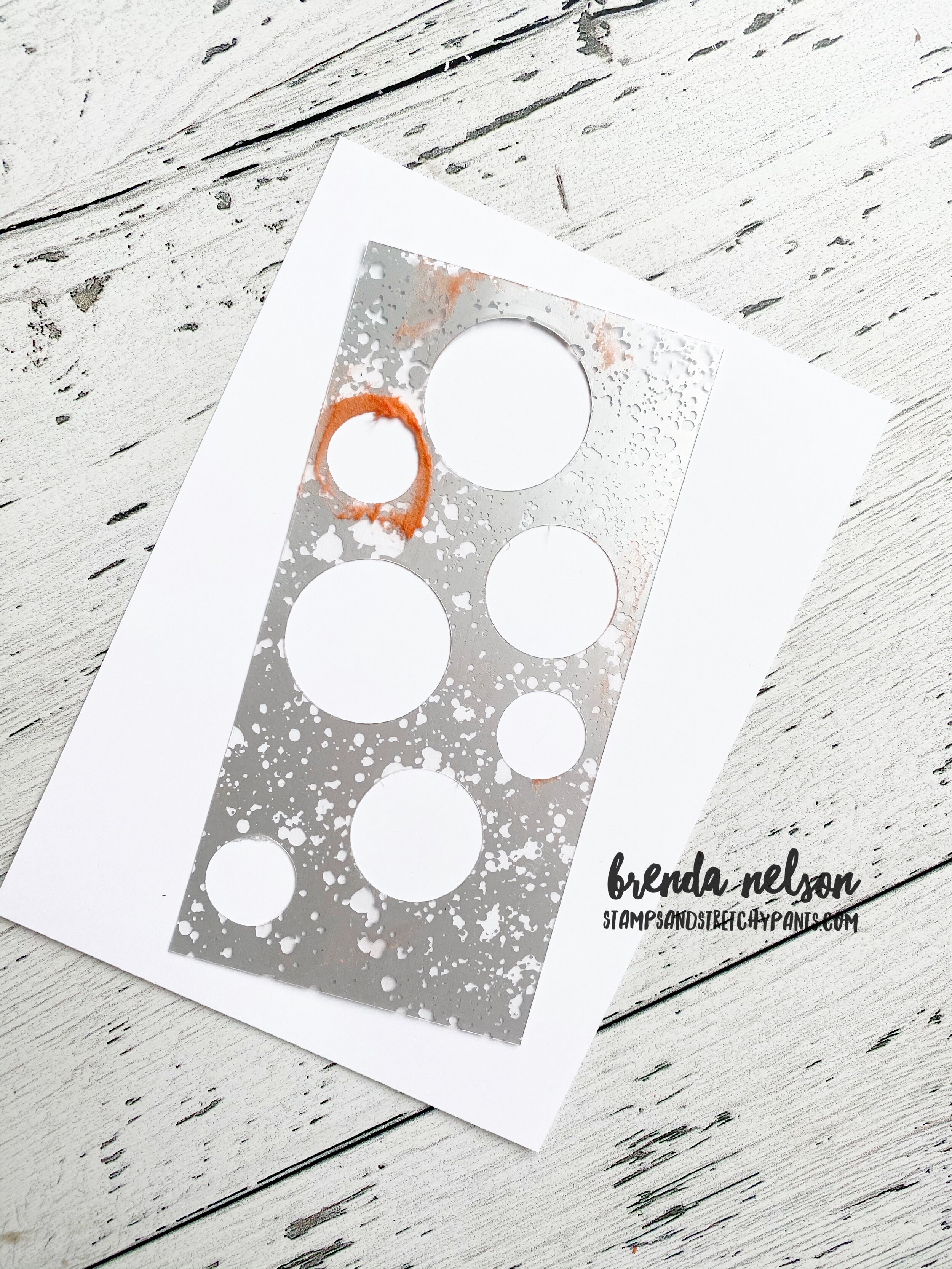
My first idea was to create a custom stencil using our Window Sheets so I could use some embossing paste.

Well, seems that I didn’t have any Window Sheets! So I decided to use some retired Mercury Glass Acetate paper instead! Sometimes you have to be resourceful!


I used the circle dies and a small 3/4 circle punch to make this custom stencil. I placed it over top of my Whisper White 12x12 base and ran some Embossing Paste over top that I had mixed with a couple of drops of Calypso Coral Re-Inker.

When I was using the spatula to cover the circles I tried not to focus on getting the circles perfectly smooth. I thought that would also help created some texture on the page.

final.jpg
I tinted my embossing paste with re-inker and mixed it in an empty embellishment container! I never throw those containers away as I find I can always repurpose them for something!

I tinted my embossing paste with re-inker and mixed it in an empty embellishment container! I never throw those containers away as I find I can always repurpose them for something!

I am in love with the color palette for my page today! I used Calypso Coral, Bumbleebee, Just Jade and Pool Party for this cozy page. I think these colors look so fantastic together no matter the time of year!


final.jpg

Another great way to showcase texture is to use our embossing folders. I chose to use the Winter Snow Embossing Folder and I wanted to add in some snowflake imagery to this page. I continued with that theme by using the So Many Snowflakes Dies. Both items are from the Snowflake Splendor Suite in the Handmade for You catalogue. The snowflakes and the sprig are cut from Shimmery White card stock to add a little dazzle.

You can find the sentiment “Eat, Drink and Be Cozy” in the Warm Hugs stamp set and the worlds cutest to go coffee cup is from the Press On stamp set.

The big white sprig is from the Beautiful Boughs dies in the main catalogue and is a carry over set from last holiday season.

final.jpg

I stamped the phrase “Its the Most Wonderful Time of Year” on Just Jade card stock and punched it with the Label Me Fancy punch and added some Gingham Bumblebee ribbon behind. Another way I created texture was by adding in some of the In Color Enamel dots in Just Jade and Bumblebee in select areas on the page.

I really hope you are inspired to pull out your embossing paste or add it to your next order! It is a really fun product to play around with an experiment! You can always shop with me if you are Canada! You can use the hostess code on my side bar or visit my online store!


Man's Best Friend

Recently a dear friend of mine lost her beloved dog after many years of being a beloved family member. She asked me to create a scrapbook page in his memory.

She asked me to use the Playing with Patterns Designer Series paper and the new Playful Pets stamp set. I decided to add in a retired set, Happy Tails, into the design too because it has some really special elements. I also borrowed the phrase “We’re the Best of friends” from the Bird Ballad stamp set.

final.jpg

I chose the color palette of Misty Moonlight, Seaside Spray, and Crushed Curry but you could easily reproduce this page with more feminine colors using the same 6x6 stack (Purple Posy and Calypso Coral).

I cut a large heart using the Stitched Be Mine dies to be the focal point of where Jake’s name was to go. This could also be customizable too. I added lots of stamped hearts and paw prints. This page is an eclectic mix of new products, older favourites and retired stamp sets. Some sets you just can’t part with!


A few different ribbons helped create this focal area. I used the Bumblebee Gingham ribbon, the blue from the Playing with Patterns Ribbon Combo pack and some silver twine I had laying around.

I really loved the sentiment “ A Best Friend” and it worked perfectly right above the Seaside Spray heart.

final.jpg

I actually loved how this turned out so much that I decided to turn it into a card too. Do you ever do that? I often do when I create something I love.

final.jpg

To create the card, I kept many of the same elements as the scrapbook page, but decided to stamp and color with Stampin’ Blends the cute dog from the Pampered Pets stamp set in Smoky Slate with a Crushed Curry collar to coordinate. I kept the ribbons and added in a couple embellshments from the Frosted & Clear Epoxy Droplets collection.

I hope both of these projects inspire you today and I am blessed my friend asked me to create such a meaningful memento.


Around the World on Wednesday--The World Around Us!

I really think this is a unique and interesting theme…the world around us! I mean one can go in so many directions. When I think of the world around me, I reflect on something that I do a lot of and I came up with drink lattes and take selfies :)

So I wanted to design a page that reflects my coffee loving selfies! I still have to print pictures, which I will admit is highly unusual for me. I almost always have my picture when I design a page!

91442295_10216484369808661_2887014979863576576_n.jpg
When I think of coffee I think of brown tones so I started off with Early Espresso as my base for my photos and then I decided to add a girly feel by using Rococo Rose as my page base with accents of Pretty Peacock. Its sort of a unique color combo …

When I think of coffee I think of brown tones so I started off with Early Espresso as my base for my photos and then I decided to add a girly feel by using Rococo Rose as my page base with accents of Pretty Peacock. Its sort of a unique color combo but I think it totally works with my coffee loving theme!


We have so many awesome stamp sets to support this super fun theme! I started with the Press On stamp set as the to go coffee cup is just the best and the coffee beans make terrific background filler.

Of course I had to use the little coffee cup from the Warm Hugs stamp set as a background accent too.

I chose fun and cheeky phrases to describe my love of a good latte!

final 95.JPG

If you take time to search through your stamp sets, you might be surprised in the different ways you use them. Take the “Lucky Me” sentiment, it is from the Game on stamp set. And really, sometimes I do feel that way about me coffee :)

I cut the word Coffee using the Playful Alphabet dies and beside its added the phrase “Life is better with you” from the Many Mates stamp set. Who else can relate to feeling this way about your morning coffee? Ha ha ha!


One of the key things I do when I am creating scrapbook pages is create little areas to convey the ‘theme’ of my page. I often say “its all in the details”! You can look at these spaces as little card fronts if you are starting to transition from ca…

One of the key things I do when I am creating scrapbook pages is create little areas to convey the ‘theme’ of my page. I often say “its all in the details”! You can look at these spaces as little card fronts if you are starting to transition from card making to scrapbooking.

I added a circle of coordinating DSP, used a fun punch, plus a couple different embellishments.


The Nothings Better Than stamp set was another ‘must use’ stamp set in creating these fun pages. I had to stamp the ‘coffee’ stamp in the background!

I found the “I like you a latte’ in the Christmas set, Warm Hugs! And used the dies from the bundle to create a fun layer with some of the Faux Suede ribbon.

The Crumb Cake scallop border under the photo mat is from the Peony dies.

final 99.JPG
I just love this little corner! Because its true, ADULTING IS HARD! My kids have no idea how great they have it, hahaha!

I just love this little corner! Because its true, ADULTING IS HARD! My kids have no idea how great they have it, hahaha!

I really hope you enjoyed my take on our theme, The World Around Us! I can’t to see what the other gals in the hop have created, so make sure you visit everyone and please feel free to leave a comment!

Tricia Butts from the United States is next up on the hop, click below to get to her creation!


Joy of Sets--Harvest Time!

Welcome to the Joy of Sets monthly blog hop! So happy to have you hopping along with us checking out all of our “Harvest Time” themed projects! This month I knew I wanted to create a scrapbook page. We have some beautiful wheat sheaves dies that I knew I wanted to incorporate.

81259502_10215727473486726_1409492916610531328_o.jpg
final.jpg

I started with a base of Crushed Curry because I saw that color represented in the field in front of us and I accented our photo with Seaside Spray because I picked up that tone in the sky. While our outfits have grey, I also feel that Seaside Spray has a grey undertone to the blue. I don’t always match my pages to the colors in my photos but it worked out so beautifully this time.

This picture was taken about 4 years ago and my kids have just changed so much! I can hardly believe it and I am so thankful that I have made memory keeping a priority in my life.

I took the theme of “Harvest Time” literally as I added the word right into my main title. The term harvest immediately made me think of wheat sheaves and I wanted to highlight them on my page in the Crushed Curry and golden tones.

final.jpg

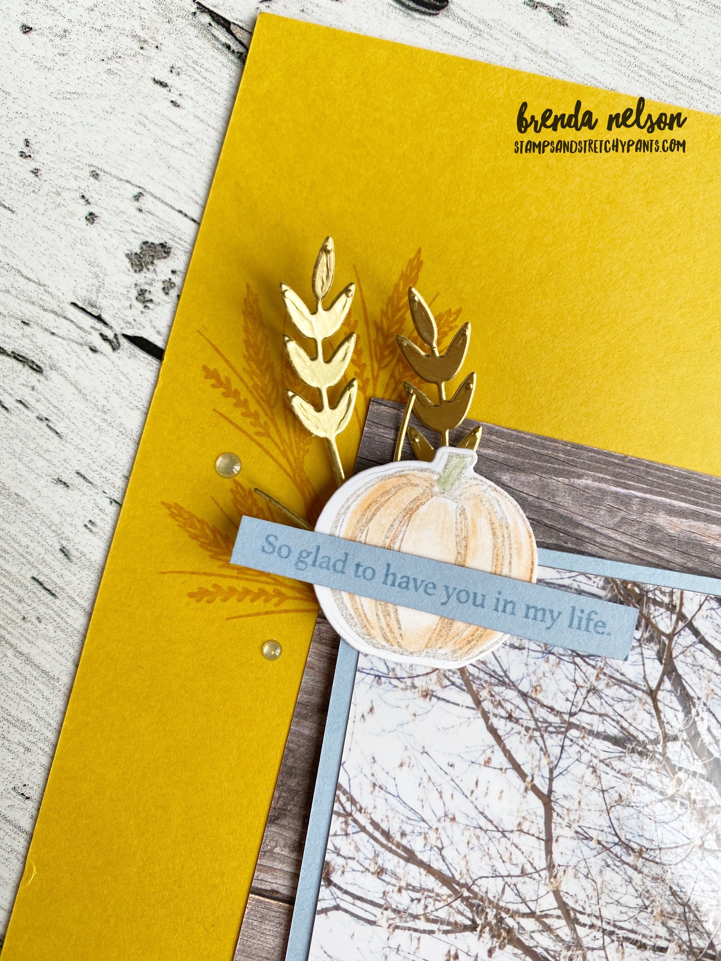
The Gather Together stamp set was a perfect fit for my design as it has a wheat sheaves image in the set and a cute little pumpkin.

The die cut wheat sheaves are from the Autumn Essentials dies. I have really gotten my value out of this die set. If you go back through some of my posts you will see how many times I have utilized it.

I cut the word “harvest” using the Playful Alphabet dies (another MUST HAVE) out of Soft Suede card stock and stamped them with the little collection of ‘spots’ that was also in the Gather Together stamp set. And of course I used the Foam Adhesive sheets with my letters. The word also pops because it is partially layered on a strip of DSP from the In Color 6x6 stack.

The log slice image is from the classic Rooted in Nature stamp set found in the annual catalogue. I cut it by hand. The words ‘happy’ and ‘blessings’ are from the Country Home stamp set, they are a part of single stamp that says “Happy Harvest Blessings”.

The pumpkin is stamped in Grey Granite and coloured with our water color pencils in Pumpkin Pie and Old Olive. I wanted the pumpkins to be subtle which is why I coloured them with the water color pencils.

final.jpg

My photo is also layered on a large piece of DSP from the Taste of Good DSP stack. I LOVE this paper, I would definitely recommend investing in it.

The sentiment “So glad to have you in my life” is from the Gather Together stamp set. I finished off the page with a few Gold Glitter Enamel Dots!


I really love how this page turned out. It has all the feels of fall and harvest and when I look at the photo I have so many wonderful memories of having these pictures taken with my In Laws. And I especially love my youngest sons hand on his chest as he had a piece of gum in his pocket he was allowed to have after the pictures. Haha. I love that he is making sure its still there!

I hope you enjoy all of the projects that everyone shares this month!

You can keep going NEXT to see the fabulous Angie Mackenzie!

final.jpg