Color Fusers November 2021

Hello friends! Wow, did October ever go by quickly! Its now November 1st and officially Christmas season. Fall and halloween are dead, bring on the holiday! Although that is NOT what I am sharing with you today! Our color combo this month could be viewed as a tricky one as the 4 tones are all quick dark, however I had the best pictures to work with this color theme!

IMG_3964.jpg

This month our crafty group is creating projects with Merry Merlot, Misty Moonlight, Cinnamon Cider and Early Espresso. Back in July I had a Besties Photo shoot with two of my long time friends and we did a little picnic afterwards. The picnic set up totally reminded me of Misty Moonlight and a pattern from the In Good Taste Designer Series stack so I used that as my inspiration to design this page.

These are two of my besties I met while in University! We hit things off working at a restaurant together.  We have actually not all lived in the same city for over 20 years but despite the distance I know they would have my back always and no matter what #friendsforever

These are two of my besties I met while in University! We hit things off working at a restaurant together. We have actually not all lived in the same city for over 20 years but despite the distance I know they would have my back always and no matter what #friendsforever

I started with a 12x12 in Misty Moonlight and on the top half of the page I stamped the large flowers from the Blossoms in Bloom stamp set. I actually love this stamp set as I love a good image that can fill in space. I stamped it in the same ink color for a tone on tone look.

The bottom of my page features the In Good Taste DSP with a couple of strips of Cinnamon Cider DSP from the retired In Color 6x6 stacks (last years design). Adding this strip felt like a natural way to incorporate this color and create division between the two sections of my page.

Are you an F Bomb kind of mom? Hahaha, we are and my friend had these cups designed especially for us!

Are you an F Bomb kind of mom? Hahaha, we are and my friend had these cups designed especially for us!


I used Early Espresso card stock as my photo mats and I ran them both through the Timber 3D Embossing Folder for a subtle effect.

It was easy to add in Merry Merlot by die cutting some flowers from the Pierced Blooms Dies. This is one of my favorite die sets in the Annual Catalogue!

I added some retired In Color Enamel Dots and the sentiment is from the Blossoms in Bloom stamp set.

final (4).jpg

You can find the sentiment “Friends Forever” in the Lighthearted Lines stamp set. NOTE: Friends Forever is part of a phrase and l used my Paper Snips to do some Stampin’ surgery on this rubber stamp as I really wanted to use this part of the phrase all on its own.

The label is also a die from the Pierced Blooms Dies and I added a bit of retired Cinnamon Cider ribbon behind and some gold thread.

final (1) 3.jpg

I am so pleased with how this page turned out using this color combination! I cannot wait to see what the other girls create this month! Please visit everyone’s blogs and share some love and comments! And if you don’t follow me on Instagram you can find me @stampwithbrenda

You can go backwards to see what Melissa has created and forwards to see what Melanie has designed! I know they will both wow you with their creativity!

Have an awesome November and see you next month! If you live in Canada and are looking for some creative inspiration I would love you to stamp with me! Please reach out at any time!

Happy Haunting!

Hello friends! I offer 3 different scrapbook classes each month so of course for October we had to make some spooky layouts! I wanted to share one with you today that is a little more traditional Halloween than my pink and gold pumpkin page!

final.jpg

The base of this page is Pear PIzzazz and when I think of this color I picture the Wicked Witch of the West from the Wizard of Oz! Hahaha! I love how a color can evoke certain memories!

In a few select spots on the background I stamped some bats from the Sparkle of the Season stamp set in Pear Pizzazz ink.

Happy Haunting is from the Banner Year stamp set and is on a label found in the Pretty Pillow Box Dies. When you go through your dies you never know what you might find! Behind the sentiment I layered some Linen Thread and some of the Black & White Gingham ribbon! I just love that ribbon!


The Trick or Treat area is actually my favorite on the page as I incorporated ‘October’ from the Days to Remember stamp set is a really unique and subtle way that I love.

I die cut a label from the Seasonal Labels Dies and I ran it through a retired spiderweb folder, I just can’t part with it! Behind it I added a spooky black wreath from the Seasonal Swirls Dies.

The pumpkin is die cut using the Detailed Pumpkins Dies and I brought the sentiment to life by stamping mini spiderwebs on it (from the Banner Year stamp set) and adding some Black Glittered Organdy Ribbon.

final.jpg

Because I am obsessed with the spider web from the Frightful Tags Dies I had to add it onto this page too with a little “Happy Halloween” found in the Sparkle of the Season stamp set.

I added some Cute Halloween elements too—Trick or Treat and the little strip of DSP! And by having two placed to add photos I can snap two Halloween selfies!

If this page has inspired you at all, please reach out to me to see how you can join in my scrapbook classes! They are my absolute favorite and I am always excited to stamp with new friends!

You can message me at stampsandstretchypants@gmail.com

Pink Pumpkins and Golden Webs!

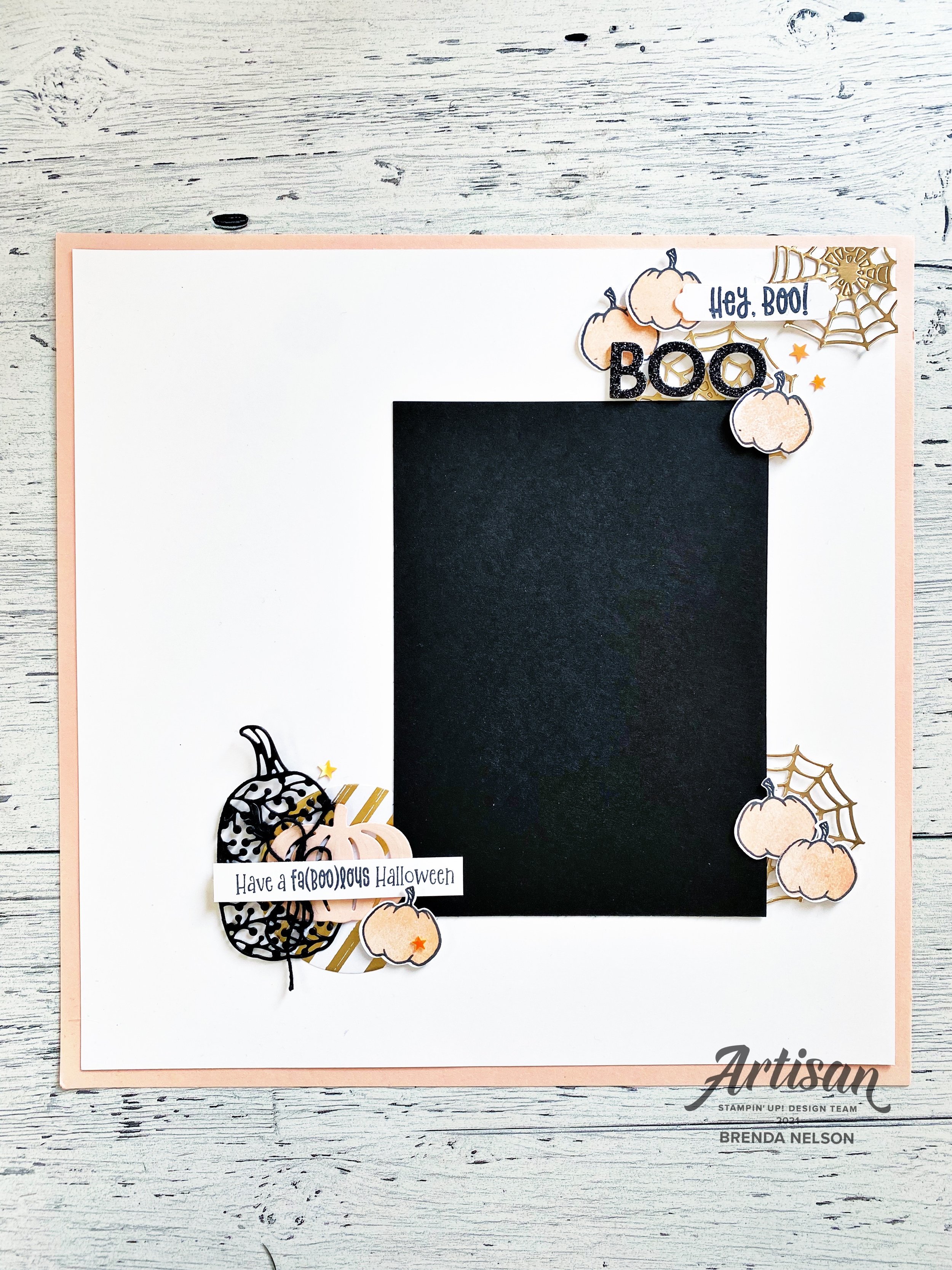
Here is a Halloween scrapbook page with a twist! Who doesn’t love the sophisticated colors of pink and gold? I decided to use them here for a unique color palette for this scrapbook page!

final (4) 6.jpg

I started with a base of Petal Pink card stock in 12x12 and added a layer of Basic White over top. There is actually no background stamping on this page, which is a little unusual for me! I let amazing dies do all the work to bring this page to life!

I used the stamp set Cutest Halloween for my pink pumpkins and the sentiments “Hey Boo” and “Have a fab(boo)lous Halloween”. I thought they were the perfect sentiments for this page.


I love this fun little area or vignette on the top right of my page. I used the Brushed Metallic Cardstock and the Frightful Tags Dies to cut out the spider webs and I love that they are incomplete webs—meaning you don’t see a full web.

Hey Boo! is cut using one of the label dies from the Seasonal Labels Dies.

Boo is cut from our Black Glitter Paper, Foam Adhesive Sheets and the Playful Alphabet Dies.

I also added a few of the Cute Stars Adhesive-Backed Sequins as an extra fun embellishment!

final (5) 4.jpg

The pumpkin outline is stamped with Momento Ink and filled in with the Petal Pink ink. You can punch these out using the coordinating Halloween Punch! One is added flat to the page and the other two are elevated with Dimensionals. I think this whole little area has so much texture and interest to it!

final (1) 16.jpg

For this bottom left little vignette I wanted the feel of an elegant pumpkin patch. I started with a large circle but from the Expressions in Ink Designer Series Paper and layered pumpkins from the Detailed Pumpkins Dies in Basic Black and Petal Pink. Of course you want to tie in elements on your page together so I used another stamped pumpkin and some of the Cute Stars embellishments again.

The sentiment also has some black twine from the Bakers Twine Essentials Pack behind it as well. Have you noticed I love me some twine?

final (4) 6.jpg

I hope this page inspires you to create a scrapbook page with colors that you don’t normally associate with Halloween! I absolutely LOVE how it turned out and I can’t wait to add a picture to this page after this years festivities!

If my design has inspired you, please consider shopping with me if you live in Canada! I would love to keep doing what I love!

Around the World on Wednesday --Changing Seasons

The changing of seasons really is my favorite time of year! I love all of the colors that nature blesses us with, not to mention the gorgeous projects we can complete with all of our Stampin’ Up! products! For this month Around the World on Wednesday Hop, our theme is ‘changing seasons’. I created this fabulous scrapbook layout with some of my favorite things!

91442295_10216484369808661_2887014979863576576_n.jpg

I hope you enjoy this hop as you visit some amazing talented crafters from around the world. I love how everyone interprets our monthly themes! I know you will be inspired!

I love to scrapbook, especially anything to do with fall. When the leaves start to turn its absolutely gorgeous in Alberta as in many places in the world. These pictures are from 3 years ago already! I can’t believe how much my kids have changed in that time frame! Which is why I am so blessed to be able to capture our memories in a more permanent way.

final (12) 4.jpg

I started with a base of Rich Razzleberry and added some depth with my Blending Brushes and Blackberry Bliss ink. I also flicked my dark Black Stampin’ Blend marker over the blended area for another bit of texture. This is the easiest way to add interest to your backgrounds!

I focused on two die sets for this layout—Harvest Dies and the Beautiful Leaves Dies. Both of these dies have amazing images or shapes that don’t require any stamping! You can just simply cut them out to add as embellishments to your design.

The Blackberry Beauty DSP was the color inspiration for my page as I used both Rich Razzleberry and Blackberry Bliss, Cinnamon Cider, Kraft paper, Gold Shimmer Vellum and Very Vanilla as my colors, with the sentiments all stamped in Soft Suede.

final (9) 4.jpg

For the left hand side of my scrapbook page (yes, I actually design left to right!) I added two strips of the amazing Blackberry Beauty DSP—this specialty paper has gold foil inlaid in the design. It is so rich and luscious! My photo matte is Very Vanilla and I love to have the strips and my photo offset. Nothing is square!

I cut the large leaf shape from the Beautiful Leaves Dies out of Blackberry cardstock and then cut it vertically in half. This allowed me to use some on top left and bottom right corner of my photomat. Because our eyes move left to right I tend to have a little vignette at the top of the left and at the bottom of the right on this page of my double spread.

The two thistle shapes are cut from the Kraft 6x6 stack and the wheat is cut from the Gold Shimmer Vellum! I love to layer all of these shapes together to form a bouquet of sorts!

The sentiment “Enjoy the Little Things” Is from a retired stamp set, but its the perfect phrase and size so it is one that I still keep hanging around! The other phrase on this page, “Love is What Makes us Family” is from Lovely You. I love the mix of fonts in this stamp set!

final (10) 5.jpg

On the right hand side of my scrapbook layout, I wanted to be able to include two 4x6 photos. The photo mats are Soft Suede and once again nothing is square. These pages are actually two pages that my Scrapbook Group members made this month as well. I find be eliminating things being perfect, hence adding things on an angle, it takes away the stress of having to have everything perfectly aligned! Because my eye was just on the bottom right corner of my previous page, it kept the eye moving across to this page by having a vignette in the bottom left and then naturally up at the top right. These are aspects I consider when designing my scrapbook pages. I hope this is a helpful tip!

Many of the same elements are also carried through on this page, however I did add a couple small individual leaves from the Beautiful Leaves Die cut from the Kraft paper. Both pages have some Champagne Rhinestones, they coordinate so beautifully with this suite!

“You make the ordinary extraordinary” is from the Simply Succulents stamp set and “Love You More” is from Measure of Love.

I love how these pages turned out! If you live in Canada and are interested in scrapbooking, please reach out to me!

Now onto the HOP! You can keep hoping to Tricia Butts an amazing crafter from the United States!


Color Fusers--July 2021 Blog Hop

Hello friends! I really appreciate you taking the time to pop by and enjoy our Color Fusers Blog Hop! I love color challenges as they help stretch my creativity! This month’s color challenge is amazing and I am so excited with the project I designed using Basic White, Basic Black, Petal Pink and Gold!

IMG_9468.jpg

When I was mentally toying around with this color palette, I had the idea to create something with stripes. I ended up including them but on the diagonal to create a focal point for my scrapbook page!

I also chose this particular picture because my mom and daughter are wearing black and white and call me crazy, but my photos have to coordinate somewhat with my page designs. In fact I hardly EVER create a page without my pictures first. I can make exceptions for specific holidays, like Father’s or Mother’s Day, but typically I always chose my picture first!

I also chose this particular picture because my mom and daughter are wearing black and white and call me crazy, but my photos have to coordinate somewhat with my page designs. In fact I hardly EVER create a page without my pictures first. I can make exceptions for specific holidays, like Father’s or Mother’s Day, but typically I always chose my picture first!

I decided to start off with a Basic White background for my scrapbook page and I added a spray of black using my Stampin’ Blends marker. I flicked the Blend across my page where I was intending to add in some flowers.

The flowers are from the Blossoms in Bloom stamp set and are stamped in Petal PInk. I pinched up the edges to give them a little more interest and depth. This page is quite minimalist for me but I am so happy with how it turned out!

final (22).jpg

The best part of this whole page is this 4 x 10 diagonal panel that I created to bring in the Basic Black, Petal Pink and Gold colors of this challenge. I cut a separate piece of Basic White card stock to 4 x 10. I then covered it with Tombow Glue—I think this is key, because there is wiggle time with this glue to get things perfect unlike Stampin’ Seal. I added in my strips which are 1 1/4 wide. Once I had them in place, I flipped over the Basic White and trimmed off the excess to create this fun panel.

The sentiment “Love is What Makes Us Family” is from the stamp set Lovely You.

I also added in a few Gilded Gems for a little extra pop of gold.

final (21).jpg

The sentiment “I like you a lot” is from the Blossoms in Bloom stamp set.

I cannot wait to see what the others in the Hop create with this color combo. If I am your first stop make sure you Hop all the way around and leave a comment! If you live in Canada you can shop with me using my Hostess Code or visiting my online store :)

You can go back to see what amazing project Melanie has created by clicking below,

To see what my fellow Artisan Design Team member Tami has designed please click below

Thank you so much and hope you all have an amazing JULY! Happy Stamping!