Create with Connie and Mary--Blue Bayou!

This week the Design Team has been tasked with the theme of Blue Bayou or ‘shades of blue’. I actually love how many ‘blue’ options that Stampin’ Up! currently has available for us to craft with. Any guesses how many ‘blue’ tones we have? I will share the answer at the end of my post!

21DesignTeamBadge.png

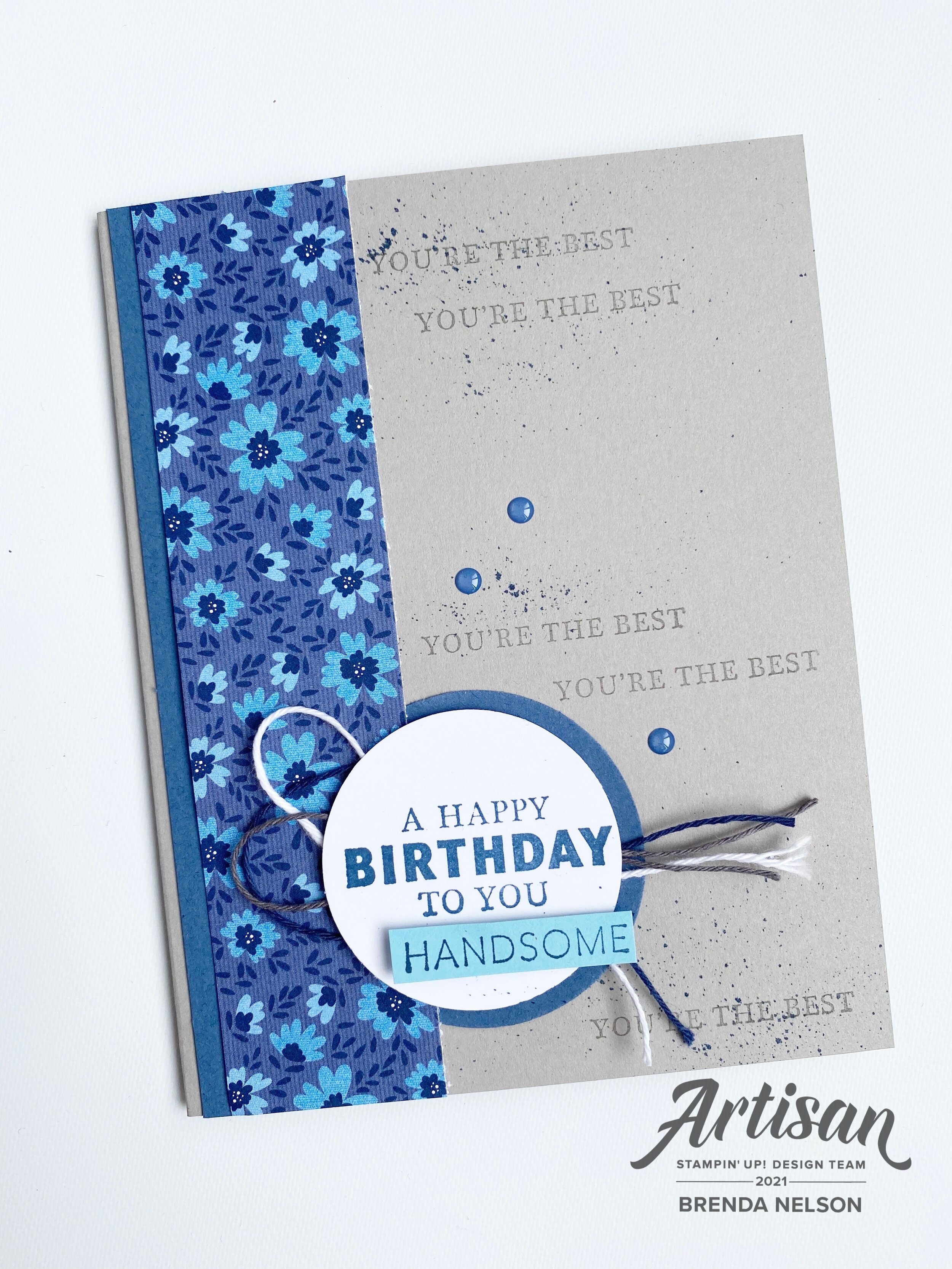
I decided to combine some of our ‘blue' colors with Smoky Slate as we have some really fantastic DSP right now that I wanted to incorporate and it blends these colors together. I also had not played with the Well Suited Suite so this design challenge felt like the perfect time to play!

final 11.jpg

I wanted this Well Suited DSP to be the stand out on this card which is why I did not make the card base ‘blue’. All of the blues in this strip of DSP have a grey base to them (in my opinion) and I wanted to pull that color in as well so that some of the fun elements would pop.

I added in another blue by using Misty Moonlight as my accent blue—you can see it along the strip of card stock tucked behind the DSP and the circle that is tucked behind the sentiment. The sentiment is also stamped in Misty Moonlight and I added the word ‘handsome’ to the sentiment by trimming this word from the large Father’s Day phrase in the stamp set. Handsome is stamped on Balmy Blue to add a little brightness to the card and play off the DSP.

I love how we can customize any of our projects by trimming specific words out and isolating them. It opens up a world of possibilities!

I added some MIsty Moonlight In Color Enamel Dots to the base after flicking my Misty Moonlight marker across the back and I used both of the Well Suited Twines and the Basic White Twine from the Snail Mail suite as well to accentuate my sentiment.

final 11.jpg
 

This card also has all of the components of #goodcarddesign that I have been sharing lately on my Instagram @stampwithbrenda (go give me a follow) and on my blog.

You can easily recreate this card using any of our DSP, stamp sets and embellishments. Watch for a future post with some #goodcarddesign samples!

And if you were wondering how many ‘shades of blue’ that Stampin’ Up! offers—I count 8!

I hope you have a lovely Saturday! Thank you so much for hoping by and if you want to go BACK you can see what Melissa has designed and if you click NEXT you can see what Connie has created for us!

Create with Connie and Mary-Meet the Team!

Hello friends! I have been a part of the Create with Connie and Mary Design Team for a while now and its been such a fun experience for me! I personally love the weekly creative challenges as they do get me out of my comfort zone and using up stamps and supplies that I may not have been using!

21DesignTeamBadge.png

I love everything about this card, especially because it really highlights #goodcarddesign a topic that I have recently begun working on with my team to help them develop crafting confidence. I touched on this topic last week so I really encourage you to go back and read this post! You will also find several other card examples following this same "#goodcarddesign as this strawberry card.

I do believe that every good card has 5 design elements and if we create a card that uses them it is a lot easier to create future projects using the same #goodcarddesign. This allows us to save time and also show others how you can create something similar with different stamps, paper and embellishments, because that is what it’s all about right?

final (1) 6.jpg

I used the Sweet Strawberry bundle and I am so happy its a bundle carrying forward in our new upcoming catalogue! I stamped some of the little flowers on the background using Blushing Bride ink to create that tone on tone stamping. I added three strips of Designer Series Paper from the Playing with Patterns collection. They are 3/4 x 3 each. I also like the fact that they are offset from each other too as it gives are more whimsical feeling to this project.

A Blushing Bride Scallop Circle is cut from the Layering Circles Dies. I added a white circle over top and ran it through the Greenery Embossing Folder for a little bit of texture. In between the circles I added some Basic White twine from the Snail Mail Twine Combo.

The strawberry is stamped in Poppy Parade ink and I thought the little ladybug embellishment was the perfect little touch. The strawberry stem and sentiment are stamped in Soft Seafoam ink.

I hope this project inspires you to get stamping today!

I hope this project inspires you to get stamping today!

Thank you so much for checking out my blog today! I share with the Design Team every Saturday so please remember to check back in every week!

You can head back to the main Create with Connie and Mary page by clicking “Next”!

Etched in Nature--Card Inspiration for On Tour!

Yesterday my team and I participated in some virtual training provided by Stampin’ Up!. They are hosting sessions over the course of a week to demonstrators all over the world which is really exciting. As part of our event registration, we were given the stamp set Etched in Nature and I decided to use this set as part of my team’s Afterparty event that I hosted virtually.

It is always more fun to stamp together and even better when we all have the same stamp set to use. I designed 3 Make’n Takes to work on with my team. Now, I will be totally honest, this stamp set was not a style I would normally gravitate towards so it was a pretty good challenge for me to create cards that had a design and a feel that I loved. However, playing with the NEW In Colors, some ribbon and embellishments and the new Hand Penned Designer Series Paper made this a much easier project than I was anticipating!

final (1) 5.jpg

I think these cards look fabulous as a trio and all have a really unique feel to them as individual projects. By designing them with the same color palette and using the Hand Penned DSP as the anchor, they work as a group. This stamp set doesn’t have coordinating dies or punches so I had to pull in a couple favorite options to help accentuate the design.

final (2) 4.jpg

The base of this card is the new Pale Papaya. This is a really interesting color for me as it leans yellow and it leans orange based on the colors that you pair it with. This color is one featured in the Hand Penned DSP. I punched out a circle that highlighted the color. This swatch also allowed me to pull in coordinating colors such as the Mint Macaron and Misty Moonlight circles. Both of the card stock circles are stamped with images in Momento Ink from the Etched in Nature stamp set.

I added a die cut sprig in Basic White from the Forever Flourishing Die set to add to that natural feel. Thank You is also stamped in Momento Ink and behind the sentiment I added some of the Pale Papaya Open Weave Ribbon and Basic White Thread. A few Matte Black Dots finished off this card perfectly!

This next card is an example of #goodcarddesign and was a feature project design of our team meeting. I briefly touched on this topic on a previous blog post and I will be adding to my #goodcarddesign concept with more examples later this week—so make sure you check back if you are interested in this concept!

final (4) 5.jpg

The base of this card is the new Soft Succulent color and its just such a warm green with a nice grey undertone to it. It definitely has a ‘neutral’ feel to it and I can imagine it pairing so well with our other 50+ colors!

I added a scallop detail in Misty Moonlight along the edge using the Peony Die and layed a strip of DSP from the Hand Penned collection. I did a bit of background stamping and stamped the sentiment out twice so I could pop up and isolate the word Happy Moments.

Between the two circles I added some of the Soft Succulent Open Weave Ribbon and some Basic White twine. A few Opal Rounds to add some glitz to this card was the perfect touch.

final (6) 3.jpg

The final card in this trio is on a crisp Basic White card stock base. I added a middle panel that I ran through the Tasteful Textile 3D folder and added two strips of DSP from the Hand Penned Collection.

I wanted to focus on the butterflies from the stamp set on this project. Underneath the sentiment, stamped on Pale Papaya, I added a little strip of Polished Pink as scallop accent using the Stitched Be MIne Dies. The ribbon is amazing—I LOVE IT! It is the new Pale Papaya & White 1/2 Ribbon. A few In Color Jewels just finished things off perfectly!

Overall, I really really love how these cards turned out and believe that you can recreate them with ANY stamp set you might have that combines images and sentiments!

final 9.jpg

Create with Connie and Mary-Yellow Submarine Theme!

Hello friends! Thank you for checking in this week! This week our design theme was ‘Yellow Submarine’ and I decided to create a project that features the many yellow colors that Stampin’ Up! makes. This is actually a great card design to feature any of our colors, especially our upcoming new In Colors, so you might see this design again in the future!

21DesignTeamBadge.png
final (4) 4.jpg

I started my card on a Basic White base and added a layer with a stitched star die cut. I love stars and I am happy these dies are carrying forward.

Behind this die cut is where I added strips of all the yellow colors that Stampin’ Up! makes! I started with So Saffron, then Daffodil Delight, Bumblebee, Crushed Curry and Mango Melody. Now the Mango might be controversial (is it yellow or is it orange?) but in this configuration I think that it works.

final (1) 4.jpg

The sentiment is from the Pierced Blooms stamp set and is stamped in Bumblebee ink on So Saffron card stock. I added two ribbons behind—Bumblebee Gingham and Daffodil Delight Ruched Ribbon. And a few Artistry Blooms Sequins and voila! A fun sunny yellow card!

I can’t wait to see what the other Design Team members come up using this theme. You can go BACK to see what Melissa has made and NEXT to see what Connie has created! Please feel free to comment or use my Hostess Code if you live in Canada for any of your ordering needs.

Color Fusers--April 2021 Blog Hop!

Welcome friends to another monthly Color Fusers Blog Hop! I love this hop because it really gets me out of comfort zone for color coordination!

This month we are all tasked with creating projects featuring Seaside Spray (which is also retiring), Old Olive and Real Red. I wanted to challenge myself to use these colors to create a scrapbook page!

colorfuserapril.jpg

By chance, I happened to have this photo of my youngest son, laying on my craft table. As soon as I glanced at it and saw our color challenge, I thought it was a perfect fit!

final (8).jpg

It worked so well to use the Real Red for apples with Old Olive green accents and a nice Seaside Spray background. I am really going to miss Seaside Spray. I was a blue that I used quite often. However, the new In Colors are also pretty fabulous too!

I added some large polka dots in the coordinating ink onto the background with the Circle Celebration stamp set. The photo mat is made up of a retired piece of 6x6 DSP in Seaside Spray (from the first round of this In Color), Old Olive and Real Red card stock.


I used the stamp Harvest Hello’s to do most of the design work for me on this page. I stamped the apples in Momento Ink and colored them with my Real Red Stampin’ Blends. You can punch out all of the elements of the apple with the coordinating Apple Builder Punch!

I love this stamp set and it will be a keeper for me, especially because I am nowhere near being done scrapbooking school memories of my 3 kids.

final (9).jpg

I added in the A+ and some Old Olive ribbon from the Ornate Garden Ribbon Combo Pack and a few cute red Resin Hearts to create a fun focal point on the corner of my photo. I love how I was able to tuck a cute little apple up underneath the photo too.

One of my favorite sets from this catalogue was Ridiculously Awesome. I can’t tell you how many times i have used it! It is such a fantastic set to use for scrapbooking!

final (4) 3.jpg

I stamped the phrase in Seaside Spray and then again in Old Olive so I could hand trim out the word ‘Awesome’. I really wanted it to pop and this is an easy way to draw the eye to a certain word out of your sentiment.

Of course I added a few more apples and Resin Hearts!

final+%281%29+3.jpg
 

I created another area of interest on the top left by adding in “You Make me Smile” and another A+, plus a couple different twines and Resin Hearts.

final (8).jpg

I love how this page turned out and am so happy I have this memory recorded of Shepard. This color challenge worked perfectly for me!

I can’t wait to see what everyone else on the Design Team creates this month! You won’t want to miss what anyone has designed. You can go back to see what Tami Hewlett has created or next to see what Melissa Kerman has stamped for us. Make sure to visit everyone, we are a small awesome group!

Please feel free to leave a comment and if you are in Canada and would like to order any of the supplies I used, please use Hostess Code on the side bar!