Create with Connie and Mary--St. Patrick's Day!

Welcome to another Create with Connie and Mary blog hop! This week we are all sharing projects with St. Patrick’s Day in mind. Now you might think that Stampin’ Up! doesn’t have a lot to offer to support this theme but I think you will be pleasantly surprised with what we have created for you.

I just love our new spring imagery! This is something that Connie designs for us! She is one talented lady!

I just love our new spring imagery! This is something that Connie designs for us! She is one talented lady!

final (5) 2.jpg

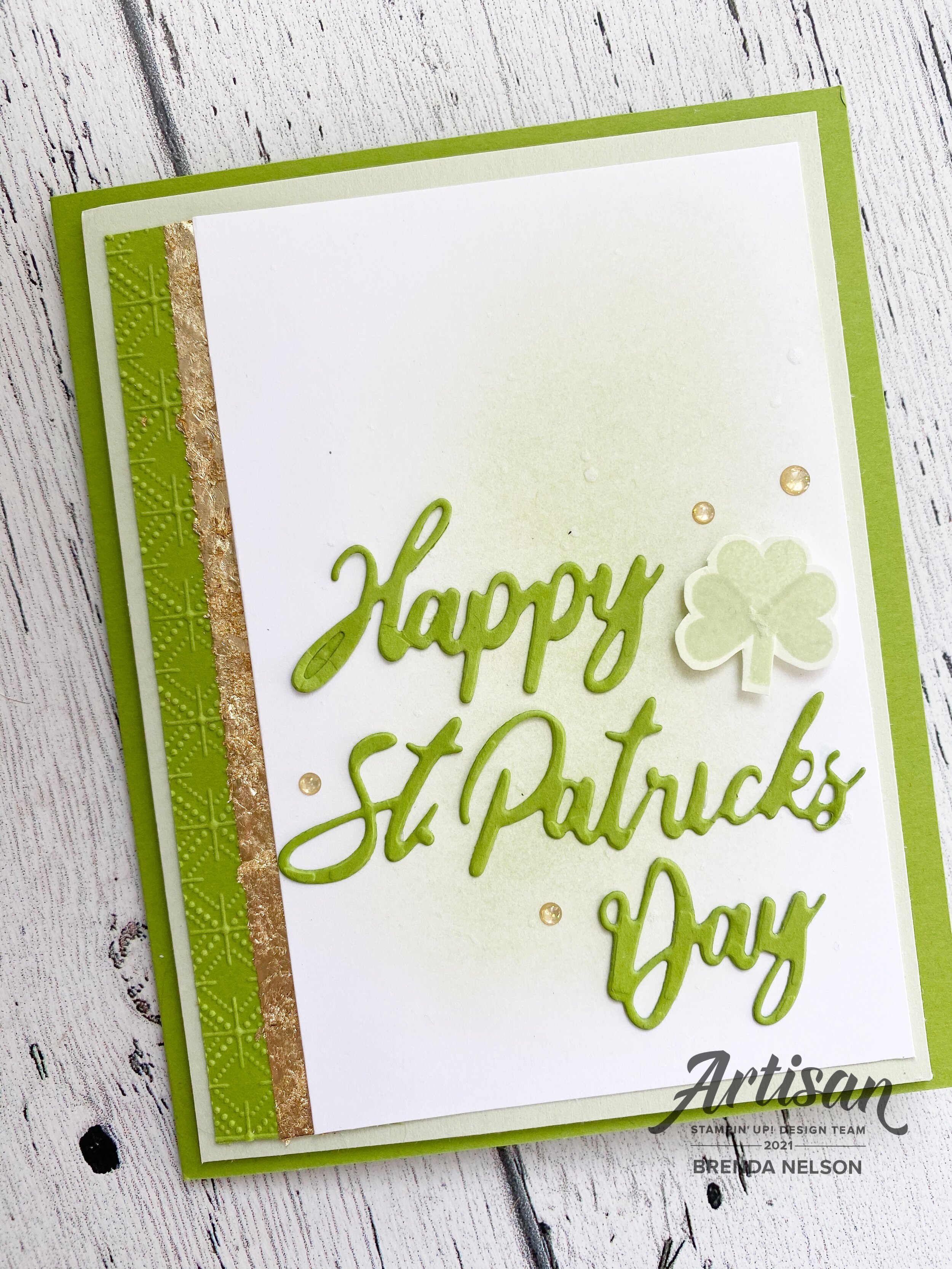
Did you know that we sell dies that have Happy St. Patrick’s Day as an option? It is actually one of the die sets that I like to suggest to new stampers because it has a lot of holiday options. It is called Word Wishes and can be found in the Annual Catalogue.

final (1) 25.jpg

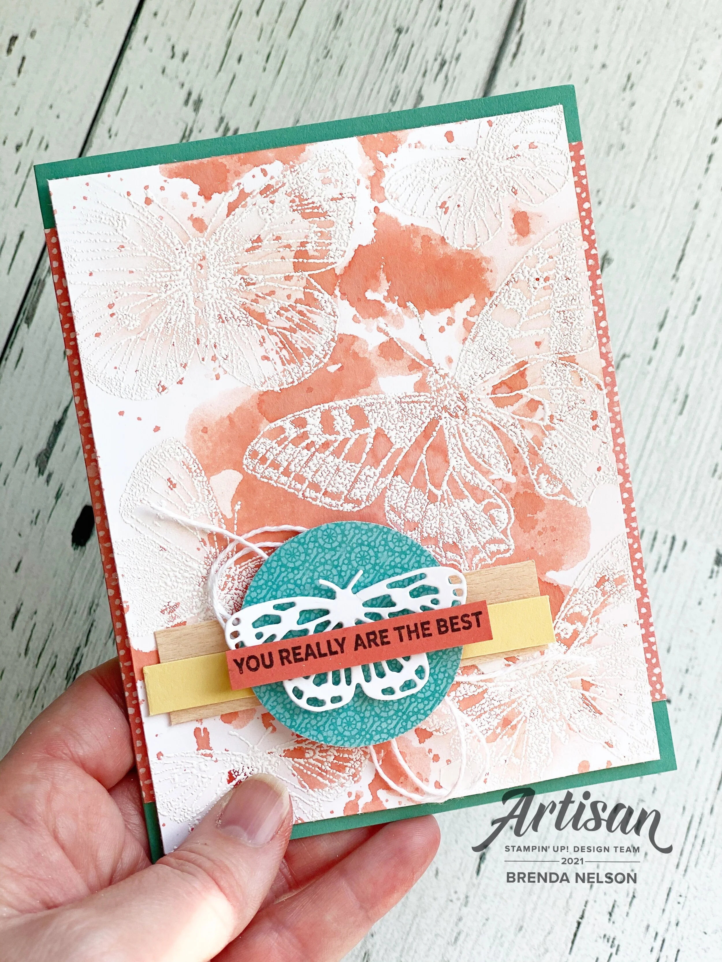
I actually only used a few supplies to create ths card—-but there is some stamping! I began by lightly blending the background with Soft Seafoam ink and our amazing new Blending Brushes. I then flicked my Wink of Stella pen across the background to give it a fun shimmer. I die cut the sentiment in Granny Apple Green which is also the base of my card.

This initial layer is also on Soft Seafoam. I liked the idea of blending our softest green with our brightest green.

I wanted to add a shamrock because its synonymous with the holiday so I made my own with a small heart from the Lots of Heart stamp set and a Stampin’ Write marker for the stem! I hand trimmed it and added it by my sentiment with a Mini Dimensional.

final (10) 2.jpg
 

Gold is also an awesome accent for this theme so I added in some of the Gold Glitter Enamel Dots around the sentiment.

I wanted a little bit of detail along the edge of my card so I embossed a strip of Granny Apple Green card stock in the Dainty Diamonds 3D folder. Using my Tear’n Tape adhesive, I ran it the length of the card stock and pressed it into the Gilded Leafing embellishment for that amazing gold pop.

final (9) 2.jpg

I hope you enjoyed my card project, I had alot of fun designing it and I know the other girls with also inspire you with their creations! Please feel free to leave a comment and if you are in Canada you can shop with me anytime by using my Hostess Code shared on my main page!

Easy Watercolor with the Butterfly Brilliance Bundle

Hello friends! I am always looking for an easy way to create a fantastic background, especially if it can be watercolored! I decided to pair up this easy watercoloring technique with the new Butterfly Brilliance Bundle! It is an awesome bundle with a stamp set and coordinating dies that is an early release product from Stampin’ Up!

final (1) 22.jpg

I started with a base of Just Jade card stock and added two little strips of DSP from the Butterfly Bijou collection. This 6x6 stack of paper is only available this month! So it is a fun exclusive offering!

I order to do water coloring I would suggest using Shimmery White, which is what I used on my card, or water color paper. Shimmery White is a little more cost effective if you are planning to make a bunch of cards and it is thicker than Basic White so it allows more water to be used on the card base.

The Stamparatus will be your best friends with this large stamp! You can use the stamp on the plate either attached to the base or separate like I did here.

The Stamparatus will be your best friends with this large stamp! You can use the stamp on the plate either attached to the base or separate like I did here.

To start creating my background I began by inking of the stamp with White Craft ink and stamping it on my Shimmery White card stock. I added white embossing powder on top and heat set it.

This step helps create an ‘ink resist’ technique as the water coloring will not take where the butterflies are stamped.

This step helps create an ‘ink resist’ technique as the water coloring will not take where the butterflies are stamped.

I cut a piece of our Window Sheets to the same size of my card base. You can also use one of our cello bags too if you do not have access to a Window Sheet.

Choose an ink refill of your choice, I decided on Calypso Coral for this project. You will also need a water mister and a water painter. The water painter just helps spread the ink around on the window sheet if you need to.

final (1) 20.jpg
 

Start by adding a drop of ink onto the window sheet. You will then spritz some water on top and if you need to use the water painter to move the inky water around to cover a larger surface area on the window sheet.


Once you have your window sheet ready you are going to take our butterfly shimmery white card stock layer and flip it over so that the stamped side is going to touch the inky window sheet.

I tapped my paper around using my fingers to press the paper into the ink in different spots. I did not just lay this shimmery white piece on top.

The idea behind this method is that you only want the inky water to touch your paper in select spots.

Each background will be unique and different!

final (1) 21.jpg
I just think this looks so cool and I love how every single piece will look different! And to clean the window sheet when you are done just. grab a tissue or baby wipe! Easy peesy!

I just think this looks so cool and I love how every single piece will look different! And to clean the window sheet when you are done just. grab a tissue or baby wipe! Easy peesy!

final+36.jpg

To finish off the front of my card I added a small piece of the Natural Touch specialty paper and a small strip of So Saffron card stock over top. I punched a circle from the Butterfly Bijou DSP and I cut a white butterfly from the dies.

The sentiment is from the In Bloom stamp set and is trimmed down by hand from its original form.

I really love this technique and I hope you are willing to give it a try!

Color Fusers-March 2021 Blog Hop

Welcome to the Color Fusers March Blog Hop! We have sort of a masculine color combo to work with this month but I put a bit of a girly spin on these colors—Seaside Spray, Grey Granite and Early Espresso!

03_2021 Graphic (1).jpg

I knew that I wanted to use Early Espresso as my base and to create some extra texture to the cards I decided to add some strips of Early Espresso card stock in 3/4 inch widths across the base of the cards. It almost looks like panelling! I have been watching a lot of HGTV lately so maybe that is what influenced me! ha ha ha!

final 13.jpg

I cut a Basic White Stitched Rectangle to use as my focal point on the card. Using my Blending Brush (new favorite tool alert!) I added a bit of Grey Granite to the base and flicked my Grey Granite Stampin’ Write Marker over top. I love the look of a good marker spray over your projects!

final 15.jpg
 

The In Bloom bundle was used to embellish the rest of this card. The dies are AAAMAZING! I haven’t even put them away since I got them! I cut a few flowers in Seaside Spray, the stitched detail in the flowers plays into the stitched rectangular layer which I really like.

I added a few small Early Espresso flowers with some Silver Metallic Pearls.

I stamped and hand trimmed a couple of flowers in Grey Granite ink. You might wonder why I didn’t use a die and that is because the stamped images in this set do not have dies. The dies are all independent stitched shapes that coordinate with the stamped images.

The sentiment is from the In Bloom stamp set and is stamped with Early Espresso ink on Grey Granite card stock. I added a strip of the Seaside Spray Metallic Ribbon (found in the annual catalogue) behind it and popped it up on Dimensionals for a little lift.

final+%281%29+2.jpg

Whenever you use a dark card stock color as a base you need to add a lighter layer on the inside so you can write a message. I added in a Basic White base and of course had to do a little stamping. I stamped some little Grey Granite flowers and ‘You Mean so Much to Me’ in Seaside Spray. I added a few more teeny flowers in Early Espresso and a Silver Metallic Pearl to pull all of the outside elements of the card inside.

I can’t wait to see what the other members of the team have created with this color combo! I love to challenge myself with color combos and I hope this Hop inspires you as well!

The fantastic Melanie Hockin is up next so let’s see what she has designed!

If you are starting here you can always go back as well to see what Bonnie O’Neill has designed! I know you will find inspiration all through this hop!

Create with Connie and Mary--Masculine Cards!

I don’t know about you but I always find Masculine Cards the trickiest to design! I was up for the challenge this week and have a special 30th birthday drive by party to attend this weekend, so the timing was great!

Design Team.jpg

I decided to make a card with our rich and elegant Night of Navy card stock as my base and feature. When I think of masculine cards I also think of bold geometric shapes too so I decided to use The Right Triangle dies, and the Whiskey Business stamp set combined.

I love how these stitched triangles look layered together with a bit of tone on tone design! I stamped a couple of the triangles with a print from the Right Triangle Stamp Set in Night of Navy Ink.

I love how these stitched triangles look layered together with a bit of tone on tone design! I stamped a couple of the triangles with a print from the Right Triangle Stamp Set in Night of Navy Ink.

In order to make sure my design came together I actually layed out the dies on my card base before I actually cut anything. This is a great first step in bringing your design idea to life and a way to make sure you are not wasting paper!


After I had my triangle dies set up the way I wanted for my card design I took a picture so that I could reference it once I had all of the triangles cut out of the Night of Navy card stock. This made assembly so easy!

IMG_4074.jpg
This was such a quick and easy card to assemble once I had decided on my design!

This was such a quick and easy card to assemble once I had decided on my design!

The Right Triangle bundle does not have an sentiments so I decided to use “Cheers To You” from the Whiskey Business stamp set. I stamped it in NIght of Navy ink on a piece of Seaside Spray card stock.

I couldn’t resist adding a few embellishments from the Flowers for Every Season Ribbon Pack and the Playing with Patterns Ribbon Combo Pack, plus a few Holiday Rhinestones!

To see what the rest of the Design Team has created, you can go BACK to see Melissa’s creation or NEXT to see what Connie has created for some amazing masculine inspiration!

Artisan Design Team February Share!

Hello friends! I am so excited to share a few more details on my Artisan Design Team projects for February! My focus was on the A Touch of Ink stamp set and the Golden Garden Acetate Specialty Paper. I knew right away that I wanted to use this acetate paper on a scrapbook page and share an easy tip for coloring it.

The design is printed on a thick window sheet or acetate and is gold on one side and silver on the other! You can feature either side by just coloring on the opposite or backside of what you want to feature.

The design is printed on a thick window sheet or acetate and is gold on one side and silver on the other! You can feature either side by just coloring on the opposite or backside of what you want to feature.

The easiest way to color our acetate sheets is to use our alcohol based Stampin’ Blends markers in the DARK option. Some of the alcohol inks depth is lost on the window sheet so I found I had better success using the dark option and then you can layer on a bit of color by adding in a different shade on top like I did on some of the leaves with Old Olive and Mossy Meadow.


You also want to make sure that you peel off the protective layer that is on the silver side of the acetate sheet.

Once you have done this you can start coloring with your Stampin’ Blends.

I also decided to hand trim around the flowers of the 12x12 sheet.

final (14).jpg
closeup.jpg
You can use this easy coloring technique embellish a scrapbook page or a card!

You can use this easy coloring technique embellish a scrapbook page or a card!

IMG_2442.jpg

I used Basic White Note Cards for the two cards that I designed. I added a bit of the Gilded Leafing to both my butterfly on the note card and the hummingbird on my scrapbook page. I also stamped with the Gilded Leafing on the butterfly card and hand trimmed some of the florals from the Fine Art Floral DSP.

On the second note card I colored a strip of the acetate that I had left over from my scrapbook page and added it to a piece of the Fine Art Floral Designer Series Paper.

I hope you are inspired to try coloring the Golden Garden Acetate paper and adding into onto one of your crafty projects! Make sure to check out the whole Artisan Design Teams creations on Stampin’ Up!’s Facebook and Instagram accounts!

IMG_2439.jpg