Flowers for Every Season

I recently had a creative swap challenge with my Team, we needed to pick a suite from the catalogue and create a card project using the elements in that suite. I chose the Flowers for All Seasons Suite (pg 10-11 of Annual Catty) to create with because sadly, I have had all of these supplies and had not used them since I got them in May/June. Who can relate?

I will admit, when a new catalogue is released I go a little crazy ordering everything that inspires me! But there are only so many hours in the day to craft, so sometimes awesome stuff like this product suite sit on my shelf not getting any love!

I did add in a few elements from outside of this suite, the sentiment and the die to cut it out. The sentiment is from Lovely You (pg 22) and the dies are the Tasteful Labels dies (pg 179). I also used the Tasteful Textile 3D embossing folder on the white card front layer.

final 65.JPG

I actually chose a bit of a softer color palette as well for my card than what is showcased in the catalogue as well. I wanted something that felt peaceful and relaxing unlike the bold colors of the suite. I started by choosing the flower collection I liked in the Jar of Flowers stamp set. There are 4 options and I liked this one because it felt the fullest. I chose to color it with some soft Stampin’ Blends in Purple Posy, Highland Heather, Pink Pirouette (retired I know, sad face), Pool Party, Mango Melody and Granny Apple Green. There are no dies with this stamp set, just the cutest jar punch! So you will have to hand cut any of the bloom images.

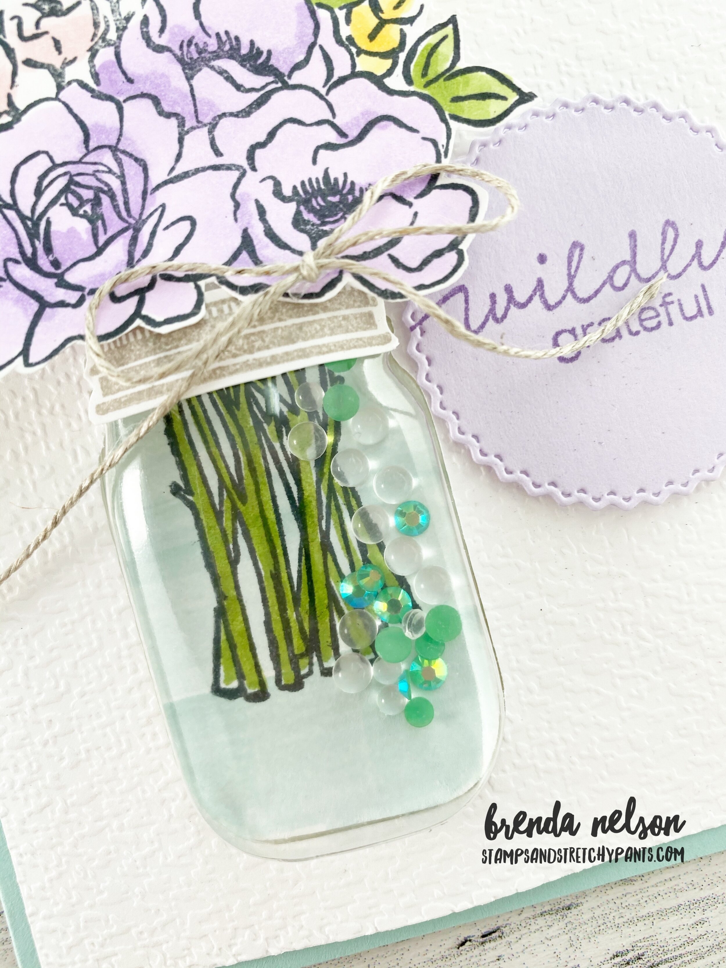
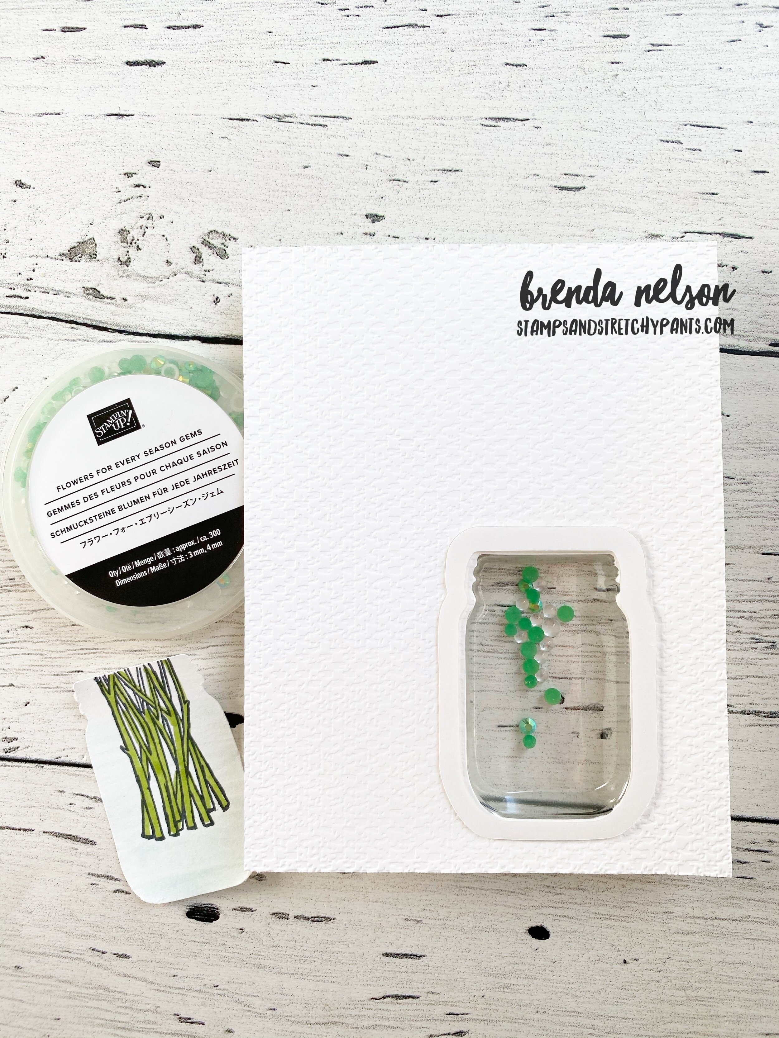
Creating the ‘shaker’ part of this card took a few steps. After I ran the Whisper White card stock through the Tasteful Textiles embossing folder I used the jar punch to create the shaker space. I added in the Mason Jar Shaker Dome (pg 158). I dropped a few of the Flowers for Every Season gems inside the dome. I wanted it to look like there was water in the shaker dome so I used my Water Painter brush and Pool Party ink to swipe some color on scrap white card stock. I then stamped the stems and coloured them with the Granny Apple Green Stampin’ Blends. I punched this out with the Jar Punch and added it into the space created by the dome. Now this will not seal this shaker dome up, you will need to use another piece of scrap paper (3 x 2.5 should do it) to seal this up after you take off the adhesive strip around the shaker dome.

final 66.JPG

I decided to add a few white sprigs from the Sunflowers dies as it helped fill in the flower arrangement. I also had to double stack my Dimensionals on the back of the flowers to get them to sit up high enough to match the Mason Jar dome. The rim of the jar is stamped in Grey Granite and hand cut. I added it on with Glue Dots.

I really really love how these cards turned out, especially because I had to make 14 of them! It was actually a relaxing way to spend my weekend, colouring and fussy cutting!

Joy of Sets--That's FONT-astic!

Thank you so much for hopping along with The Joy of Sets team this month! If I am your first stop, welcome, and have fun seeing all the creative ways we are using FONTS!

81282095_10215727204039990_3298457582506606592_o.jpg

A big thank you Joy of Sets team for such a unique Blog Hop Theme! I had a lot of fun creating my project featuring FONTS and how they can help bring your projects alive. I wanted to create a scrapbook page as it gives you the space to use a variety of FONTS on your project.

On this page I used 5 different fonts, 4 from stamp sets and one from the Playful Alphabet dies! I love the unexpected combo of fonts!

On this page I used 5 different fonts, 4 from stamp sets and one from the Playful Alphabet dies! I love the unexpected combo of fonts!

final 60.JPG

I used the Peony Garden DSP as my color palette and then decided to add in some soft purples to pull in the color from the lilac bush in our picture. I always look at some angle to get my photo to coordinate with the colors of my scrapbooking.

Always is stamped in Smoky Slate using the Field of Flowers stamp set from the Annual Catalogue. Smile is cut in Blushing Bride and is lifted using the Adhesive Sheets. Quite possibly my FAVORITE accessory in the new catalogue, at the moment at least!

I Like You A Lot is also stamped with Smoky Slate ink on Highland Heather card stock. You can find this phrase in the Blossoms in Bloom stamp set. I used a retired scallop boarder punch (gasp, yes, I don’t sell everything! Somethings I love too much to get rid of, even if they are retired!) to highlight the sentiment and paired it on top of the of Label Me Lovely punch that I trimmed down.

The embellishments in the corner are the new Elegant Faceted Gems. Now when you look at them in the catalogue on pg 157, it looks like you get a light green gem, you DON’T—its actually the clear gem appearing that way because of the background it was photographed on. I wanted to point out because I don’t using ‘read’ stuff, I am a visual person!

final 62.JPG

I decided this page was taking on an elegant feel and it needed something to fill the white space but not be distracting at the same time. I ended up using the Basic Patterns Decorative Masks with the Shimmery White embossing paste. I love the feel and texture it gave the page. I added in a small strip a DSP in a Purple Posy pattern to keep the purple flowing down the page. It is from the Playing With Patterns DSP.

Happy Day is from the much overlooked, in my opinion, stamp set called Friend Like You in the annual catalogue. And the accompanying sentiment is from the Forever Blossoms stamp set. This set holds a special place in my heart as it was one of the stamp sets I used when I presented at On Stage in November of 2019.

The Highland Heather die cut flowers are from the Many Layered Blossoms dies in the Annual Catalogue.

I really love how soft and lovely this page turned out and how using a variety of fonts really show cased the photo!

I really love how soft and lovely this page turned out and how using a variety of fonts really show cased the photo!

I hope the next time you sit down to do some memory keeping you consider how mixing up the fonts on your page can add a little twist!

Enjoy making your way around to all 16 Blogs this month! Next up is Alejandra Gomez, I can’ wait to see what she has created for us.


Create with Connie and Mary--Hot Summer Days!

When I think of “Hot Summer Days” I definitely think of ice cream! I hope you enjoying this weeks Create with Connie and Mary Blog Hop theme! Make sure you visit everyone on the Hop!

We have been having some super hot days here in Alberta and I am LOVING every minute of it! And summer ice cream calories don’t count I have decided!

Image+2020-04-27+at+6.31+PM+(1).jpg
final 56.JPG

Have you been following along with my blog regularly? Are you noticing a trend…maybe with the Playing with Patterns Suite? Hahaha, I don’t even notice I am using it half the time! It just seems to work with EVERYTHING! Hopefully I have you hooked on it too and you can use my August Host Code to shop for anything you need!

What is unique about this page, is all of the DSP strips of paper are actually from 6x6 DSP stacks! You would never know though as I strategically hid the seams behind the photos. I used the Playing With Patterns, In Color, Whale of a Time and Flowers for Every Season 6x6 collections. I used my finger nail to soften the edges of the DSP to give it some added texture when I added it to the 12 x 12 Whisper White.


I used a trusty old favourite, the baby wipe technique, to create this soft background. I then used my Water Painter to flick the Coastal Cabana ink all over.

final 54.JPG
I don’t know how you feel about ice cream but I think the sentiments on this page describe my feelings for it perfectly! Hahaha! And my sons expression on his triple scoop ice cream cone is just priceless!

I don’t know how you feel about ice cream but I think the sentiments on this page describe my feelings for it perfectly! Hahaha! And my sons expression on his triple scoop ice cream cone is just priceless!

I used a bunch of different sentiments from three different stamp sets to enhance this page. I used Nothings Better Than, Blossoms in Bloom, and Bloom and Grow. And of course, the Playful Alphabet dies!

I hope you enjoy what the other gals have created this week for you and I hope you are having an awesome summer yourself! You can go back to see what Melissa has created and next to see what Connie has designed!

Create with Connie and Mary--Playing With Patterns ALL DAY LONG

When Connie and Mary shared that our design theme for this week was to feature the Playing with Patterns Suite, I won’t lie, I was pretty excited as it is my favourite suite in the new catalogue! I love the fun colors and its one of the best 6x6 Designer Papers we have ever had (in my humble opinion!). Creating this projected also worked out well because my Avid Stamping group that meets monthly, also made these projects earlier this summer. I love when projects can do double duty!

Image+2020-04-27+at+6.31+PM+(1).jpg
I decided to make three fun and colourful cards with the Playing with Patterns Suite keeping the color palette true to the suite.

I decided to make three fun and colourful cards with the Playing with Patterns Suite keeping the color palette true to the suite.

When I make cards that all coordinate, whether its the same bundle, suite or stamp set, I do like to present them with coordinating packaging.  I think its a great touch and makes giving the collection as a gift super easy as even envelopes are incl…

When I make cards that all coordinate, whether its the same bundle, suite or stamp set, I do like to present them with coordinating packaging. I think its a great touch and makes giving the collection as a gift super easy as even envelopes are included. I still LOVE our Acetate boxes that are in the catalogue, don’t forget about them because they are not ‘new’.

The stamped envelopes that coordinate with each card are seriously just the cutest.  I love getting mail (especially when its not bills) and having these show up in my mailbox would really brighten my day.

The stamped envelopes that coordinate with each card are seriously just the cutest. I love getting mail (especially when its not bills) and having these show up in my mailbox would really brighten my day.

final.jpg

The first card I created was this fun shaker option as I had not made one in quite a while. I started with a Night of Navy card base and stamped the stripes in the same color ink on the background (p.s I love that this stamp from the Pattern Play stamp set fits the width of the card!). I used a circle die to cut out the window/shaker component and then stamped some hearts in opposing corners in Calypso Coral with an added marker flick (to take away a bit of the white). The Adhesive Strips were perfect for bending around the circle on the back of the card. I then used the Confetti Flowers Border punch to punch out a selection of flowers in the coordinating colors. I added in some sequins from the Woven Threads as some extra filler.

I cut the Coastal Cabana DSP from the Playing with Patterns 6x6 stack to 3 1/4 x 3 1/4 and secured it to the Adhesive strips to enclose everything and create the shaker.

HI was cut using the awesome Playful Alphabet Dies (a serious MUST HAVE) and added to the Adhesive Sheets so they would be raised up. I love how this card turned out!

final.jpg

For this card, I wanted to use the Playful Alphabet dies in a bit of different way by featuring the negative image of the letters. I started with a Blushing Bride base and cut the word SMILE out. I layered. a strip of DSP behind and raised it up on Dimensionals on the card base. I stamped the chevron image in Coastal Cabana on the card base along with some marker flicking. The Crushed Curry scallop detail under SMILE is cut from one of the dies in the Peony set. I borrowed the word ‘friend’ from the Field of Flowers stamp set.

final.jpg

This card might be my favourite of the three—-I think I love the Coastal Cabana base and using the two different dot stamp sets in the collection. Cue the Confetti is stamped in Calypso Coral ink on Blushing Bride cards stock. I cut four strips of DSP that are 2 1/4 by 3/4 and added them overlapping and at different angles. A couple pieces of ribbon and some embellishments and voila!

I absolutely LOVE this card project and its just the kind of project my Avid stamping group loves! I hope you do too!

I absolutely LOVE this card project and its just the kind of project my Avid stamping group loves! I hope you do too!

I hope you are enjoying the blog hop so far…if you are starting here you can go Back to check out Melissa’s creation or Next to see what Connie has stamped for us!

In the Pines

One of the amazing things about where I live, Edmonton, Alberta is how close to the Rocky Mountains I am and all of the beautiful forests. As soon as I saw this stamp set, In the Pines, in the catalogue I knew it needed to be on my first order! It reminds me of an Albertan Winter!

final.jpg

I used Misty Moonlight as my base and first layer. I stamped the little ‘dots’, which could be snow, around the perimeter of the card base layer. Notice the embossing folder? LOVE! It is called the Evergreen Forest 3D Embossing folder. It’s actually tucked away in the Handmade for You catty, so make sure you don’t miss it on page 35. It works perfectly with this bundle.

I decided to mix stamping and die cutting on this card. The stamped tree is in Just Jade, with the filler layer stamped off to achieve a slightly lighter tone of the ink. The wider of the two trees is cut out of Shaded Spruce card stock using the Pine Wood Dies. Shaded Spruce and Just Jade look so so good together. Its definitely a color combo I will be leaning into this holiday season! The smaller tree is cut with another die from Just Jade card stock.

final.jpg

The sentiment is stamped in Early Espresso on Crumb Cake and cut out with the Timeless Label punch—its looks different than its original form because the paper is only wide enough for the curved section of the punch! I love to use punches in a unique way!

The Night of Navy ribbon is from the Playing with Patterns Ribbon Combo Pack and was the perfect width and texture for this card.

You could easily turn this into a Christmas card by using the other phrase in the stamp set ‘Seasons Greetings’

You could easily turn this into a Christmas card by using the other phrase in the stamp set ‘Seasons Greetings’