Around the World on Wednesday--Case the Designer!

For our Around the World on Wednesday blog hop we are casing another designer from the hop and I am lucky enough to CASE Annette Ball from Stampin’ With the Bees. I thought this was such a fun and unique idea!


91442295_10216484369808661_2887014979863576576_n.jpg
 

This is a card that Annette created in June and as soon as I saw it, I thought it would be fun to CASE featuring the Forever Fern bundle in the new Catalogue. I loved the circle cut out from the front of the card that allows for the peek-a-boo look into the inside.

stampin with the bees

I have included a link so you can go directly to Annette’s Blog to check out her original post!

101290169_2693538257424591_2030198107009974272_n.jpg
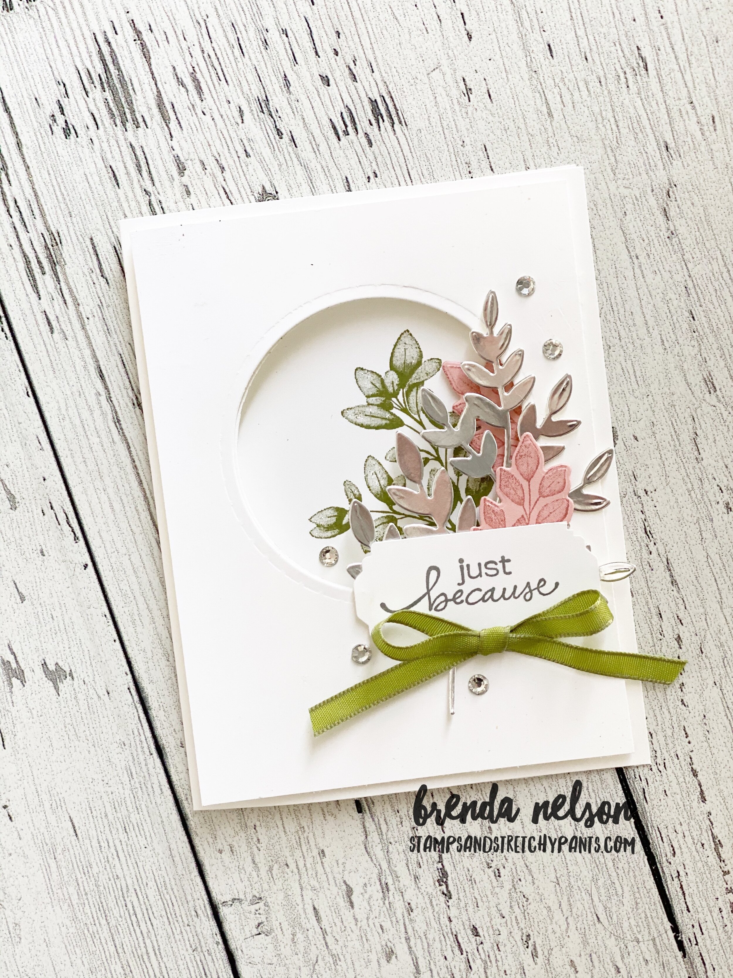
This is my take on Annette’s card—I added another panel to the front as it is easy to cut two circles out at once  on our die cutting machine.  I popped the front layer up on Dimensionals.

This is my take on Annette’s card—I added another panel to the front as it is easy to cut two circles out at once on our die cutting machine. I popped the front layer up on Dimensionals.

final.jpg

The Forever Fern bundle (pg 110) includes 14 dies in the set. I used the largest fern die on some Silver Foil Paper. I stamped out two of the smaller ferns in Blushing Bride ink on the same color card stock and die cut those. The fern image on the inside, which you get to see through the peek-a-boo window, is stamped in Old Olive. The sentiment is from Lovely You bundle (pg 22) and is stamped in Smoky Slate. I used the Lovely Labels Pick a Punch with my paper cut to 1 inch, which is the largest width you can use on this versatile punch. The ribbon is from the Ornate Garden Ribbon Combo Pack. Some Rhinestone Basic Jewels just added a bit of sparkle.

Please visit Tricia Butts next to see who she is CASEing and her fabulous project! Thanks for hoping along with us and please feel free to leave a comment!


Red, White and Blue with Connie and Mary!

This weeks challenge is a Red, White and Blue theme as it is July 4th in the United States! Happy Independance Day to all of my crafty American friends! I used this color scheme to create a masculine birthday card with one of my favourite sets in the new catalogue—Pallet Thoughts on page 137. It was in my very first order that I placed in June. In the stamp set there is a phrase, “Hello Handsome”, and I wanted to incorporate that into my card.

Image+2020-04-27+at+6.31+PM+(1).jpg

I stamped the Buffalo Check stamp in Real Red on Whisper White card stock. It reminded me of a picnic blanket. I stamped ‘handsome’ in Night of Navy and added some ‘screws’ to sides in Smoky Slate. This is also a fun little stamp in the set. I decided to emphasize the word Hello by using the Playful Alphabet Dies and the Foam Adhesive sheets. I cut the letters from Night of Navy Card Stock which is also the card base.

The card front is covered in a piece of DSP from the In Good Taste paper collection and then I added the Buffalo Check piece at an angle and cut off the excess. I used a retired circle punch to snip out a half circle at the top on each side so that I could tie some ribbon from the Playing With Patterns ribbon along the card.

This card is what I would call #simplestamping and the template of the card is unique without being too complicated! I hope you like it!

final.jpg
final.jpg

I can’t wait to see what amazing projects are showcased throughout this blog hop! You can go BACK to visit Melissa or you can go forward to visit Connie! Make sure to hop the whole way through!

#daydrinking...card style!

Adulting is hard, especially in these interesting times! So sometimes a girl has got to do what a girl has got to do and enjoy a day time beverage! You can also make a cute card like this while consuming your beverage!

I used the new Nothings Better Than stamp set which is Connie Stewart’s 1,000,000 achiever stamp set. Did you know that? When you sell 1,000,000 CSV you get to help design your own stamp set! It is such a cool thing. And I think if Connie and I lived in the same city we would definitely be friends as I also love Cookies, Chocolate, Coffee and Cocktails!

I created this card based around the color palette of the Playing with Patterns DSP. I absolutely LOVE the colors in this collection. The base of my card is Coastal Cabana with a layer of Smoky Slate and a strip of the DSP tucked along the side that ties in all of the colors used to embellish the card.

I cut a star out from the Stitched Stars dies in Misty Moonlight to create a fun layer. The sentiment is stamped in Highland Heather ink of coordinating card stock. The shape is from the Stitched Rectangles dies (a craft room must have!). Cocktails is cut using the “I love You More Than” dies from Gorgeous Grape card stock.

final.jpg

I added in two of the ribbons from the Playing with Patterns Ribbon Combo between the star and rectangle layers. I coloured the cocktail glass with my blends and added Wink of Stella over top of the blue drink. A few of the Playing with Patterns Resin dots and this card is complete!

I loved this card so much that I created a whole bunch for a swap I am participating in with my team. I hope they love them as much as I do!

final.jpg
final.jpg

Create with Connie and Mary! Ombre Style!

One of the things I like to do when we get a batch of new In Colors is pair them up in an Ombre style to see how they work with our existing colors. I created FIVE layouts that feature each new In Color with color strips. This is the easiest way to showcase these colors in an ombre fashion. And while these are scrapbook pages, you can easily use the same method to create a card! This weeks Create with Connie and Mary challenge was OMBRE so these page designs worked out perfectly!

Image+2020-04-27+at+6.31+PM+(1).jpg


final.jpg
 

All of these pages are created using 5 colors, the All Things Fabulous Bundle, Water Painters, a Stamp-a-ratus and the Playful Alphabet dies with the Foam Adhesive Sheets.

This first page features the following colors: Night of Navy, Misty Moonlight, Pacific Point, Seaside Spray and Balmy Blue.

The flowers are stamped using the All Things Fabulous stamp set with the aid of my Stamp-a-ratus and 3 ink colors. I used Seaside Spray, Balmy Blue and Misty Moonlight in that order.

I used the smallest brush tip of the new Water Painters to flick a spray of Misty Moonlight ink over the page and repeated this technique on each page with the coordinating In Color.

I love how bright and fun this page and how my lululemon sweatshirt coordinates! In fact that is a theme in ALL OF MY PAGES :).

I love how bright and fun this page and how my lululemon sweatshirt coordinates! In fact that is a theme in ALL OF MY PAGES :).

This page features Magenta Madness and the colors Poppy Parade, Melon Mambo, Rococco Rose and Blushing Bride. The flowers are stamped in Blushing Bride, Rococco Rose and Magenta Madness in that order. I love having the ability to create my own fun titles using the Playful Alphabet dies and the Foam Adhesive Sheets. No one else is going to scrapbook me, so I have to keep my own memories!

I love this ombre green combo! I used Bermuda Bay, Coastal Cabana, Just Jade, Mint Macaroon, and Pool Party and the flowers are stamped in Pool Party, Mint Macaroon, and Just Jade in that order.

I love this ombre green combo! I used Bermuda Bay, Coastal Cabana, Just Jade, Mint Macaroon, and Pool Party and the flowers are stamped in Pool Party, Mint Macaroon, and Just Jade in that order.

final.jpg

Look! Another coordinating outfit! Haha! I had so much fun finding pictures and creating these pages to have on display in my craft room. This page features Early Espresso, Soft Suede, Cinnamon Cider, Crumb Cake and Sahara Sand. The colors are stamped in Crumb Cake, Cinnamon Cider and Soft Suede in that order.

You may also notice that there are two ribbons on each of my pages! It was so easy to find coordinating ribbons as there are so many fabulous options in our new catalogue.

I saved my favourite for last. Even my kids had a good laugh over my title! This page features the ‘yellows’ and starts with Mango Melody, Crushed Curry, Bumblebee, Daffodil Delight and So Saffron. The flowers are stamped in So Saffron, Daffodil Del…

I saved my favourite for last. Even my kids had a good laugh over my title! This page features the ‘yellows’ and starts with Mango Melody, Crushed Curry, Bumblebee, Daffodil Delight and So Saffron. The flowers are stamped in So Saffron, Daffodil Delight and Bumbleebee in that order.

I hope these pages have inspired you to play around with our color families to create your own ombre looks!

Go Back to visit Melissa and Next to see Connie’s creation!

Prized Peony Project

I was really intrigued with this Prized Peony bundle when I received it in my last order. The Peony dies has 17 pieces to it and I won’t lie, it did take me a bit to figure out how to assemble this 3 D peony as it is a bit different from any other dies Stampin’ Up! has had. Once I got my mind around it they became very easy to put together. I created a fun project using our new Mini Paper Pumpkin boxes and two note-sized cards. My only complaint would be that these boxes don’t fit a full sized card. However, I will just have to get used to making note sized cards!

 
final.jpg

I created this handy chart to quickly illustrate the order of assembly the peony. If you use the bottom of the flower as a visual aid it also will help you with the assembly. And because the layers nestle quite snuggly you don’t actually need that much adhesive.

There are also 3 leaves included in the Peony Dies so I added those onto the guide so you can see which pieces layer together to create the final leaf. I hope it helps!

I labeled the flowers in the order that they slip inside each other.  You can fold back the paper along the slit to help create more dimension in your flowers.

I labeled the flowers in the order that they slip inside each other. You can fold back the paper along the slit to help create more dimension in your flowers.

fullsizeoutput_1225e.jpeg

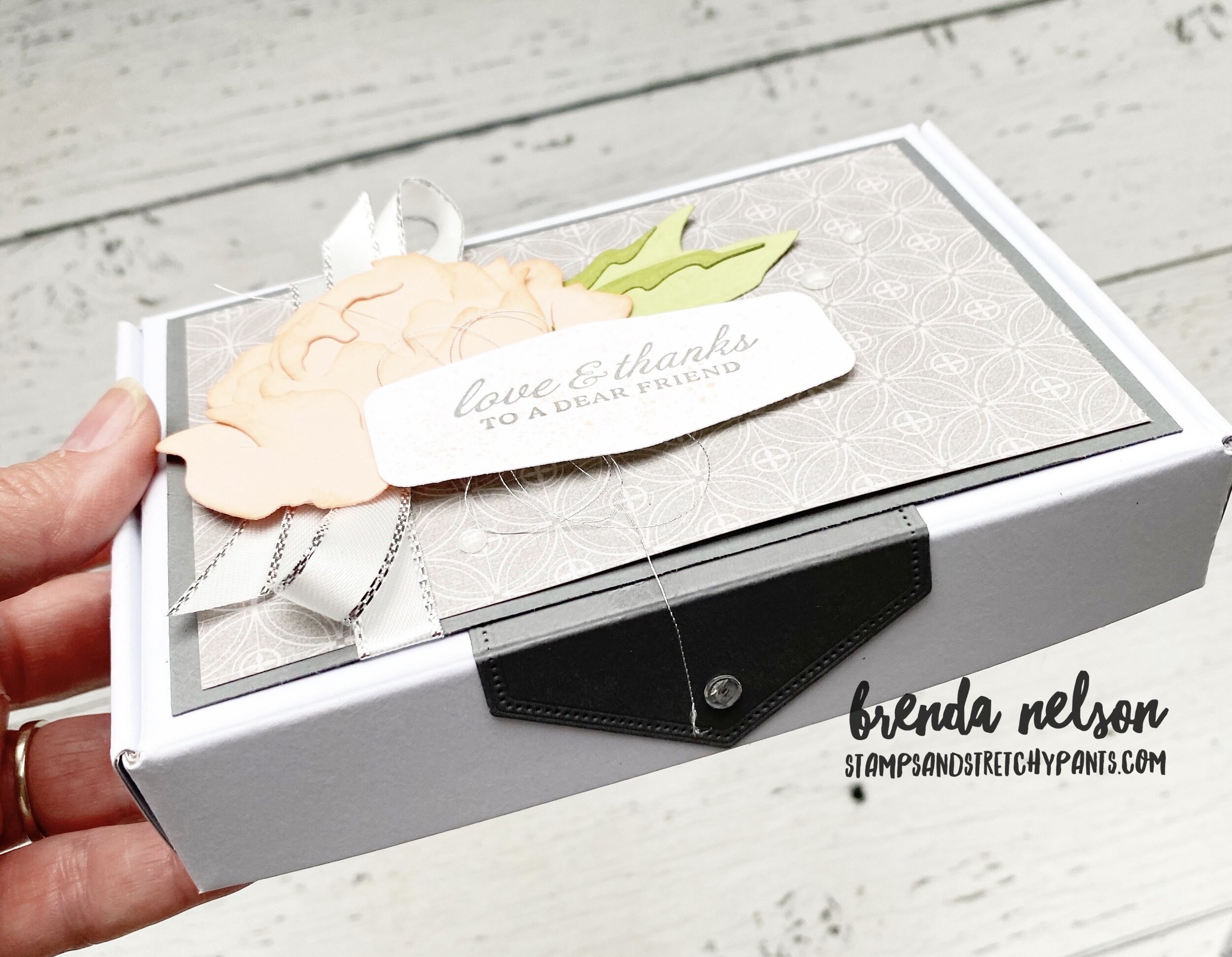
I love the size of these mini paper pumpkin boxes! They are just so fun and have unlimited potential. I wanted this project to look ‘fancy’ so I added a tab using the Stitched Rectangular dies to create a tab that gives the illusion of keeping the box closed. I added one of the Elegant Faceted Gems to it as well.

final.jpg

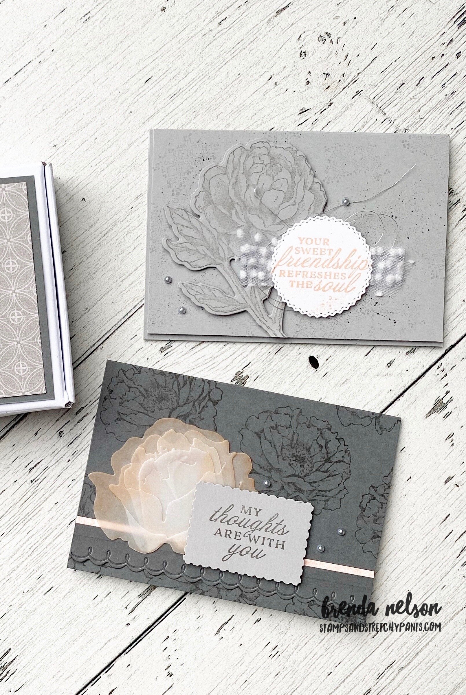
The Smoky Slate card has a light background stamped using one of the images in the Prized Peony stamp set. I stamped it off first so it was very faint and then I used my Water Painter dipped in some Basic Grey ink to create a splatter. I stamped the large peony on Smoky Slate card stock and cut it out with the coordinating die. It is popped up on Dimensionals. The sentiment is stamped in Petal Pink and cut out with a die from the Tasteful Labels dies.

The Basic Grey card has the large single bloom (no stem) stamped as the background. I then cut the peony pieces out of vellum and sponged the edges in Petal Pink ink. I added a very thin strip of DSP and the scallop edge is cut from a piece of the Basic Grey card stock (about 1.2 inch in thickness). A few silver metallic pearls completes the look!