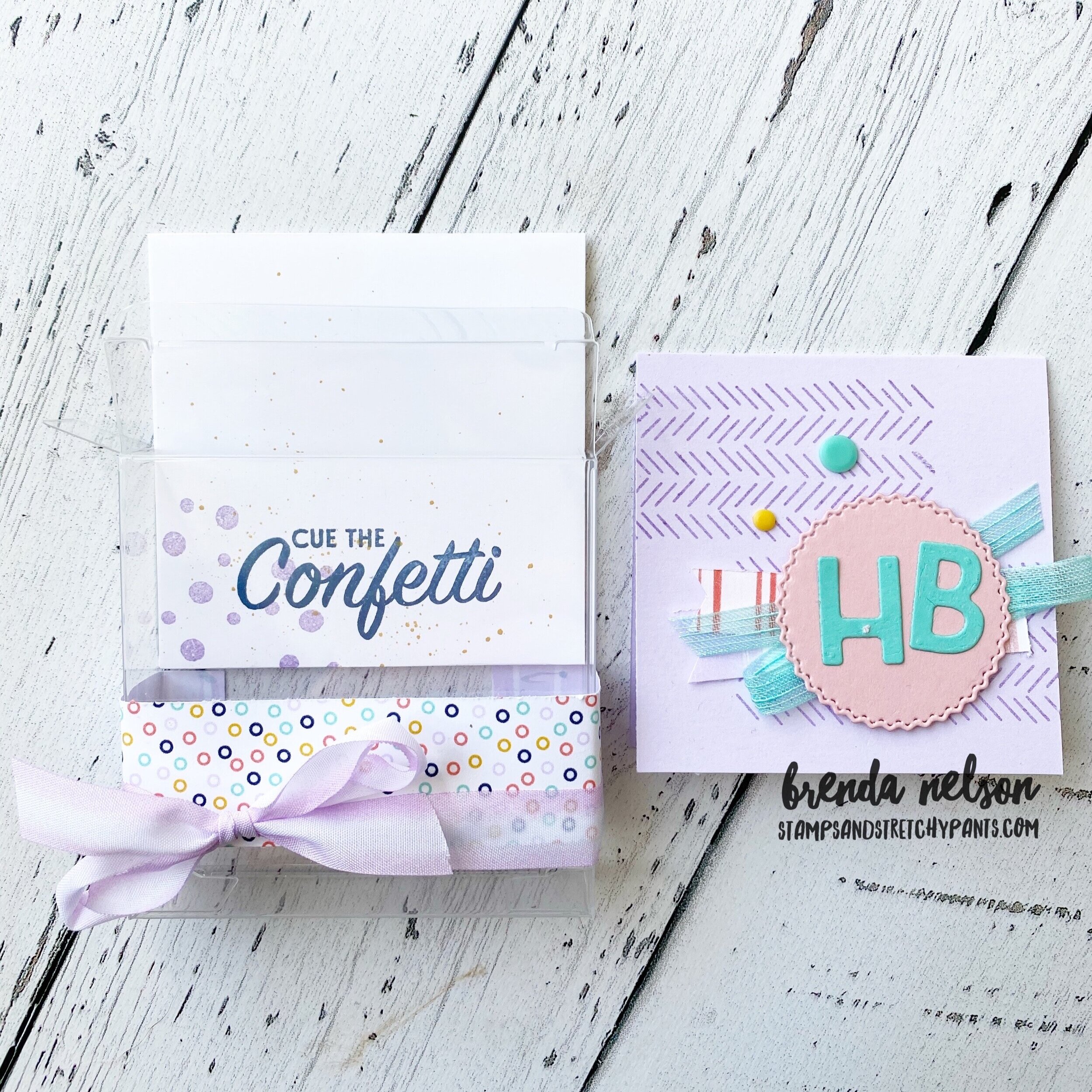
In Color Bookmarks!

Have you noticed all of the amazing inspiration in the new Annual Catalogue? One of my favourite things to do is CASE (Copy and Share Everything) the projects and the first one I chose are these amazing In Color Bookmarks to share with all of my group members in June.

 
final.jpg

These bookmarks are a great way to share the 5 new In Colours, ribbon, and a new bundle Lovely You. You can find Stampin’ Up!’s version on page 23 of the catalogue.

I started by stamping an entire sheet with my chose floral image and then I trimmed the card stock down into strips to fit into the Lovely Labels Pick a Punch. I used the smallest punch option which was 1/2 in width.

This project is the perfect example of making one sounds fun, making thirty is dirty! Hahaha! Who else can relate? It happens to me more than I would like to admit! But I know everyone who receives one will appreciate it :)

This project is the perfect example of making one sounds fun, making thirty is dirty! Hahaha! Who else can relate? It happens to me more than I would like to admit! But I know everyone who receives one will appreciate it :)


Tasteful Touches Fun Fold

Sometimes you just need a good card fold, design and elements to make a really awesome card! Today I am sharing a ‘fun fold’ card that is simple but packs a punch!

You start with your standard card base of 4 1/4 x 5 1/2. Mine is Purple Posy. You can get 4 card bases out of one sheet of card stock too which is awesome. You will then cut your second ‘card’ base to 3 x 11 and score at 5 1/2. Once you have these two pieces you can stamp a pattern along the edges of the Purple Posy. I used one of the images from the Tasteful Touches stamp set and stamped in Highland Heather. Attach the white card to the Purple Posy base and then embellish as desired.

final.jpg
final.jpg

I used the Tasteful Touches stamp set as the focal point of this card. I absolutely LOVE the feathers. I stamped them in Bumbleebee on Whisper White card stock. I inked the feather once and stamped it three times to get three different tones of the ink. These are then hand cut.

The sentiment, You are the Best, is actually stamped twice. I stamped it once and then layered a 1 inch strip of card stock over top as a mask. I then stamped my sentiment again to get the second half ‘The Best’ to line up underneath this strip. I then added a DSP strip from the Flowers for Every Season 6x6 stack overtop in place of where the mask was.

I added a bit of linen thread and some of the shapes from the In Good Taste Wooden Elements. The Misty Moonlight scallops along the white base edges come from the Budding Blooms dies. And of course I had to flick my Purple Posy marker across the Whisper White base! Its the best trick out there to take away the feeling of too much blank space.

I hope you will give this ‘fun fold’ a try! Have an awesome day!

Create with Connie and Mary--Birthday Celebrations!

This week’s theme is birthday and I think its because a special someone (hint: Connie) is celebrating a birthday! So naturally we are celebrating by sharing birthday cards with everyone. I used the new Playing with Patterns Suite to create this easy peasy card!

I love the colors in this suite and tried to incorporate little snip-its of them all on one card! The base is Purple Posy and I stamped the polka dots from the Pattern Play stamp set in Highland Heather. I cut and scored this card base like a normal card ( 4 1/4 x 5 1/2) and then trimmed off an Inch. This lets a little peek a boo option happen to highlight this striped patten paper from the Playing with Patterns DSP. I used the Stitched So Sweetly dies to cut the scallop rectangle from a Crushed Curry patterned designer paper found in the DSP.

I love that the ribbon for this suite is a trio of colors and textures. You get a skinny piece of Night of Navy, a shimmery Coastal Cabana option and a Purple Posy/White wide ribbon all in one set! You can find it in the catalogue on pg 161, along with a bunch of new amazing ribbon options.

I stamped the sentiment on Seaside Spray card stock with the new Misty Moonlight In Color and cut it out using a die found in the Stitched So Sweetly collection. I stamped it again in Calypso Coral on the same card stock and cut by hand ‘Cue The’ to add in that color to the design. A few of the Playing with Patterns Resin dots and voila! An easy peasy card!

Image 2020-04-27 at 6.31 PM (1).jpg
This card came together so effortlessly with the elements of this amazing suite!

This card came together so effortlessly with the elements of this amazing suite!

final.jpg

Did you notice the cute little 3x3 acetate boxes in the new catalogue? I made a little mini card and coordinating envelope to go with my full size card. It would be cute to stash a little treat behind the card in the box.

The HB is cut out using the Playful Alphabet Die which is a part of the Pattern Play Bundle on pg 102 of the catalogue. If my projects have inspired you with this suite (see my blog post from Wednesday) you can use my Monthly Hostess Code to place a…

The HB is cut out using the Playful Alphabet Die which is a part of the Pattern Play Bundle on pg 102 of the catalogue. If my projects have inspired you with this suite (see my blog post from Wednesday) you can use my Monthly Hostess Code to place an order!

You can hop backwards to check out Melissa’s project or you can go on to our birthday girls blog post! Enjoy your day, I hope you get to stamp something!

Splish Splash! Joy of Sets Blog Hop!

The theme for June is Splish Splash and what a better way to introduce you to this amazing new product suite, Whale of a Time. The whale punch is literally so cute I can’t even handle it! Everything I used on these two cards are new so let me take you through it!

I wanted to created a water background so I used watercolor paper with our new Water Painters. The brushes come in 3 tip sizes and before you twist the brush on super tight, twist in REVERSE, to get the brush tip off to add water! I added a drop of re-inker in three colors, Pool Party, Coastal Cabana, and Pretty Peacock, to an acrylic block. I took the widest brush tip (shown below) and dripped a drop or two of water onto the block. I mixed the re-inker around and then added it to my watercolour paper in a horizontal brush stroke. I then took the medium water brush and dripped some water on top to give sort of a bubble finish. I let those dry and while waiting put together the whale using the builder punch. I stamped a bit of detail to his back and top fin in Shaded Spruce. When the background was dry I used the same color to add in the sea weed.

When I looked through the Whale of a Time Designer Series Paper I knew immediately that I wanted to cut the ‘wave’ design apart and layer it on my card to create more 3D feeling waves. I was able to get two cards out of one piece of DSP. I added some of the Whale of a Time sequins into the sea weed for a bit of whimsy. The sentiments are stamped and embossed with White Embossing powder on Pretty Peacock card stock and then just cut by hand and added onto the cards with Mini Dimensionals.

The card bases are Pretty Peacock and Mint Macaron and both have a Shaded Spruce layer which was ran through the new Seabed embossing folder.

 
final.jpg
IMG_3659.JPG
Isn’t the detail in these DSP waves amazing? It was my inspiration for the color pallet of this card. I think these cards would be super cute to give my kids next week when they finally finish their online schooling.Narelle is next on our blog hop t…

Isn’t the detail in these DSP waves amazing? It was my inspiration for the color pallet of this card. I think these cards would be super cute to give my kids next week when they finally finish their online schooling.

Narelle is next on our blog hop today, I absolutely love her style! I can’t wait to see her fabulous creation with this unique theme!

Next Blog on the hop
 

Around the World with the NEW Catalogue!

This might be the most exciting Around the World on Wednesday blog hop in 2020 as we are all featuring things from the brand new catalogue! Its like an early Christmas! The suite that I was the most excited about was the Playing with Patterns suite on page 100. I absolutely loved the color pallet and after playing around with the Playing with Patterns Designer Series Paper I might go on record and saying is my favourite DSP of all time. That is quite the commitment but to me it is perfection!

91442295_10216484369808661_2887014979863576576_n.jpg
 

I knew right away I wanted to create a scrapbook page layout with this suite adding in a few other stamp sets I was excited about. I love a good floral set and I was drawn to the images and sentiments of this new bundle, All Things Fabulous on page 121.

And look at my subject matter! Could he be even cuter? Hawkins has been my faithful companion and my best buddy during the past few months. As soon as I saw the Pallet Thoughts stamp set with “Hello, Handsome” I knew it would be the perfect set to use when scrapbooking my dog, sons or husband! And I love the distressed wood stamp in this set as well. It is the perfect layering piece!

The whole page is designed around the colors of the Playing with Patterns suite—Purple Posy, Night of Navy (however, I substituted our new In Color Misty Moonlight), Coastal Cabana (my favourite color of all time), Crushed Curry (once again I substituted Bumblebee), and Calypso Coral.

final.jpg
fullsizeoutput_11f66.jpeg
I really love the flowers on this page combined with the soft colors.  The enamel dots are an awesome finishing touch that helps add dimension to the page. I like my pages to have lots of layers and textures.  I used the largest Water Painter brush …

I really love the flowers on this page combined with the soft colors. The enamel dots are an awesome finishing touch that helps add dimension to the page. I like my pages to have lots of layers and textures. I used the largest Water Painter brush to swipe over top of the Bumblebee flowers right after I stamped them. I did the same thing on the barn wood piece to soften things a bit and spread out the color slightly. I also stamped the flowers multiple times to give a gradient look to them as well. That is one of the easiest ways to create different colours. Ink once and stamp repeatedly!

I was so excited and inspired by this page layout that I took all of the same elements to create this adorable mini album. I used photos of our ‘quarantine times at home’ as my subject matter. Ridiculously Awesome is a new mlllion dollar achiever se…

I was so excited and inspired by this page layout that I took all of the same elements to create this adorable mini album. I used photos of our ‘quarantine times at home’ as my subject matter. Ridiculously Awesome is a new mlllion dollar achiever set co-designed by Ronda Wade with artwork contributed by Sean Douglass. I LOVE the oversized fonts which makes this a dream set for memory keeping!

For the album shown below, I used all of the same products (minus the flowers) to create this project. I also added in the stamp set A Grand Kid. I love the phrases in it and can see myself using it a lot even though I don’t have ‘grand kids’. Its definitely not a set to be overlooked because of the title.

Click through these photos to see some different views of this fun mini album :)

The next stop on our awesome blog hop of 24 participants is Cindy Schuster from Nutmeg creations! Cindy works at Stampin’ Up! and is one of the amazing co-founders of Stampin’ Through the Catalogue. You can follow them on the Gram @stampinthroughthecatalog