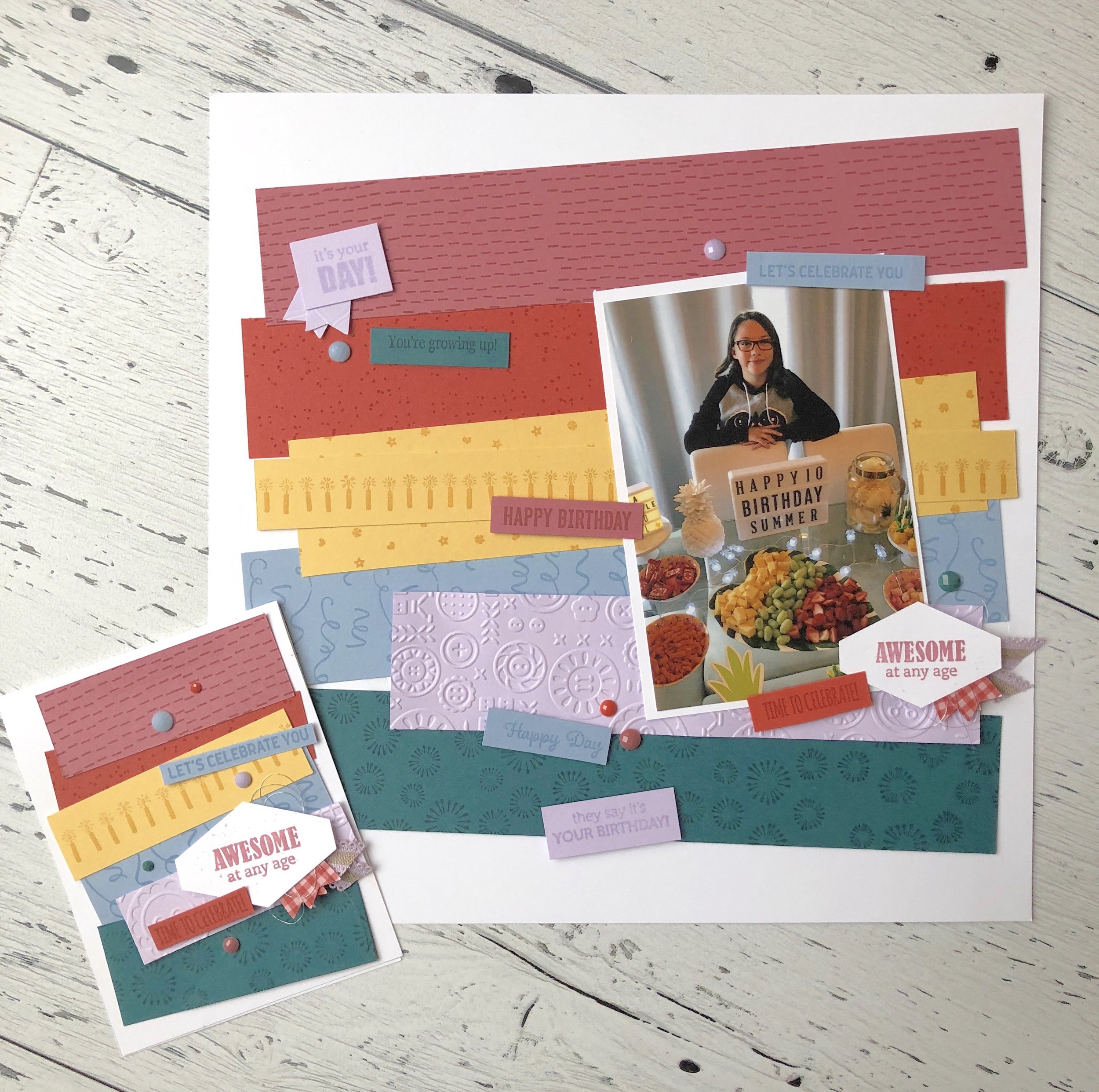
CASE the Catalogue #2019
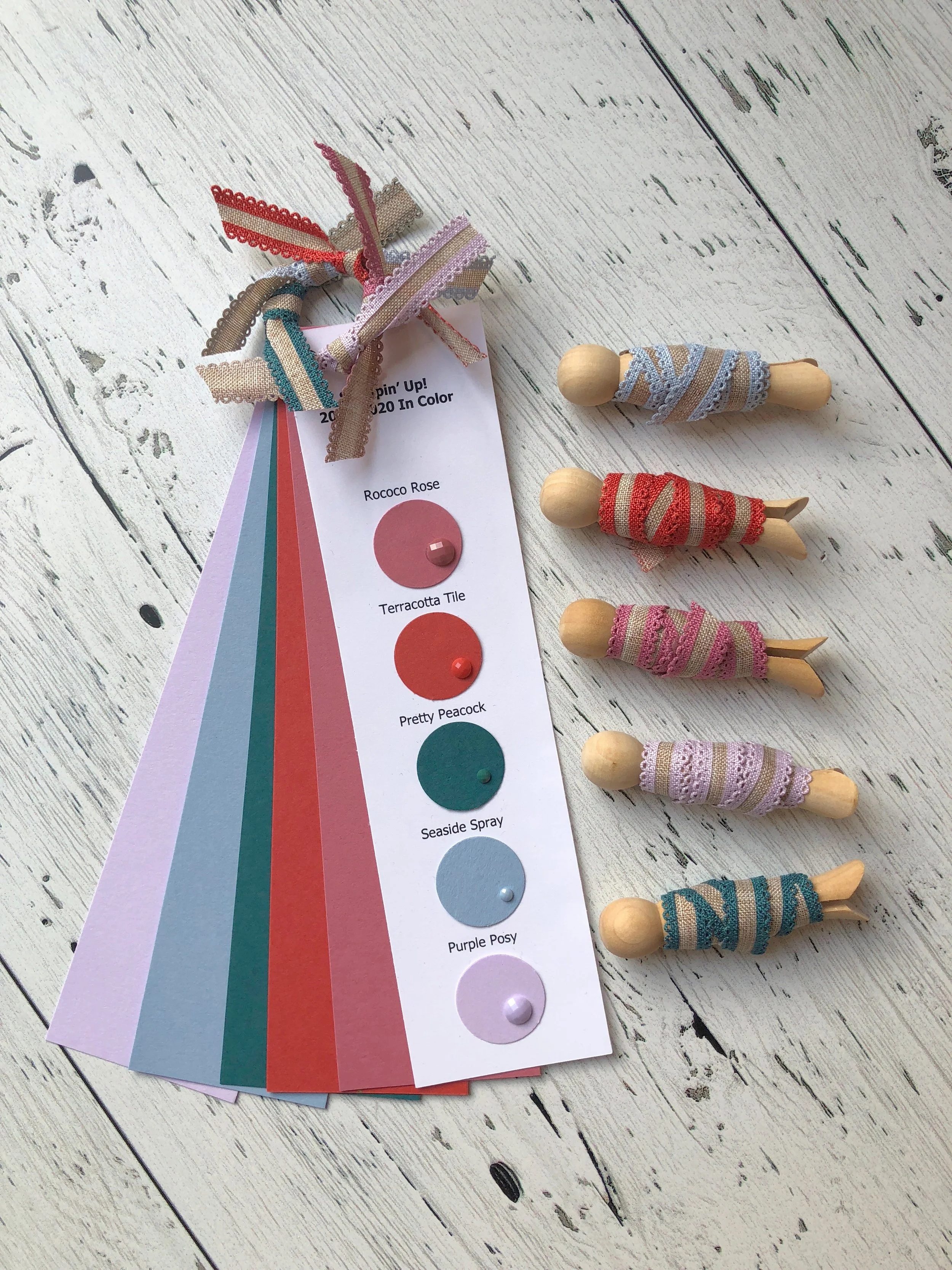
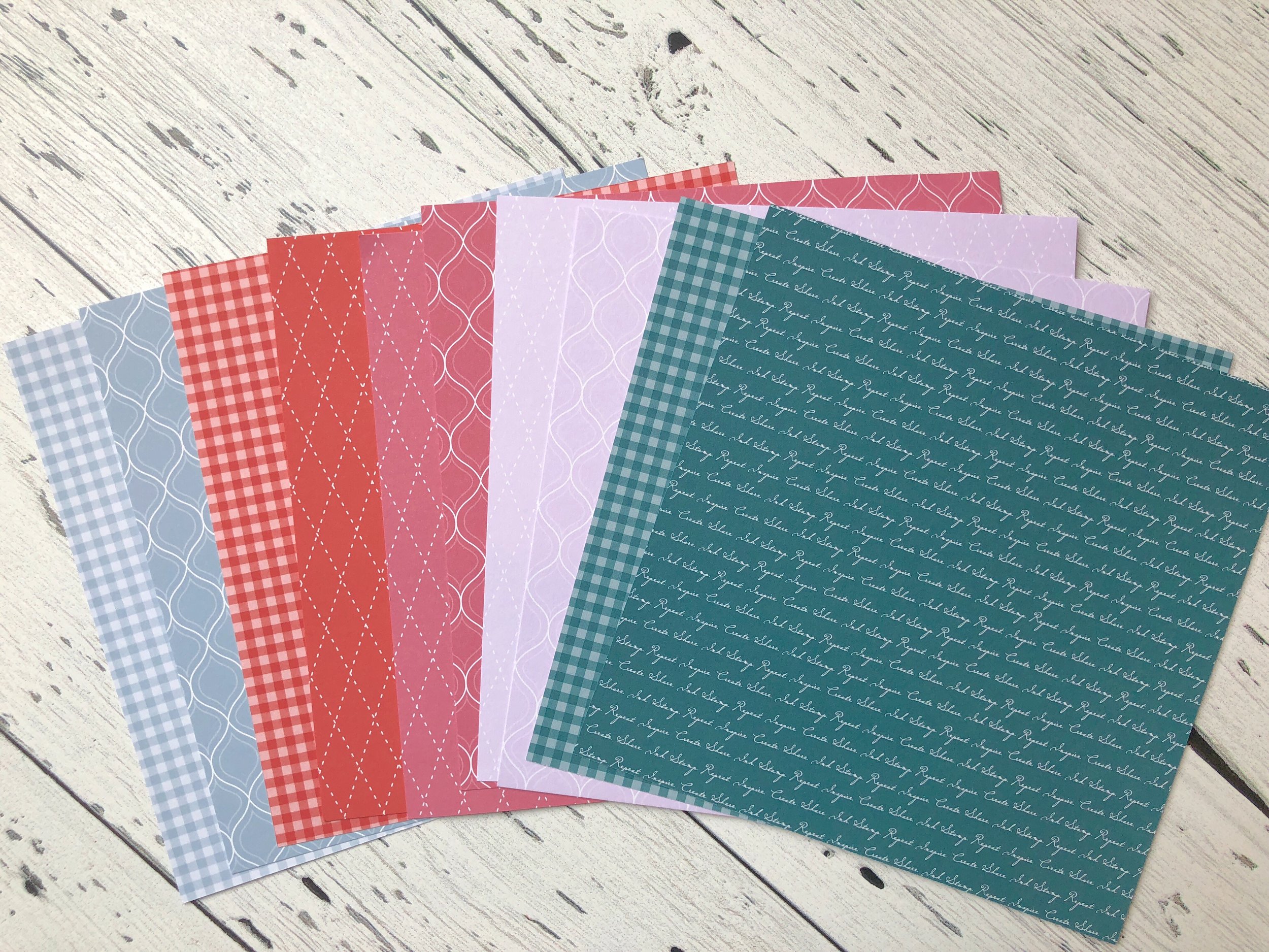
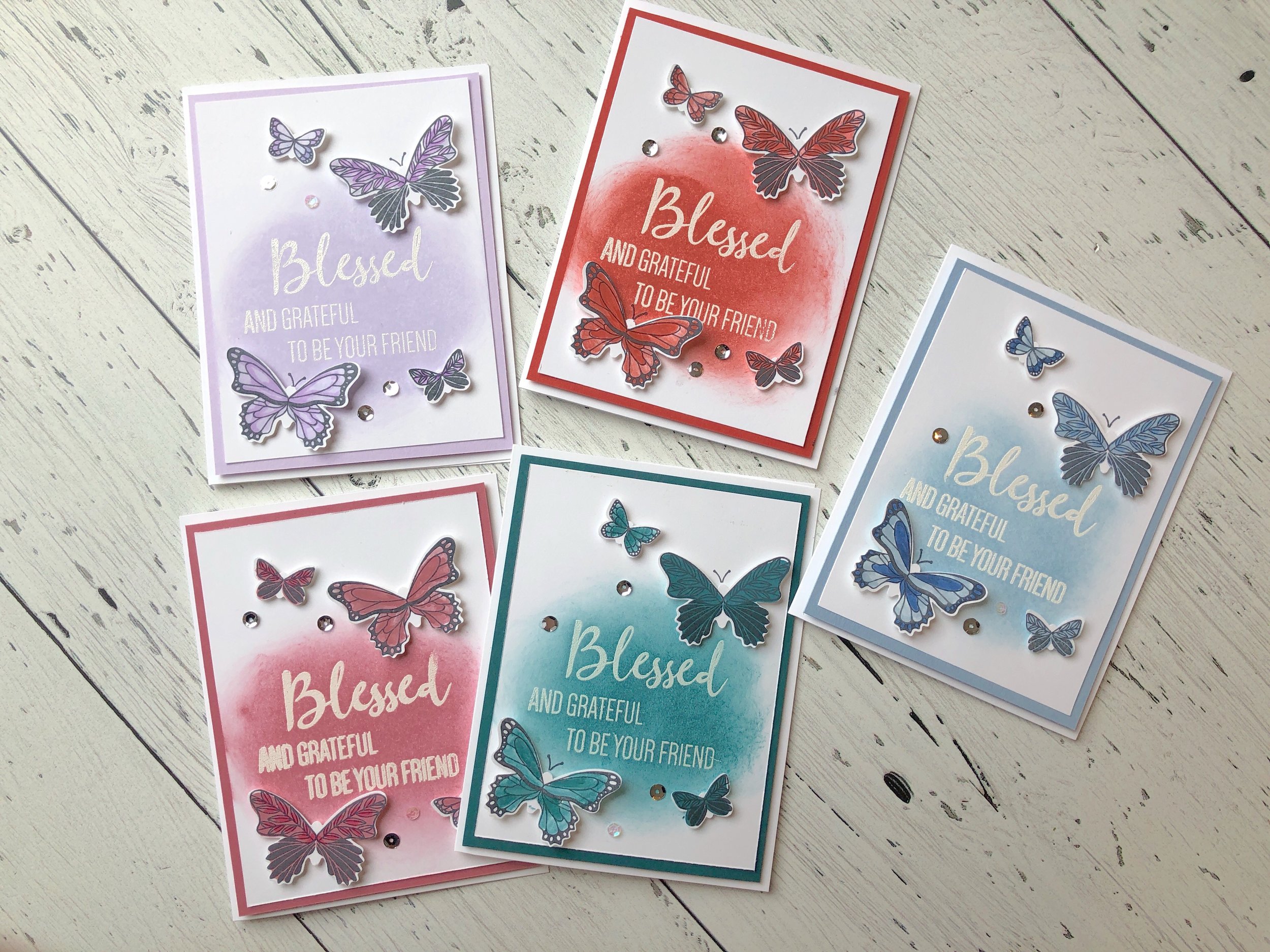
One of the best decisions I ever made as a team leader was to motivate and inspire my team to take on the challenge of CASEing every project in the annual catalogue! We have never completed the entire catalogue, but we work hard at the challenge. This ongoing project motivates my team to use their supplies, choose projects to CASE that inspire them and it opens the door for sharing and communication. The first thing I do when I have the new catalogue in my hands is look though it and mentally pick all of the fun projects I want to recreate. The best part is swapping these with each other. We all end up with some truly amazing projects!

7BF6C660-A7CC-4424-A6CC-BDF0625C5616.jpg

Scrapbooking Tip #1

Something I hear a lot in regards to memory keeping is that people just don’t know where to start. If you are seasoned card maker or a newbie stamper, I often find scrapbook page inspiration from my cards. Try looking at your 12x12 as a ‘card front’. It is after all, just a bigger canvas! Here you can see how I took this card (inspired by a project in the new annual catalogue) and recreated it as a page layout! Often we have more space so we can add in extra phrases, layers or embellishments onto our pages too.

 
fullsizeoutput_6e4.jpeg
 

Who loves a rainbow?

I know I absolutely love a rainbow and when I can make something with a color scheme it just makes my whole heart happy! I was so excited to play with our new In Colors (Roccoco Rose, Pretty Peakcock, Terracotta Tile, Seaside Spray and Purple Posey) and add them into a rainbow lineup! I love how amazing our colors all look together! This layout was actually quite quick to put together using the Tailored Tag punch!

fullsizeoutput_6ec.jpeg
IMG_8455.JPG

Meet the New In Colors!

As you know, every year Stampin’ Up! introduces 5 new colours for us to be creative with. Each collection lasts 2 seasons in the Idea Book and Catalogue. The new 2019/2021 In Colours are Roccoco Rose, Terracotta Tile, Pretty Peacock, Seaside Spray, and Purple Posy. I would describe them as having a grey muted undertone. They look amazing on their own or paired with some of our permanent colours. So far I would say my favourite is Seaside Spray as I am really enjoying the blue tones in our colour assortment.