Color Fusers January 2022

Hello friends and welcome to another year of the Color Fusers Blog Hop! I really love participating in the Hop because it forces me to look at my SU colors in a new way and experiment with new color combos! The color combos are all submitted by the Hop Team Members. To kick off the new Year, Happy 2022 everyone!, we are playing with Night of Navy, Mint Macaron, Blushing Bride and Soft Suede.

As soon as I saw these colors I knew that I wanted to make a scrapbook page —a January winter theme page. Making this in advance will also hopefully ensure that I get outside in January to do something fun, so I have a couple of cute pictures to add to my page! This might sound ridiculous, but when its -30, trust me, you don’t really want to be outside!

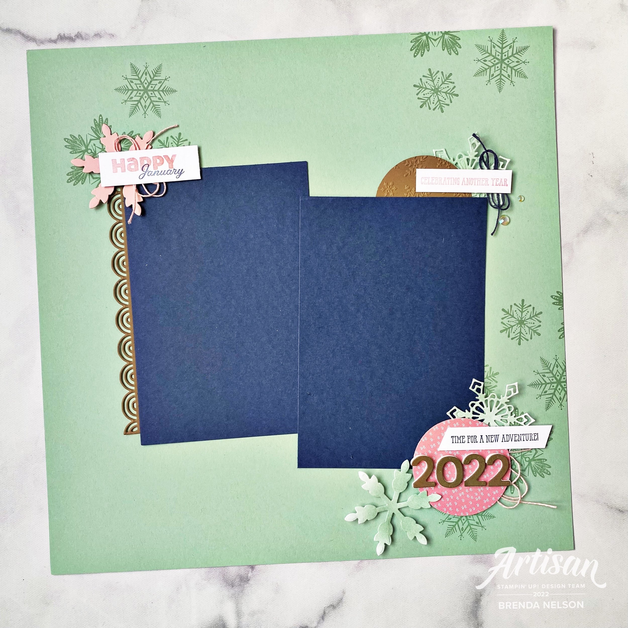
This layout also works perfectly to support a monthly class that I offer, Year in Memories, where we scrapbook each month of the year. At the end you have a complete album of 2022!

I started with a base of Mint Macaron because I felt that it was the color that linked the other 3 together. Soft Suede works perfectly as an accent color, along with Blushing Bride. Night of Navy gets a bit more attention as I chose it for the photo mats. I also decided on vertical pictures, because let’s face it, we take alot of selfies.

Fun Fact: I have over 4,000 selfies on my camera roll. Guess you could say I like myselfie. Hahaha!


This page is a mix of recently retired, really retired and new products! Sometimes past products are the perfect fit for our projects so I try not to stress out too much about using them, but I always make sure there is something NEW and CURRENT on my pages too. This way I can discuss all sorts of things during my classes.

The sentiment “Celebrating another year” is actually masked from a larger phrase and is from the stamp set Well Said. This set is retired but I have hung onto it because it has some more unique phrases such as “Time for a New Adventure” which is at the bottom of my page. I thought they were both rather fitting for a January, new year, page.

The Soft Suede half circle is embossed with a retired folder too. Behind the sentiment you see some twine and a snowflake, cut from the Gingerbread dies. All 3 of the Mint Macaron snowflakes were die cut from Basic White card stock and then I ran my Blending Brush across with some Mint Macaron ink. I added my favorite new embellishment, the Iridescent Rhinestone Jewels, to the side.

The top left corner of my page features the Merry Snowflakes stamp set in the background. I mounted the 3 snowflakes from the set onto a block and used it with Mint Macaron ink to stamp across the background of my page.

The Blushing Bride die cut snowflake is from the So Many Snowflakes Dies which are in the Annual Catalogue. Paired up with some new stamps, this is a fun little area of interest! The Brilliant Rainbow Dies supplied the Soft Suede scallop border along my photo mat and I isolated “Happy” from a stamp in the Slim Sayings set, which is a new JJ catalogue release. January can be found in the set Days to Remember which was one of the best new sets in the Annual Catalogue for memory keepers! It isn’t too often that date sets come around!

The bottom little section is my favorite though because I love how “Time for a New Adventure” and 2022 work together! In the spirit of a new year, I would agree! And I am choosing to enter this new year with a positive heart and mind. The date is mounted on a circle from the Sunshine & Rainbows paper which is a free Sale-a-bration choice.

Overall I really love this color combo and I think it completely suites this page design! I can’t wait to add some photos to it! Thank you for joining us on our first Hop of 2022! I hope you will leave a comment and join us for the whole year!

Next up on the Hop is the amazing Bonnie O’Neill—I can’t wait to see what she makes with this color combo! You can also hit the Previous Tab to see Tami’s creation. We are a small group this month so make sure you give us all some love.

Around the World on Wednesday--My Favorite Month!

I am really excited about the theme for this month’s Around the World on Wednesday Blog Hop! Our theme is our FAVORITE month…and it was a tricky one for me as my birthday is in January so obviously I LOVE BIRTHDAY MONTH but its also cold AF so my love of summer wins out!

July is my FAVORITE month because it is the month that we spend a week at the lake with the entire Nelson family. 19 grandkids and cousins! Isn’t that spectacular?

Deciding on the month of July as my favorite month also coincided perfectly with a new bundle of products that I was recently able to order. This bundle was a perk for Demonstrators attending On Stage this month and it will be available in the upcoming January-July Occasions Catalogue. You will LOVE this catalogue, hands down this publication is in my Top Ten favorites of all time. All I will say is Rainbows, Cactuses and Pineapples oh my!

This is our annual family picture that we take at Greenwater Lake each year. We have been visiting this lake since my oldest son was an infant—17 summers!

I knew I wanted to use this family picture and I wanted to make sure to honor the tones of the water and the trees in my design. I used a base piece of paper from the Hand-Penned Designer Series collection that was Garden Green with a white floral print.

I layered a piece of Basic White 12x12 that I trimmed down to 11 1/2 x 11 1/2 inches. As the main photo mat I used a piece of DSP from the new Heart & Home Designer Series Paper collection. One side of all of the papers is this amazing wood panel design in Basic Grey. There are several patterns of a wood look so I chose the one that looked like a tree to continue with the nature element.

I also added a striped piece of DSP in Mint Macaron from the Hand-Penned Designer Series collection. I made sure the stripes were going horizontal in nature to help elongate the page.


I love to create focal points or vignettes (areas of interest) on my scrapbook page that help tell the story. Sentiments are very important to me and they are honestly the criteria by how I pick most stamp sets. I absolutely love the sentiment “What a Beautiful Day for Love”. Obviously you can use this for a wedding or a baby’s arrival, but should it not be how we approach all of our days? Every day is a beautiful day for love and I never leave those words unsaid to my kids. I tell them all the time and it fills my heart when my teenage son will repeat them back to me on the phone or with his friends!

I stamped this gorgeous floral image, one of two in the stamp set Blessings of Home, in Momento Ink. I then colored it in with a term I have coined “Lazy Watercoloring”. I simply add ink to one of our clear blocks and use my Water Painter (the fine tip) to the ink with a very small amount of water. I then colored in the flowers with Bumblebee, Blushing Bride, Coastal Cabana and Garden Green ink. It barely took me any time at all which is why I love it!

I die cut the shape with the new Flowers of Home Dies and added it to a So Saffron die cut. I cut this using the Seasonal Labels Dies and ran it through the Timber 3D folder. I love how this page is a mix of so many different products from 3 different publications!

Stamping softly in the background added such a beautiful element to this page. I used the smaller floral image in Smoky Slate ink.

The sentiment is stamped in Bumblebee Ink and is also cut with the Seasonal Labels Dies! I added some white twine from the Bakers Twine Essentials Package and some of the Blushing Bride Frayed Grosgrain Ribbon behind my sentiment.

A few sprigs cut in Garden Green cardstock from the new Flowers of Home dies and this little area was complete—-or was it? No it wasn’t, it also need to add an embellishment so I chose some from the Classic Matte Dots (another upcoming new product). You will love these as you get 2 sizes and 4 colors—-white, vanilla/pearl, grey and black.

I created another focal point on the top right of my page. I stamped the smaller flower in Momento ink and colored it with Blushing Bride, Bumblebee and Garden Green ink. What I really love about this area is there is not a stamp in the set that actually says “Perfect Day”. I used my Stampin’ Write Basic Grey marker to combine two individual sentiments into one that better suited my page. I love how we can customize so many of our Stampin’ Up! products!

I added the same twine, ribbon and Matte Dots to this area plus a few sequins from the Subtle Shimmer Sequins. I love these sequins so much and hope they are available after the Holiday Catalogue period ends.

I am so in love with this page and creating it right now was perfect therapy for me. The days are shorter now and the weather has changed but making this page took me right back to the lazy days of summer.

I can’t wait to see what the rest of the Hop creates this month! There are some seriously talented people on this hop and the inspiration is unbelievable!

I am one of your Canadian ‘stop’s on this hop and next up you are going to the United States to see what Tricia Butts has designed for this challenge!


Color Fusers November 2021

Hello friends! Wow, did October ever go by quickly! Its now November 1st and officially Christmas season. Fall and halloween are dead, bring on the holiday! Although that is NOT what I am sharing with you today! Our color combo this month could be viewed as a tricky one as the 4 tones are all quick dark, however I had the best pictures to work with this color theme!

IMG_3964.jpg

This month our crafty group is creating projects with Merry Merlot, Misty Moonlight, Cinnamon Cider and Early Espresso. Back in July I had a Besties Photo shoot with two of my long time friends and we did a little picnic afterwards. The picnic set up totally reminded me of Misty Moonlight and a pattern from the In Good Taste Designer Series stack so I used that as my inspiration to design this page.

These are two of my besties I met while in University! We hit things off working at a restaurant together.  We have actually not all lived in the same city for over 20 years but despite the distance I know they would have my back always and no matter what #friendsforever

These are two of my besties I met while in University! We hit things off working at a restaurant together. We have actually not all lived in the same city for over 20 years but despite the distance I know they would have my back always and no matter what #friendsforever

I started with a 12x12 in Misty Moonlight and on the top half of the page I stamped the large flowers from the Blossoms in Bloom stamp set. I actually love this stamp set as I love a good image that can fill in space. I stamped it in the same ink color for a tone on tone look.

The bottom of my page features the In Good Taste DSP with a couple of strips of Cinnamon Cider DSP from the retired In Color 6x6 stacks (last years design). Adding this strip felt like a natural way to incorporate this color and create division between the two sections of my page.

Are you an F Bomb kind of mom? Hahaha, we are and my friend had these cups designed especially for us!

Are you an F Bomb kind of mom? Hahaha, we are and my friend had these cups designed especially for us!


I used Early Espresso card stock as my photo mats and I ran them both through the Timber 3D Embossing Folder for a subtle effect.

It was easy to add in Merry Merlot by die cutting some flowers from the Pierced Blooms Dies. This is one of my favorite die sets in the Annual Catalogue!

I added some retired In Color Enamel Dots and the sentiment is from the Blossoms in Bloom stamp set.

final (4).jpg

You can find the sentiment “Friends Forever” in the Lighthearted Lines stamp set. NOTE: Friends Forever is part of a phrase and l used my Paper Snips to do some Stampin’ surgery on this rubber stamp as I really wanted to use this part of the phrase all on its own.

The label is also a die from the Pierced Blooms Dies and I added a bit of retired Cinnamon Cider ribbon behind and some gold thread.

final (1) 3.jpg

I am so pleased with how this page turned out using this color combination! I cannot wait to see what the other girls create this month! Please visit everyone’s blogs and share some love and comments! And if you don’t follow me on Instagram you can find me @stampwithbrenda

You can go backwards to see what Melissa has created and forwards to see what Melanie has designed! I know they will both wow you with their creativity!

Have an awesome November and see you next month! If you live in Canada and are looking for some creative inspiration I would love you to stamp with me! Please reach out at any time!

Happy Haunting!

Hello friends! I offer 3 different scrapbook classes each month so of course for October we had to make some spooky layouts! I wanted to share one with you today that is a little more traditional Halloween than my pink and gold pumpkin page!

final.jpg

The base of this page is Pear PIzzazz and when I think of this color I picture the Wicked Witch of the West from the Wizard of Oz! Hahaha! I love how a color can evoke certain memories!

In a few select spots on the background I stamped some bats from the Sparkle of the Season stamp set in Pear Pizzazz ink.

Happy Haunting is from the Banner Year stamp set and is on a label found in the Pretty Pillow Box Dies. When you go through your dies you never know what you might find! Behind the sentiment I layered some Linen Thread and some of the Black & White Gingham ribbon! I just love that ribbon!


The Trick or Treat area is actually my favorite on the page as I incorporated ‘October’ from the Days to Remember stamp set is a really unique and subtle way that I love.

I die cut a label from the Seasonal Labels Dies and I ran it through a retired spiderweb folder, I just can’t part with it! Behind it I added a spooky black wreath from the Seasonal Swirls Dies.

The pumpkin is die cut using the Detailed Pumpkins Dies and I brought the sentiment to life by stamping mini spiderwebs on it (from the Banner Year stamp set) and adding some Black Glittered Organdy Ribbon.

final.jpg

Because I am obsessed with the spider web from the Frightful Tags Dies I had to add it onto this page too with a little “Happy Halloween” found in the Sparkle of the Season stamp set.

I added some Cute Halloween elements too—Trick or Treat and the little strip of DSP! And by having two placed to add photos I can snap two Halloween selfies!

If this page has inspired you at all, please reach out to me to see how you can join in my scrapbook classes! They are my absolute favorite and I am always excited to stamp with new friends!

You can message me at stampsandstretchypants@gmail.com

Pink Pumpkins and Golden Webs!

Here is a Halloween scrapbook page with a twist! Who doesn’t love the sophisticated colors of pink and gold? I decided to use them here for a unique color palette for this scrapbook page!

final (4) 6.jpg

I started with a base of Petal Pink card stock in 12x12 and added a layer of Basic White over top. There is actually no background stamping on this page, which is a little unusual for me! I let amazing dies do all the work to bring this page to life!

I used the stamp set Cutest Halloween for my pink pumpkins and the sentiments “Hey Boo” and “Have a fab(boo)lous Halloween”. I thought they were the perfect sentiments for this page.


I love this fun little area or vignette on the top right of my page. I used the Brushed Metallic Cardstock and the Frightful Tags Dies to cut out the spider webs and I love that they are incomplete webs—meaning you don’t see a full web.

Hey Boo! is cut using one of the label dies from the Seasonal Labels Dies.

Boo is cut from our Black Glitter Paper, Foam Adhesive Sheets and the Playful Alphabet Dies.

I also added a few of the Cute Stars Adhesive-Backed Sequins as an extra fun embellishment!

final (5) 4.jpg

The pumpkin outline is stamped with Momento Ink and filled in with the Petal Pink ink. You can punch these out using the coordinating Halloween Punch! One is added flat to the page and the other two are elevated with Dimensionals. I think this whole little area has so much texture and interest to it!

final (1) 16.jpg

For this bottom left little vignette I wanted the feel of an elegant pumpkin patch. I started with a large circle but from the Expressions in Ink Designer Series Paper and layered pumpkins from the Detailed Pumpkins Dies in Basic Black and Petal Pink. Of course you want to tie in elements on your page together so I used another stamped pumpkin and some of the Cute Stars embellishments again.

The sentiment also has some black twine from the Bakers Twine Essentials Pack behind it as well. Have you noticed I love me some twine?

final (4) 6.jpg

I hope this page inspires you to create a scrapbook page with colors that you don’t normally associate with Halloween! I absolutely LOVE how it turned out and I can’t wait to add a picture to this page after this years festivities!

If my design has inspired you, please consider shopping with me if you live in Canada! I would love to keep doing what I love!