Joy of Sets Blog Hop--April!
/
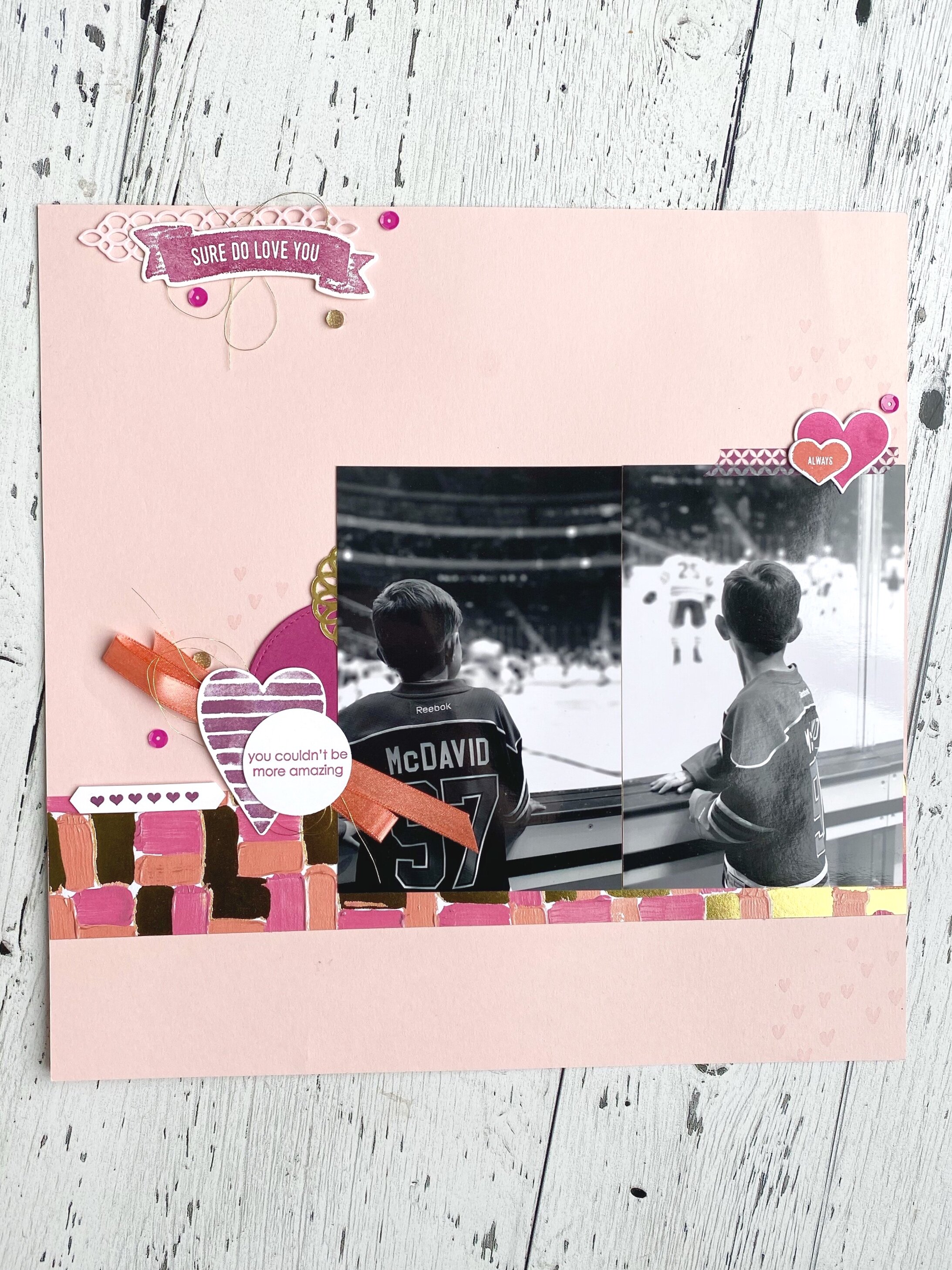
Welcome to the Joy of Sets Blog Hop for April! Thank you so much for hopping on over to see what we are all up to this month—the theme is BIRTHDAY! Now I could have made a birthday card, but instead I decided to create a scrapbook page of my most recent birthday in January. I had a fun girls night in playing games, eating and drinking Prosecco!
The color pallet for this page was inspired by my birthday cake, however I knew that I also needed to keep it neutral to coordinate with what we are all wearing. And YES, I design my pages around my photos. I typically do not create a page without a photo and I use the subject matter and colors to dictate my color pallet choices. stamps and embellishments.
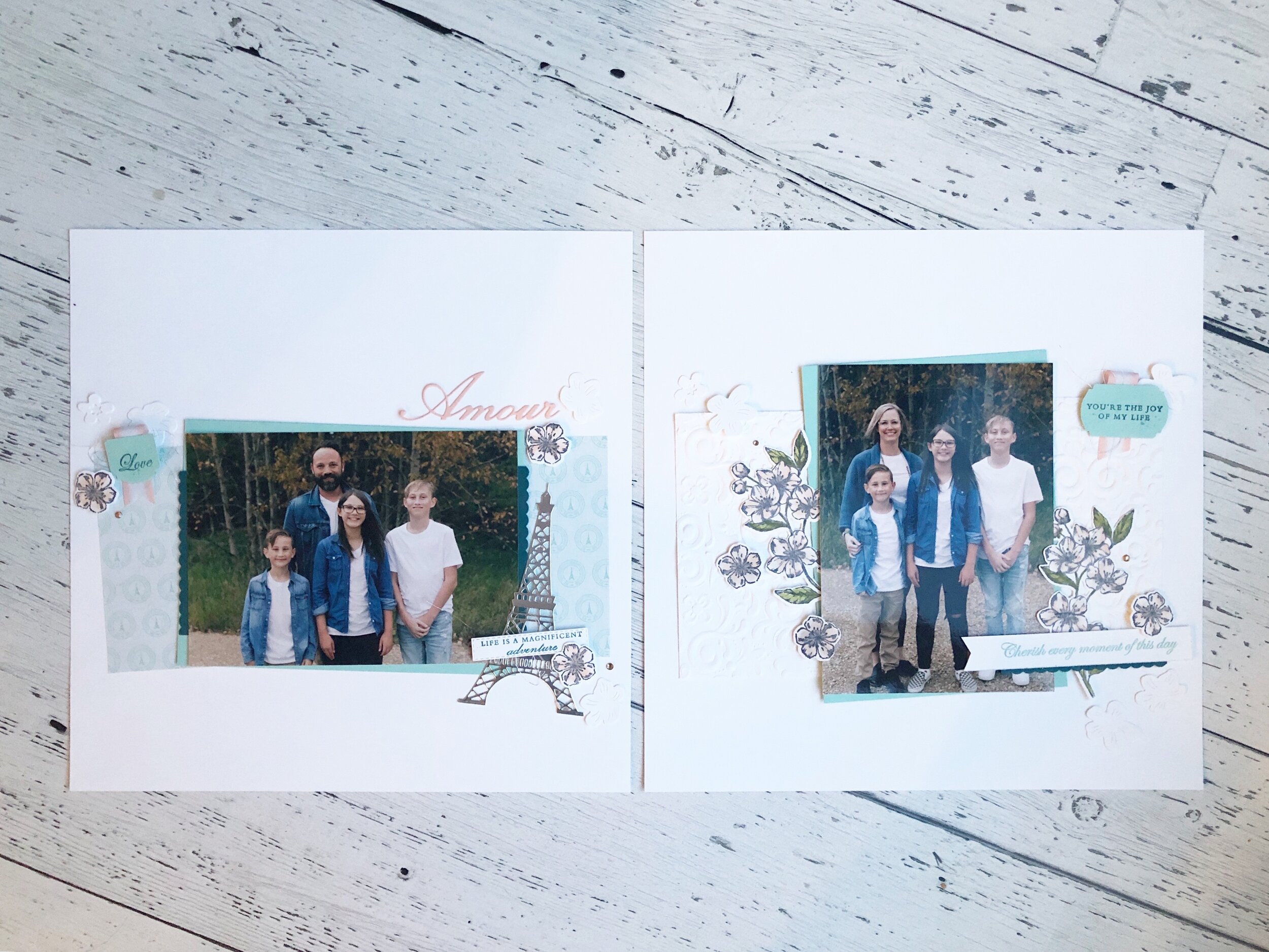
On this page I have used some current popular product, the Poppy Moments Dies, along with a stamp set from the Annual Idea Book & Catalogue—Seaside Notions. I used some up and coming new products too—the DSP strip right below the bottom photo is the new Ornate Gardens Specialty Designer Paper and I added in some Gilded Gems from this product suite as well.
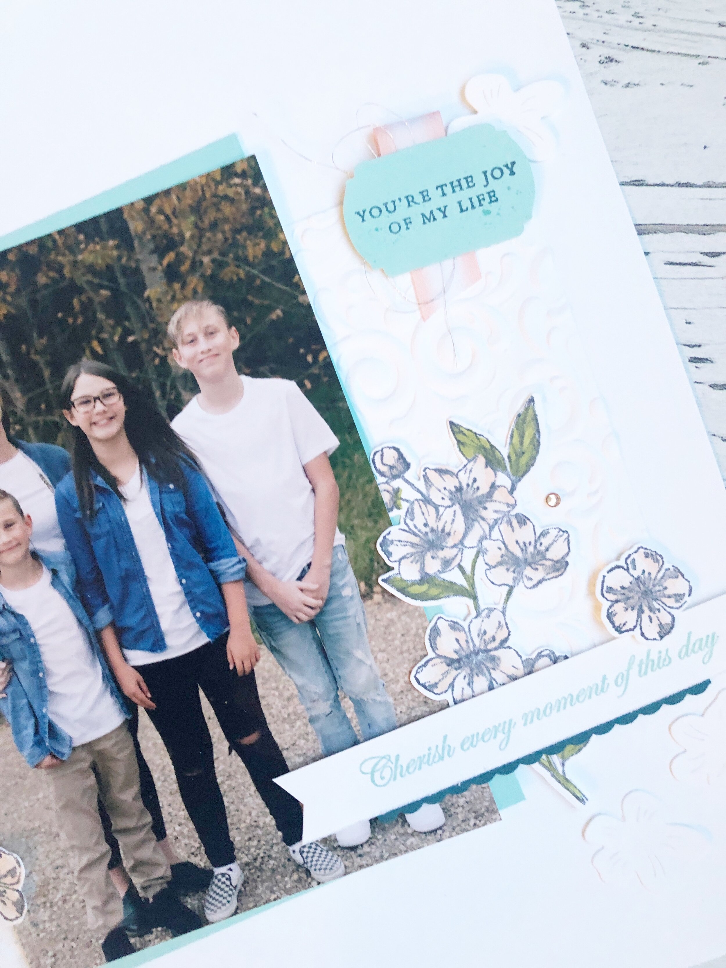
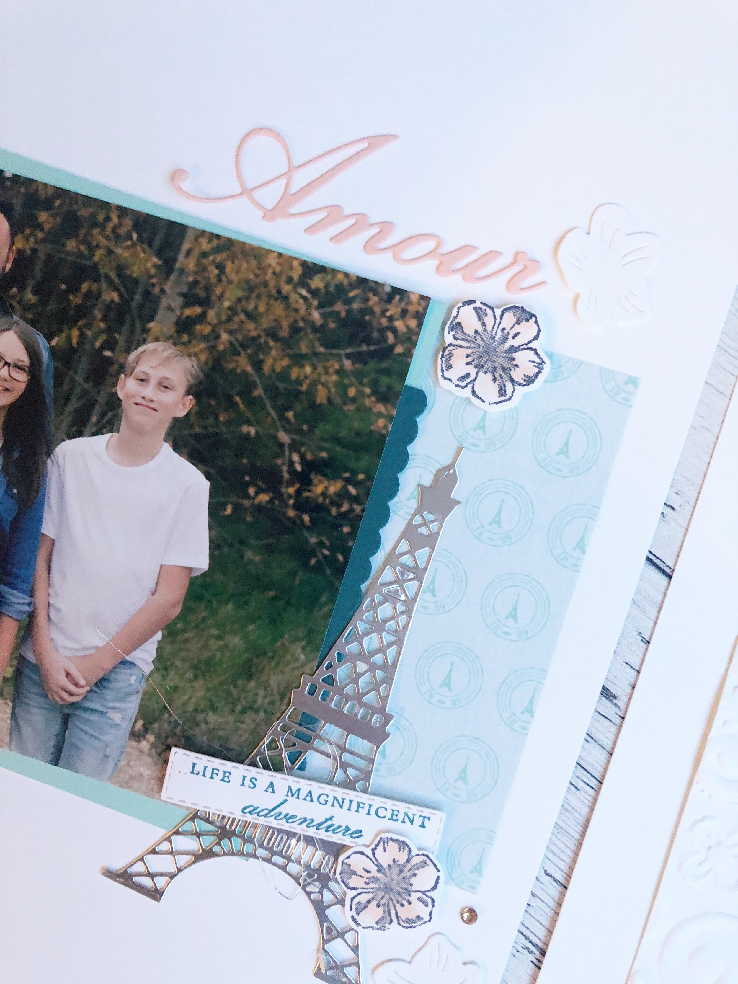
One fun tip for when using the Poppy Moments Dies is to keep them tone on tone. I ran the base of the flowers through the Subtles Embossing Folder (found in the Idea Book & Catalogue) and it gives it just the right amount of texture.
The colors I used on this page are Crumb Cake, Petal Pink, Grapefruit Grove and Terracotta Tile with gold accents.
This page didn’t not take long to put together and can easily be recreated using different DSP and even different flower dies! I hope it inspires you!
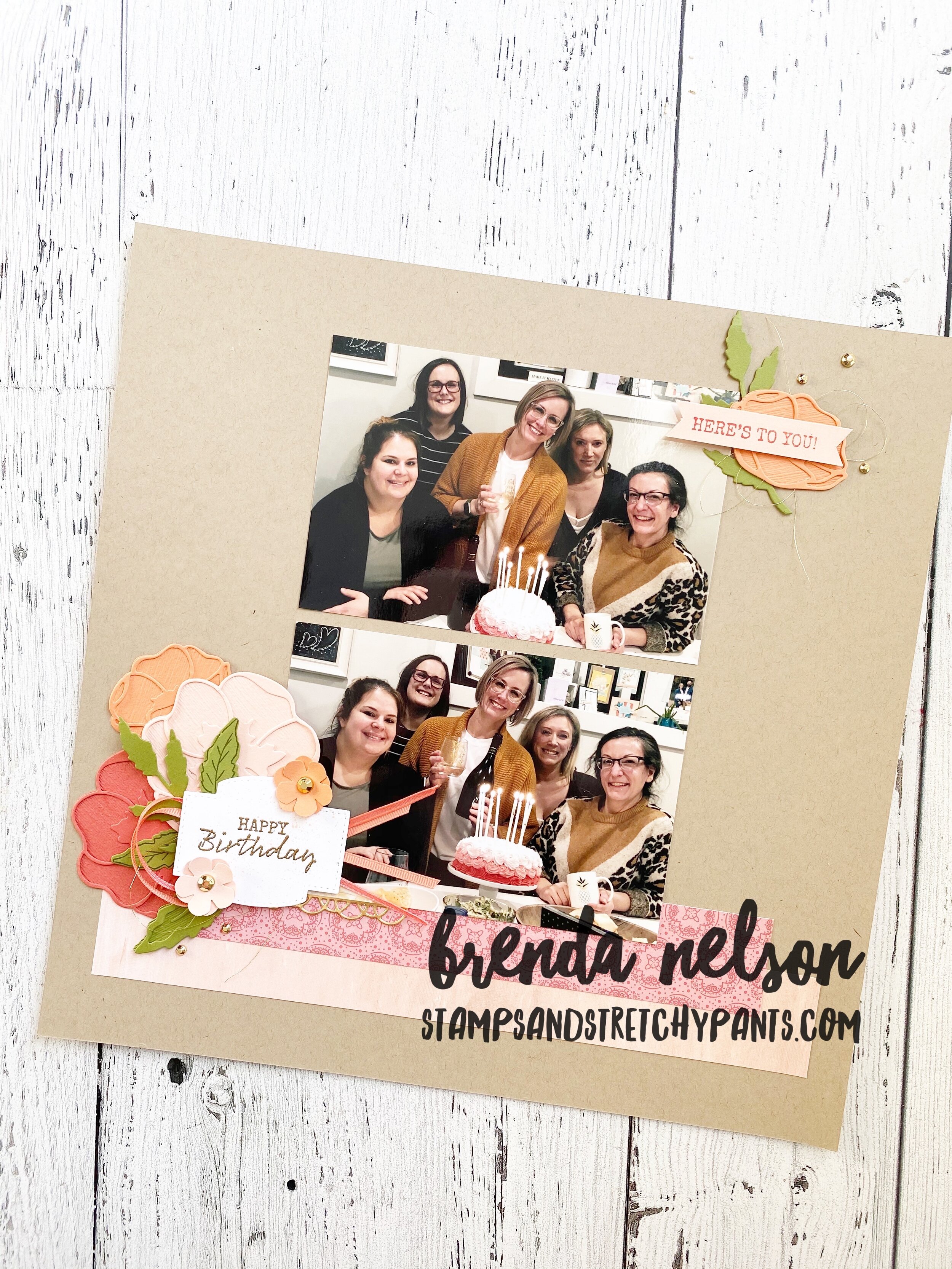
Happy 44th birthday to me!
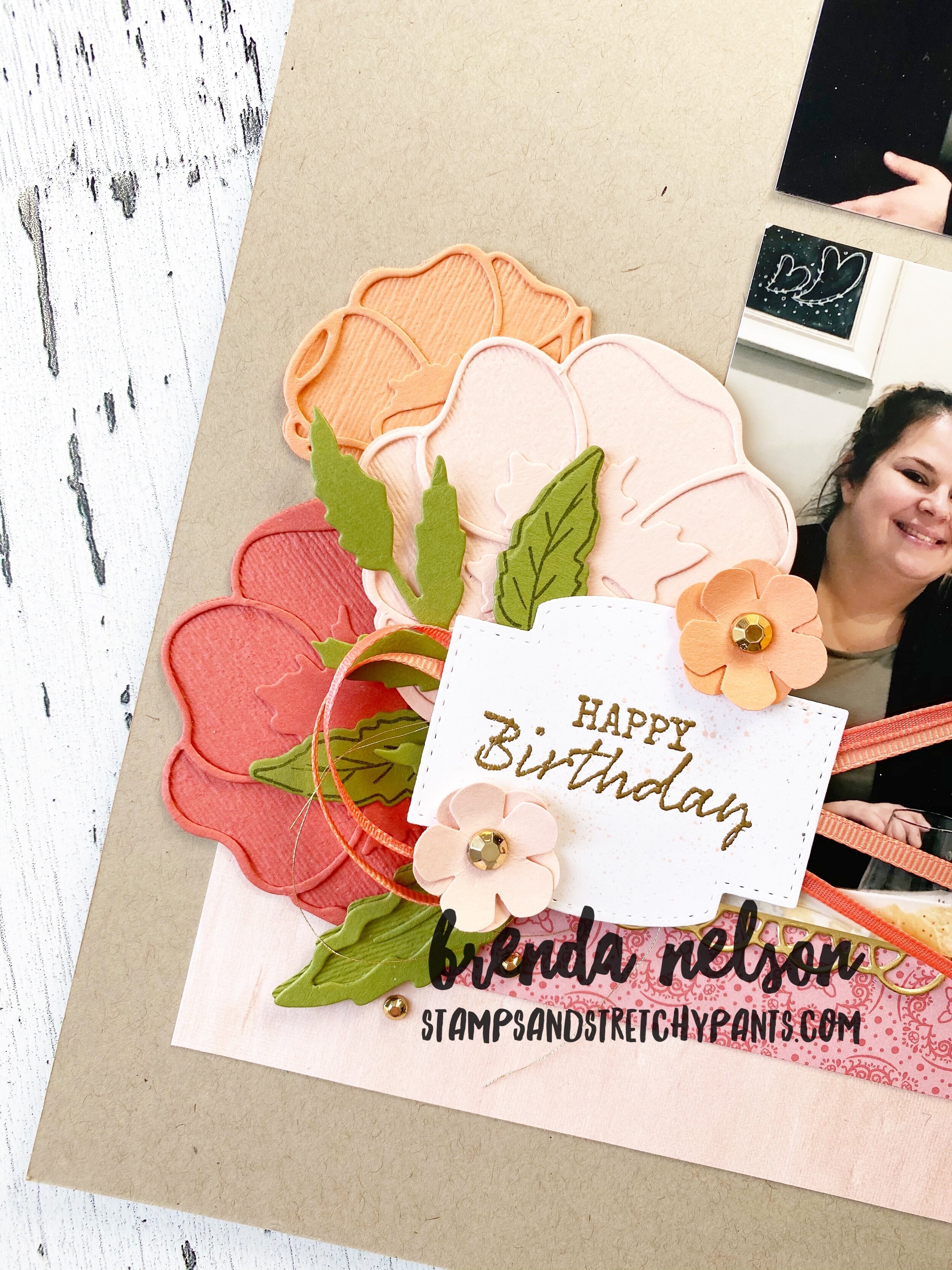
In this photo you can see the detail the Subtles Embossing folder gives to the flowers, I think is perfect! And those new Gilded Gems—on point!
Please visit Sue Allen’s blog next on the hop!