Love Your Colors!

Recently in our Artisan Team group chat we were talking about colors that we rarely use and don’t ‘love’ as much as some others. The idea was born to create a project using that color that tends to be left out and launch a campaign to #loveyourstampinupcolors

We hope you will share this hashtag too and create a project that features a color that can feel a little lonely in your collection.

IMG_8056 2.JPG
final (13).jpg

Can you tell what color was my focus? Merry Merlot! I don’t know why but it isn’t a color that I reach for very often, but after making this card I think I have developed a little more love for it. Doesn’t it look beautiful and elegant paired with the Shaded Summer stamp set and some gold accents?

The base of my card is Merry Merlot and I cut a 2 x 5 1/2 strip that I ran through the Pretty Flowers embossing folder and added to the bottom of my card.

I cut a layer of Basic White and ran the bottom through the one of the Basic Borders Dies…if you do not have these yet, hit ADD TO CART now :)

final (10).jpg

I decided to pull out the Gilded Leafing to add an elegant touch to my card. I thought it would look so pretty with Merry Merlot. I used the wide tip of my Tombow Multi Adhesive Glue to spread some glue in random spots along the edge. You can then press the panel into the Gilded Leafing and dust off the excess. It is such as easy way to add this product on.

I flicked my Merry Merlot marker across the card base too. I love adding a little flecking of color to my projects and this technique is so easy.

final (11).jpg

I used my Stampin’ Write Markers in Merry Merlot and Mossy Meadow to color both of the large floral images in the Shaded Summer stamp set. I then hand trimmed this out and added them to my project to appear like one larger floral.

I also selected a couple flowers to color again and cut out to add on top of the image to give a little more height and dimension.

I added a little strip of Gold Foil Paper along the top edge as well for a little more glam. And finally finished it off with some classic Pearls! Can’t get any more elegant than pearls right?

final (17).jpg

I love how this card turned out and I am so happy I have sparked a little more love for this rich lovely color. I hope you will pull Merry Merlot off of your shelf and create something with it too. Make sure to use the hashtag #loveyourstampinupcolors

Create with Connie and Mary--Pastel Techniques

Hello friends! I am really excited to share a pastel technique with you today. As well this is my final blog post as a Designer for the Create with Connie and Mary Blog Hop. I have really enjoyed participating in these weekly challenges for the past year + and have learned so much! I have appreciated the comments and encouragement along the way. I will be continuing to share here and on my Instagram so I hope you will continue to follow along with me on my creative journey!

21SUSatHopWelcome.png

Have you played with our new Stampin’ Pastels yet? I have made so many fun things with them! I have been stamping long enough that I remember way way back when Stampin’ Up! had them in the annual catalogue. So I was able to draw on a few of those long forgotten techniques plus play around and experiment with some new ones as these pastels are different than what we offered in the past.

TOP TIP: In order to get the ‘chalk’ off of the pastel, use the scraper tool attachment of the Pick a Tool to scrape the coating from the outside of the pastel. If you were to open your package and rub your finger over the chalk, you would notice nothing would be on your finger. However, after you scrape the chalk it will easily rub off on your finger!

final (1).jpg

Along with using the new pastels I wanted to use another new product we have which are the Plenty of Patterns Decorative Masks. I love masks because you can use them with so many other products we sell. Embossing Paste, Blending Brushes, Finger Daubers, Spritzers and the list can go on!

final (2).jpg
 

I started by selecting my Decorative Mask and pastel color. For this project I used the pastel that looks like Coastal Cabana.

I placed my mask over top of my Basic White card stock and simply rubbed my chalk over top of the mask.

The ridges from the mask will help shave or release the chalk from the stick.

I removed the mask and with gentle pressure you can remove the excess chalk with your Blending Brush. You do not want to press too hard to lose the design from the Decorative Mask.

I really love this technique as its quite simple but creates a really wonderful background for your project.

To embellish and decorate the rest of my card I used the Flowers of Friendship Bundle. I stamped the flowers with Momento Black Ink and then I colored them with a Water Painter. I applied the tip of my Water Painter DIRECT to my pastel and colored! It is another fun way to use this product. And using a Water Painter gives the finished look a ‘watercolor’ feel which I love!

final (4).jpg

I hope you will add the Pastels to your next order as they are inexpensive and so fun to experiment with! I will continue to share projects with the Pastels over the summer so keep checking back in!

To continue on with the Hop you can go BACK to see what Melissa made this week or NEXT to see what Connie has designed. Please feel free to leave a comment or use my Host Code if you are inspired and live in Canada!

Artisan Design Team--June Share!

Hello friends! I cannot believe that this month marks the halfway point of this amazing journey and experience! I have learned so much along the way but the best part has been the amazing new friendships I have developed with the other team members!

The Artisan Design Team is broken up into 3 groups as we have the largest team to date and my group was given the assignment of creating with the Art in Bloom bundle which features the new Bloom Hybrid embossing folder!

pictapgo-output (10).jpg

I couldn’t resist the opportunity to create a page with this little cutie’s smiling face, especially because he is now 16! But his eyes have not lost their sparkle and his face still lights up the room. And I also want people to feel ok about scrapbooking their sons, nephews, husbands, etc with flowers and pinks and other bright fun colors!

I started with a 12x12 base on a sheet of DSP from the Expressions in Ink Specialty Designer Series Paper. This gave me the foundation to add in these bright pink accents.

I used this new Hybrid Embossing Folder in two ways on this page—-one is the traditional way in the sense of I ran some Basic White card stock through the Stamp Cut & Emboss Machine to create two accent panels to flank my photo. The second way is that I used some Gold Foil Paper to emboss and cut the flowers out. This is what makes this folder so unique—it does both at the same time!! You place your paper in the folder and add the dies on top (they will nestle inside).

I also stamped out some flowers and colored them with the Pale Papaya Stampin’ Blends and then used the dies to cut out the flowers.

pictapgo-output (11).jpg

My favorite element in the Bloom Dies is the shape that cuts out the ‘ticket’…I just love it and think its a great way to add interest or to cut out with a sentiment. On my card I used it as an accent piece.

My tip to accompany this project is a classic one—using your Stampin’ Write Marker to isolate specific words to change how a sentiment is presented. You can see here that the sentiment in its original form is ‘long’ and I wanted something that would fit into a circle. So I just used the marker to isolate the words and stamp them in the shape I wanted.

Notice the ink spray in the background? One of my favorite things of all time—-use your Stampin’ Write Marker or even a Stampin’ Blend to flick or spray ink across your project. I do this ALL THE TIME. It just helps take away the ‘white’ space on a project.

If my projects have inspired you in any way and you would like to place an order you can hit the button below that will take you directly to my online store. Or you can use the HOST code on the main sidebar on my page. I truly appreciate it as I hope to keep loving what I do for as long as possible!

shop with me

Create with Connie and Mary--Glitz and Glam

Hello, welcome to the blog hop this week. Our theme is “Glitz and Glam” which can mean so many things! I associate it gold and lots of layers and interest!

21SUSatHopWelcome.png

I think the Expressions in Ink suite is pretty damn GLAM and its also super unique to Stampin’ Up! so I knew I wanted to do some creating with it. I designed 3 projects for my monthly Class to Go Kit which I will share in a a separate post. Here is a little teaser for you though!

final 77.jpg

I started with a Basic White card base and added a layer of this awesome gold strip paper from the Expressions in Ink Specialty DSP. I used the Layering Circles dies to cut a circle or window. In behind this I layered the fantastic floral die that is a party of the Artistic Dies.

The Artistic Dies also have this large leaf die that I cut out of Just Jade ink and trimmed and placed around the big Polished Pink stamped floral.

I used the coordinating Ephemera Package to add in some glitz with the gold leaves and sprig and the iridescent sequins scattered around.

I think this card definitely has a ‘glam’ feel to it, don’t you?

Let’s see what the other team members have created this week. You can go back to see Melissa or next to see Connie! And watch for another post with all of my Class to Go Details!

Around the World on Wednesday--Step it Up!

Welcome to another Around the World on Wednesday Blog Hop! This is literally the only way you can actually go ‘around the world’ in these fun and interesting times, hahaha! So I am happy to have you here!

I loved this months theme as its always a good challenge for me to try a fancier fold card style from time to time and that was how interpreted the theme of ‘step it up’! I can’t wait to see what all of the other gals from around the world design!

137064325_10218496422788728_249469279951355940_n.jpg

I wanted to play with the Sweet as a Peach stamp set as I haven’t had a chance to ink it up yet and I knew it would be a good option for the card style I had in mind. I had a request from a stamping friend to show her how to make a waterfall card and it worked out perfectly for this monthly challenge!

The Waterfall card style is an oldie but a goodie! And the best part is that is not complicated to make but look super fancy and is sure to get a ‘wow’ reaction from the recipient!

The Waterfall card style is an oldie but a goodie! And the best part is that is not complicated to make but look super fancy and is sure to get a ‘wow’ reaction from the recipient!

To create this style of card you need to choose a stamp set (or multiple sets) that has a lot of imagery and or sentiments for the 4 flip panels or the ‘waterfall’ aspect. I decided to use Sweet as a Peach because it has 12 words or sentiments in the stamp set and I wanted to layer up the peach and floral images with sentiments.

I decided to stick with the color palette of the You’re a Peach DSP therefore the base of my card is Crumb Cake with accents of Early Espresso.

To create the two tones of the peach I stamped it in Pale Papaya and then used my Blending Brush in Calypso Coral ink to add a deeper color straight to the stamp. Because these white squares are not that large, I used a couple of the leaves from the bottom of the big leaf stem on these peaches. The inside peach uses the larger leaf included in the set.

pictapgo-output 3.jpg

I also applied the same concept to stamp out the trio of flowers—stamping it in Pale Papaya first with the Calypso Coral added with a Blending Brush. I stamped all of the sentiments in Early Espresso ink.

On all 3 of the peaches I also added a bit of Wink of Stella for a little glimmer. Sadly it is really hard to photograph but looks really great IRL (in real life, yes I had to ask one of my kids once what that mean when they sent it in a text!!!).

final (4) 15.jpg

I added the polka dot pattern from the You’re a Peach DSP straight to the card base and added a few Champagne Rhinestones to the peach images.

pictapgo-output (2) 2.jpg

I punched a hole at the bottom of the waterfall piece to thread some of the new Pale Papaya & White ribbon through that I tied with a Linen Thread bow. This also helps the recipient know to pull on this piece when they receive their card.

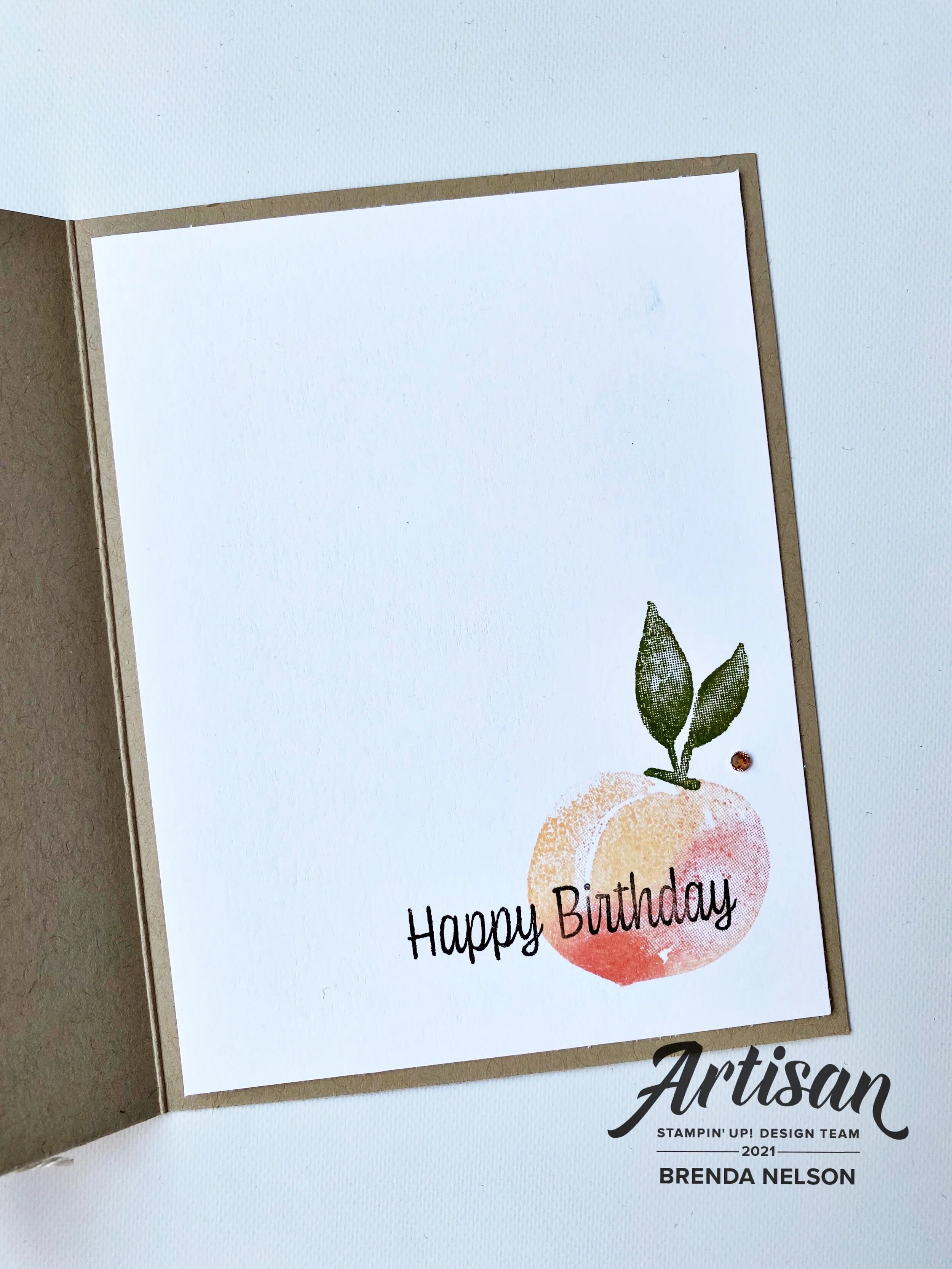
And I also wanted to stamp the inside for a bit of extra fun!

 
91442295_10216484369808661_2887014979863576576_n.jpg

I hope this waterfall card design sparks an interest for you to try your own! I have included the instructions below and trust me, its easy!

pictapgo-output 5.jpg

To Create a Waterfall card:

Cut standard card base @ 81⁄2’ x 51⁄2” and standard mat @ 51⁄2" x 41⁄4”. Cut one “Anchor Strip” out of cardstock @1” X 4.” Cut one “Movable Strip” out of cardstock @ 2” x 9.” Cut 4 dark squares @ 2” and 4 whisper white (light) squares @ 13⁄4”.

  1. Lay the cardstock “Movable Strip” on scoreboard in landscape position and score this 4 times @ 2", 2 3⁄4", 3 1⁄2", and 4 1⁄4". Fold all score lines in the same direction and burnish with bone folder. 


  2. Apply adhesive to both ends of the “Anchor Strip” - only 1⁄2” on each side leaving centre part free. Attach this to the mat piece. Then add the mat piece to the card base front.

  3. Lay “Movable Strip” on card so that the folded parts are on top of the “Anchor Strip” and the unscored part is behind it. Adhere only the top end (1⁄2”) to the ‘Anchor Strip” This is so the parts can move freely. 


  4. Stamp images onto small white squares. Colour stamped images. Adhere to the 2” dark squares. Attach squares to the “movable strip” starting with the bottom one. NOTE- use only thin strip of adhesive along the top of each square for the top 3 squares - they need to be able to flex - fully attach the bottom square at top and bottom.

  5. Punch hole at bottom of under piece of the Movable Strip - then thread ribbon through and tie with a bow.

Thank you to my awesome friend Hetty for these directions! She is a library full of fun folds and is always willing to supply me with measurements when I need them! You can follow her on Instagram @stampin911hq!

Following me on the hop is Tricia Butts from the United States and if you didn’t know where in the world you are right now, I live in Edmonton, Alberta Canada! Please feel free to leave a comment and make sure to visit us again next month!