Flip & Pull Mini Album Project
/I wanted to share a mini album I made for my Mother in Law for this past Christmas. I took a class that my friend and fellow demonstrator Jessica, @jessbstamps, offered in November. We put this album together over 2 sessions and then were left to add photos and embellishments on our own. It truly is a one of a kind project and gift!

This completed album definitely has some weight to it. Because the album was so interactive with photo panels opening and flipping in every direction, I did have to be more aware of embellishing. So while I didn’t embellish to my typical avid standards I am happy with what I was able to add into the album. I think it will make a really great keepsake as it is pretty well constructed. We used a lot of Tear & Tape on this project!
I want to note that because I do not have this album in front of me anymore, I cannot exactly remember the order of the pages. So the way my photos are shared my not actually be how they are in the album! Disclaimer! And I have NO measurements or anything for you as I did not design this project.
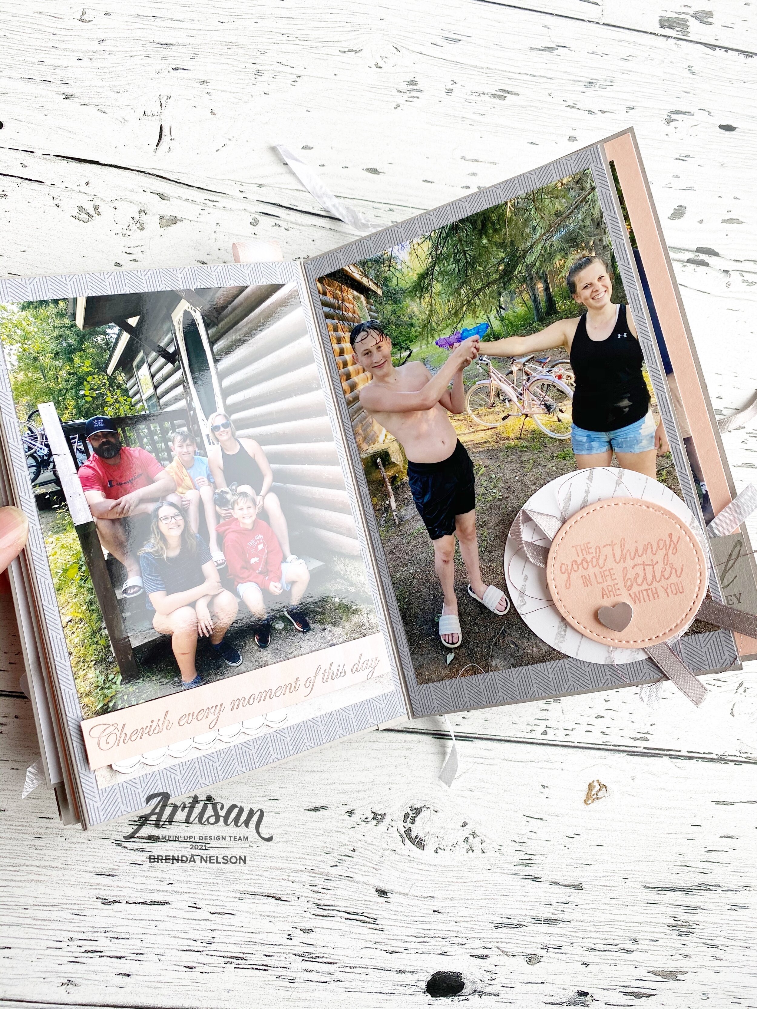
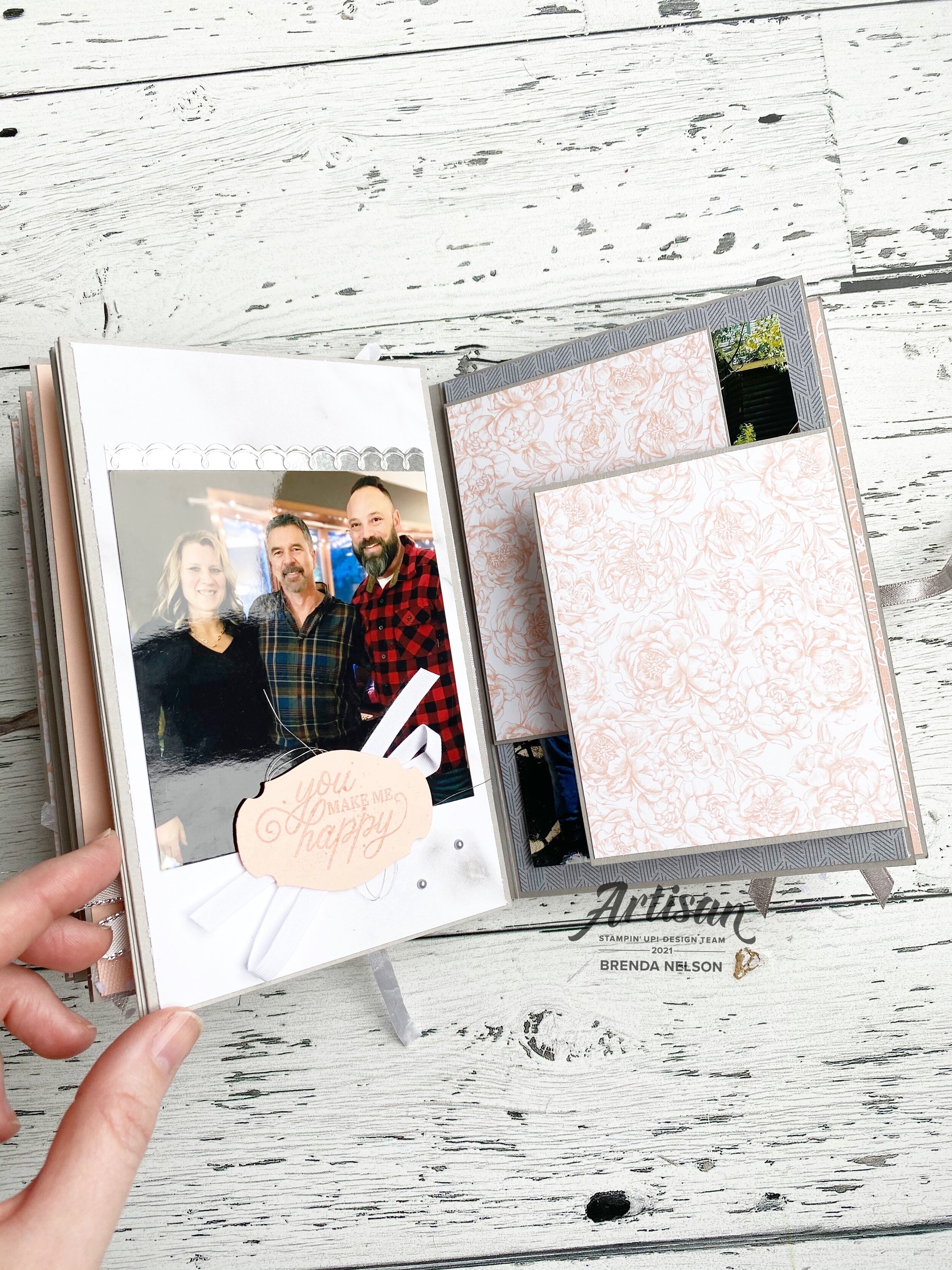
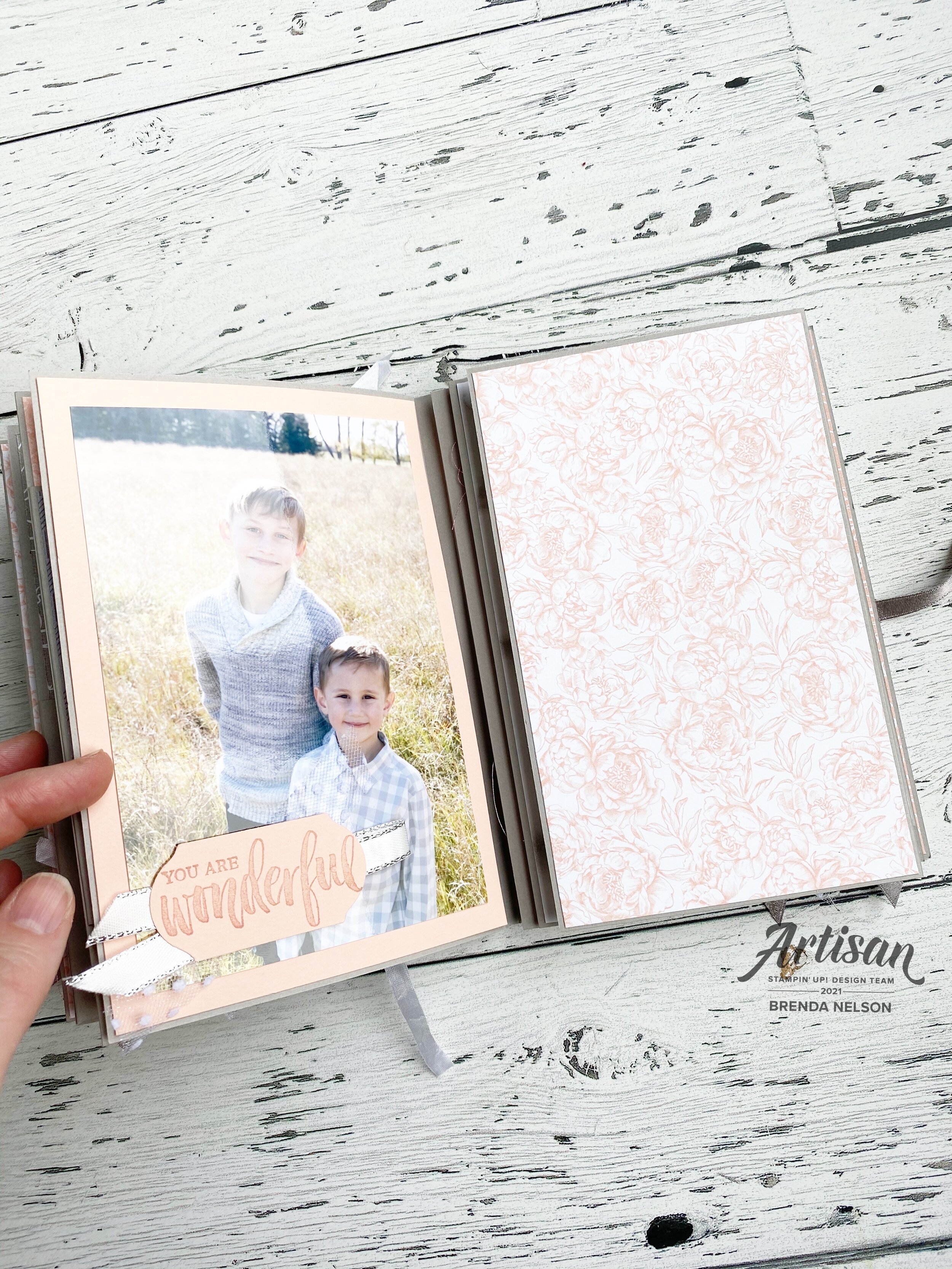
We have so many fantastic stamp sets to choose from that I had no shortage of inspiration to embellish this album. I added in a variety of ribbons and Silver Metallic Pearls through out and kept the colors true to the Peony Garden DSP. The base of the album is Smoky Slate card stock and we almost used an entire package to make this album and almost the entire package of Peony Garden DSP.

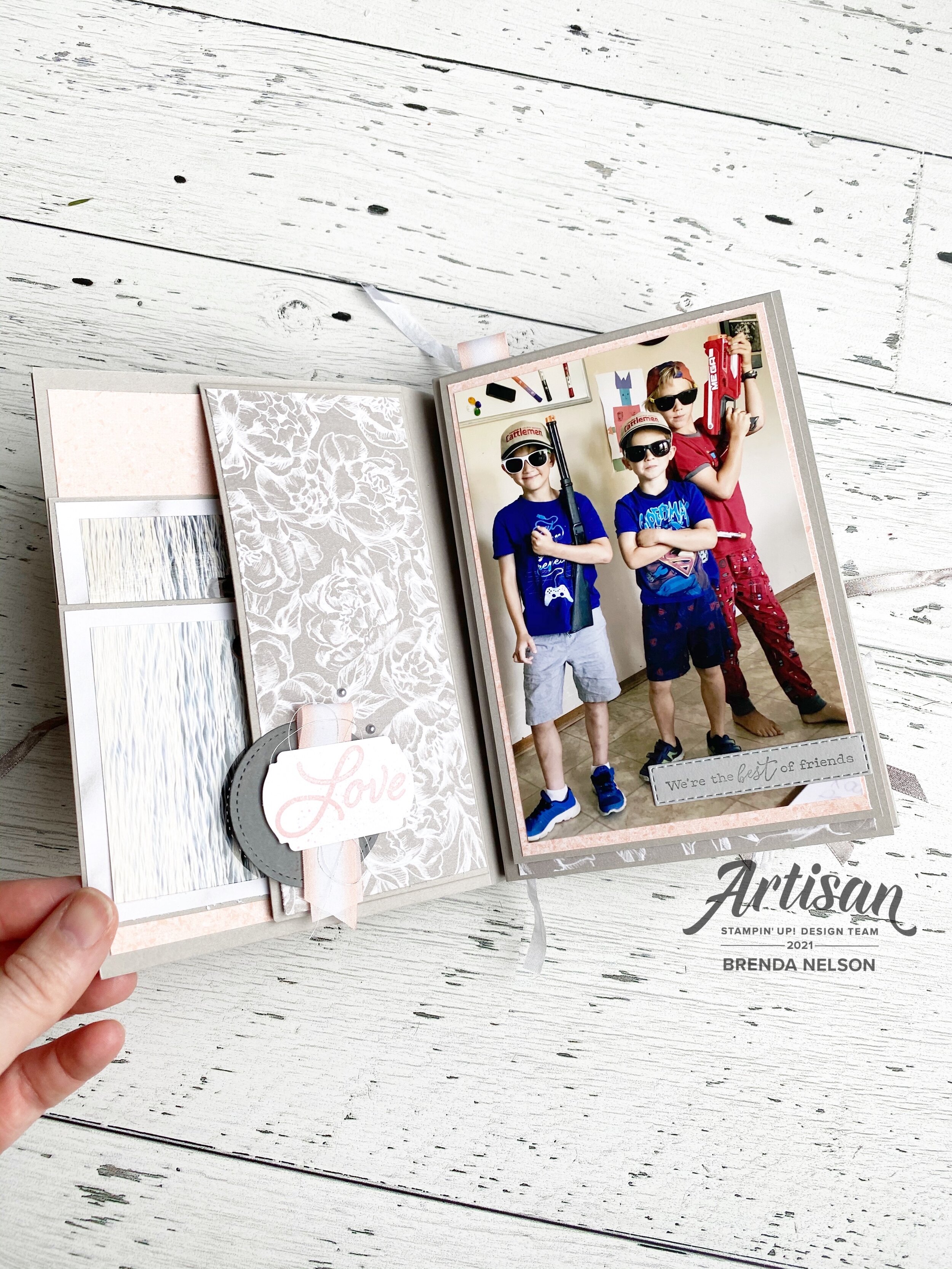
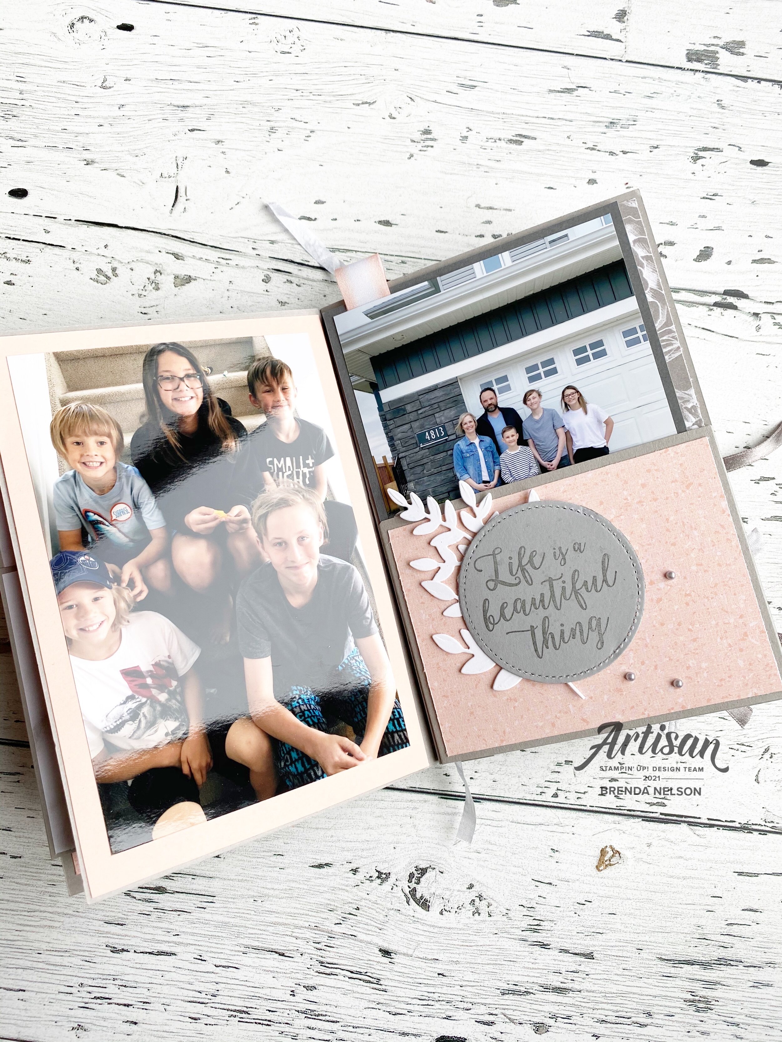
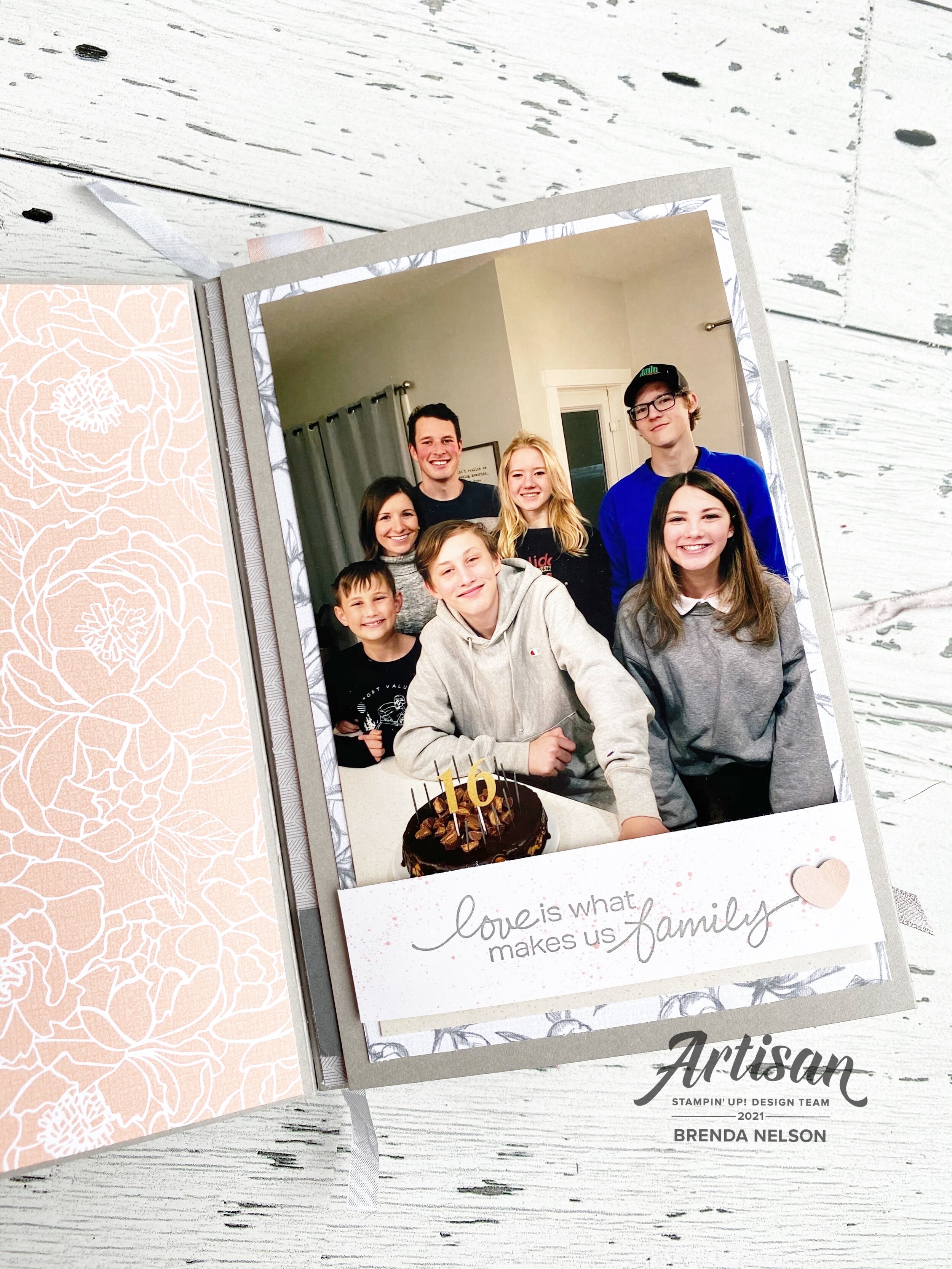
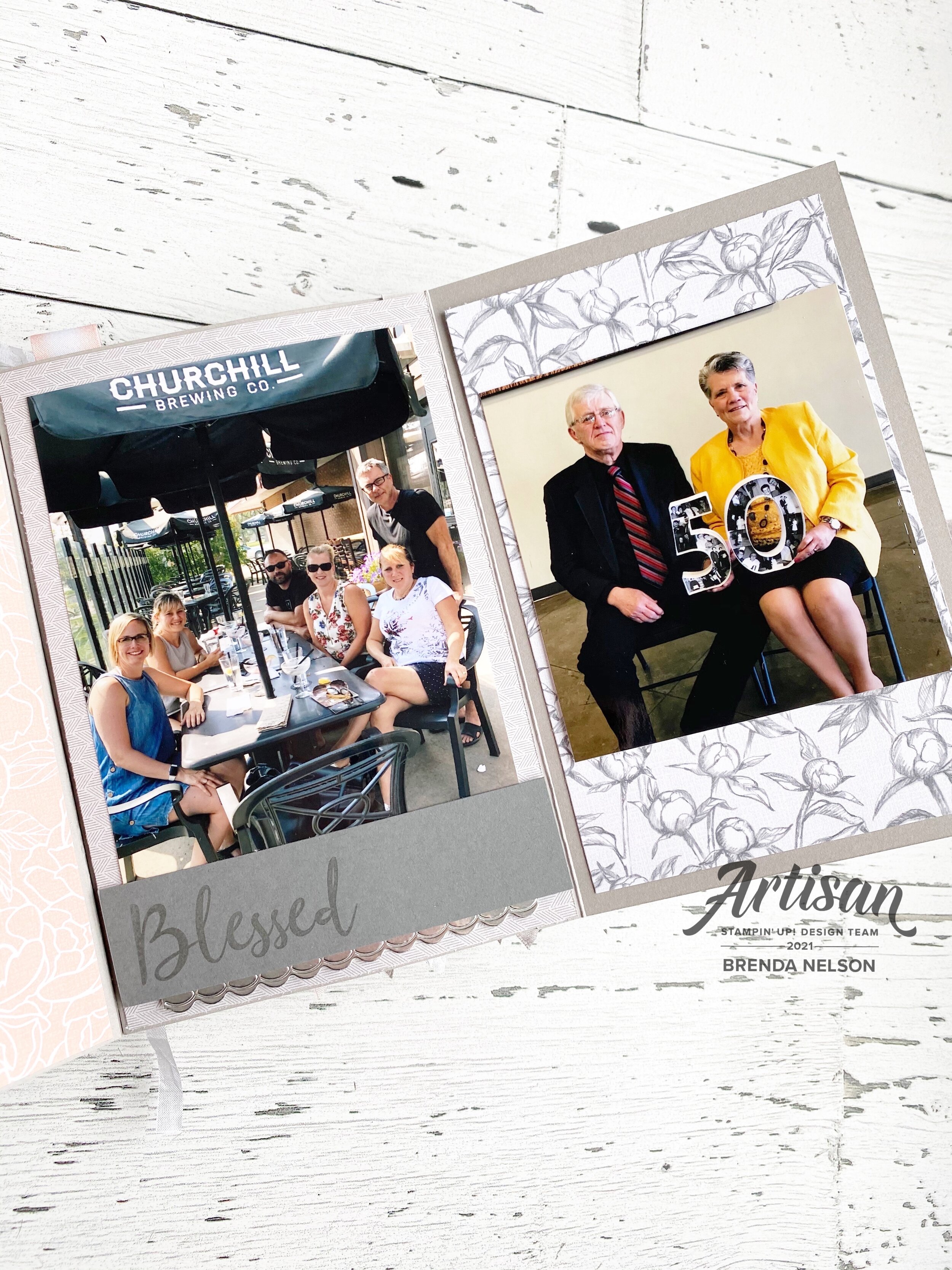
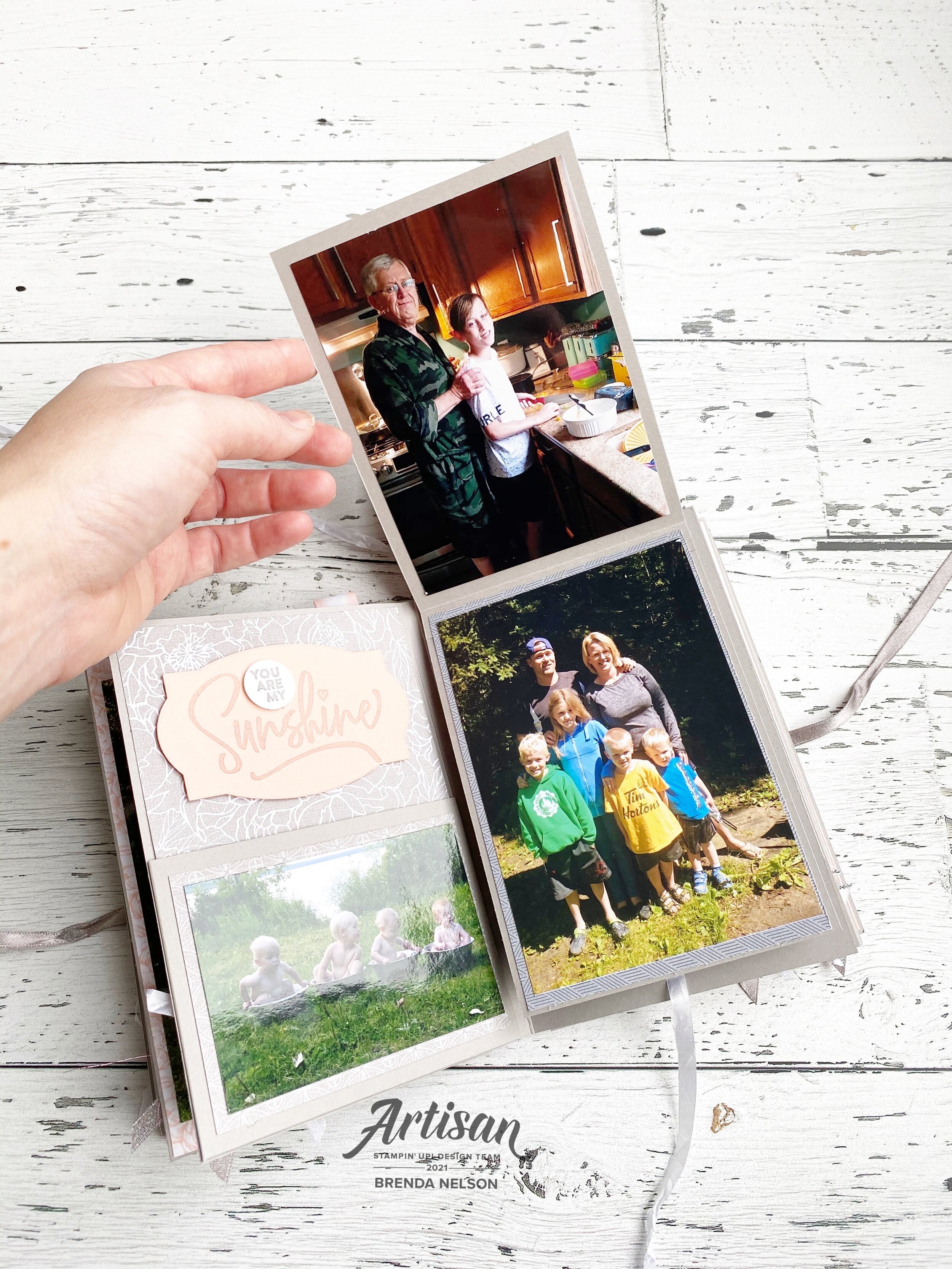
We have a very large family on the Nelson side. 19 grand kids! My nephew recently married so we are now at 20, plus all of the adult adults! So this project was a perfect way to showcase everyone and reflect on the many amazing family memories we have made so far.
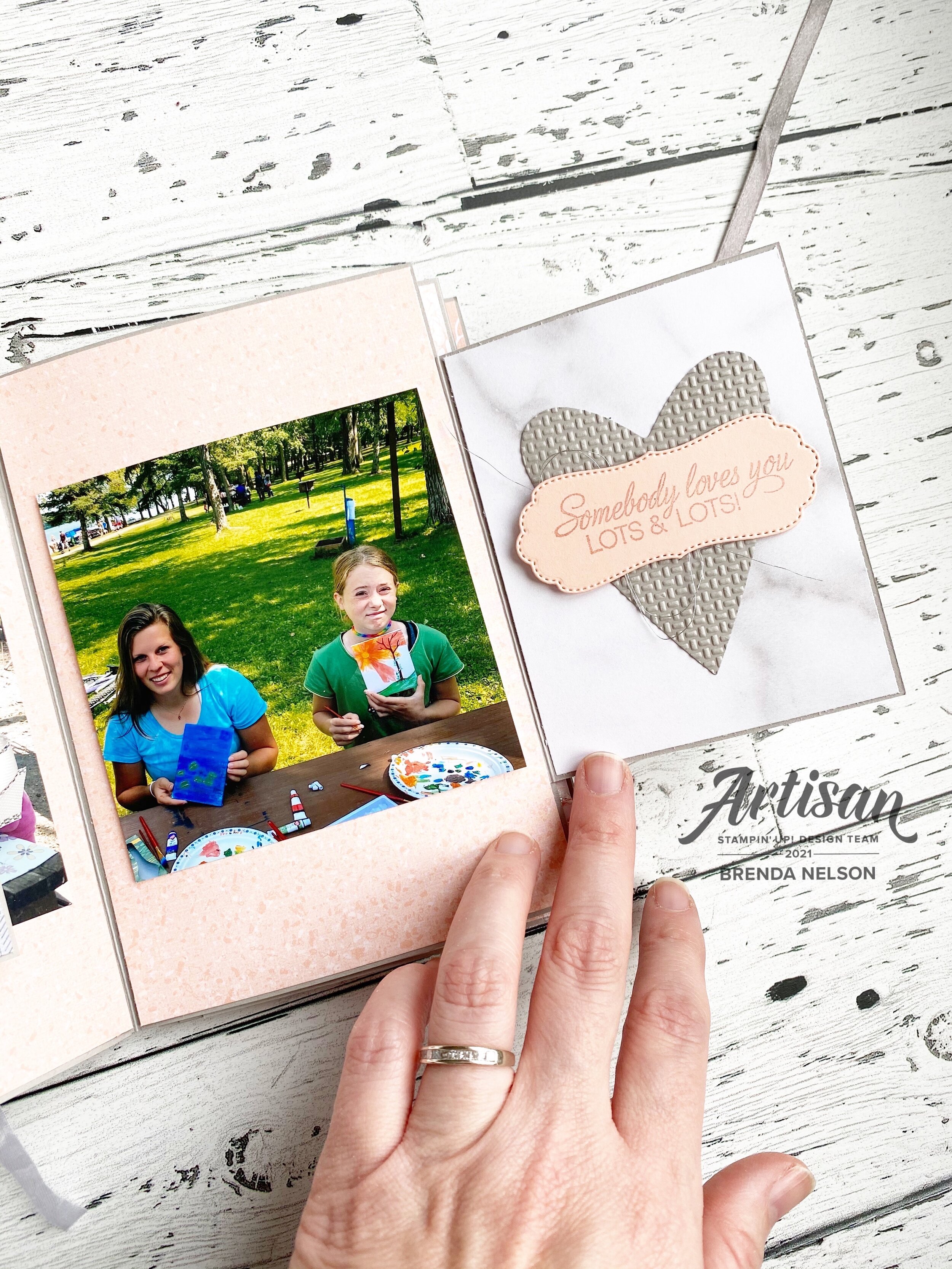
My favorite aspect to this album are all of the fun pullout pages and the pages that lift up in every direction possible. Some flip up, some flip down! Pages pull out and fold it. Its actually quite spectacular!
There is so much to explore and see while looking through this project.

One of the gals that took this class with me called these little panels ‘Saloon Doors’, we all thought that was the perfect way to describe them!

I hope this project has inspired you! I would love to make another one and fill it with memories of my family, but for now I know my Mother in Law and extended family, who live a province away, will enjoy looking at this mini album!