Create with Connie and Mary-Favorite NEW In Color!

I don’t even KNOW if its possible to pick just one color…so I am going to go with the first color I chose to create a scrapbook layout! Obviously that color was really speaking to me and I have to say I LOVE how it turned out. I hope it inspires you too!

21DesignTeamBadge.png

I am also curious to see if the Design team has similar favorites or if we have quite the spread! Its always so fun to see each week how we incorporate the challenge!

final (4) 15.jpg

The base of my page is the new Evening Evergreen and I just love it! It is such a nice rich green that looks fantastic with these lighter colors. I added interest and texture to my page by just punching a bunch of 1 inch circles and adhering them flat to the layout. This is a great way to add a design element without any background stamping.

I used the flowers from the True Love Designer Series Paper and colored them in with a variety of Stampin’ Blends.

final (1) 19.jpg

Evening Evergreen is such a nice base to showcase some brighter colors and make them really pop on your page. Here is stamped the sentiment with Fresh Freesia ink on the coordinating card stock. The sentiment is from the Color & Contour stamp set. Flowers in Calypso Coral, Polished Pink and Fresh Freesia look so awesome on this rich dark background. The leaves are colored with the new Soft Succulent Stampin’ Blend.

final (2) 16.jpg

These flowers are colored with the Pale Papaya Stampin’ Blends. I brought in a Pale Papaya photo mat and some of the new Pale Papaya and White Ribbon too. It is such a lovely color that really fills a gap in our standard color offering.

final (6) 8.jpg

You will notice in my paper crafting that I like to create little areas of interest on my pages. Typically on photos or up in the top corners of my pages.

This view gives you a sample of each of these! I love to add sentiments or phrases onto my pages to help bring my feelings about the content to life. Stampin’ Up! has no shortage of amazing stamp sets to help us in our design.

final (4) 15.jpg

If you have not pulled out this luscious green to play with yet, I really encourage you to do so. It is quite distinct when paired up with some of our current greens and as you can see it really does make a stunning backdrop for this scrapbook layout.

I can’t wait to see what the rest of team has chose as their Favorite New In Color! You can go BACK to see what Melissa’s choice is or NEXT to see what Connie has selected! Please feel free to leave a comment. Its always nice to get feedback!
Color Fusers--May 2021 Blog Hop!

Hello friends and welcome to MAY the official month of spring! Things are starting to grow and poke through the dead that claims most of the year here in Edmonton where I live! The sun is shining for longer and longer every day. Its fantastic!
I love the Color Fusers Combo that we have for you this month! This combo is bright and happy and new I wanted to make a scrapbook page…wait, I ALWAYS want to make a scrapbook page! Cards come in second place!

05_2021 Graphic.jpg

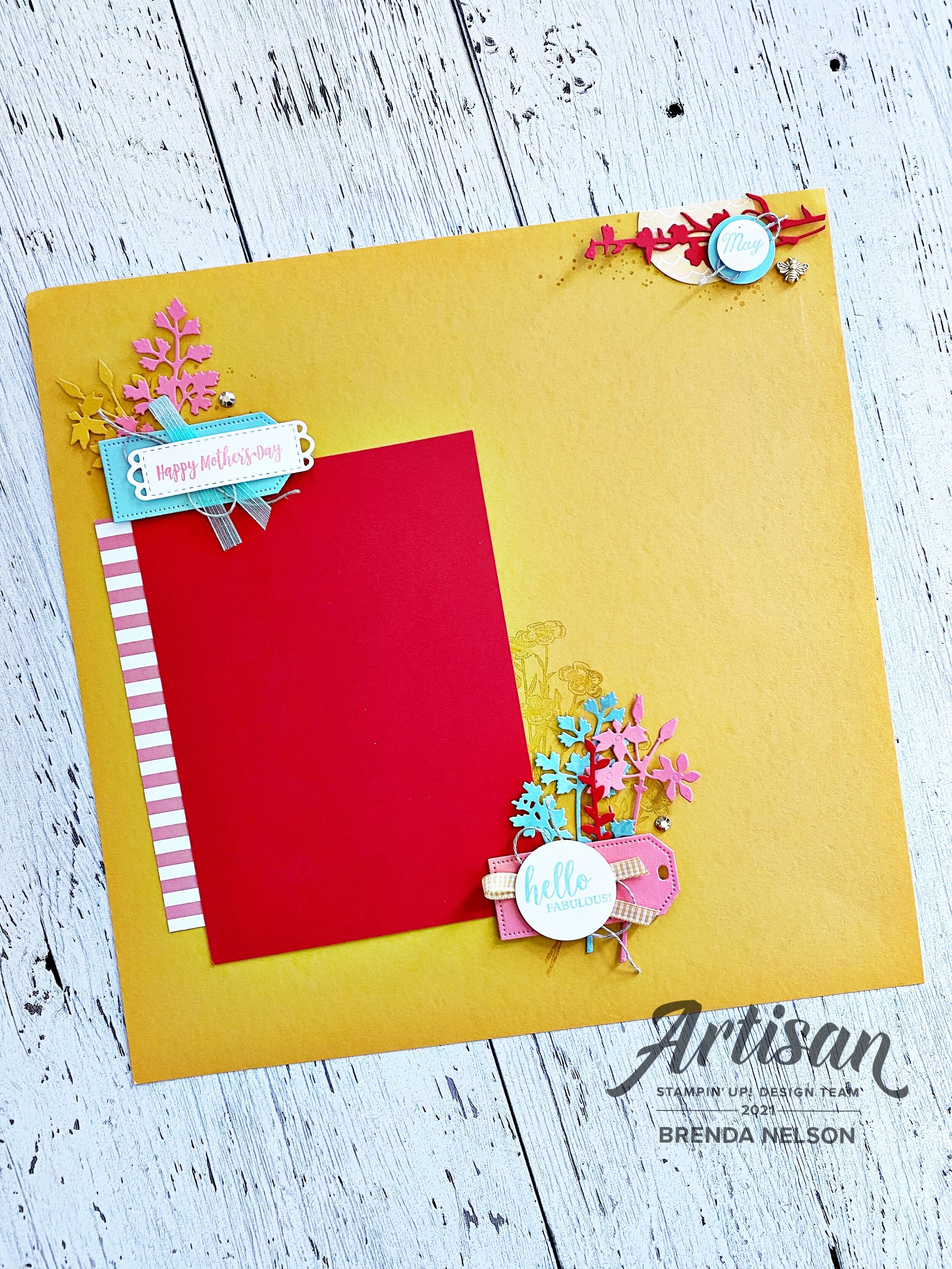
I started my page with a base of Bumblebee—-it is such a gorgeous yellow! I decided on the theme of Mother’s Day and look at me, I am ahead of the game! Now I just have to pop a 5x7 photo onto my page and Mother’s Day 2021 will be in the books!

I love the bright colors on this page, they are so happy and work so well together!

I love the bright colors on this page, they are so happy and work so well together!

I always want to play with new stuff so I pulled out the new Quiet Meadow Bundle to pair up with a returning stamp set Dressed to Impress and the new Days to Remember stamp set.

I stamped a few floral images in the background by my photo mat and added in three different die cut florals from the Meadows Dies. The Flirty Flamingo striped DSP strip ion the left side is from the new Hostess options and is called Pattern Party. I know it will be a hit! I love it!

Layered over the die cut flowers I added a tag from the new Tailor Made Tags Dies in Flirty Flamingo. The sentiment ‘Hello Fabulous’ is stamped in Pool Party ink. And really, aren’t all moms fabulous! I think so! Behind the sentiment I layered some Bumblebee Gingham Ribbon and Lined Thread.

A Gilded Gems acts as the perfect accent to this little area!

I love to create little areas of interest on my page such as this!

I love to create little areas of interest on my page such as this!


I punched a 2 inch circle out of the Hand Penned DSP and lined it up along the top right of my page. I trimmed a small portion off.

I added another stem from the Meadow Dies cut from Poppy Parade. I added ‘May’ over top from the Days to Remember stamp set with some Lined Thread and cut Bumblebee Trinket as accents.

final (1) 18.jpg
final 19.jpg

‘Happy Mother’s Day’ is stamped in Flirty Flamingo ink and is die cut from the Meadows Die and then layered on top of a tag from the Tailor Made Tags Dies. I added some Linen Thread and Pool Party in between and tucked a couple more florals from the Meadow Dies underneath with a Gilded Gem.

I hope this page inspires you to make your own page in anticipation of Mother’s Day!

I can’t wait to see how the rest of the Design Team spins these 4 colors! If you joined the Hop here (welcome!) you can go back to see what Nicole has designed and if you hit Next you can see what Tami has created for this week! Please feel free to leave a comment, I would love to hear from you!

You're So Cool

Posting a day early in anticipation of National Scrapbooking Day! I have a big team event and a card scheduled for my feed tomorrow…so lucky you! You can steal this page layout idea and make your own version tomorrow! I do plan on making a page tomorrow night while I enjoy a glass of Prosecco!

final (2) 14.jpg

I created this page because I am hosting an Ice Cream Social with my Team Leader tomorrow in one of our annual team events! We are making a bunch of projects featuring the Ice Cream Corner Suite so I wanted to share an idea with them for a scrapbook page.

And I am really loving Gorgeous Grape right now so I decided to make my page layout on this base. I added Coastal Cabana photo mats that I stamped with the cone detail stamp from the Sweet Ice Cream set.

The sentiment ‘You’re so Cool’ is stamped in the coordinating ink across the background and I gave the page a little spray of color with my Gorgeous Grape Stampin’ Write Marker.

final (2) 13.jpg

I love to create little areas of interest on my pages. At the top right corner of this page I add a partial circle from the Ice Cream Corner DSP. I hand trimmed two popsicles from the DSP and added some White Twine behind. I stamped ‘You’re so Cool’ in Whisper White Craft Ink and embossed it with White Embossing Powder. I then hand trimmed out the So Cool to draw attention to the words.


I stamped ‘Treat Yourself’ in White Craft ink and embossed it on black. I love the contrast with the sentiments being in black and white and the page being such loud colors.

I added one of the new Loose Flower Flourshings to the sentiment and tucked some of the new Highland Heather 1/2 Grosgrain behind. The Calypso Coral ribbon is sadly long retired! I love a good thin ribbon!

final 21.jpg

I stamped out a popsicle from the Sweet Ice Cream stamp set and tucked it in behind my sentiment. I love this picture of me and some girlfriends in the mountains of Montana—it was HOT! And we definitely enjoyed some Ice Cream while we were on this girls trip!

final (4) 11.jpg

This was a pretty ‘sweet’ trip if I don’t say so myself, especially as it was my last girls road trip! Ahh, life before Covid!

I hope you have an awesome National Scrapbook Day and can take some inspiration from my page!

If you are ever looking for a Canadian Demonstrator, please reach out to me! I have so much on the go and to offer virtually!

Color Fusers--April 2021 Blog Hop!

Welcome friends to another monthly Color Fusers Blog Hop! I love this hop because it really gets me out of comfort zone for color coordination!

This month we are all tasked with creating projects featuring Seaside Spray (which is also retiring), Old Olive and Real Red. I wanted to challenge myself to use these colors to create a scrapbook page!

colorfuserapril.jpg

By chance, I happened to have this photo of my youngest son, laying on my craft table. As soon as I glanced at it and saw our color challenge, I thought it was a perfect fit!

final (8).jpg

It worked so well to use the Real Red for apples with Old Olive green accents and a nice Seaside Spray background. I am really going to miss Seaside Spray. I was a blue that I used quite often. However, the new In Colors are also pretty fabulous too!

I added some large polka dots in the coordinating ink onto the background with the Circle Celebration stamp set. The photo mat is made up of a retired piece of 6x6 DSP in Seaside Spray (from the first round of this In Color), Old Olive and Real Red card stock.


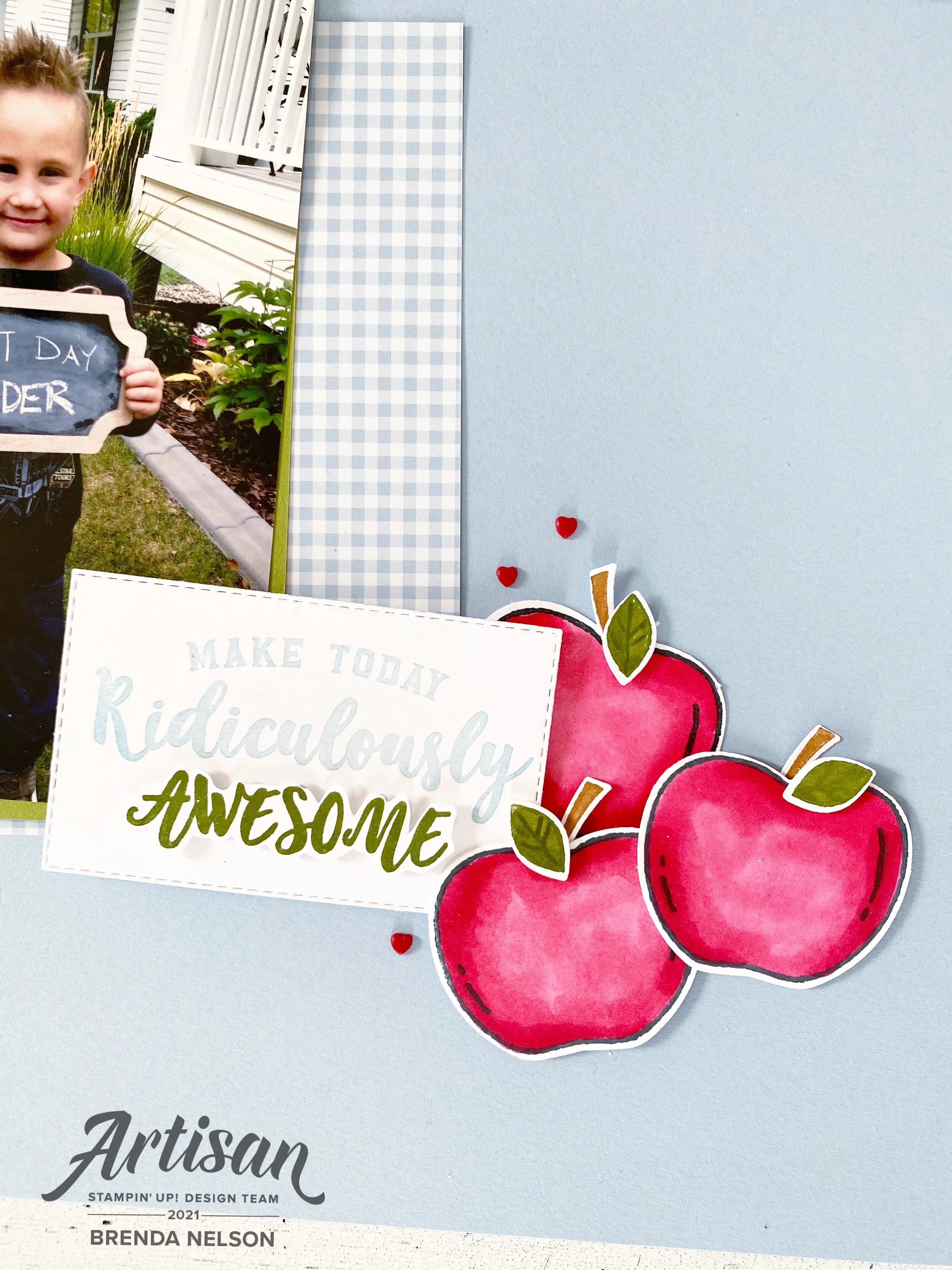
I used the stamp Harvest Hello’s to do most of the design work for me on this page. I stamped the apples in Momento Ink and colored them with my Real Red Stampin’ Blends. You can punch out all of the elements of the apple with the coordinating Apple Builder Punch!

I love this stamp set and it will be a keeper for me, especially because I am nowhere near being done scrapbooking school memories of my 3 kids.

final (9).jpg

I added in the A+ and some Old Olive ribbon from the Ornate Garden Ribbon Combo Pack and a few cute red Resin Hearts to create a fun focal point on the corner of my photo. I love how I was able to tuck a cute little apple up underneath the photo too.

One of my favorite sets from this catalogue was Ridiculously Awesome. I can’t tell you how many times i have used it! It is such a fantastic set to use for scrapbooking!

final (4) 3.jpg

I stamped the phrase in Seaside Spray and then again in Old Olive so I could hand trim out the word ‘Awesome’. I really wanted it to pop and this is an easy way to draw the eye to a certain word out of your sentiment.

Of course I added a few more apples and Resin Hearts!

final+%281%29+3.jpg
 

I created another area of interest on the top left by adding in “You Make me Smile” and another A+, plus a couple different twines and Resin Hearts.

final (8).jpg

I love how this page turned out and am so happy I have this memory recorded of Shepard. This color challenge worked perfectly for me!

I can’t wait to see what everyone else on the Design Team creates this month! You won’t want to miss what anyone has designed. You can go back to see what Tami Hewlett has created or next to see what Melissa Kerman has stamped for us. Make sure to visit everyone, we are a small awesome group!

Please feel free to leave a comment and if you are in Canada and would like to order any of the supplies I used, please use Hostess Code on the side bar!

Create with Connie and Mary--White, White and all White!

This week our challenge was to design a project featuring WHITE. I was actually excited about this as I knew I wanted to create a scrapbook page and Stampin’ Up! actually has quite a bit of white products to work with!

21DesignTeamBadge.png

I created my page on a base of 12x12 Basic White (naturally, hence our challenge!) and I created a photo mat to highlight a picture of my work bestie (@citrusandcedar). The picture is layered on Basic White and the Pearlescent Specialty Paper, which is still white, just a different tone of white! I love the subtle contrast.

final (5).jpg

I wanted to create some texture on the base of the page, especially because we are working with one color. I used one of our retired masks (I keep them all together so I wasn’t sure if it was retired or not until I wrote this) with our White Embossing Paste to add some texture and interest to the base.

I had a ton of daisy’s already punched out from a previous project so I decided to feature these on my page. Both the punch and stamp set, Daisy Lane, are being offered in our new upcoming catalogue. So that is an extra bonus! I placed some of the daisies off the edges of the page and then trimmed the excess away. I like the look this creates.

final (1) 2.jpg

I like to create a couple of focal points around my photos on my scrapbook pages too. I decided to keep it simple by using only the Daisy Lane stamp set and stamped the sentiments in Basic Grey.

The sentiment “The Best Moments” is also layered on Shimmery White. You can see how it has a different tone as well, even though its white.

I added white pearls all over the page too as some accents.

At the top right corner of the photo, Friend is punched out with the Label Me Fancy tag and has Crinkled Seam Binding and Basic White Thread behind it as an accent.

Around the photo I tied some of the Polka Dot Tulle Ribbon and Basic White Thread as another fun accent.

final (4) 2.jpg

I really love the crispness of this page and how nice and elegant it looks in tones of white. I can’t wait to see what the other ladies have created this week. You can go BACK to see what Melissa has designed and NEXT to see what Connie has created!