Create with Connie & Mary--Thinking of Fall!
/I will admit, as much as I don’t want it to be so, there is a little fall chill in the evening air! I am so blessed to live in a part of the world where we experience 4 distinct seasons. I love summer so much, but the beauty of fall is just spectacular here in Alberta. I love when all the leaves start to change and that is what influenced the design of my scrapbook page for this weeks theme—Thinking of Fall!


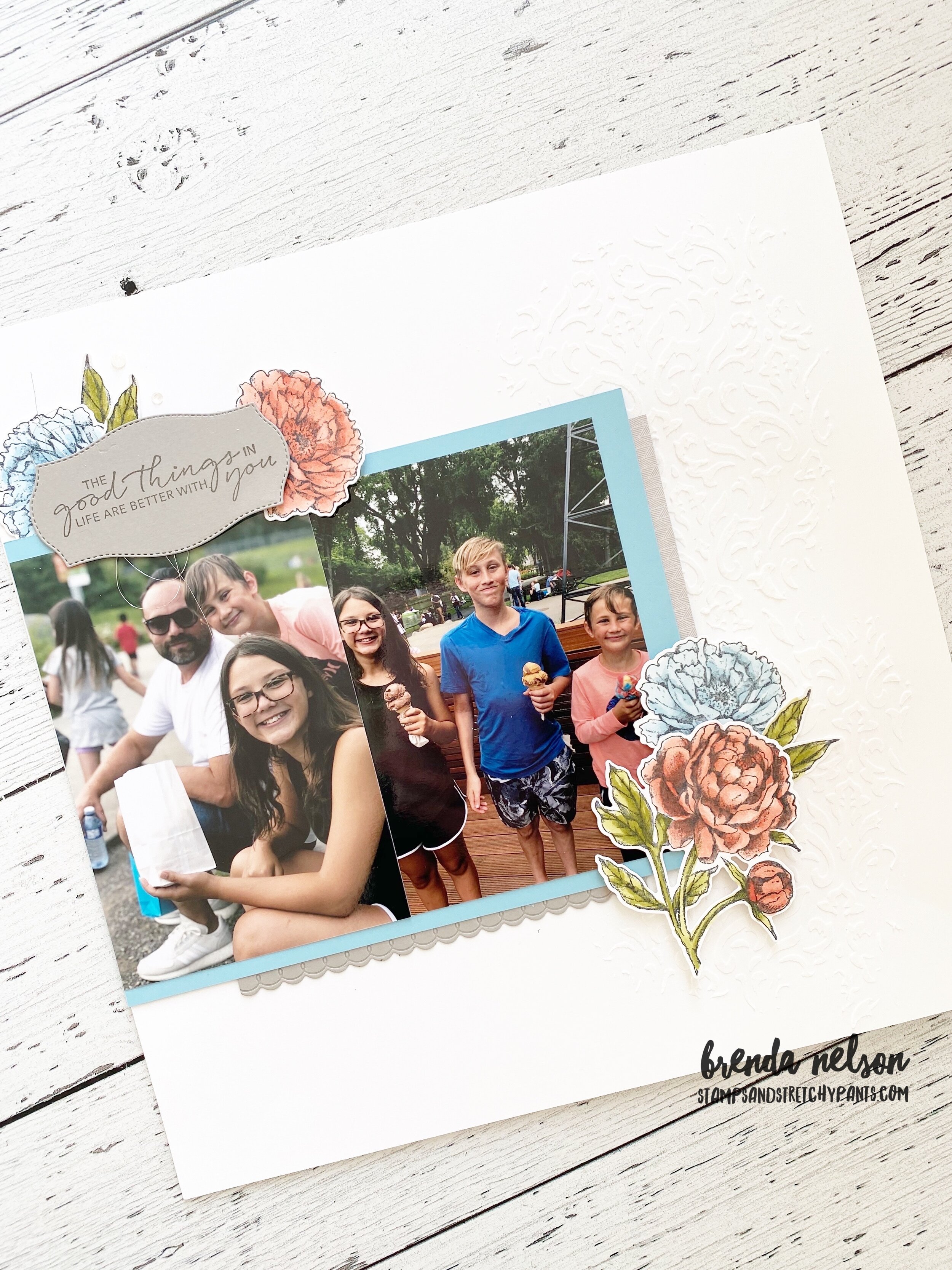
I love this photo of my two friends Donna and Karina. For the past several years we have worked together to offer 3 large group events each year called Creative Day Getaway, to local demonstrators and stampers. We are hosting our 20th event this September so I thought featuring them on this page was perfect!
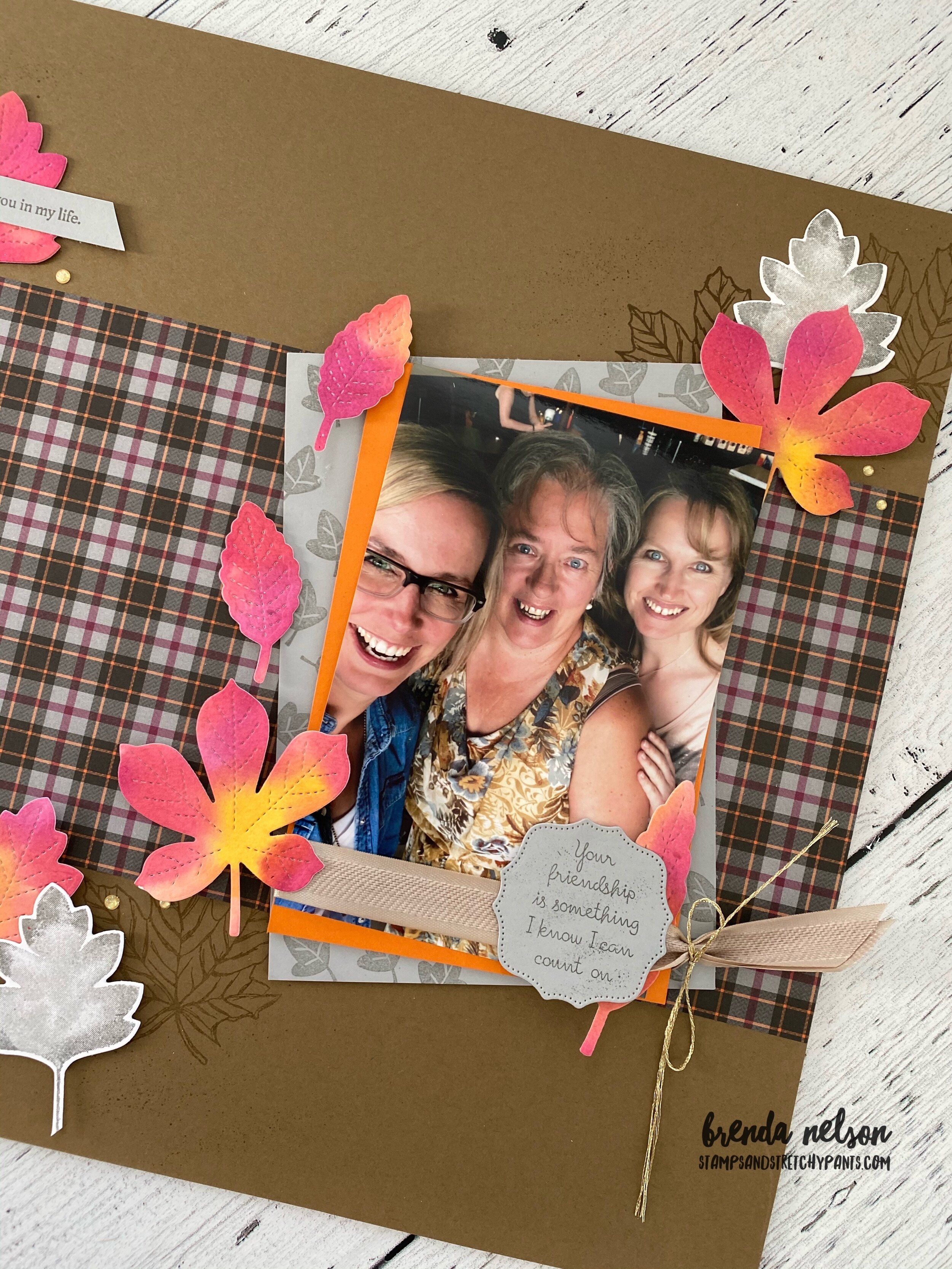
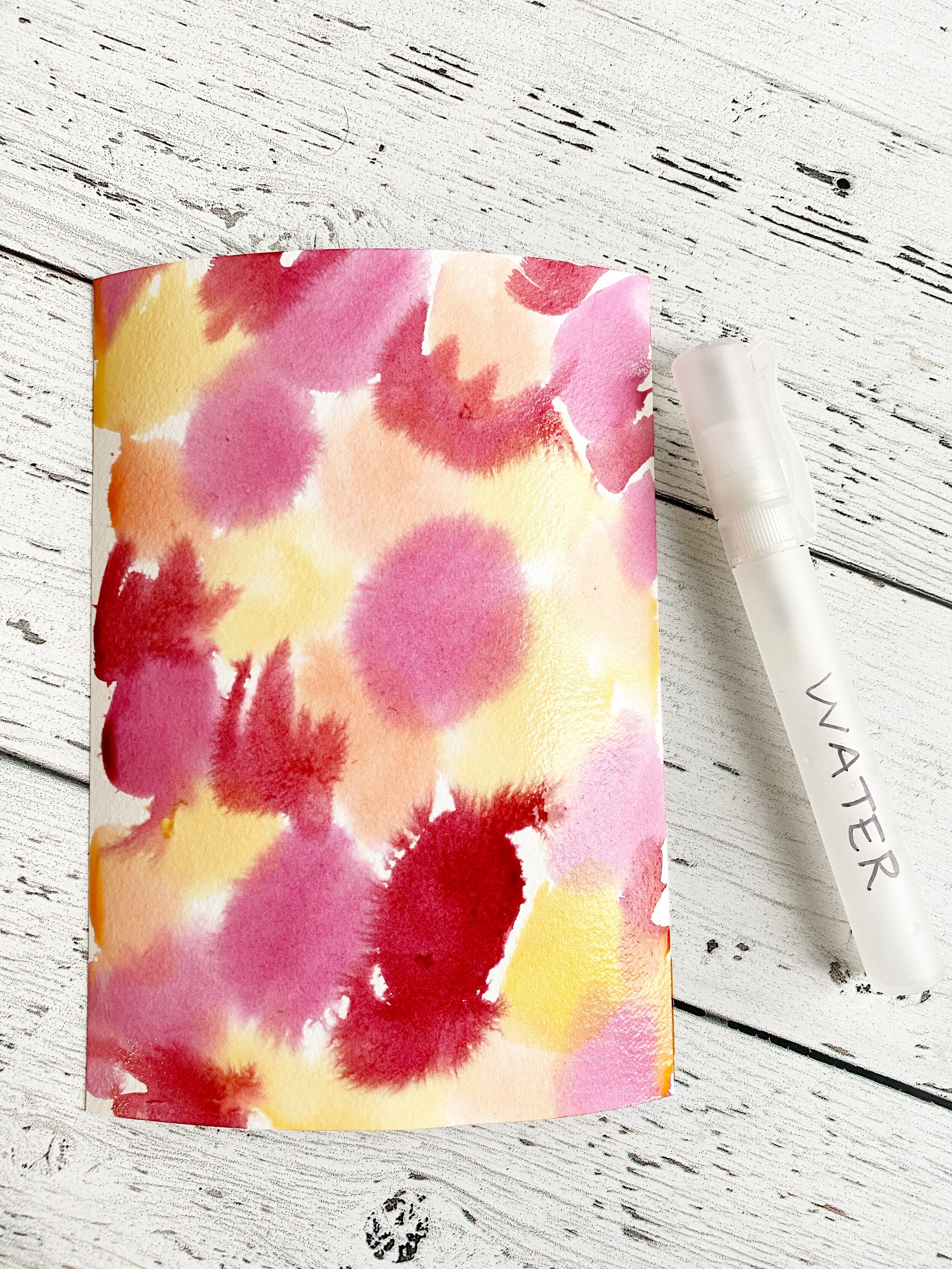
I used a really fun and easy watercoloring technique to create these leaves! Something similar was shared on the Stampin’ Up! Instagram page recently as well. I love how our Stampin’ community shares and inspires each other!
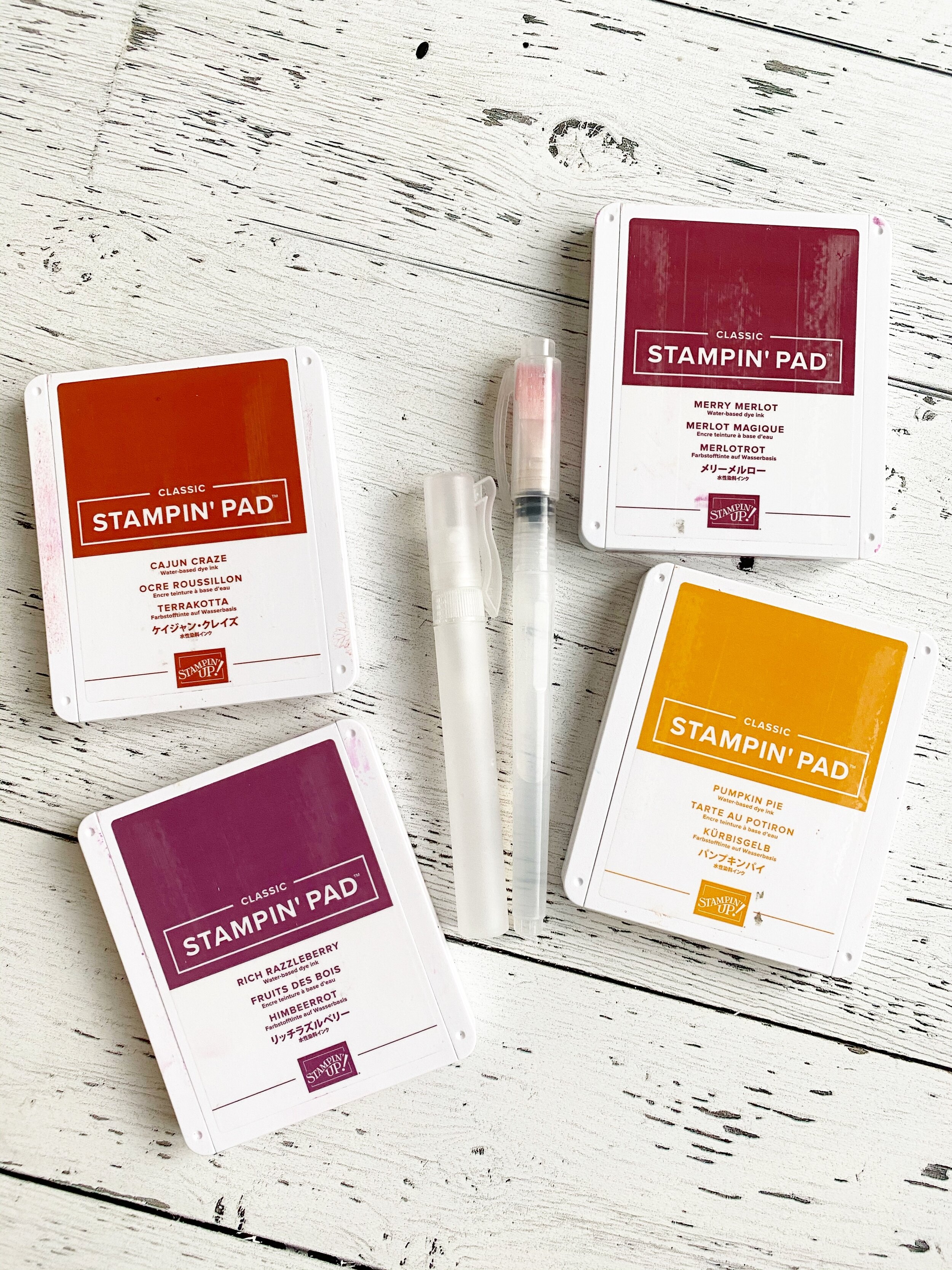
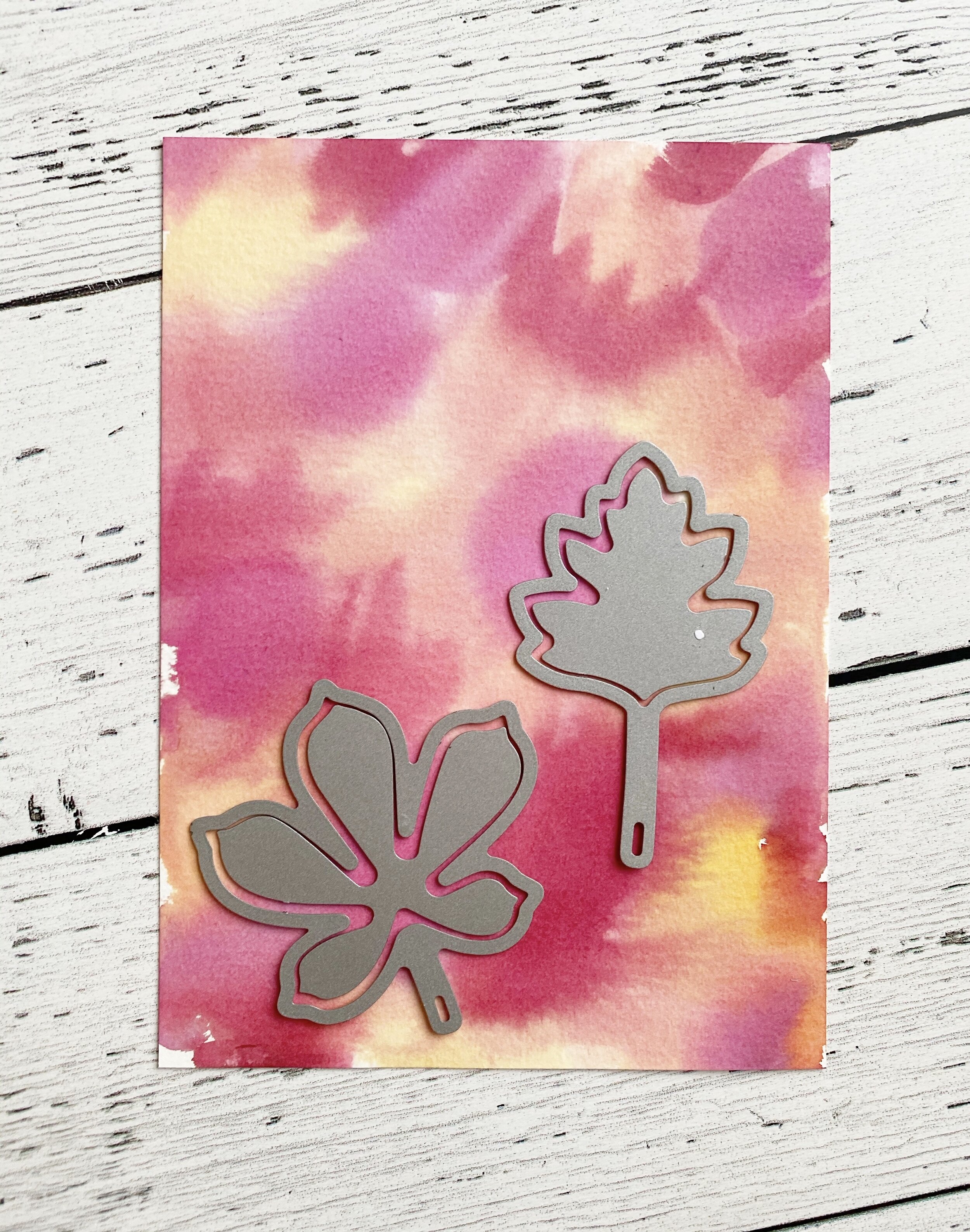
I chose the colors Cajun Craze, Rich Razzleberry, Merry Merlot and Pumpkin Pie. You will need a piece of water color paper, the large Water Painter Brush (I used the same one moving from light ink to dark ink), a Stampin’ Spritzer and the Stitched Leaves Dies.
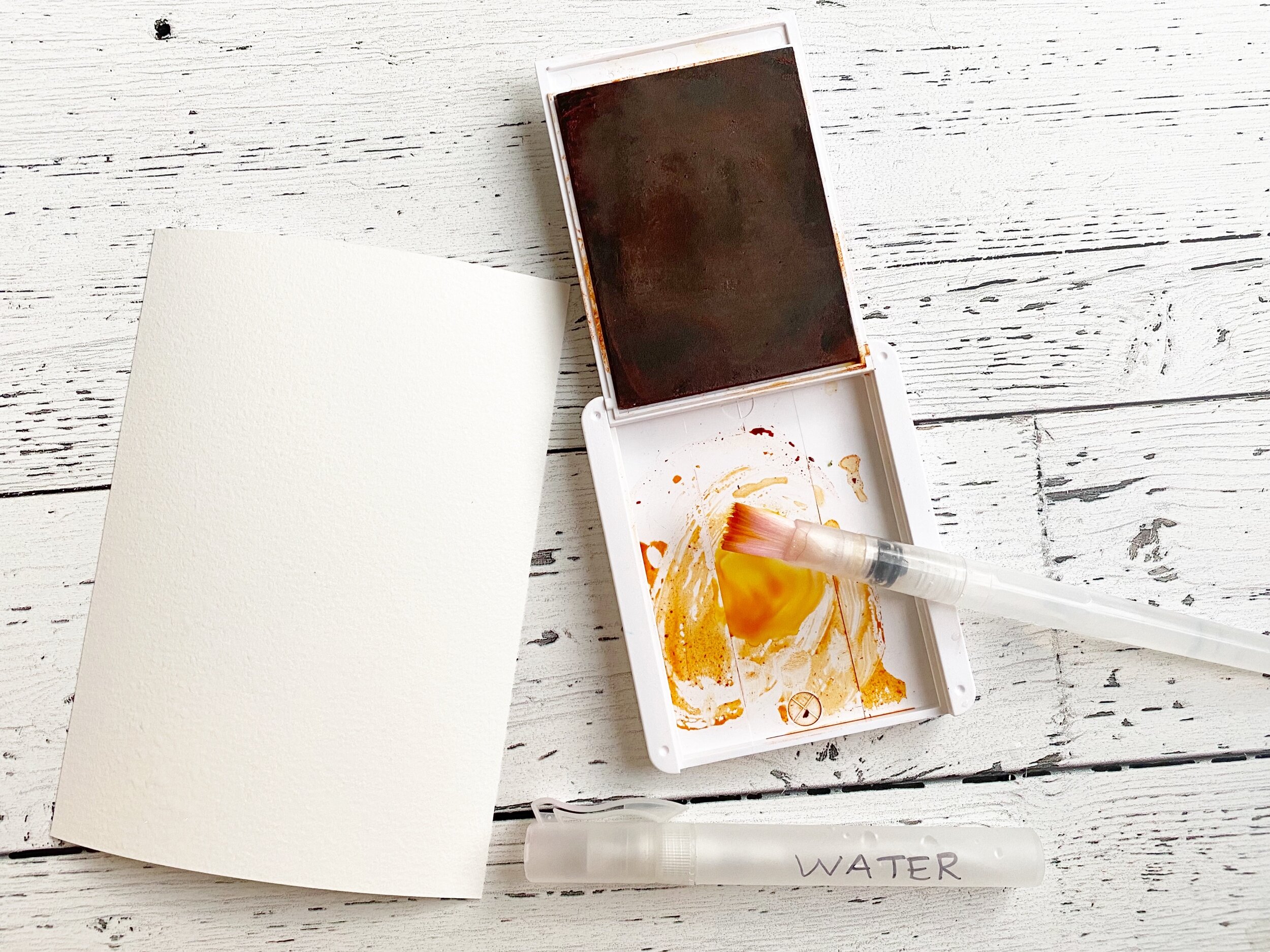
Start by spritzing the water color paper with water and starts adding in your color. It may look a little weird but after you spritzer it one more time at the end and either let dry or use your heat tool it blends all the colors together. Cut out your desired leaf shapes for your project.

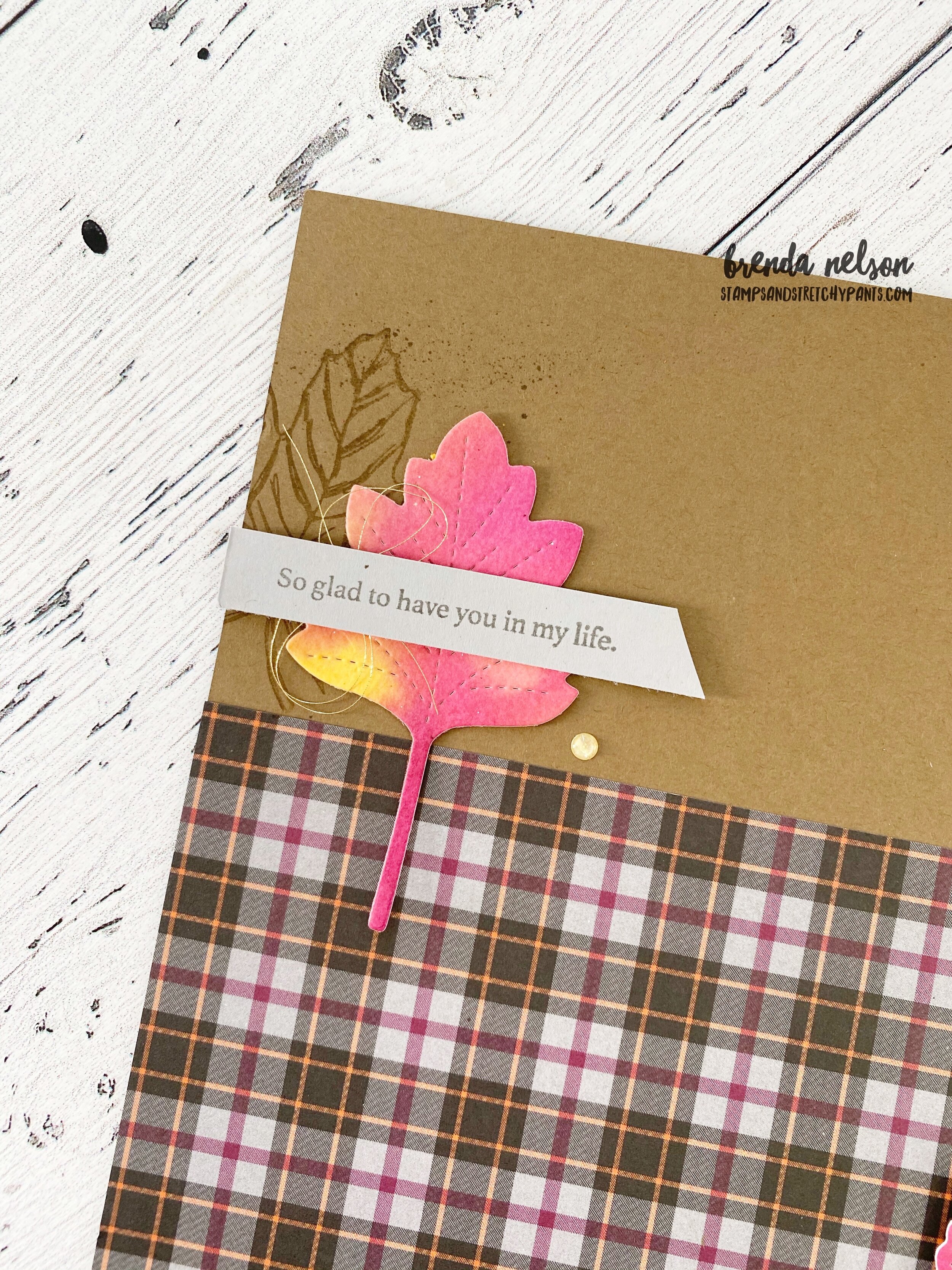
I also wanted to play off of the grey tone in the Plaid Tidings DSP with the photo mat and some grey leaves. The photo mat has little leaves stamped on it in Smoky Slate ink to coordinate with the paper. The stamp set I used is Banner Year, don’t overlook it at the back of the Handmade for You catalogue! pg 65! It has tons of potential!
I used the old school Rock’n Roll technique on my grey leaves. Stamp them in Smoky Slate and then ‘roll’ the edges in Basic Grey Ink.
I also pulled in the large maple leaf image from the Gather Together stamp set for some background stamping. And I love the stitched look of the leaves so I decided to use the Hippo & Friends dies to cut out the sentiment with a stitched detail.
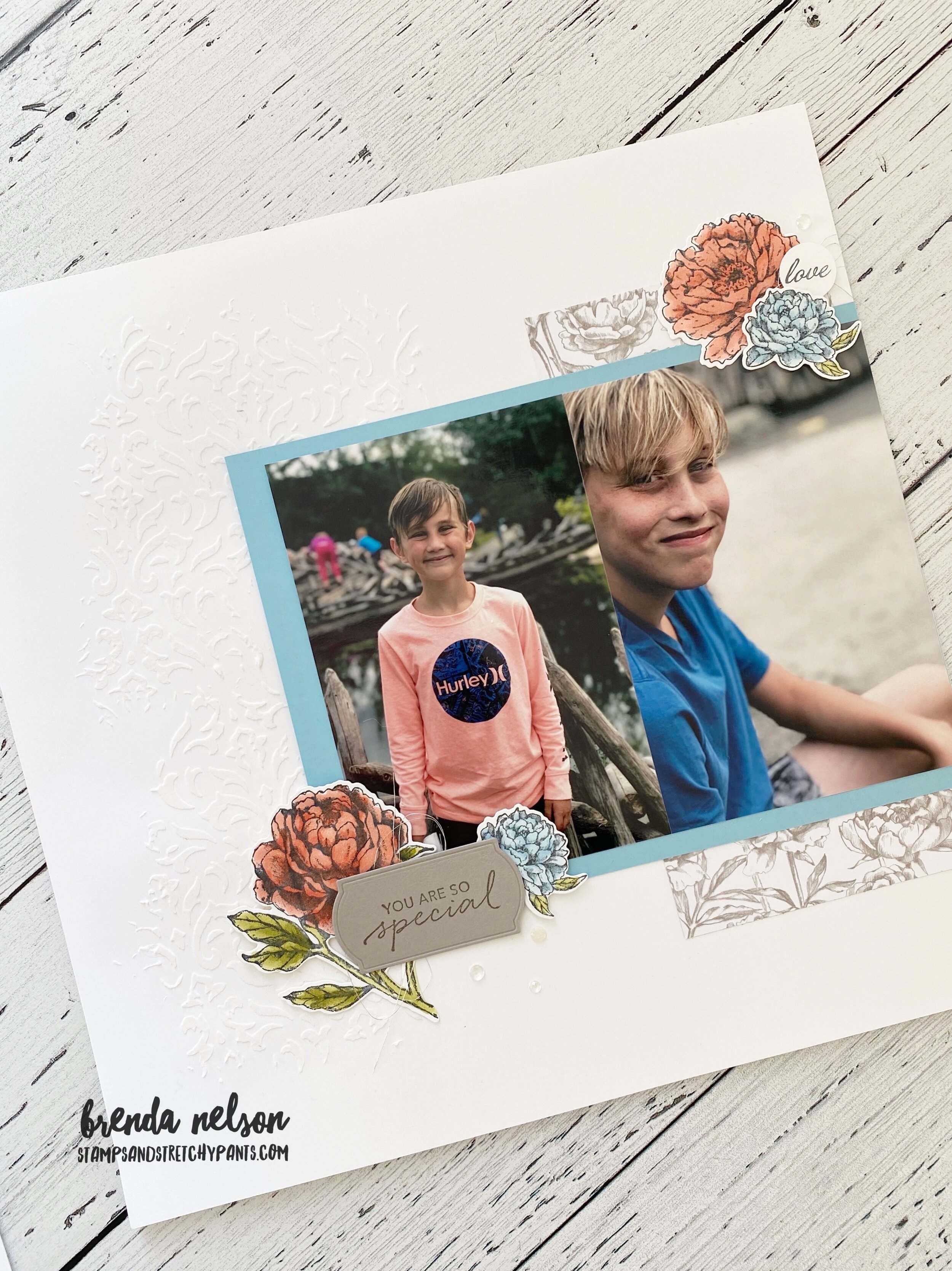
When I am creating scrapbook pages I find the magic is all in the details. Adding in different threads, textures, embellishments, layering stamps and colors. This little corner is a perfect example!
If you are in Canada and want to recreate this page you can order all the supplies from my online store! Just click below to head right there!
Thanks for hopping along with us this week as we are wrapping up August and heading into September. You can go back to see what Melissa has made if you are just joining in here or continuing hopping forward to see what Connie has designed! See you next week!