Color Fusers March 2022

Hello friend and welcome to the March edition of the Color Fusers Blog Hop! We are all so happy you have decided to check out our Hop and projects! I love this Hop because it helps me focus on NEW color combinations instead of using my go to favorites all the time!

Our color combination this month is a fun one as it includes 2 of my favorite In Colors—Soft Succulent and Evening Evergreen paired up with Rich Razzleberry! I can’t wait to see what the team comes up with this month!

Isn’t this a great combo? Now when I was considering my design, I knew I wanted my card base to be Evening Evergreen and upon searching my Designer Series collection I realized that I had few options for Soft Succulent patterns and decided this was a great opportunity to create my own!

It was easy to create my own stripy fun background with a Soft Succulent ink pad and the largest brush tip from the Water Painters. I just love how we have 3 brush tips to choose from! The widest makes creating a fun background so EASY!

To create the background, I used an acrylic block and stamped my Soft Succulent ink pad onto it, to create sort of a painters palette. I squeezed a bit of water from my Water Painter beside the ink and dipped my brush into the water and then into the ink.


I just swiped my brush across the Basic White card stock, starting at a different end each time. I don’t worry about the stripes being too perfect, I think it adds to the uniqueness and charm when they don’t. So its easy to create your own background using any of our colors!

I also decided to use my favorite bundle on this project as well—the Artfully Layered Bundle! It just has so much potential and it makes me think of vacations, the beach and sunshine!

I added some die cut shapes in Rich Razzleberry and Evening Evergreen, however I think the best part of the card is the large leaf (I am sure it has a fancy name but don’t ask me what, hahaha!). I stamped it on Basic White card stock with Rich Razzleberry ink and then used my Blending Brush with a light hand and Rich Razzleberry ink to add a light dusting of color over top! It is such a nice way to add a hint of color to the shape.

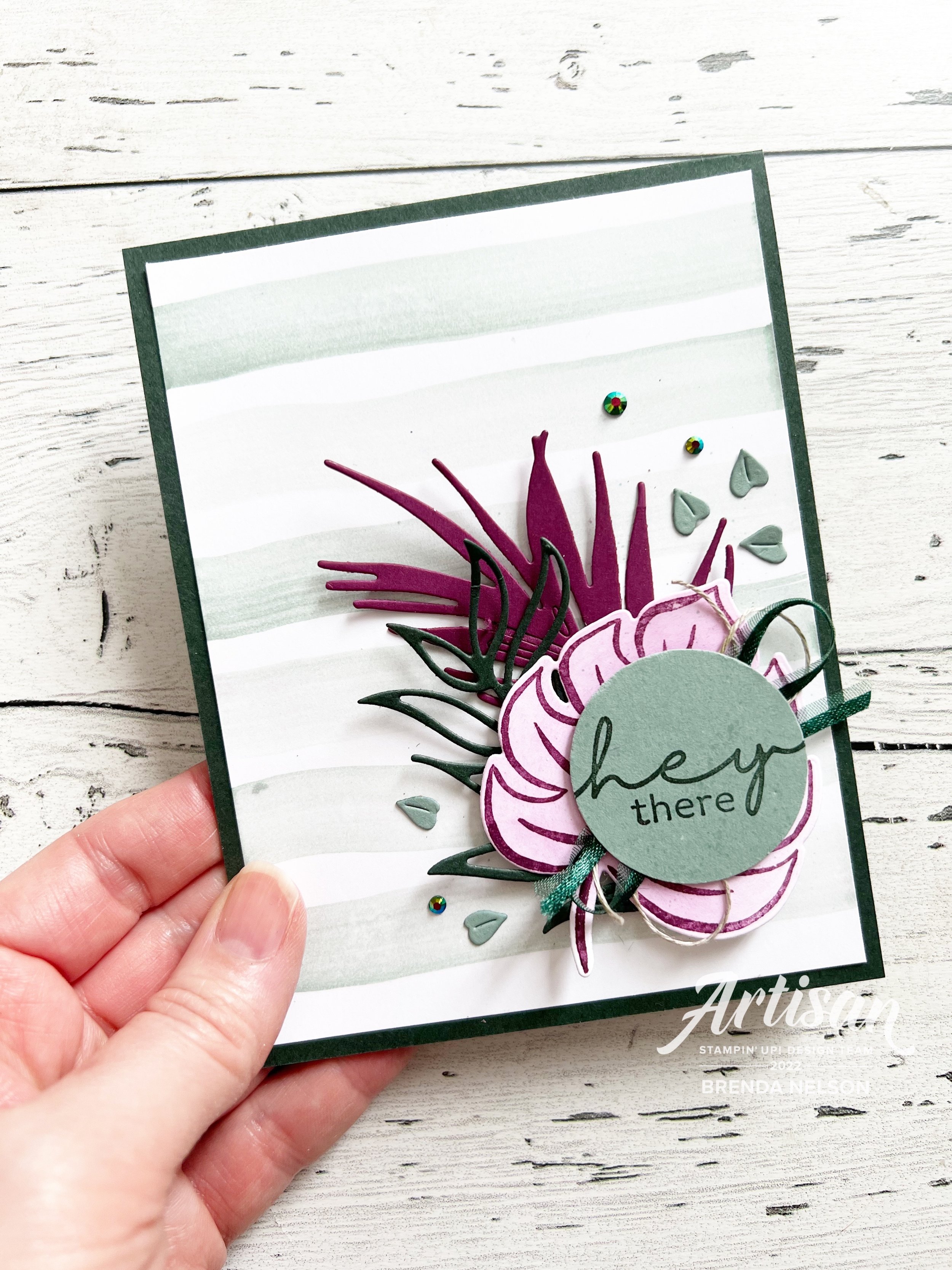
I stamped the sentiment with Evening Evergreen Ink on Soft Succulent card stock and added some Evening Evergreen Open Weave Ribbon and Linen Thread behind.

The final touch was to add some bling—of course! I used the In Color Jewels and the little teeny leaves that you can die cut with the Tropical Layers Dies. I always like to add a few little bits and bobs to my cards, I can’t help myself!

Because this card is made with a dark color as the base I find you always need to add a light layer on the inside to write your greeting. And its another opportunity to STAMP! I stamped the large leaf in Soft Succulent ink on the same color layering piece. I added Thank You in Evening Evergreen ink over top.

I hope this project inspires you to try making your own fun background! I can’t wait to see what the rest of the team designs this month! Please feel free to comment, I love to hear what you have to say!

You can hit NEXT to see what Bonnie has created or you can go in reverse and see what Tami has designed. Either way, make sure you pop around to each of our blogs! Thank you so much!

Color Fusers February 2022

Hello friends! Welcome back for another edition of Color Fusers! This month we have three new friends joining our blog hop—Sue Vine, Julie Kettlewell and Janneke Dijkstra-de Jong! I am so happy to be a part of this hop with them as they are seriously inspiring. I love this hop because it forces me to play around with color combos that I maybe had not considered!

This month our hop focuses on Misty Moonlight, Pool Party and Calypso Coral. I decided to make a slimline card to feature this color palette! I am really happy with how this project turned out, because I only used ONE stamp set to make this card! That is not something I can say very often!

I wanted to feature the new stamp set Flowing Flowers because I recently added it to my collection. It is a “Distinktive” style stamp as well so it has alot of natural texture built into the floral stamp images.

I was also inspired to create a slimline style card because we have the fantastic Slimline Envelopes in the new January to June (JJ) catalogue in Soft Succulent, Smoky Slate and Basic White. I incorporated the Basic White version into my project as well.

I stamped the largest floral image in Pool Party ink on the left side of the envelope. I added the sentiment “Sending a card instead of a text” with Misty Moonlight Ink and a quick spray of my Calypso Coral Stampin’ Blend and all three of our focus colors were on the envelope! WIn!


Let’s talk about the slim line card now! I made the card base after looking at the size of the envelope. I decided on 8 1/2 x 7, score at 3 1/2. This creates the perfect size to slip into your envelope.

I did a little background stamping with the large floral image from Flowing Flowers (same as the envelope) in Pool Party ink on the right side of the card. Because the DSP is heavy on the left I decided to not add any stamping on that side of the card.

The DSP is from the Sunshine & Rainbows Sale-a-bration collection. It is so fantastic! The Misty Moonlight pattern is 1 x 3 1/4 and the Pool Party print is 3 x 6. I added a little edge detail with the Tropical Layers Dies in Calypso Coral card stock.

Top Tip: You can use your Blending Brushes to transfer the ink from your ink pad to your stamp. I find with the Distinktive style stamps this helps the details from the stamp transfer more clearly to your card stock.

I stamped the mid sized flower from the set in Calypso Coral ink and the trio of smaller flowers in Misty Moonlight and Calypso Coral. All of the flowers are hand trimmed as there is no hardware to support this stamp set. I actually don’t mind fussy cutting and breaking apart the trio of flowers gives you alot of design options.

The sentiment is stamped in Misty Moonlight ink on the coordinating card stock. I added some white twine and Misty Moonlight ribbon from the Cotton Ribbon Combo Pack.

I finished off my project with my favorite embellishment (this week!) which are the Polished Dots. I used both of the colors in the package as well.

I hope this card inspires you to create a slimline card and to not shy away from using 6x6 DSP t accentuate your card!

Next up on the hop is Bonnie O’Neill! Make sure you go all around the hop, especially to see what our new members have created this month! You can also go to ‘Previous’ to see what Tami Hewlett has created this month.

If my project has inspired you to ‘add to cart’ please consider me as your demo! Every order let’s me keep creating and loving what I do!

You can click on any of the images below to be directed to my store. Make sure you come back next month to see what colors we will be playing with. We ‘hop’ the first Monday of each month with a fresh new color combo!

Gumball Goodness-Artisan Design Team Project

Hello friends! Welcome to a brand new year of Artisan Design Team projects! I am so happy to be a part of the team again for 2022. I think it took me most of 2021 to get my bearings so I am happy to have another opportunity! One area that I didn’t do the best at was creating a blog post to go with my monthly assignments. There are often lots of fun things to share with you that go along with our monthly posts that don’t always come across in the 2 photos we submit!

Fun fact, we submit 2 photos but I usually take like—30! hahaha! Then I narrow them down to the two best, edit them and all that jazz, and then fingers crossed they get approved! Sometimes we do have to make little tweaks and since I photograph my projects in natural light, even an hour difference can make the whole series of pictures look very different!

These cards feature the awesome Gumball Greetings Bundle from the new January to June Mini Catalogue—or the JJ catalogue!

My first assignment for 2022 was the Gumball Greetings bundle in the new JJ catalogue—the bundle can be found on page 12 and includes some really unique accents—the Gumball Machine Shaker Domes and the little Frosted Beads Assortment! I used these beads in two ways—-as filler for my gumball machine and as an accent or embellishment on my card front!

Now truth be told, I did actually struggle with this assignment! I spent alot of mental time thinking about my projects and ripped apart several attempts until I landed on these two cards. I think they are a good representation of the stamp set and the dies.

For the gumball shaker card I pulled in some DSP from the Pattern Party DSP Stack (a hostess benefit!) from the Annual catalogue. I then made my own striped accent with scraps of card stock in Granny Apple Green, Real Red and Pool Party as they were the focus colors of my project. I cut a strip of Basic White to 1 x 5, covered it in Tombow Multipurpose Glue and then added the strips of card stock on a diagonal.

This close up view shows you all of the fun things I added into the Gumball Machine Shaker Dome!

On the other side of my DSP panel I have used a die cut included in the Gumball Machine Dies that cuts out a strip of mini itty bitty hearts! The bottom of the machine is stamped in Momento Ink on Basic White, colored with Stampin’ Blends in Real Red and Grey Granite. It is then die cut. The topper of the gumball machine is stamped with Momento Ink on Real Red card stock and then I added a bit of detail with the coordinating Blends.

To add a realistic feel too the coin spinner, I added the little die cut handle and a shape from the Adhesive Backed Hexagons to the center!

The dome shape is cut with a die from the DSP and layered behind it, I stamped the dome filler. I added some stamped gumballs in Read Red, then I stamped and die cut some more in Pool Party. I added these with Mini Dimensionals inside the shaker dome area. I also stamped and die cut some hearts in Granny Apple Green and added some of the mini die cut hearts from the die strip in Real Red and Pool Party. Finally I added in some of the Frosted Beads in green and red. All of these elements made for some fantastic gumball machine filler!

I added a cute #tammybow using the new Real Red Faux Linen ribbon that was cut in half plus a few little gumballs rolling out of the bottom of the machine for some extra touches!

Each month we also need to incorporate a tip or technique into our project. I thought it would be fun to color the inside of the dome with a Dark Pool Party Stampin’ Blend to give a soft blue hue to the dome. Think of how cool this could look if you turned the Gumball Shaker Dome into fish bowl!

My second project uses the little mini gumball machine stamp as a background stamp which I love! I stamped them randomly in Pool Party ink on the coordinating paper. My favorite part of this card is how I used the heart border die as an accent behind the sentiment! I also used my Tombow Multipurpose Glue to add some of the green Frosted Beads to the card front as an embellishment, along with some stamped hearts and hearts from the die cut strip!

The sentiment is stamped in White Craft Ink with embossing powder to help the white pop on the Granny Apple Green. A little distressing of the edges and this card came together pretty quickly! I think its a fun one to give with a gift card inside!

Thank you for following along on my Artisan Journey again this year! I appreciate all of your comments and LIKES and if you live in Canada and my projects have inspired you, please consider shopping my online store!

Around the World On Wednesday--Switcharoo Fun!

Hello friends! Welcome to a new fantastic year…Cheers to YOU in 2022! Thank you for following along on my crafty journey and for checking out all of the fantastic projects on this month’s Hop! Our theme was “Switcharoo” fun! We chose a card to case for inspiration while changing up colors or other small details!

Personally, I was so happy to see rainbows back in the JJ catty! I hope they stick around for our Annual catalogue as they have so much potential. You can find the Rainbow of Happiness Bundle on page 18 of the JJ catty and the card I used for inspiration is right at the top—it is the Just Jade card that features the Cloud Punch—another new favorite product of mine! Fingers crossed it stays too!

I decided to change the orientation of the card and mix up the color palette slightly! I landed on Fresh Freesia as my card base and I used a layer that I ran through the new Gingham Embossing Folder. Now I noticed that this photo makes it look like there is white on the base layer but its just the way the light was hitting the details of the impression left from the folder.

I did some stamping on the background similar to the catalogue sample using the Rainbow of Happiness stamp set. My rainbow itself is stamped in Bermuda Bay, Polished Pink, Versamark with Gilded Leafing (remember you need to use Versamark, Heat’n Stick Powder, and then the Gilded Leafing—rubbing the leafing into the powder), and Fresh Freesia!

The whole rainbow is on some of the new Vellum 12x12 Layering Designs which just gives it a subtle detail.

I also took the sentiment and layed it out FLAT on a long acrylic block—you may notice in the catalogue that this stamp set is arched. Because its designed used photopolymer we can manipulate these stamps somewhat. I was able to stamp it in Polished Pink ink on Basic White and then trim the words apart to create a new sentiment orientation. This is one of my favorite things to do with our sentiment stamps!

My absolute favorite part of this card are the clouds. I used the new Cloud Punch to create two clouds that are so AMAZING! They are from the Mother of Pearl 12x12 Specialty Paper which is so outstanding. It is completely smooth and has the most fantastic shimmer. Definitely hit ADD TO CART on this product!

I added a couple Fresh Freesia flower embellishments from the Loose Flower Flourishes—we always want people to shop or remember our Annual Catalogue too! I can’t wait to see what all the other gals in the Hop have created with this super fun theme to kick off the year!

Please visit Tricia’s blog next to see what she has designed and leave everyone some warm fuzzy comments!

Please consider shopping my online store if you live in Canada and my project inspired you! Your support allows me to keep doing what I love and I appreciate you for that! Click on any of the images below to be directed to my store!

Happy New Year!

Happy New Year 2022!

Hello everyone! Welcome to another amazing fantastic year! Yes, 2021 was a challenge. It was hard. I cried a lot, I worried about my kids and felt sad for what I thought they were missing out on but I have given up trying to make sense of things. I am however so blessed to have a fun supportive group of friends and a job/hobby that I truly love that helped give me purpose and direction!

I look forward to new creative direction and opportunity in 2022. I promise to always try something once! And maybe again if I find out I like it! You never know until you try (I am hearing my moms voice in my head at the moment, hahaha!).

So HAPPY NEW YEAR FRIENDS, let’s have some fun together this year!

Happy New Year friends! Blessing abound for you in 2022!

I created this card to mail out to some special friends and I thought it was a fun one to share! I have been loving my Blending Brushes lately and this is a fun technique that you can try with them—its known as the Bokeh Technique. In photography, Bokeh, is the aesthetic quality of the blur produced in ‘out of focus’ parts of an image. So we can imagine these ‘dots' or ‘circles’ as being out of focus on this card project. Fun right?

Here are the supplies you will need to create this card but keep in mind you can reproduce this Bokeh look with any colors! I just went for a color palette that felt like night time, when the clocks would turn over into a new year!

I used my trusty finger Daubers for the smaller circles and the Blending Brushes for the larger circles. You could always make yourself a stencil, but I didn’t feel the need because the Picture This Dies were so perfect! The die is easy to wipe off and move around the front of your card stock.

I started with Misty Moonlight card stock and use the die and Whisper White Craft Ink for the first layer. It is important to start with white dots and then build from there. I like to layer white over white too and have lots of overlap with the colors and dots. The other colors used were Misty Moonlight and Gorgeous Grape. It also looks more natural if you have a few dots off of the edge of the card stock too.

This is a really fun technique that gets you messy fingers and each card front will be unique!

Happy is die cut from the Christmas Cheer Dies and is from the Mother of Pearl 12 x 12 Specialty Paper. It is AMAZING! You can’t see the awesomeness of it in this photo, but trust me! It has a really solid texture and is so beautiful when it catches the light. I paired it up with ‘New Years’ which is from a set called A Wish for Everything, I tend to hang onto these sets that have more unique sentiments that we don’t see as often. I added a few random sequins from the Subtle Shimmer Sequins collection. They were the perfect touch!

I hope you will give this fun Bokeh technique a try and I wish you all the blessings of a year new. Lets go forward with the spirit of positivity and keep ourselves open to experiences new things!

Happy New Year!

If anything caught your eye please feel free to shop my online store by clicking any of the images below! Thank you in advance for letting me continue to love what I do!