Around the World on Wednesday--Case the Designer!

For our Around the World on Wednesday blog hop we are casing another designer from the hop and I am lucky enough to CASE Annette Ball from Stampin’ With the Bees. I thought this was such a fun and unique idea!


91442295_10216484369808661_2887014979863576576_n.jpg
 

This is a card that Annette created in June and as soon as I saw it, I thought it would be fun to CASE featuring the Forever Fern bundle in the new Catalogue. I loved the circle cut out from the front of the card that allows for the peek-a-boo look into the inside.

I have included a link so you can go directly to Annette’s Blog to check out her original post!

101290169_2693538257424591_2030198107009974272_n.jpg
This is my take on Annette’s card—I added another panel to the front as it is easy to cut two circles out at once  on our die cutting machine.  I popped the front layer up on Dimensionals.

This is my take on Annette’s card—I added another panel to the front as it is easy to cut two circles out at once on our die cutting machine. I popped the front layer up on Dimensionals.

final.jpg

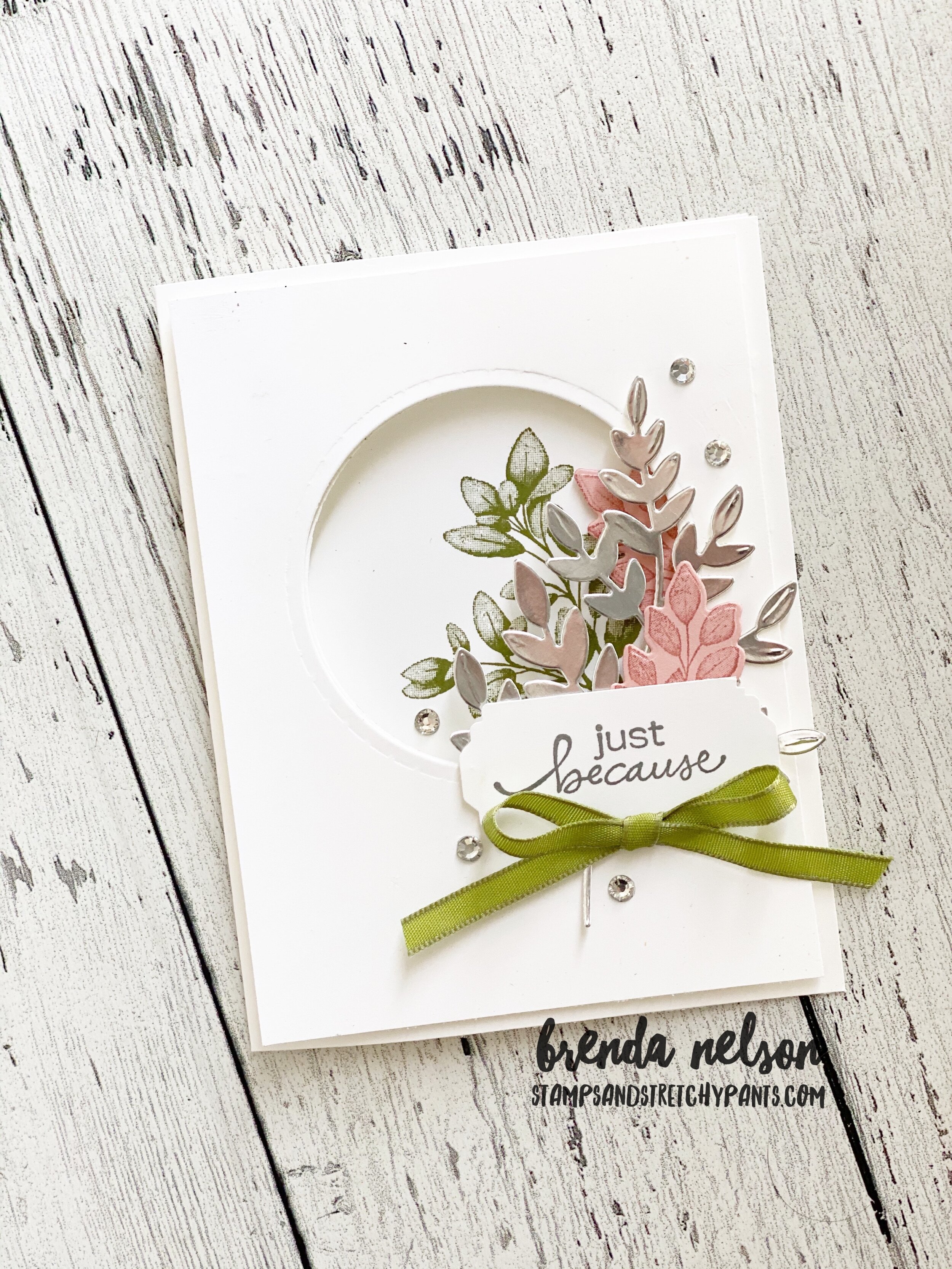
The Forever Fern bundle (pg 110) includes 14 dies in the set. I used the largest fern die on some Silver Foil Paper. I stamped out two of the smaller ferns in Blushing Bride ink on the same color card stock and die cut those. The fern image on the inside, which you get to see through the peek-a-boo window, is stamped in Old Olive. The sentiment is from Lovely You bundle (pg 22) and is stamped in Smoky Slate. I used the Lovely Labels Pick a Punch with my paper cut to 1 inch, which is the largest width you can use on this versatile punch. The ribbon is from the Ornate Garden Ribbon Combo Pack. Some Rhinestone Basic Jewels just added a bit of sparkle.

Please visit Tricia Butts next to see who she is CASEing and her fabulous project! Thanks for hoping along with us and please feel free to leave a comment!


Red, White and Blue with Connie and Mary!

This weeks challenge is a Red, White and Blue theme as it is July 4th in the United States! Happy Independance Day to all of my crafty American friends! I used this color scheme to create a masculine birthday card with one of my favourite sets in the new catalogue—Pallet Thoughts on page 137. It was in my very first order that I placed in June. In the stamp set there is a phrase, “Hello Handsome”, and I wanted to incorporate that into my card.

Image+2020-04-27+at+6.31+PM+(1).jpg

I stamped the Buffalo Check stamp in Real Red on Whisper White card stock. It reminded me of a picnic blanket. I stamped ‘handsome’ in Night of Navy and added some ‘screws’ to sides in Smoky Slate. This is also a fun little stamp in the set. I decided to emphasize the word Hello by using the Playful Alphabet Dies and the Foam Adhesive sheets. I cut the letters from Night of Navy Card Stock which is also the card base.

The card front is covered in a piece of DSP from the In Good Taste paper collection and then I added the Buffalo Check piece at an angle and cut off the excess. I used a retired circle punch to snip out a half circle at the top on each side so that I could tie some ribbon from the Playing With Patterns ribbon along the card.

This card is what I would call #simplestamping and the template of the card is unique without being too complicated! I hope you like it!

final.jpg
final.jpg

I can’t wait to see what amazing projects are showcased throughout this blog hop! You can go BACK to visit Melissa or you can go forward to visit Connie! Make sure to hop the whole way through!

#daydrinking...card style!

Adulting is hard, especially in these interesting times! So sometimes a girl has got to do what a girl has got to do and enjoy a day time beverage! You can also make a cute card like this while consuming your beverage!

I used the new Nothings Better Than stamp set which is Connie Stewart’s 1,000,000 achiever stamp set. Did you know that? When you sell 1,000,000 CSV you get to help design your own stamp set! It is such a cool thing. And I think if Connie and I lived in the same city we would definitely be friends as I also love Cookies, Chocolate, Coffee and Cocktails!

I created this card based around the color palette of the Playing with Patterns DSP. I absolutely LOVE the colors in this collection. The base of my card is Coastal Cabana with a layer of Smoky Slate and a strip of the DSP tucked along the side that ties in all of the colors used to embellish the card.

I cut a star out from the Stitched Stars dies in Misty Moonlight to create a fun layer. The sentiment is stamped in Highland Heather ink of coordinating card stock. The shape is from the Stitched Rectangles dies (a craft room must have!). Cocktails is cut using the “I love You More Than” dies from Gorgeous Grape card stock.

final.jpg

I added in two of the ribbons from the Playing with Patterns Ribbon Combo between the star and rectangle layers. I coloured the cocktail glass with my blends and added Wink of Stella over top of the blue drink. A few of the Playing with Patterns Resin dots and this card is complete!

I loved this card so much that I created a whole bunch for a swap I am participating in with my team. I hope they love them as much as I do!

final.jpg
final.jpg

Prized Peony Project

I was really intrigued with this Prized Peony bundle when I received it in my last order. The Peony dies has 17 pieces to it and I won’t lie, it did take me a bit to figure out how to assemble this 3 D peony as it is a bit different from any other dies Stampin’ Up! has had. Once I got my mind around it they became very easy to put together. I created a fun project using our new Mini Paper Pumpkin boxes and two note-sized cards. My only complaint would be that these boxes don’t fit a full sized card. However, I will just have to get used to making note sized cards!

 
final.jpg

I created this handy chart to quickly illustrate the order of assembly the peony. If you use the bottom of the flower as a visual aid it also will help you with the assembly. And because the layers nestle quite snuggly you don’t actually need that much adhesive.

There are also 3 leaves included in the Peony Dies so I added those onto the guide so you can see which pieces layer together to create the final leaf. I hope it helps!

I labeled the flowers in the order that they slip inside each other.  You can fold back the paper along the slit to help create more dimension in your flowers.

I labeled the flowers in the order that they slip inside each other. You can fold back the paper along the slit to help create more dimension in your flowers.

fullsizeoutput_1225e.jpeg

I love the size of these mini paper pumpkin boxes! They are just so fun and have unlimited potential. I wanted this project to look ‘fancy’ so I added a tab using the Stitched Rectangular dies to create a tab that gives the illusion of keeping the box closed. I added one of the Elegant Faceted Gems to it as well.

final.jpg

The Smoky Slate card has a light background stamped using one of the images in the Prized Peony stamp set. I stamped it off first so it was very faint and then I used my Water Painter dipped in some Basic Grey ink to create a splatter. I stamped the large peony on Smoky Slate card stock and cut it out with the coordinating die. It is popped up on Dimensionals. The sentiment is stamped in Petal Pink and cut out with a die from the Tasteful Labels dies.

The Basic Grey card has the large single bloom (no stem) stamped as the background. I then cut the peony pieces out of vellum and sponged the edges in Petal Pink ink. I added a very thin strip of DSP and the scallop edge is cut from a piece of the Basic Grey card stock (about 1.2 inch in thickness). A few silver metallic pearls completes the look!


Create with Connie and Mary--Monochromatics!

I will admit, I did find this weeks theme of ‘Monochromatic’ a bit of a challenge! It took me a bit to get my crafting mojo but I am happy with what I created in the end. I decided to use a color I am really loving right now which is Soft Seafoam. I am so happy it is a permanent part of our Subtles collection.

Image 2020-04-27 at 6.31 PM (1).jpg
 
final 46.JPG
final 42.JPG

I started by cutting a bunch of hearts using the Stitched Hearts dies to create a background. I then cut the joined hearts out of vellum (I was really trying to stick with the theme!) and a larger focal heart. On the larger heart I flicked with my Soft Seafoam marker. I coloured the Crinkled Seam Binding ribbon with my Dark Soft Seafoam Blend to layer behind the focal heart. I pulled a few strands loose from the vanilla ribbon that is in the Forever Greenery Trim Combo pack and added behind the heart in an organic way. This a great trick to use in place of metallic thread.

My favourite part of this card is the ‘Hi’…want to know why? Because it is on the FOAM ADHESIVE SHEETS which are basically all my dreams come true. I found the easiest way to work with the adhesive sheets and the Playful Alphabet dies is to cut the letters out of card stock first so they are handy. Then cut out the letters on the foam adhesive sheet, pick off the top layer (these sheets are like one giant Dimensional) and press the card stock letter into place and then pop it free from the sheet. Works like a charm!

HOT TIP: Don’t through away your sheet when you are done cutting it all up, save all those weird bits to use as Dimensionals.

And those clear gems…ya, to die for! They are found with the Peony Suite in the new catalogue and are called the Elegant Faceted Gems. Got to have those…add them to your shopping list right now…you will thank me!

This close up look hopefully lets you see how fabulous the HI looks on the Adhesive Sheets. I can't say enough about how amazing they are, especially paired with the Playful Alphabet Dies.  And the Elegant Faceted Gems have a pattern on them which j…

This close up look hopefully lets you see how fabulous the HI looks on the Adhesive Sheets. I can't say enough about how amazing they are, especially paired with the Playful Alphabet Dies. And the Elegant Faceted Gems have a pattern on them which just adds to their awesomeness.