Artisan Design Team Project featuring Delicate Desert

Hello friends! I could not be more excited to share my projects for March that I created for the Artisan Design Team. I absolutely loved designing with the Delicate Desert Suite especially because I used one of my all time favorite pictures of my youngest son, Shepard.

I recently updated my Scrapbook Gallery on my blog as well—so if you are looking for more scrapbook page inspiration, please check there!

Shep really was the happiest baby and such an easy toddler—I simply cannot believe at the time of writing this he is 12. I wish i had a time machine to go back and cuddle this little guy again.

I decided to make a scrapbook page AND a card for my Team projects this month. I really love the color palette of this suite—Petal Pink, Calypso Coral, Cajun Craze, Pale Papaya, Soft Succulent and Gray Granite look so AWESOME together!

For my scrapbook page, I started with a sheet of the Delicate Desert 12x12 DSP as the base and then I added a layer of Basic White over top that is cut to 11x11. This lets you see a little bit of the pattern behind. I used another piece of the DSP for the photo mat as well and cut out the leaf like shape out of the DSP and the Dry Brushed Metallic 12x12 paper. If you haven’t ordered the Dry Brushed paper yet, you should really take a chance on it. It is really cool and has alot of fabulous texture w the hints of gold layered through.

Seriously, look at Sheppie’s cute face. I can’t even.

Because the Dry Brushed Metallic paper has gold in the design I decided to stamp one of the larger flowers in Versamark and use Gold Embossing Powder. I then used my Blending Brush with Pale Papaya ink to a bit of emboss resist. It is such a classic technique, and I find everyone is impressed with embossing! I also die cut some of the triangular shapes (they remind me of a pattern on a western blanket) to add it to represent foliage. I think it worked really well!

The sentiment could not be more perfect for this scrapbook page! However, the Desert Details Dies do not have a label shape, so I borrowed this one from the He’s the Man Dies. The suite also includes the Pale Papaya Faux Velvet Trim which I cut in half to add underneath the sentiment.

My favorite part of this scrapbook page is actually the base where I used both of the large panels to create interest and texture by die cutting them in Basic White. They are added flat to the page with all of the other elements on top. I also used the Gold Faceted Adhesive Backed Sequins to add interest to the scrapbook page.

The stamp set also includes two longer border type stamps which I used along the right side of the photo. I thought it was an interesting way to bring in those design elements.


The sentiment in the top left, “Your Smile is Pure Magic” was also a fantastic addition to this page. I stamped it in Pale Papaya first and then used my Calyspso Coral marker over the ‘magic’ to make it pop. I added some of the Pale Papaya Ribbon and a die cut element.

TOP TIP: I cut the element horizontally into two pieces so I could spread it out and give the illusion of it being larger than it really is

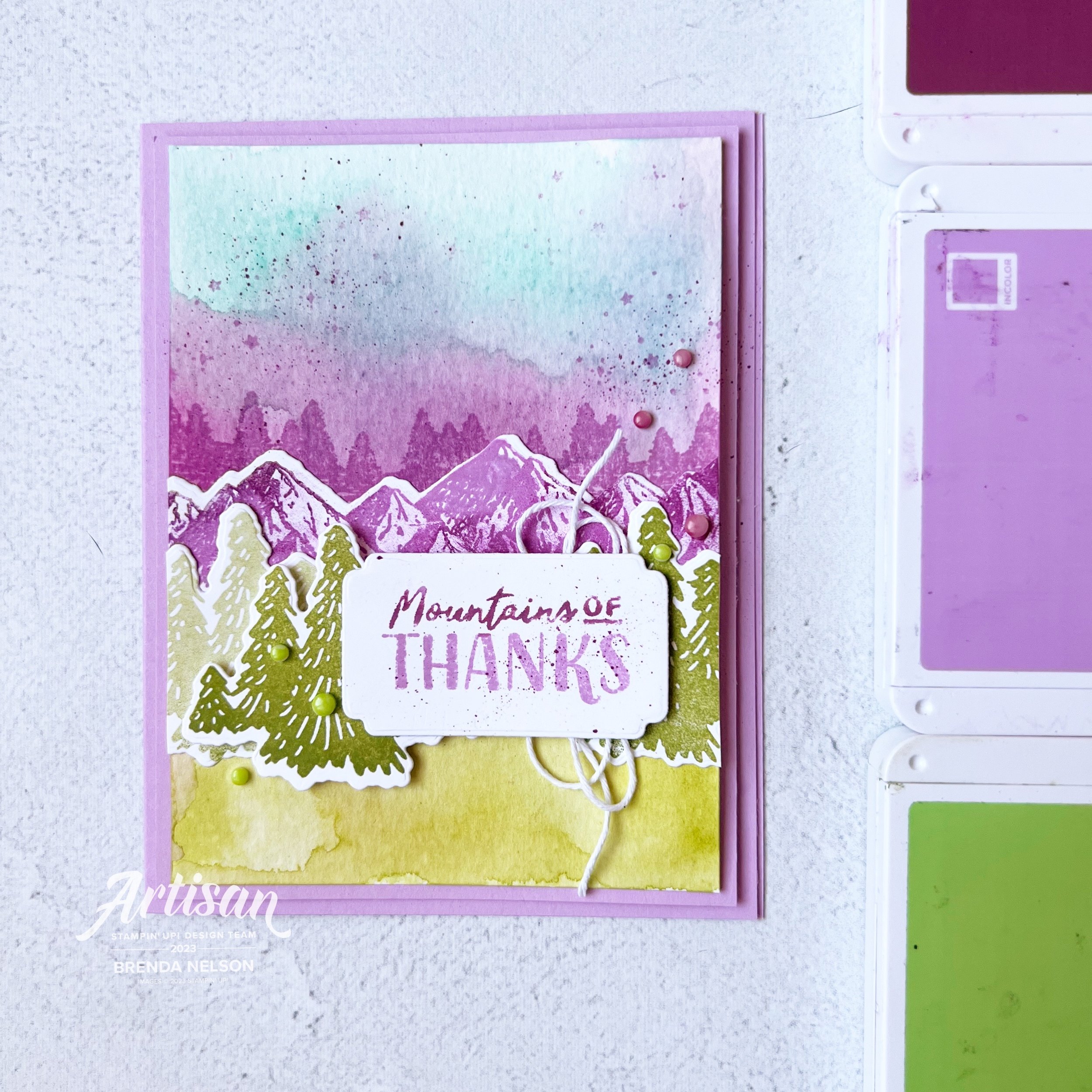
For my card design, I started with a base of Grey Granite, and then I used a piece of the DSP as a base, with another DSP design die cut with the larger decorative panel. I then cut the smaller decorative panel in Basic White. I love the edge detailing on both of these dies and how they nestle together.

The Basic White panel has a touch of color added by using a Blending Brush and Pale Papaya ink. I also flicked my Pale Papaya Stampin’ Blend over top.

The flower is also stamped in Versamark, then I added ink in Pale Papaya and Calypso Coral with a Blending Brush and finished it off with Clear Embossing Powder. This gives the flower a glossy feel. I used both the Delicate Desert and the Dry Brushed Metallic paper with the foliage die to layer behind the sentiment.

The border die included in the set was used as an accent underneath my sentiment as well. And of course, who can resist bling? So I added some of the Gold Faceted Adhesive Backed Sequins to this project as well.

I hope you enjoyed these projects and all of the other amazing things created by the Artisan Design Team! For more inspo with the Delicate Desert Suite check out on Instagram and Facebook the Stampin’ Up! Official account as well as Heather Thomas @thesongbirdstamper , Karine Lison @karinelison73choupinette, Sandra Herzog @herzerlskreativecke and Tammy Wilson @stamppaperscissors

Please feel free to shop my online store by clicking this button or any supply images! If I have inspired you, I appreciate your support so I can keep loving what I do :)

Shop with me

Color Fusers--February 2023

Hello friends! Welcome to the February Color Fusers BLOG HOP! I love to hop with this creative crew and I look forward to crafting with our color challenges each month!

This month we have a really unique color combination for you—Calypso Coral, Balmy Blue and Pale Papaya!

I love that our color challenge this month is NOT what you would expect for Valentines projects but I decided to make one with this combination anyway!

The reason I liked this color combination for a valentine’s card is because it doesn’t have to be a holiday about your spouse or significant other. It can also be a holiday about those who you LOVE so I designed a card that you could give to your mom, or a friend, or someone in your life who means something special to you.

I decided to make the base of my card Pale Papaya and I am officially going on record to say how much I will miss this fun color. It is a tone that seems to works so well with so many of our core colors!

I also had not used my Dots & Spots die in a while so I pulled it out to created an interesting first layer on my card. And because its Sale a Bration I had to use some of the DSP from the Favoured Flowers collection to anchor the bottom half of the card and create a base for the design. I also love how it has a more geometrical design that works well with the polkadot first layer.

One of the things I was most excited about in the new Occasions catalogue was the Love for You bundle. I think it is fantastic for card making AND an amazing set for scrapbooking (my first love).

I stamped out the sentiment ‘So Much Love’ in Balmy Blue. Now I think Balmy Blue is having a moment. If you flip through the Occasions Catalogue you might notice that it is showing up in a lot of the new DSP designs!


The flowers from Love For You are stamped in both Calypso Coral and Balmy Blue. I stamped the solid layer of the flower off on my grid paper and then the detail part of the stamp full strength over top. You can also add a little center if you desire as well. Seriously! The designers at Stampin’ Up! think of every possibility!

The centers and the cute little hearts are stamped in Pale Papaya.

I added Happy Valentine’s Day onto the design but you could easily omit it. But I love that you can send this card to someone who isn’t your sweetheart. And I couldn’t resist a bit of Linen Thread underneath the sentiment.

A few Pastel Adhesive Backed Sequins in blue completed this unique card! I really hope you like the twist on this Valentine’s Day project!

Next on the hop is the amazing Bonnie O’Neill so click on the image to head directly to her blog. If you want to go backwards you can click on PREVIOUS to see what Sue Vine has designed this month.

Make sure to check out everyone on the Hop and please leave a comment if you enjoy my project this month. I would love to hear from you!

Artisan Design Team--Recency Park Suite Project

Hello friends! I cannot express how excited and happy I am to be on the Artisan Design Team again for 2023. This really is a dream opportunity and I love the creative challenges each month.


The Artisan Team is split up into 4 groups and we are each given different assignments to create some truly awesome projects with to share with the Stampin’ community throughout each month.

My group is myself, Heather Thomas, Karine Lison, Sandra Herzog and Tammy Wilson!

Our assignment this month was to create with the Regency Park Suite and I could not love it more if I tried! The Petal Park punch bundle and the Sentimental Park die bundle are so fantastic and compliment each other so well. And all the add ons like the Textured Shimmer Paper and Recency Park 6x6 Paper are top notch!

I knew that I wanted to create a scrapbook page featuring my sons grade 12 grad because our family pictures were the perfect color palette for this suite. It honestly came together so easily using Night of Nave 12x12 for the background and then layering on some DSP and a big awesome photo mat of the Textured Shimmer Paper.

I used a 6x12 piece of Basic White card stock to tone down the blue a bit and to help all of the amazing flowers and the sentiment pop. I kept to the color palette of the DSP—Balmy Blue, Mango Melody, Petal Pink and Shaded Spruce. I did lots of stamping off so that the filler portion of the flowers was always a shade lighter.

This picture really shows off the Textured Shimmer paper and some of the gorgeous little flower dies from the Sentimental Park Dies. You can also see that I added some of the Adhesive-Backed Milky Dots as well to my project.


One of the best tips I learned from Tammy Wilson when we were on the team together is 2021 was to cut your ribbon in half (creates a thinner ribbon and releases some frays for that chabbier look) and how to tie a #tammybow

Tammy really is the queen of bows as you can see from her stunning projects.

I added one here underneath my sentiment which was created by combining 2 of the stamps from the Recency Park stamp set.

Along with my scrapbook page I also created some 3x3 cards and I forget how much fun they are!


I have also forgotten how much fun Mango Melody is—I think this color is having a moment along with Balmy Blue!

I used the new Cane Weave embossing folder on the base of my 3x3 card along with some coordinating DSP from the Regency Park 6x6 stack—and made a cute matching envelope!

The images on this card are from the Sentimental Park bundle! It is amazing!

This little mini card is made with a Balmy Blue base and I added a little strip of the Textured Shimmer Paper behind the first layer. The tag on the front is from the Sentimental Park dies and I just trimmed it down to fit this little card. I also hand cut out the words ‘YOU’ instead of just stamping it to the tag, just to add some interest and height. The Milky Dots are a great embellishment add on along with flowers from Petal Park.


I think of the 3 mini cards this one is my favorite. But I am partial to Petal Pink. It looks so good with the Night of Navy Bordered Ribbon (this ribbon is top notch).

I used another one of the labels from Sentimental Park and dressed it up with some images from both stamp sets and the DSP—you can see a Mango Melody flower at the bottom—I trimmed it right from the Recency Park paper. And I based everything on a panel of Petal Pink ran through the Cane Weave folder.

I love this whole suite! So much so that I am featuring it at my Spring Stamp Camp with my border buddy Hattie Nelson from Honeybee Stampers!

Our event is virtual on zoom—saturday, feb 25th. It includes a full package of the regency park dsp, 1/2 pkg of the textured 12x12 shimmer paper, milky dots and the full roll of ribbon—plus projects and demonstrations!

Hattie and I would love to have you at our event! I can ship kits anywhere in Canada! The event registration is $75 (plus extra if you need your kit shipped) and all the fun is shared in a private Facebook group! Try clicking this form to register! (I say try because this is something new!)

or you can touch base with me at stampsandstretchypants@gmail.com

Thank you so much!

I hope you enjoyed all of the projects shared by the team this first month of January! The Artisan Design Team is so excited to share in creativity with you all throughout 2023! Please come back every month to my blog and check Instagram to see all of the awesome projects we are sharing!

Sale a bration Kick Off 2023!

Hello friends! I hope you had an amazing holiday season and I am so excited to be back again after a little crafting hiatus. I mean, I did craft, I just didn’t share as much on social! The theme of my post today is Sale a Bration—or the happiest time of year! Who doesn’t LOVE to get FREE stuff. I mean if you are spending money anyway…might as well get some free goodies!

Isn’t this little owl the cutest? He is actual one of three owls found in the new 2023 Sale a Bration stamp set Adorable Owls. And he truly is! I wanted to create a card that depicted an owl flying high in the sky and I think this turned out pretty close to my vision!

I started with a base of Basic White card stock and I used Balmy Blue ink and a Blending Brush to add the first layer of blue. I then added some Tranquil Tide in the corners. I feel like these two colors did a great job created dimension for the sky. I then took my Water Painted and flicked some water over top. Water acts like an eraser giving the illusion of moisture in the air.


The cute stitched clouds are die cut from the Give it a Whirl Die set in the annual catalogue. I love that you get 3 sizes of clouds to help design a scene!

I added a strip of DSP from the In Color DSP stack along the bottom to help ground the sentiment. And a little Linen Thread behind the sentiment (stamped in Tahitian Tide) with a little scallop border just makes it pop.

My flying owl is colored with a mix of Stampin’ Blends from the Neutral Tones collection plus some Crumb Cake and Tahitian Tide. I really feel that this owl has a lot of dimension and I really enjoy coloring with our Blends. I couldn’t resist adding some of the new Pastel Adhesive-Backed Sequins too. They might be my favorite new embellishment!


You can shop the Sale a bration catalogue, choosing a free item with your $60 CAN purchase by clicking on any image. This should direct you straight to my online store.

Look at all these fun choices you get during Sale a bration 2023! I love the Adorable Owls set, I think it has alot of potential to color with Stampin’ Blends, Watercolor Pencils, or lazy watercoloring!

Color Fusers--January 2023

Hello friends and welcome back to another year of the Color Fusers Blog Hop! We are so happy to have you here and we have some new friends joining us from around the world. So make sure to go all the way through the hop!

I was very excited about this color combo of Fresh Freesia, Rich Razzleberry and Granny Apple Green, however…I did cheat, I added in a fourth color because I really needed it to bring my card vision alive! I hope my fellow teammates can give me a pass for creative inspiration!

My card features a fourth color—Coastal Cabana! I had a summer sunset over the mountains in my mind and I really needed it to bring my card background to life.

This card reminds me of my recent trip I took w one of my besties—we drove through the rocky mountains, down through washington, idaho and montana. it was beautiful!

I started with a card base and first layer of Fresh Freesia. I then used our Watercolor Paper to create my background. I started by spritzing the paper with water and then I added in Coastal Cabana with a Water Painter to the top half of the watercolor paper. I then blasted it with my heat tool.

Next I added another spritz of water to the mid section of the card and added some Rich Razzleberry ink with a Water Painter. I made sure that these two colors ran together to create a ridge line. I wanted my mountain range to look like it was fading into the background. I stamped a few little stars from the Greatest Journey set on the sky part of the card.

I then spritzed the bottom half of the watercolor paper again and added my Granny Apple Green color to the bottom.

look at my well loved ink pads! I think i need to a magic eraser to them!

I used two stamp sets to complete this card—the ever fabulous and will never leave my stash stamp set, Mountain Air! I stamped the tree line in Rich Razzleberry ink. The mountains are stamped in Fresh Freesia and then I took a finger dauber in Rich Razzleberry to the tops and filled in a bit of the white space. The mountains were then die cut using the Majestic Mountain Dies.

The trees in forefront are stamped in Granny Apple Green—two full strength and one set stamped off. They were stamped using the new Greatest Journey stamp set and die cut with the coordinating dies.

The sentiment is from the same stamp set and I inked it up in Fresh Freesia and then took my Rich Razzleberry marker over top of the ‘Mountains of’ portion of the stamp to get that two-tone look. The sentiment is cut using the new Something Fancy Dies. I flicked my Rich Razzleberry marker over the sentiment and added a bit of white bakers twine behind.

I wanted some embellishments on my card so I used my Parakeet Party and Rich Razzleberry Stampin’ Blends to color some of the vanilla Classic Matte Dots so they would coordinate.

I LOVE how this card turned out and its really one of a kind, because as you all know with watercoloring, you can rarely repeat the same thing twice! Or I cannot at least! I had a lot of fun making it and my hands were a complete mess. But really, if your hands are inky, did you even really craft? Hahaha!


Don’t you love how many uses we have for our Stampin’ Blends? I love that we can create so many custom things such as the Classic Matte Dots, or color over our many ribbons, or on Window Sheets (a tip I shared for one of my Artisan assignments last year), we can use them for flicking/spritzing, highlighting words, doodling and so much more!

I can’t wait to see what Bonnie O’Neill creates so make sure to hop over to her NEXT or you can be a rebel and go PREVIOUS to see what Sue Vine has designed. Either way, I know you will be impressed so make sure to visit everyone on the hop to see what they have made this month! And thank you again for checking in to see what crafty projects I have been up to!